Orientação gerada a partir de informações públicas. Apenas para referência.
uic é um pacote Flutter que oferece uma coleção de componentes de interface do usuário de alto nível e widgets independentes projetados para agilizar o desenvolvimento de aplicativos. Ele fornece elementos reutilizáveis e bem estruturados que aumentam a consistência e reduzem o código boilerplate. Construído com a experiência do desenvolvedor em mente, o uic suporta a implementação rápida da interface enquanto mantém flexibilidade para personalização. O pacote é ideal para equipes que buscam acelerar os fluxos de trabalho de design e desenvolvimento sem sacrificar o controle sobre layout ou estilos.
Casos de uso
Prototipagem rápida
Construindo interfaces de usuário consistentes entre telas
Criando bibliotecas de componentes reutilizáveis
Acelerando o desenvolvimento de recursos
Simplificando layouts complexos
Principais recursos
Widgets de alto nível, prontos para uso
design de componente autônomo
Padrões de estilização consistentes
Mínimo boilerplate
API voltada para desenvolvedores
Indicado para
Iniciantes do Flutter procurando estrutura
Desenvolvedores experientes que querem construir interfaces mais rápidas
Equipes priorizando consistência da interface
Projetos com prazos de desenvolvimento apertados
Considerações
Otimizações específicas de plataforma limitadas
Sem sistema de tematização embutido
Depende da integração manual para personalizações avançadas
Pode exigir o aprendizado de novas convenções de componentes
README original
Snapshot do README original do repositório-fonte vinculado. Consulte o repositório para o conteúdo mais recente.
UIC (UI Components)
A set of high-level Flutter UI components and stand-alone widgets for easier implementation of most used UI features.
Components:
StatefulData - A listenable data model and accompanying widgets to display the data according to its state.
ResponsiveLayout - Allows easily build layouts that fits the current form factor.
CheckboxUic - Enhanced Checkbox that maintain its state, has a title and can show additional description in each state.
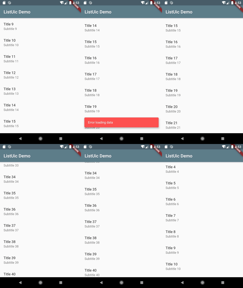
ListUic - Wrapper of ListView, which implements related data loading and state management logic.
LoginUic - A Login form, that hides most of the UI logic under the hood, but still customizable to fit your app design.
ProgressUic - Wrapper of ProgressIndicator with additional text.
Widgets:
ActionButton - Wrapper of Material button, that manages a state of an action which is performed on the button click, and shows progress while the action is performed.
Deck - Shows stacked cards, that can be expanded and collapsed.
InlineTextField - Text view with ability to inline edit its content.
StepIndicator - Simple, but customizable step/page indicator.
A common case of displaying a piece of data in your UI is that you also would like to display some accompanying views while the data is loading, or if an error occurred.
StatefulData model
StatefulData is a wrapper of your data that handles data loading and notifies its listeners on data state changes.
In a simple case of one-time loaded data you define it like this:
final yourStatefulData = StatefulData<YourDataType>(
  loader: () => loadData(),
);
Once you've created the StatefulData object it starts loading data asynchronously using provided loader function and notifies listeners on data loading state.
There is an option to not start data loading immediately, use startLoading parameter to control this behavior:
In this case you can load data by calling loadData() method:
yourStatefulData.loadData();
This method also can be used to refresh the data at any time.
If you have a stream of data use the StatefulData.watch constructor as following:
final yourStatefulData = StatefulData<YourDataType>.watch(
  source: () => yourDataStream,
);
In this case your data will be automatically updated.
The following data states are supported by the StatefulData:
State
Description
initialLoading
Data is loading at the first time (current data is empty).
initialLoadingError
An error occurred on initial data loading.
empty
Data loading is successfully finished, but the empty data was received.
ready
Data was successfully loaded and its value is available.
loading
Data loading is in progress.
error
An error occurred during data loading.
StatefulDataView widget
Typically StatefulData is used with StatefulDataView. This is a widget that listens to provided StatefulData object and updates the UI according to the current data state.
Enhanced, but still simple, checkbox widget. Unlike original Checkbox widget, CheckboxUic maintain its state. Also it has a title and can show an additional description.
Supports all original parameters of Checkbox Flutter widget
Has initial value
Shows a title, which can be individual for checked and unchecked state
Optionally shows additional text description, which can be individual for checked and unchecked state
Supports custom widgets instead of text description
Usage
Import the package
import'package:uic/checkbox_uic.dart';
Simple usage of CheckboxUic:
  @override
  Widget build(BuildContext context) {
    return Scaffold(
      appBar: AppBar(
        title: Text(widget.title),
      ),
      body: CheckboxUic(
          initialState: true,
          title: 'Show additional description',
          description: 'This is description for checked state.',
          descriptionUnchecked: 'CheckboxUic can show description text, which can be '
              'individual for each state (checked and unchecked).',
          onChanged: (value) {
            print('$value');
          },
      ),
    );
  }
Almost each app has screens that display a list of items. Simple task at first look, it often requires much related staff to be implemented. All that boilerplate can be simplified with ListUic widget.
Features:
Pull to Refresh gesture to reload list data
Pagination (infinite scroll) to load next part of data on scroll to the end of the list
Progress indicator for initial data loading
Individual view for empty data
Individual error view
Progress indicator at the end of list when next page of items is loading
A wrapper of Material buttons, that incapsulates managing of the local state of an action which is
performed on the button click, and updates the button content to display the progress view when the action is performed.
Uses TextButton, ElevatedButton or OutlineButton as an underlying button widget.
Supports all attributes of standard buttons.
Allows to display a simple progress indicator or a custom view when the action is performed.
Provides callbacks on action state changes.
Usage
Import the package
import'package:uic/widgets.dart';
You can use ActionButton the same way you are using normal button widgets. But instead of 'onPressed', you provide action function in the action attribute.
Makes Text view editable. In the view mode is shows a normal Text widget (or your custom view). On double tap it is switching to editing mode, and allow user to inline edit the text.
Supports text styling in both view and editing mode.
Supports text field decoration in the editing mode.
Uses minimalistic appearance of text field in editing mode by default.
Notifies when user done editing text.
Supports custom widget to show in view mode instead of normal Text widget.
Simple, but customizable step (page) indicator. It can be useful to show a current item in sliders and carousels, or a current page in a flow where user has to pass through a sequence of screens.
Supports custom colors for completed, selected and incomplete steps.
Optionally shows lines connecting step items.
Supports custom line colors, width and length.
Can be expanded, to fit parent size.
Horizontal or vertical orientation (NOT IMPLEMENTED YET)
Notifies when user select a step. (NOT IMPLEMENTED YET)
Supports custom widgets for complete, selected and incomplete steps.
Builder function that allow to define individual view for each step. (NOT IMPLEMENTED YET)