adaptive_scrollbar



Language: English
Adaptive Scrollbar is a library that allows you to create one or more desktop-style
scrollbars on a single screen, each of which is bound only to its own object
and placed in its own place on the screen.
How to use it
Just wrap with AdaptiveScrollbar your widget that contains your ScrollView
object and specify the controller that is attached to this ScrollView object.
AdaptiveScrollbar(
  controller: controller,
  child: Center(
    child: ListView.builder(
      controller: controller,
      itemBuilder: (context, index) {
        return Text(
            "Line " + index.toString());
      },
      itemCount: 50,
    ))),
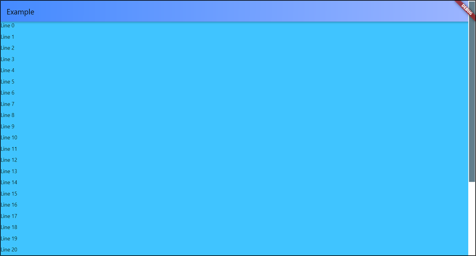
Multiple scrollbars
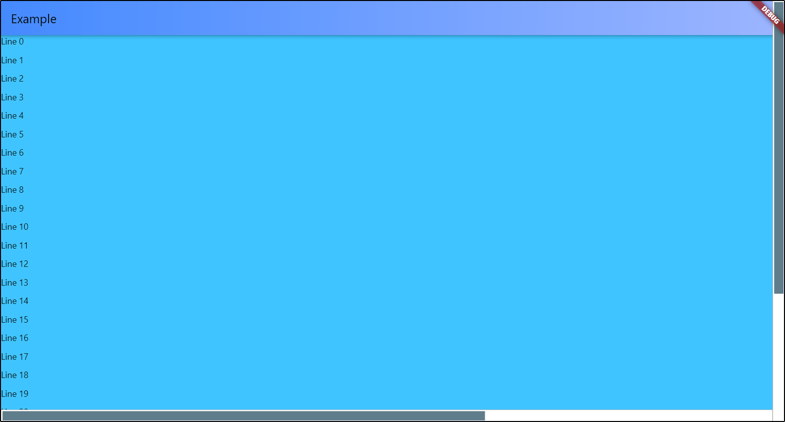
You can add multiple scrollbars to the screen at once. The controller
is a required parameter in order to track changes to only one object
if there are several ScrollView objects in your widget.
return AdaptiveScrollbar(
  controller: verticalScroll,
  width: verticalWidth,
  child: AdaptiveScrollbar(
    controller: horizontalScroll,
    width: horizontalWidth,
    position: ScrollbarPosition.bottom,
    underSpacing: EdgeInsets.only(bottom: verticalWidth),
    child: SingleChildScrollView(
      controller: horizontalScroll,
      scrollDirection: Axis.horizontal,
      child: Container(
        width: 2000,
        child: Container(
          color: Colors.lightBlueAccent,
          child: ListView.builder(
            controller: verticalScroll,
            itemCount: 30,
            itemBuilder: (context, index) {
              return Container(
                height: 30,
                child: Text("Line " + index.toString()));
            }))),
    )));
Customization
You can position your scrollbar on any of the 4 sides of the screen.
There is only one thing - if you choose ScrollbarPosition.top or
ScrollbarPosition.bottom, your scrollbar will actually be rotated 90 degrees,
and the top will be on the left. Do not forget about this if you specify
the spacings for slider and under the slider part. I'll think about how to simplify this.
AdaptiveScrollbar(
controller: verticalScroll,
width: verticalWidth,
child: AdaptiveScrollbar(
controller: horizontalScroll,
position: ScrollbarPosition.bottom,
underSpacing: EdgeInsets.only(bottom: verticalWidth),
width: horizontalWidth,
child: ...
),

To set slider width, you can set the horizontal sliderSpacing.
The vertical sliderSpacing will determine the padding of the slider
from the start and the end of the bottom. The height of the slider
is determined automatically based on the size of the ScrollView object.
If ScrollView object has nowhere to scroll, the scrollbar will not be displayed
on the screen.
You can set colors for slider and under the slider part, or completely set
the decorations for them.
Slider scroll-to-click speed
You can set your own speed parameters for moving the slider in the direction
of the click. scrollToClickDelta is the distance that the slider will move
in one move. scrollToClickFirstDelay is the duration of the first delay
between the slider moves in the direction of the click, in milliseconds.
scrollToClickOtherDelay is the duration of the remaining delays between scrolls
in the click direction, in milliseconds.
AdaptiveScrollbar(
  ...
  scrollToClickDelta: 75,
  scrollToClickFirstDelay: 200,
  scrollToClickOtherDelay: 50,
  ...
),
Parameters
| Parameter |
Description |
Type |
Default value |
| child |
Widget that contains your ScrollView. |
Widget |
required |
| controller |
Controller that attached to ScrollView object. |
ScrollController |
required |
| position |
Position of scrollbar on the screen. |
ScrollbarPosition (enum) |
ScrollbarPosition.right |
| width |
Width of all scrollBar. |
double |
16.0 |
| sliderHeight |
Height of slider. If you set this value, there will be this height. If not set, the height will be calculated based on the content, as usual. |
double |
Calculated based on content |
| sliderChild |
Child widget for slider. |
Widget? |
- |
| underColor |
Under the slider part of the scrollbar color. |
Color |
Colors.white |
| sliderDefaultColor |
Default slider color. |
Color |
Colors.blueGrey |
| sliderActiveColor |
Active slider color. |
Color |
sliderDefaultColor.withRed(10) |
| underDecoration |
Under the slider part of the scrollbar decoration. |
BoxDecoration |
BoxDecoration(shape: BoxShape.rectangle, color: underColor) |
| sliderDecoration |
Slider decoration. |
BoxDecoration |
BoxDecoration(shape: BoxShape.rectangle, color: sliderDefaultColor) |
| sliderActiveDecoration |
Slider decoration during pressing. |
BoxDecoration |
BoxDecoration(shape: BoxShape.rectangle, color: sliderActiveColor) |
| scrollToClickDelta |
Offset of the slider in the direction of the click. |
double |
100.0 |
| scrollToClickFirstDelay |
Duration of the first delay between scrolls in the click direction, in milliseconds. |
int |
400 |
| scrollToClickOtherDelay |
Duration of the others delays between scrolls in the click direction, in milliseconds. |
int |
100 |
| underSpacing |
Under the slider part of the scrollbar spacing. Don't forget about rotation that depends on position. |
EdgeInsetsGeometry |
const EdgeInsets.all(0.0) |
| sliderSpacing |
Slider spacing from bottom. Don't forget about rotation that depends on position. |
EdgeInsetsGeometry |
const EdgeInsets.all(2.0) |

