搜尋套件、儲存庫與 APP 分類

套件詳情v1.0.5

animated_cursor

用於增強使用者介面互動的動畫游標

AndroidiOSWebmacOSWindowsLinux
近 30 天下載
75
喜歡數
33
Pub 分數
160

安裝套件

flutter pub add animated_cursor

套件介紹

根據套件公開資料產生的選型評估,僅供參考。

Animated Cursor 是一個 Flutter 套件,透過在多個平台提供可自訂的動畫游標來增強使用者介面互動。它讓開發者能夠建立動態游標效果,例如軌跡、形狀或動畫,進而提升視覺反饋與參與度。此套件支援桌面(Windows、Linux、macOS)與行動裝置(Android、iOS)平台,非常適合沉浸式 UI 經驗。透過 pub add 簡單整合,即可實現流暢且高效能的游標動畫,無需複雜設定。適用於遊戲、創意應用或互動式儀表板。

適用情境

  • 互動式 UI
  • 遊戲開發
  • 創意應用
  • 儀表板介面
  • 視覺反饋系統

主要特色

  • 可自定義的游標動畫
  • 跨平台支援
  • 流暢的效能
  • 輕鬆整合
  • 軌跡效果
  • 響應式設計

適合對象

  • UI/UX 設計師
  • 遊戲開發者
  • 互動式應用創建者
  • 桌面應用程式建構器
  • 創意編程專案

使用建議

  • 在低階設備上的效能
  • 網頁上的自訂功能有限
  • 需要平台特定的測試
  • 可能不適用於所有無障礙需求
  • 極簡設計中的潛在過度使用

原始 README

以下為關聯原始碼儲存庫的 README 原文快照,最新內容請造訪原始碼儲存庫。

Alt Text

View on GitHub View on GitHub View on Linkedin View on Github

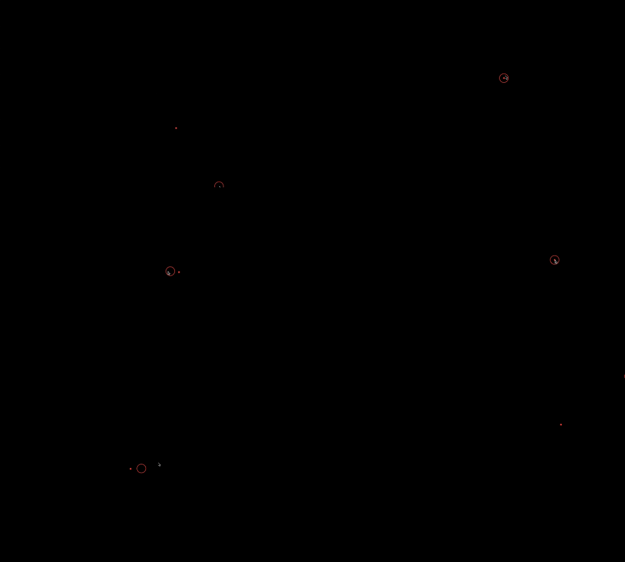
Preview

Alt Text

Animated Cursor Package

Welcome to the Animated Cursor package for Flutter! This package provides a customizable animated cursor widget that you can easily integrate into your Flutter projects.

Installing

Add dependency to pubspec.yaml To use the latest version of animated_cursor, add the following line to your pubspec.yamlfile:

dependencies:
  animated_cursor: ^1.0.5

Install it You can install packages from the command line: with Flutter:

$ flutter pub get

Import the package

import 'package:animated_cursor/animated_cursor.dart';

Usage

AnimatedCursor
(
circleColor: Colors.red,
dotColor: Colors.red,
backgroundColor: Colors.black,
borderWidth: 2,
child: Container(color: Colors.black)
);

Properties of Animated Cursor:

Name Type Default Behaviour Description
child Widget The child widget beneath the animated cursor.
cursor MouseCursor? SystemMouseCursors.basic The cursor to be displayed when the mouse is over the child widget
circleColor Color? Color(0xFF4CAF50) Color of the animated circle.
dotColor Color? Color(0xFF4CAF50) Color of the animated dot.
backgroundColor Color? Colors.transparent Background color of the cursor.
circleDuration Duration? 100 Duration of the animated circle's appearance.
dotDuration Duration? 350 Duration of the animated dot's appearance.
borderWidth double? 1 Width of the cursor's border.
shape CursorShape? BoxShape.circle Shape of the cursor (Circle or Rectangle).
borderRadius BorderRadius? 100 Border radius for the cursor (applicable when shape is set to Rectangle).

Example

import 'package:animated_cursor/animated_cursor.dart';

void main() {
  runApp(MyApp());
}

class MyApp extends StatelessWidget {
  const MyApp({super.key});

  @override
  Widget build(BuildContext context) {
    return MaterialApp(
      title: 'Animated Cursor',
      debugShowCheckedModeBanner: false,
      theme: ThemeData(
        primarySwatch: Colors.red,
      ),
      home: AnimatedCursor(
        // cursor: SystemMouseCursors.alias,
        circleColor: Colors.red,
        dotColor: Colors.red,
        backgroundColor: Colors.black,
        borderWidth: 1,
        child: Container(color: Colors.black),
      ),
    );
  }
}

Additional Information

👍 If you appreciate our solution's value and positive impact on your project,✨ show your support with a thumbs up! 🌟 Your feedback fuels our commitment to excellence.💫 Thank you for choosing us!

-Darshak Desai

所屬分類

依賴

依賴清單 1 項

原始碼儲存庫

使用此套件的專案

暫無相關資料。