搜尋套件、儲存庫與 APP 分類

animated_reorderable_list 封面
套件詳情v1.3.0

animated_reorderable_list

一個具有簡單實現和順暢過渡效果的 Flutter 可重新排序動畫清單。

AndroidiOSWebmacOSWindowsLinux
近 30 天下載
3.7萬
喜歡數
195
Pub 分數
150

安裝套件

flutter pub add animated_reorderable_list

套件介紹

根據套件公開資料產生的選型評估,僅供參考。

一個 Flutter 套件,可增強標準的 ReorderableListView 在項目重新排序時的平滑、動畫過渡效果。設計簡潔且具備優異效能,無需複雜的自訂邏輯即可提供流暢的使用者體驗。適用於使用者經常重新排列項目的清單,例如任務管理器或可自訂儀表板。此套件支援所有主要平台,並能順暢整合至現有的 Flutter 專案中。

適用情境

  • 任務管理應用
  • 可自訂的儀表板佈局
  • 拖曳項目重新排序
  • 使用者偏好排序
  • 互動式清單介面

主要特色

  • 平滑的動畫過渡
  • 簡單 API 結合
  • 跨平台支援
  • 優化效能
  • 內建拖曳反饋
  • 輕鬆自訂

適合對象

  • 尋求直覺式清單重新排序的開發者
  • 需要響應式 UI 互動的專案
  • 具有動態內容排序的應用程式
  • 重視開發速度的團隊
  • Flutter 初學者探索進階組件

使用建議

  • 在非常大的清單上可能會影響效能
  • 僅限垂直列表佈局
  • 需要小心處理項目鍵
  • 不適用於水平重新排序
  • 最佳搭配穩定的項目識別碼使用
  • 與其他觸控偵測器的潛在衝突

原始 README

以下為關聯原始碼儲存庫的 README 原文快照,最新內容請造訪原始碼儲存庫。

animated_reorderable_list

This library is a powerful and easy-to-use solution for implementing animated list and grid with drag-and-drop functionality in Flutter.

Features

  • [x] Smooth transition during item insertion and removal from the list with animations.
  • [x] Drag and Drop support (ReorderableList) for both ListView and GridView with Animation.
  • [x] It can be both animated and reordered at the same time
  • [x] Animating items is as simple as updating the list.
  • [x] Pre-built animation like fade,scale, slide, flip etc for Flutter list.
  • [x] Provides support for both lists and grids
  • [x] Supports large lists and creates items on demand as they come into the viewport.
  • [x] Enable/disable drag and drop functionality.
  • [x] Control reordering of item / locked an item.

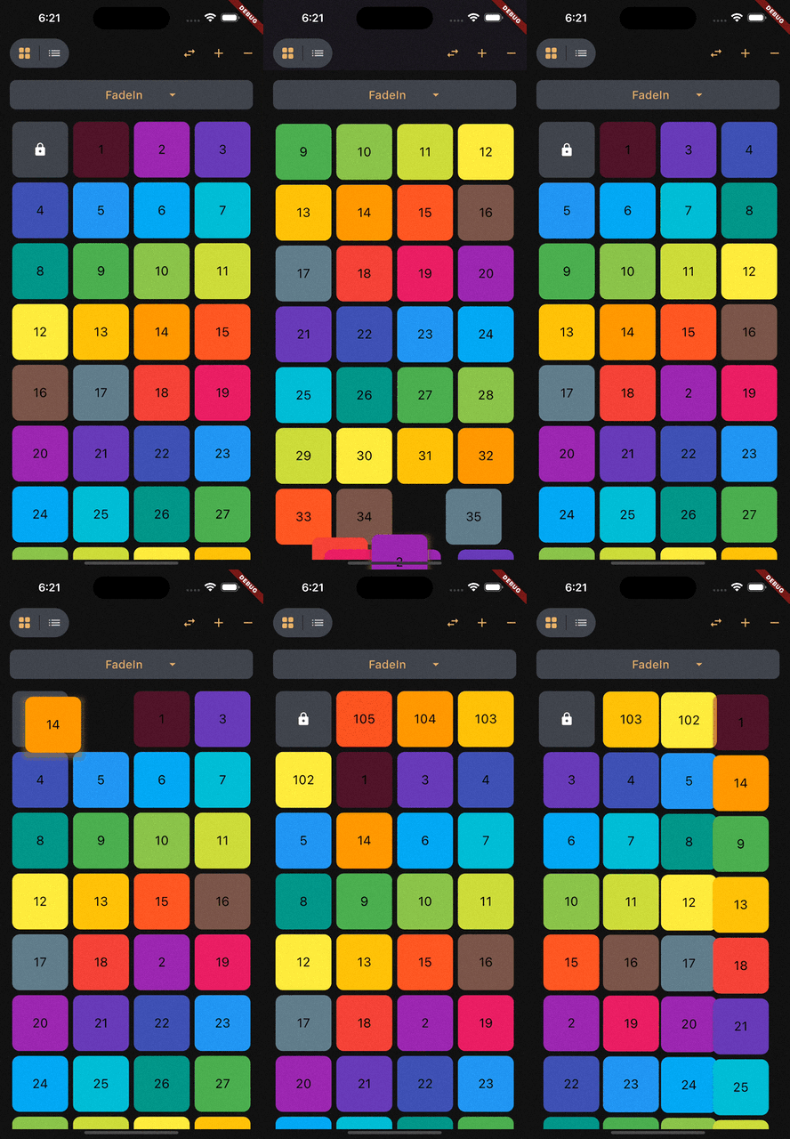
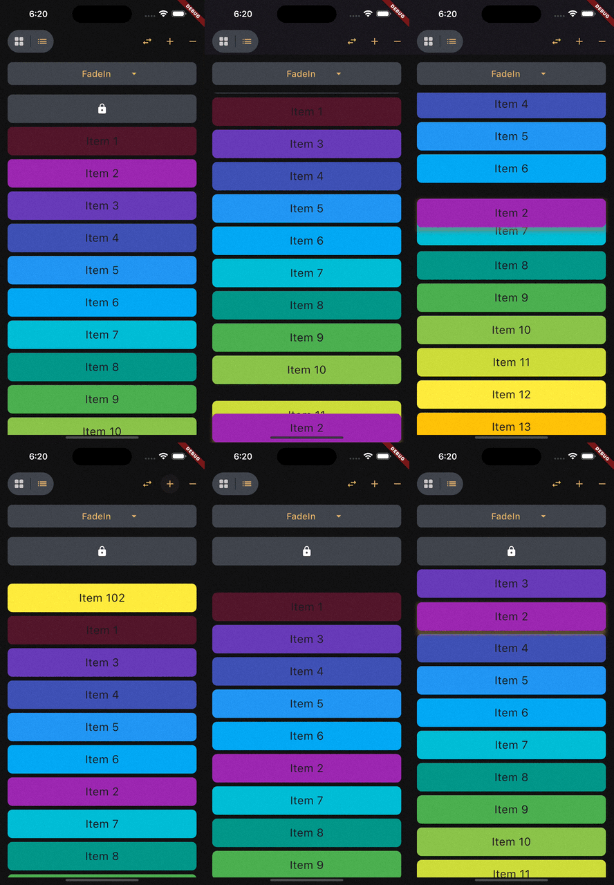
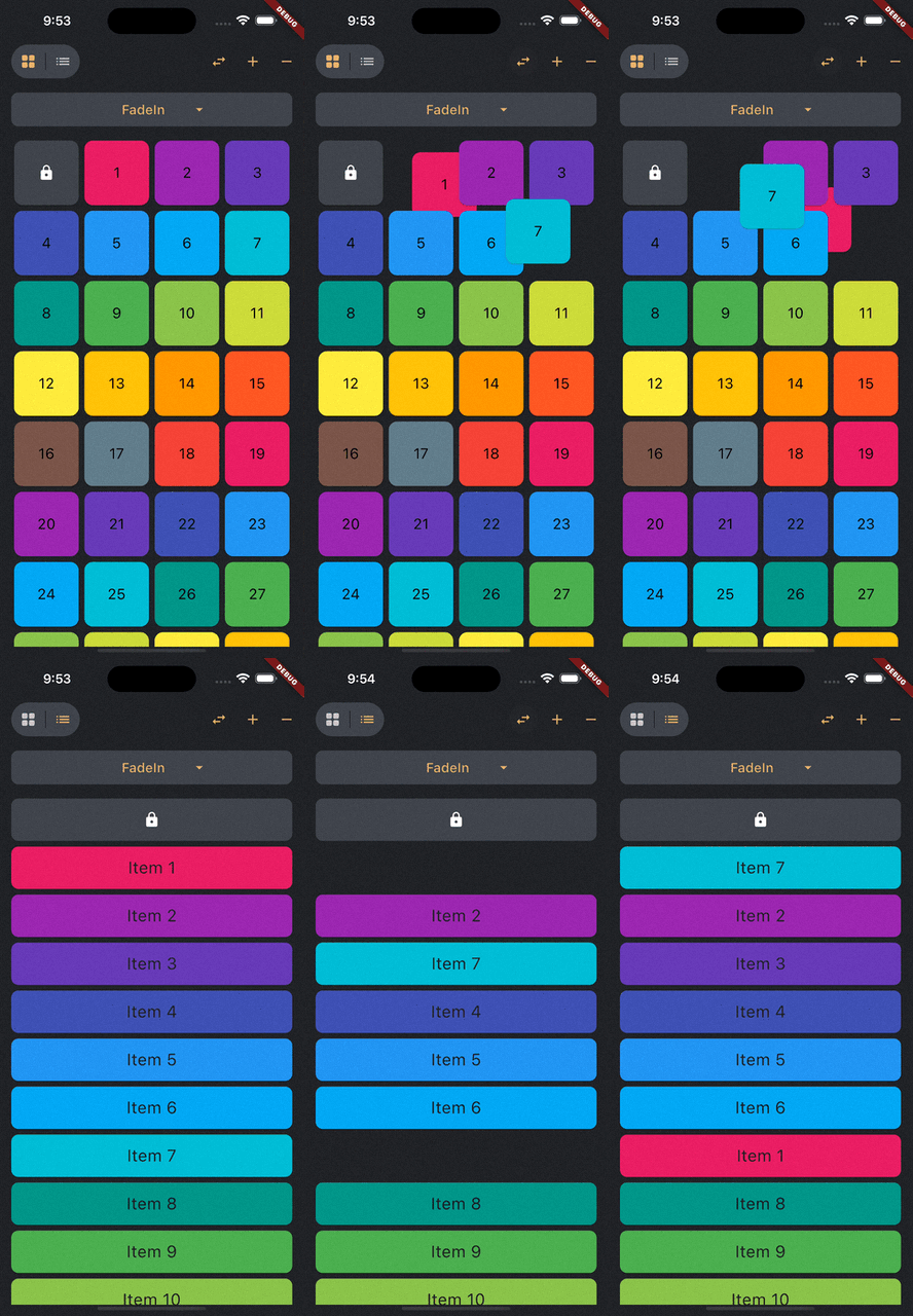
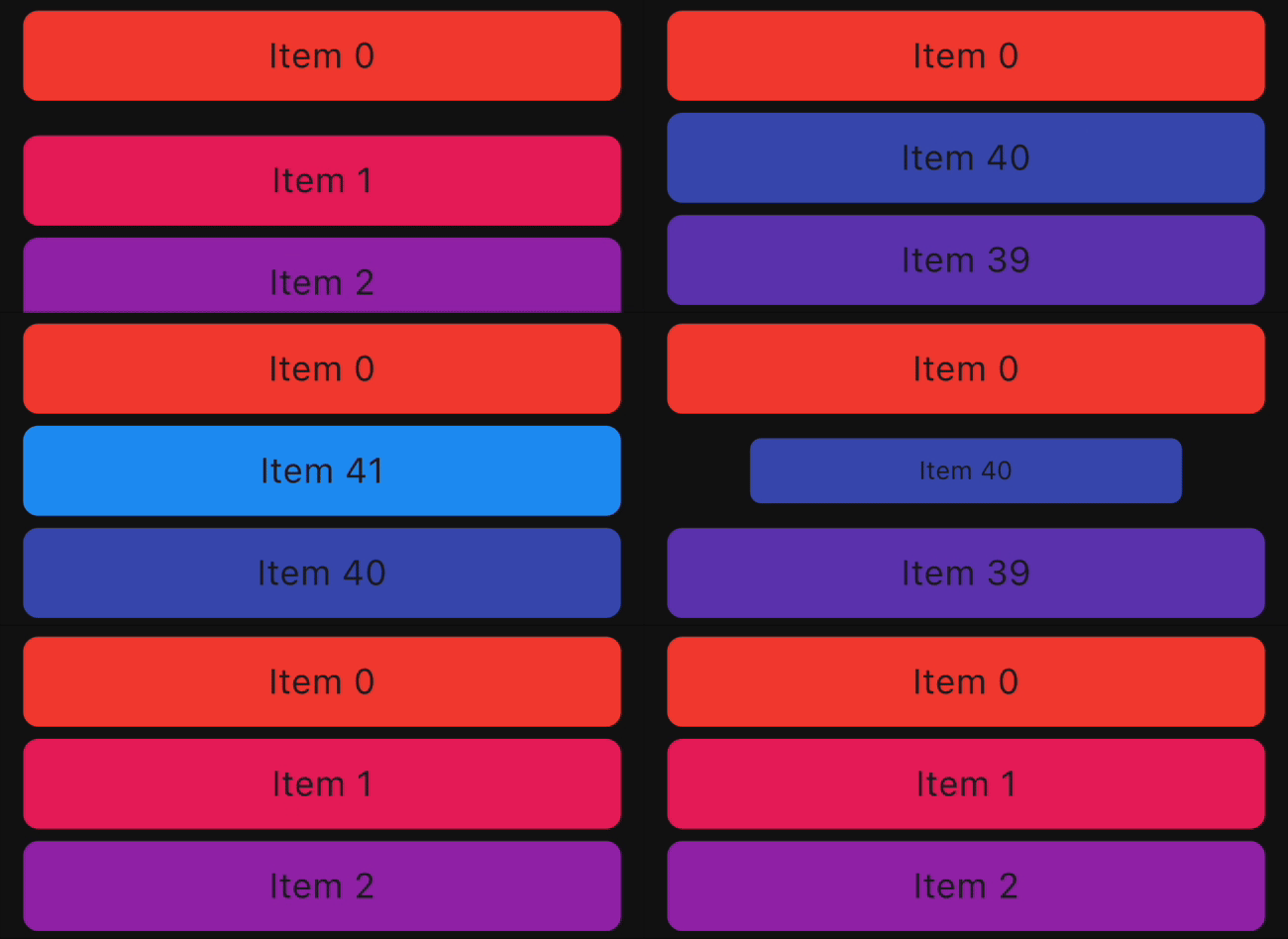
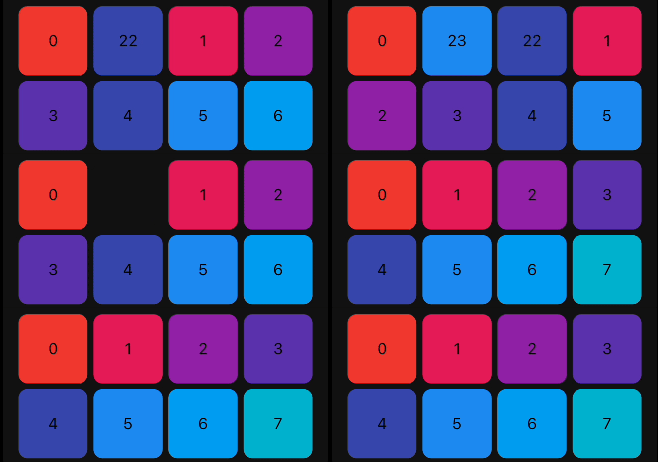
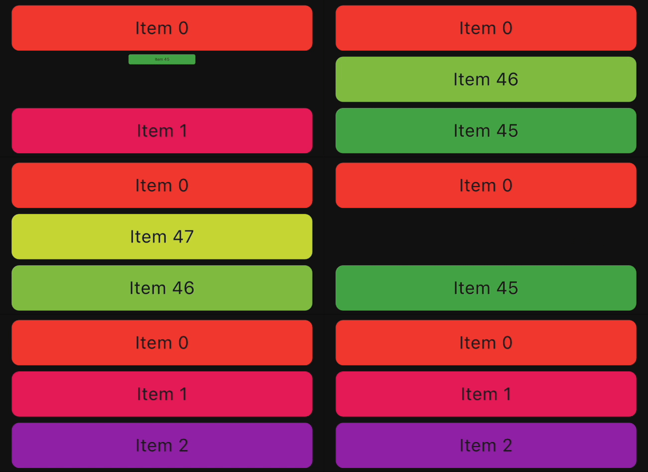
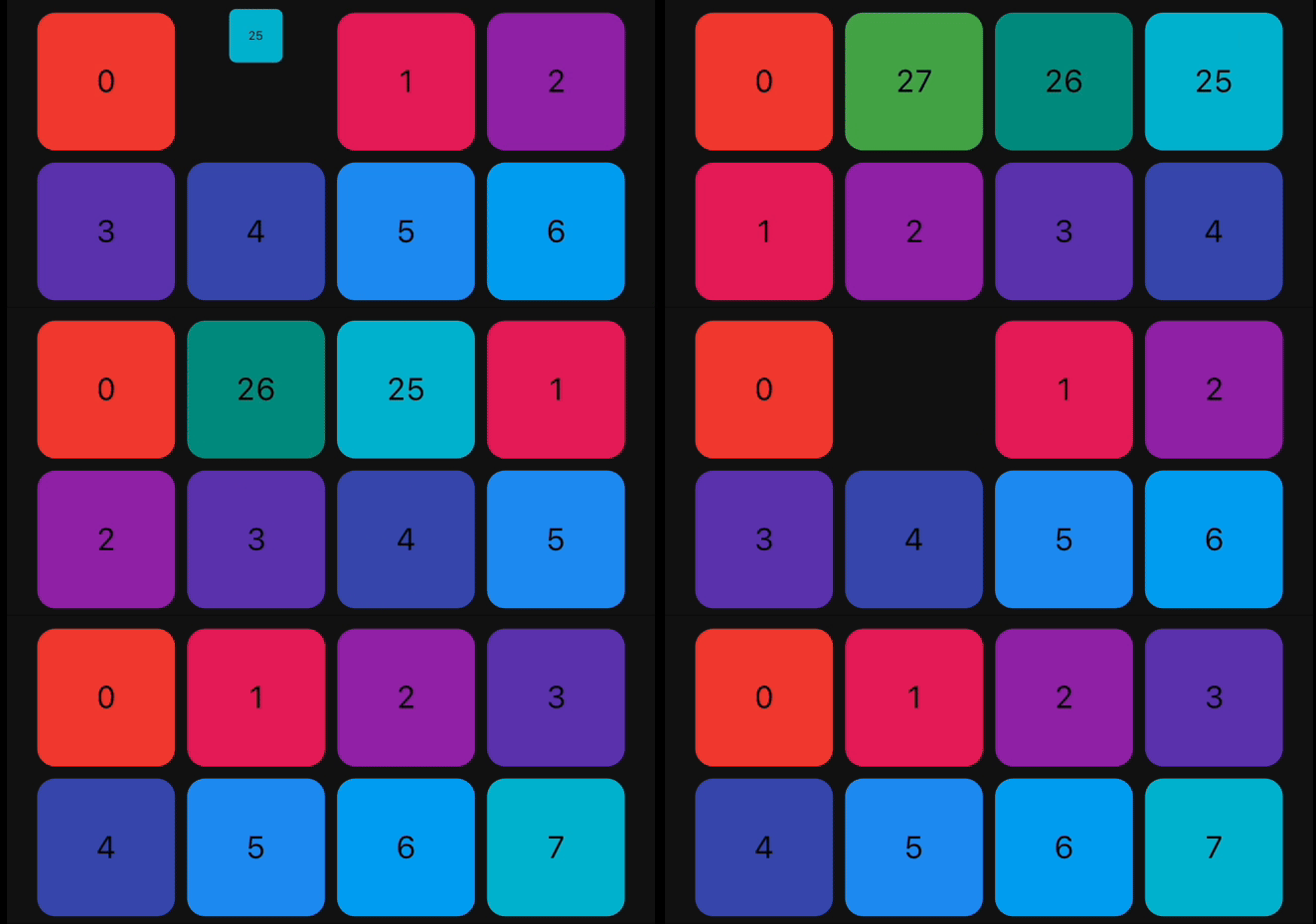
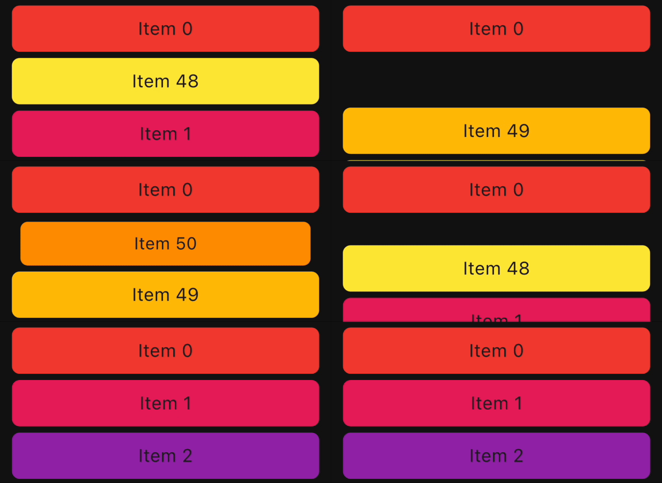
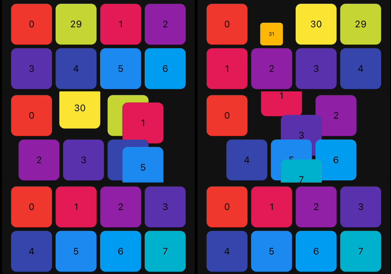
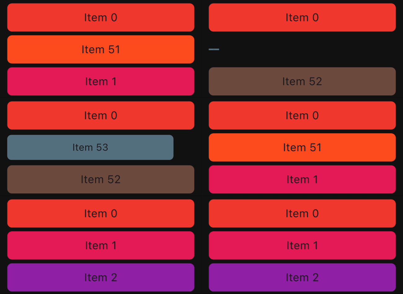
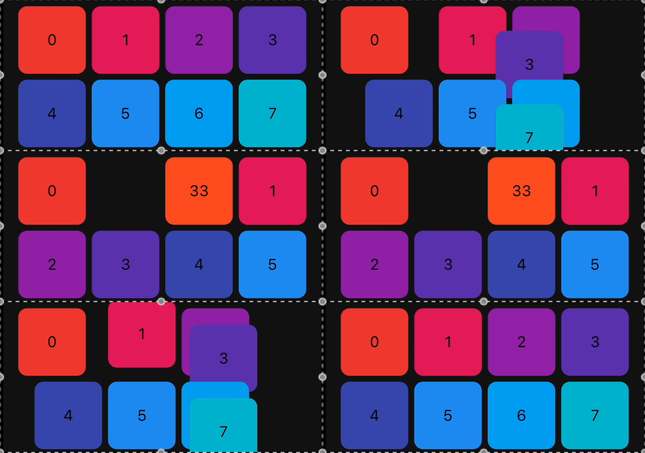
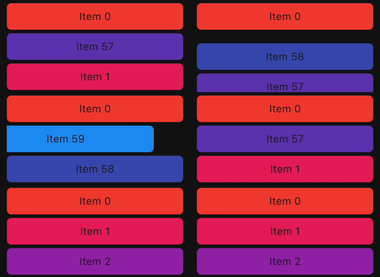
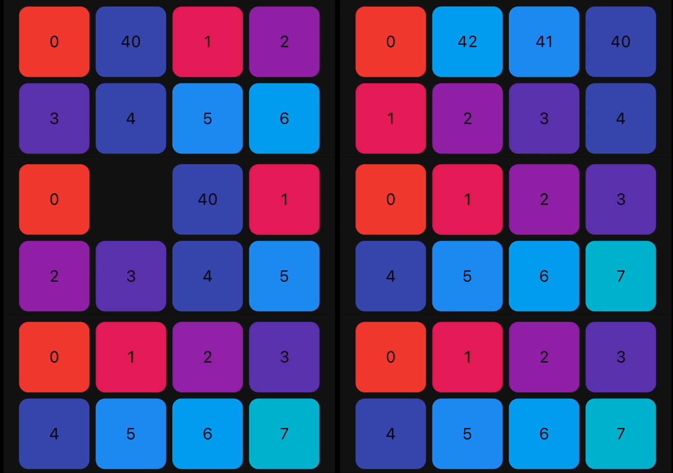
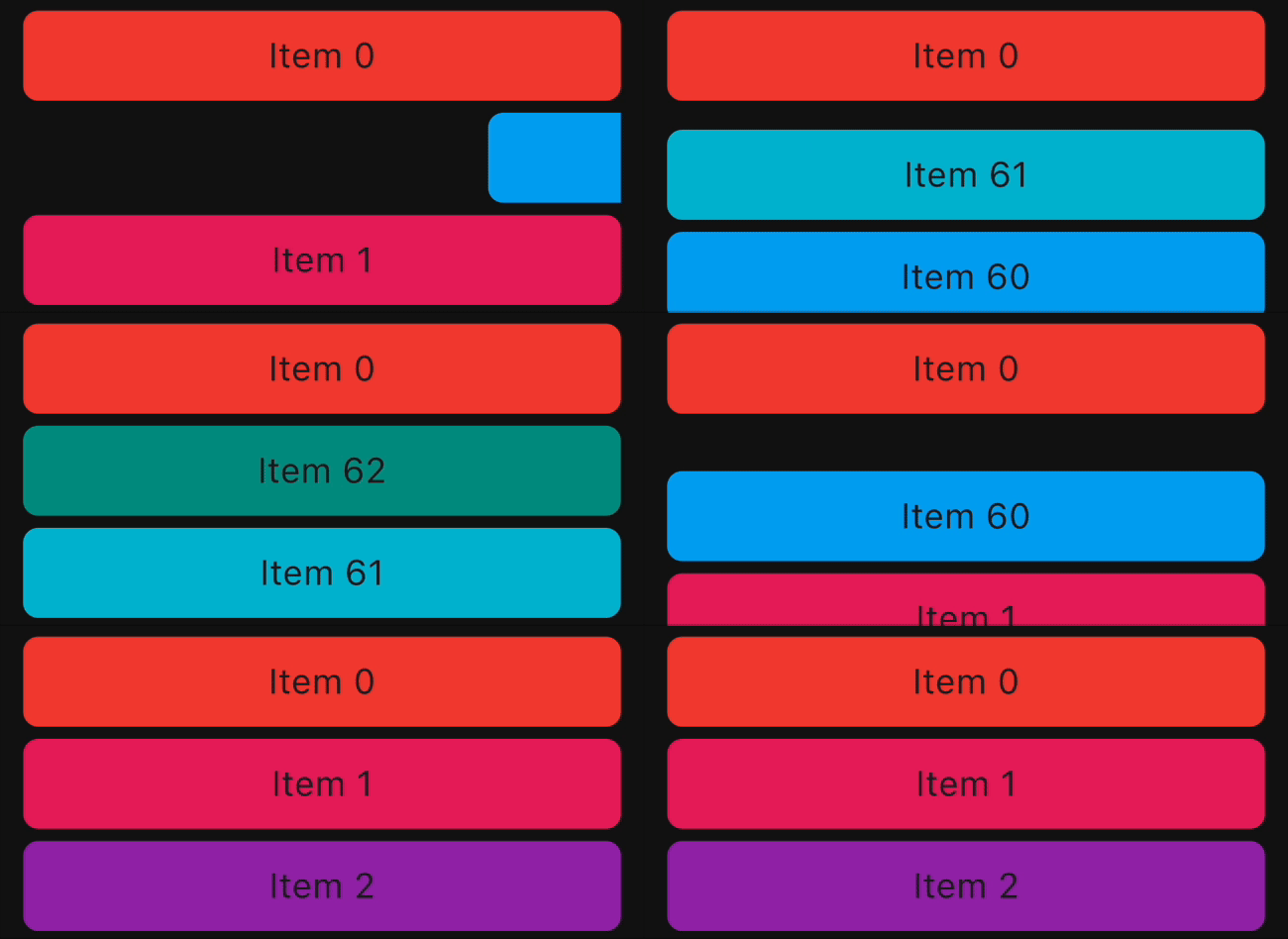
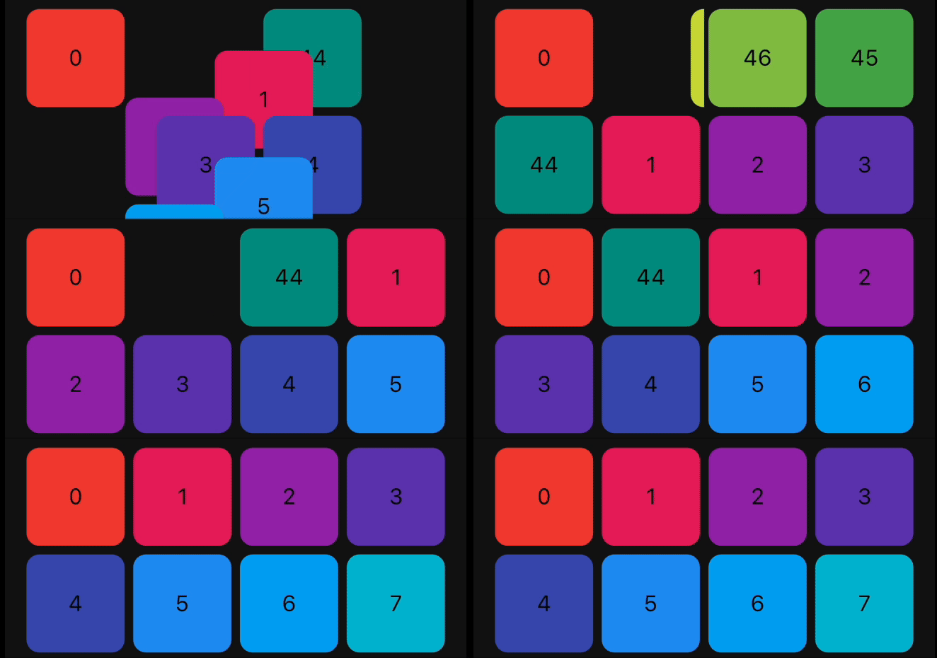
Demo

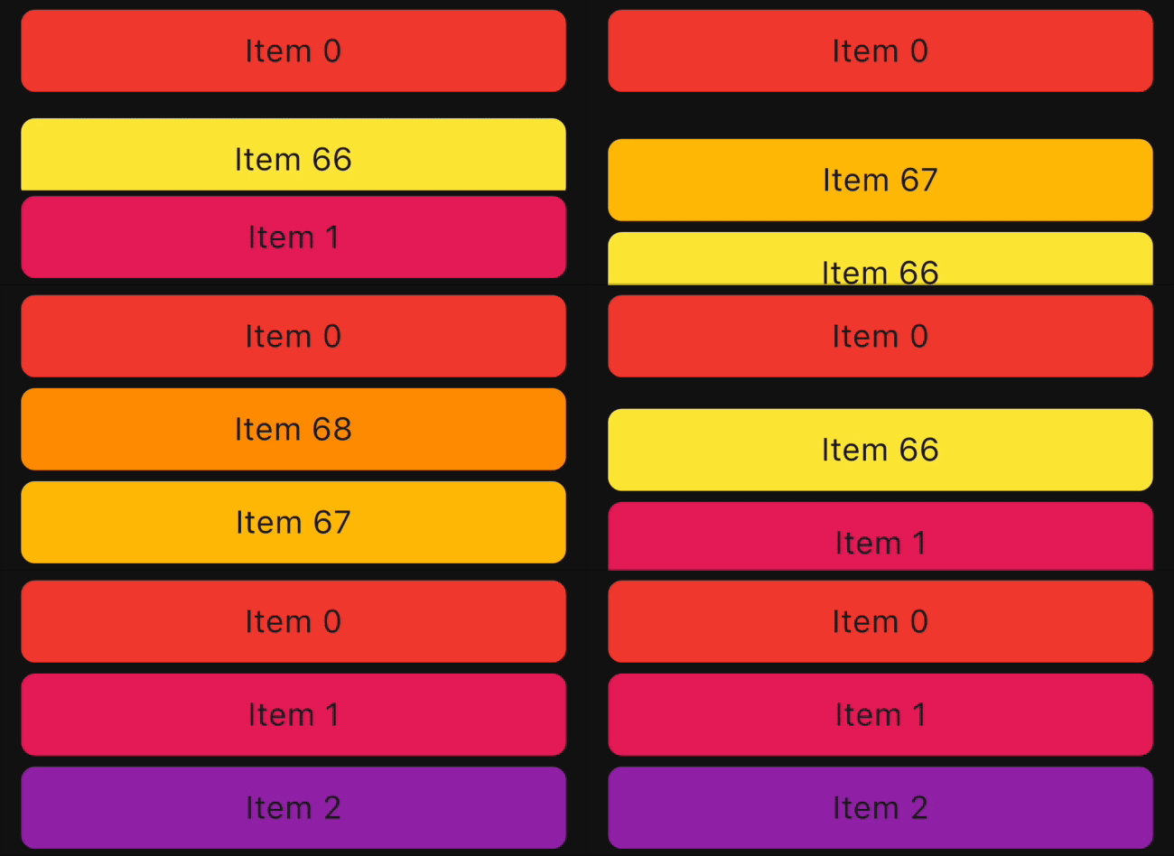
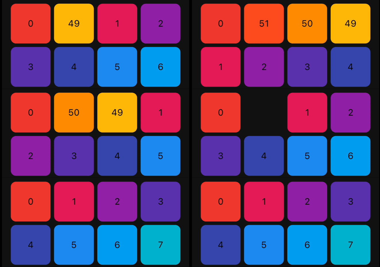
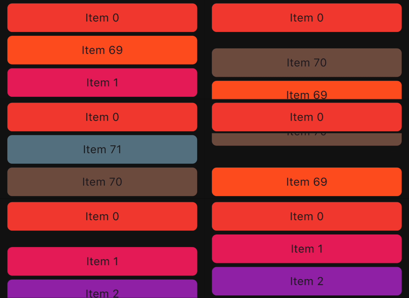
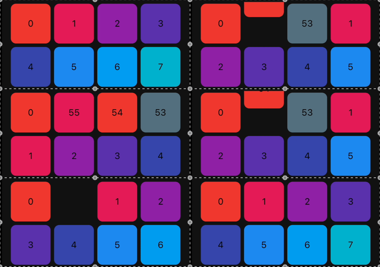
Reorderable List
ReorderableGridView ReorderableListView Swap Animation

How to use it?

1. Add dependency

Add this to your package's pubspec.yaml file:

dependencies:
  animated_reorderable_list: <latest_version>
2. Install it

You can install packages from the command line:

with pub:

$ pub get

with Flutter:

$ flutter pub get
3. Import it

Now in your Dart code, you can use:

import 'package:animated_reorderable_list/animated_reorderable_list.dart';
4. Use it

Sample app demonstrates how simple the usage of the library actually is.

Basic usage

AnimatedReorderableGridView

A AnimatedGridView with built-in support for drag and drop functionality.

AnimatedReorderableGridView(
  items: list,
  itemBuilder: (BuildContext context, int index) {
    final user = list[index];
    return ItemCard(
      key: ValueKey(user.id),
      id: user.id,
    );
  },
  sliverGridDelegate:
      SliverReorderableGridDelegateWithFixedCrossAxisCount(
          crossAxisCount: 4),
  enterTransition: [FlipInX(), ScaleIn()],
  exitTransition: [SlideInLeft()],
  insertDuration: const Duration(milliseconds: 300),
  removeDuration: const Duration(milliseconds: 300),
  onReorder: (int oldIndex, int newIndex) {
    setState(() {
      final User user = list.removeAt(oldIndex);
      list.insert(newIndex, user);
    });
  },
  dragStartDelay: const Duration(milliseconds: 300),
  isSameItem: (a, b) => a.id == b.id,
)
AnimatedReorderableListView

A AnimatedListView with built-in support for drag-and-drop functionality.

 AnimatedReorderableListView(
  items: list,
  itemBuilder: (BuildContext context, int index) {
    final user = list[index];
    return ItemTile(
      key: ValueKey(user.id),
      id: user.id,
    );
  },
  enterTransition: [SlideInDown()],
  exitTransition: [SlideInUp()],
  insertDuration: const Duration(milliseconds: 300),
  removeDuration: const Duration(milliseconds: 300),
  dragStartDelay: const Duration(milliseconds: 300),
  onReorder: (int oldIndex, int newIndex) {
    setState(() {
      final User user = list.removeAt(oldIndex);
      list.insert(newIndex, user);
    });
  },
  isSameItem: (a, b) => a.id == b.id
)

AnimatedListView

A AnimatedListView that animates insertion and removal of the item. Use this widget when you don't need drag-and-drop functionality.

AnimatedListView(
  items: list,
  itemBuilder: (context, index) {
    final user = list[index];
    return ItemTile(
      key: ValueKey(user.id),
      id: user.id,
    );
  },
  enterTransition: [FadeIn(), ScaleIn()]
  exitTransition: [SlideInUp()],
  isSameItem: (a, b) => a.id == b.id,
)
AnimatedGridView

A AnimatedGridView that animates insertion and removal of the item. Use this widget when you don't need drag-and-drop functionality.

AnimatedGridView(
  items: list,
  itemBuilder: (context, index) {
    final user = list[index];
    return ItemCard(
      key: ValueKey(user.id),
      id: user.id,
    );
  },
  sliverGridDelegate:
      SliverReorderableGridDelegateWithFixedCrossAxisCount(
          crossAxisCount: 4),
  enterTransition: [FadeIn(), ScaleIn()],
  exitTransition: [SlideInDown()],
  isSameItem: (a, b) => a.id == b.id),

Duration for animation

//optional
insertDuration: const Duration(milliseconds: 300),
removeDuration: const Duration(milliseconds:300),

The duration for item insertion and removal animation. If not specified, the default duration is Duration(milliseconds: 300).

Enter and exit Animation

To apply animation, while inserting or removing item, specify a list of animation:

//optional
    enterTransition: [FadeIn(), ScaleIn()],
    exitTransition:  [SlideIn()],

If not specified, then default FadeIn() animation will be applied.

Delay, duration, curve

Animation have optional delay, duration, begin, end and curve parameters. Animations run in parallel, but you can use a delay to run them sequentially:

//optional
 enterTransition: [
     FadeIn(
        duration: const Duration(milliseconds: 300),
        delay: const Duration(milliseconds: 100)),
     ScaleIn(
        duration: const Duration(milliseconds: 500),
        curve: Curves.bounceInOut)
    ],

If a specific duration is provided for the animation, it will run for that specified duration. However, if insertDuration or removeDuration are specified, it will override specific item duration.

Custom AnimationBuilder

//optional
insertItemBuilder: (Widget child, Animation<double> animation){
      return ScaleTransition(
         scale: animation,
         child: child,
     );
  }
                                    
removeItemBuilder: (Widget child, Animation<double> animation){
       return ScaleTransition(
          scale: animation,
          child: child,
      );
    }

You can use custom insertItemBuilder or removeItemBuilder if you wish to implement your own customized animations instead of relying on the built-in animations provided by the library. In these custom builder functions, the child parameter represents the widget returned by the itemBuilder callback, and the animation parameter provides the animation control.

If a custom insertItemBuilder is provided, it will override the enterTransition. Similarly, if removeItemBuilder is provided, then it will override exitTransition.

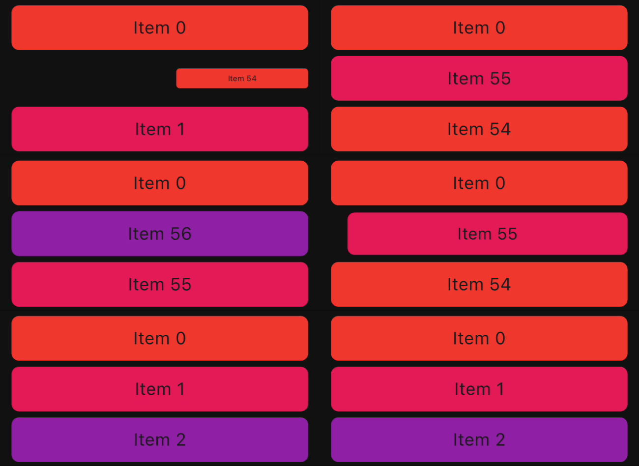
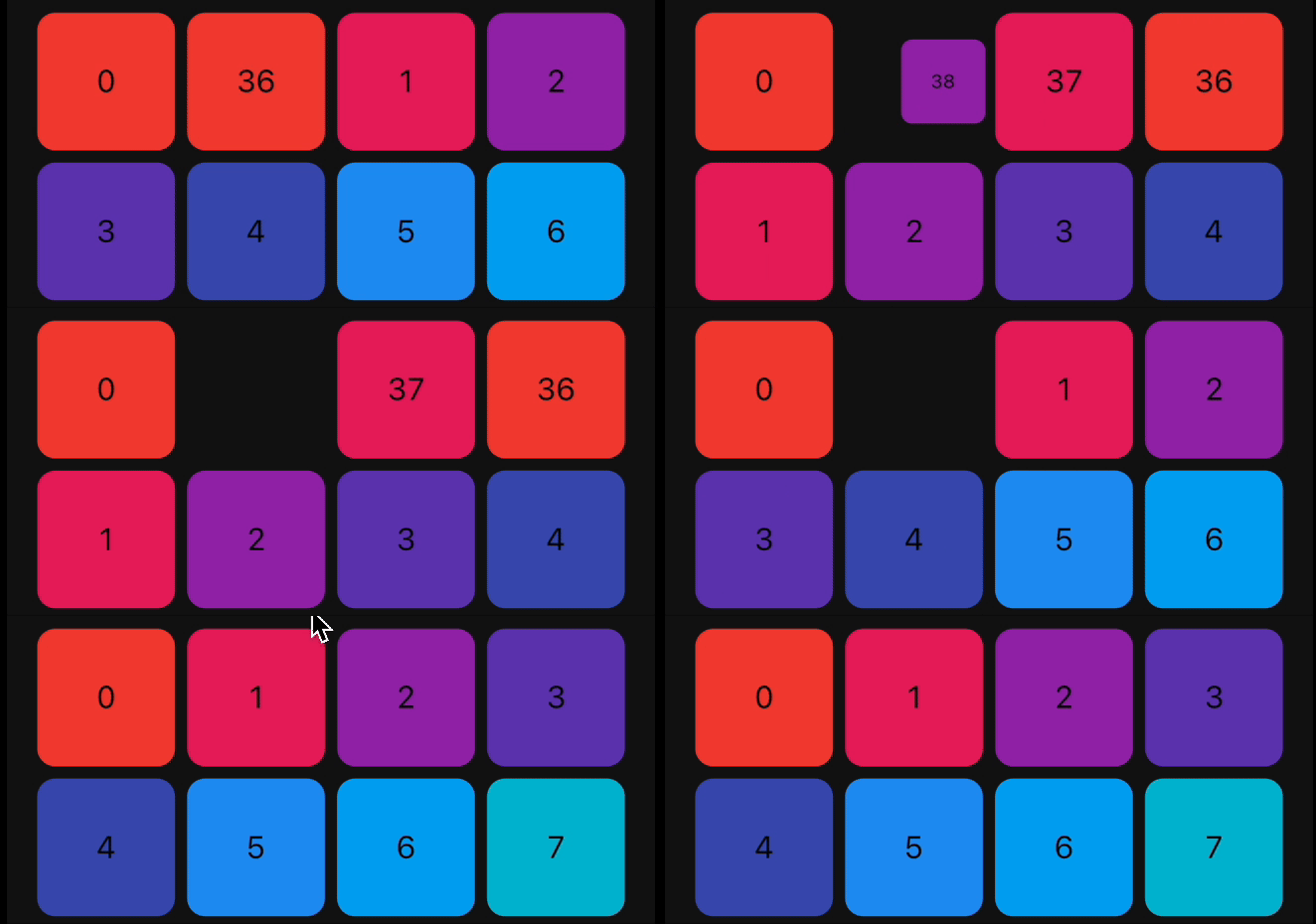
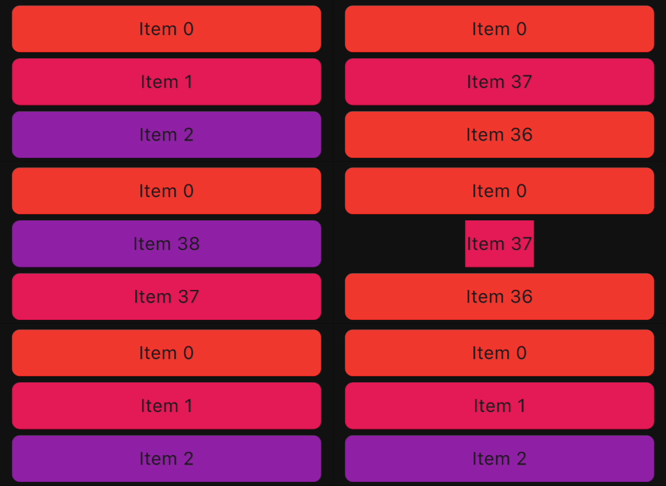
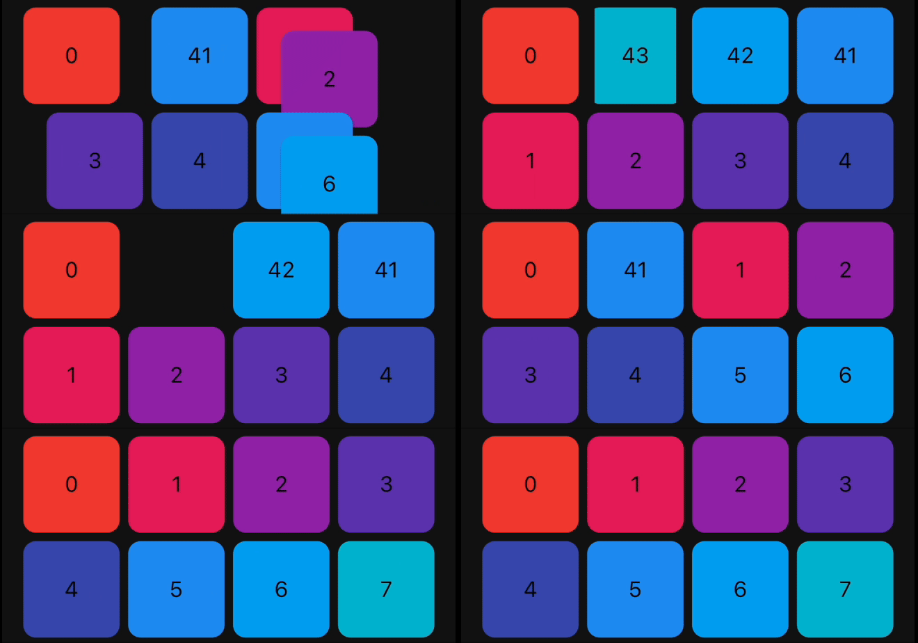
Animations

The library provides a set of pre-built animations that can be used for item insertion and removal. You can use multiple animations at the same time by providing a list of animations.

The following animations are available:

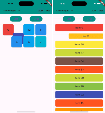
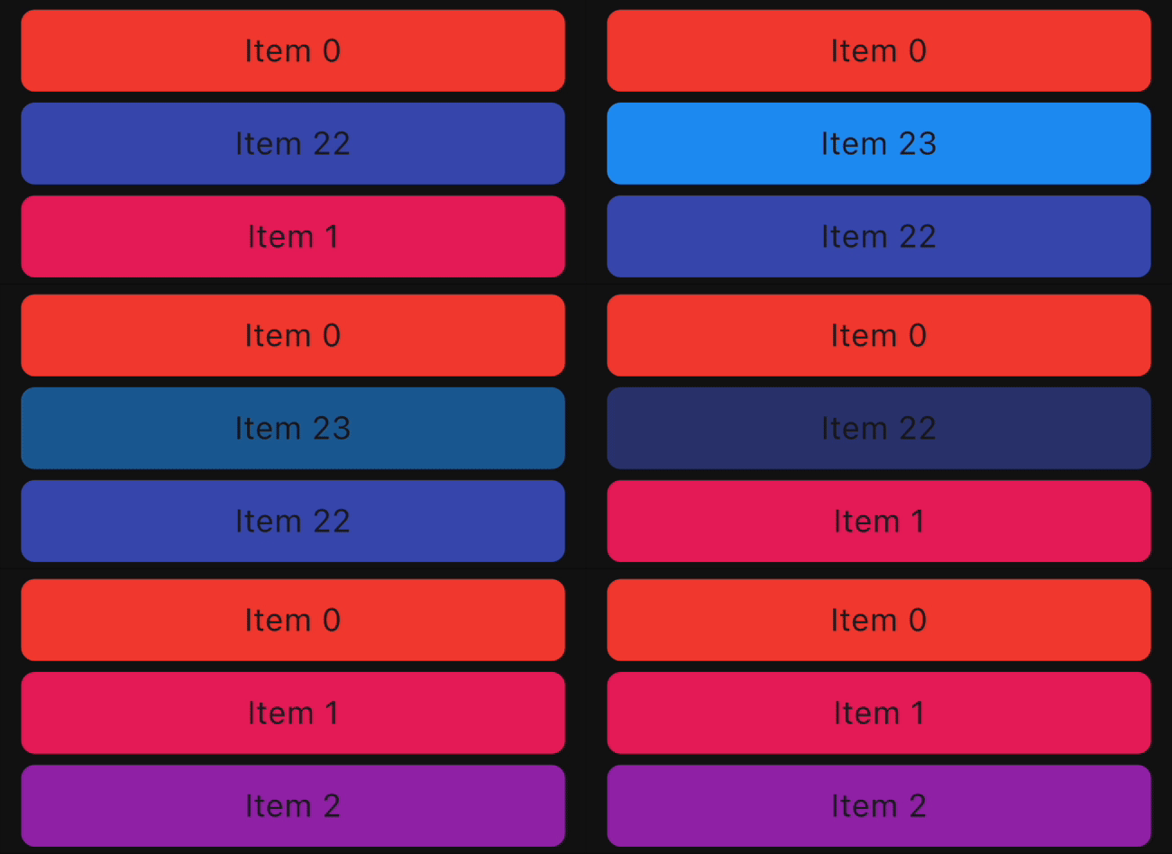
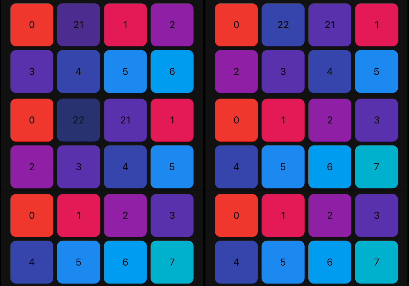
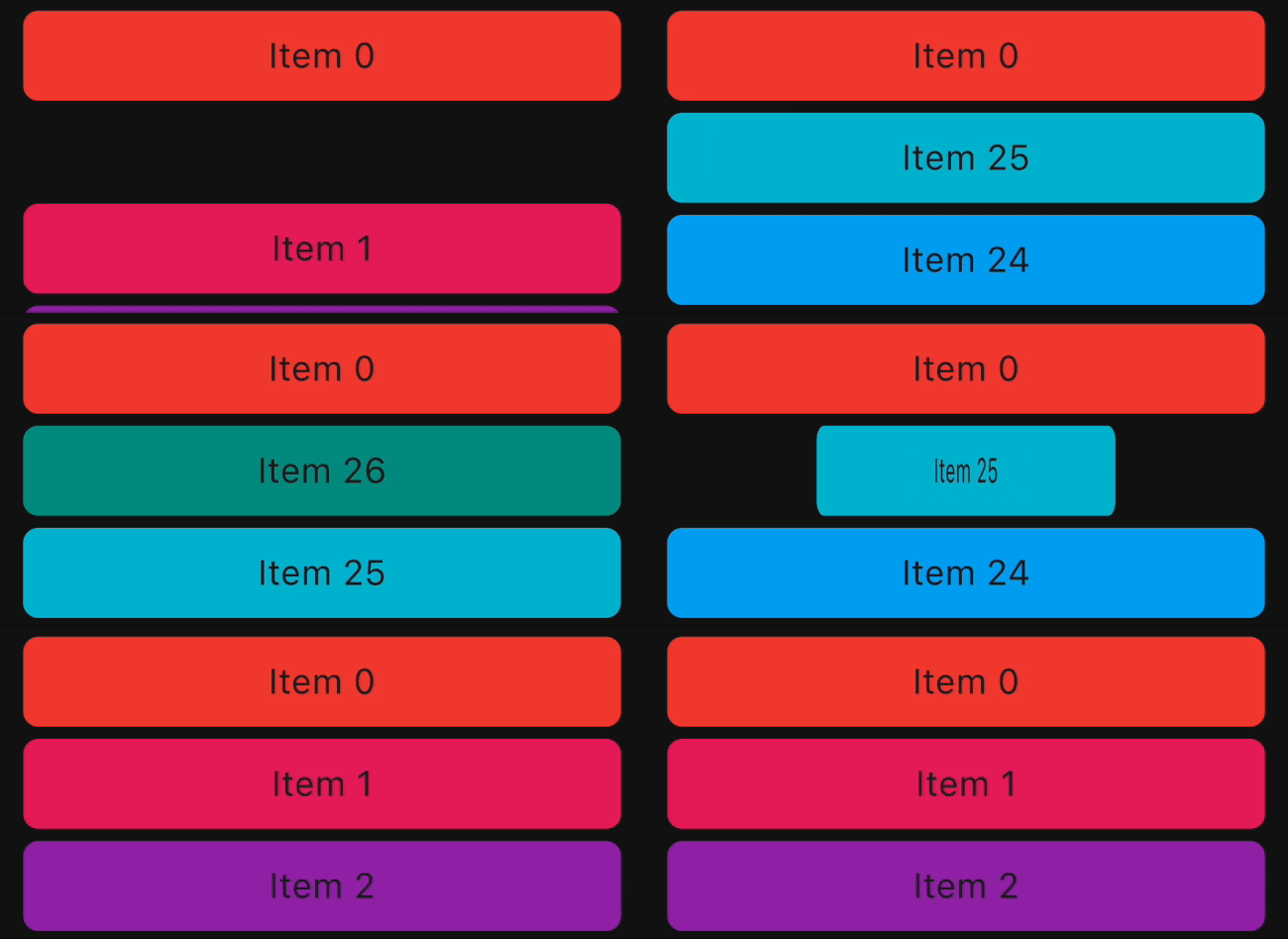
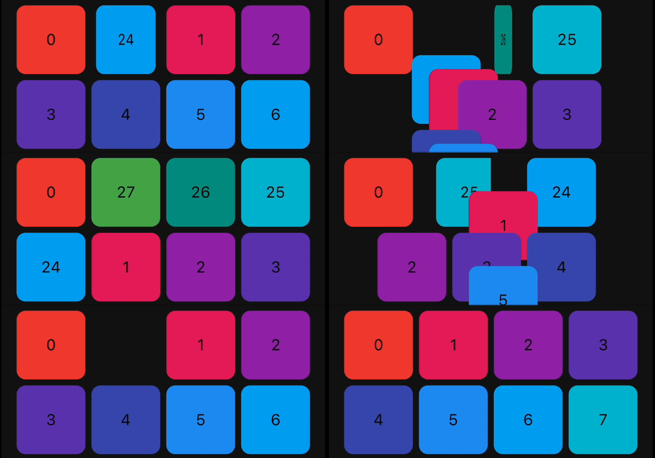
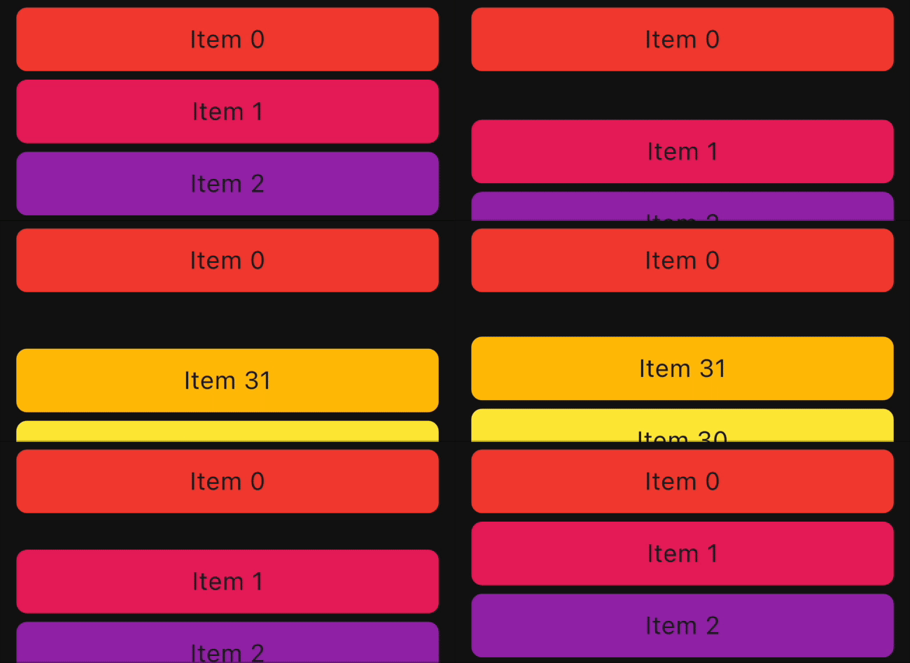
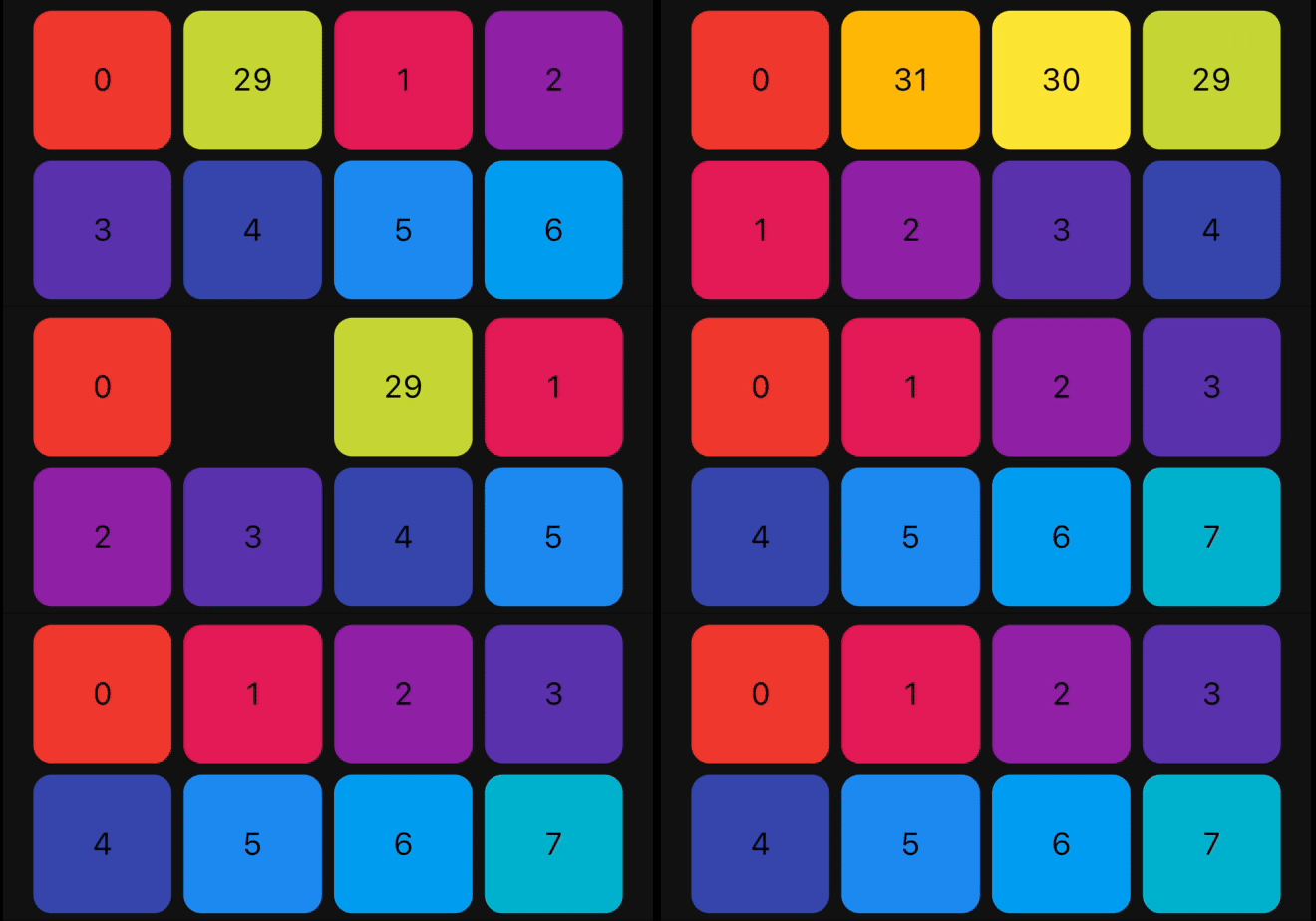
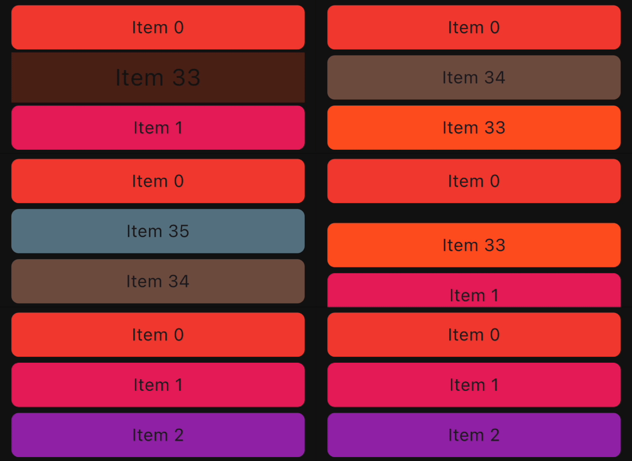
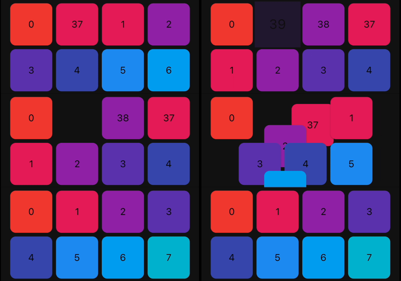
Animation Type ListView Example GridView Example
FadeIn
FlipInY
FlipInX
Landing
ScaleIn
ScaleInTop
ScaleInBottom
ScaleInLeft
ScaleInRight
Size
SlideInLeft
SlideInRight
SlideInDown
SlideInUp

Bugs and Feedback

We welcome and appreciate any suggestions you may have for improvement. For bugs, questions, and discussions please use the Github Issues.

Acknowledgments

This library builds upon the foundation laid by the incredible work of the Flutter team. The core logic for animated list and drag-and-drop functionality are derived from Flutter's native widgets, specifically AnimatedList and ReorderableListView.

Contribution

The Canopas team enthusiastically welcomes contributions and project participation! There are a bunch of things you can do if you want to contribute! The Contributor Guide has all the information you need for everything from reporting bugs to contributing entire new features. Please don't hesitate to jump in if you'd like to, or even ask us questions if something isn't clear.

Credits

animated_reorderable_list is owned and maintained by the Canopas team. You can follow them on Twitter at @canopassoftware for project updates and releases.

Inspired by recyclerview-animators in Android.

所屬分類

原始碼儲存庫

使用此套件的專案