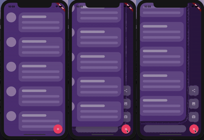
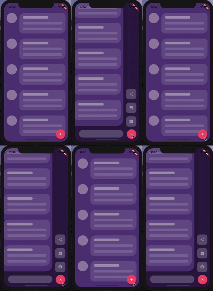
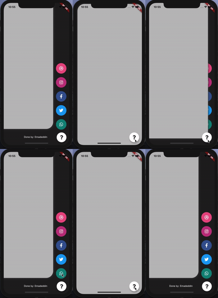
AnimatedStack 是一個 Flutter 套件,可實現自訂動畫堆疊頁面,非常適合設計具有平滑過渡效果的互動式側邊選單按鈕。它為建立動態導航介面提供了靈活的基礎,允許開發者疊加元件並動畫化其可見性與定位。該套件支援 Android、iOS、Web、macOS、Windows 與 Linux 等多個平台,適用於跨平台應用。透過直覺的設定選項,它以流暢的動畫與回應式設計提升使用者體驗。其輕量級特性確保在各裝置上皆有高效能表現。
適用情境
自訂側邊菜單實現
互動式導航介面
動畫頁面過渡
浮動操作按鈕增強功能
跨平台 UI 組件
主要特色
流暢的動畫堆疊
可自定義的頁面過渡
多平台支援
輕量且高效
與現有 UI 的輕鬆整合
靈活的控件層疊
適合對象
開發自定義導航抽屜的開發者
尋求動畫互動的UI設計師
跨平台應用程式創建者
需要動態佈局變更的應用程式
專注於打造精緻使用者體驗的團隊
使用建議
可能需要額外的樣式才能實現複雜佈局
性能取決於動畫的複雜程度
除了基本用法外,文件有限
未針對極大型堆疊進行優化
最適合中等動畫強度
原始 README
以下為關聯原始碼儲存庫的 README 原文快照,最新內容請造訪原始碼儲存庫。
Animated Stack
Custom animated stacked pages, to create customisable side menu buttons.
Providing simple menu for sharing buttons, side menu, message sending, about page, ... etc.
Getting Started
At first, you have to create Foreground and Background Widgets.
Here is a simple example to meet minimum requirements.
AnimatedStack(
backgroundColor: ...,     // Background Container color
foregroundWidget: ...,    // Foreground Container color

columnWidget: ...,        // Right Widget, (use Column for best results)
bottomWidget: ...,        // Bottom Widget, (use Row for best results)

scaleHeight: 100,         // Sliding animation height, default is 60
scaleWidth: 100,          // Sliding animation width, default is 60


buttonIcon: ...,          // FAB icon (IconData)
fabIconColor: ...,        // FAB icon color
animateButton: false,     // Sometimes, we don't want to animate the button!
fabBackgroundColor: ...,  // FAB background color

slideAnimationDuration: ..., // Animation Duration, default is 800 Milliseconds
buttonAnimationDuration: ...,// Animation Duration, default is 240 Milliseconds

openAnimationCurve: ...,    // Animation Curve, default is ElasticOutCurve(0.9)
closeAnimationCurve: ...,   // Animation Curve, default is ElasticInCurve(0.9)
enableClickToDismiss: true, // Enable Click on Main Widget to close
preventForegroundInteractions: true, // Prevent Clicks on Main Widget
onForegroundCallback: () => print('on Close Callback'), // On Close Callback
);