Animation List
A simple animation listview widget.
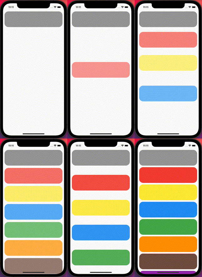
When it is built, list item is shown by sliding and bouncing.
⚙ Preview


⚡ Installation
Add animation_list: ^3.1.0 to your pubspec.yaml dependecies. And import it:
import 'package:animation_list/animation_list.dart';
ℹ️ How to use
Simply add a Animation List widget with required params.
final List<Map<String, dynamic>> data = [
    {
      'title': '1111',
      'backgroundColor': Colors.grey,
    },
    {
      'title': '2222',
      'backgroundColor': Colors.red,
    },
    {
      'title': '3333',
      'backgroundColor': Colors.yellow,
    },
    {
      'title': '4444',
      'backgroundColor': Colors.blue,
    },
    {
      'title': '5555',
      'backgroundColor': Colors.green,
    },
    {
      'title': '6666',
      'backgroundColor': Colors.orange,
    },
    {
      'title': '7777',
      'backgroundColor': Colors.brown,
    },
    {
      'title': '8888',
      'backgroundColor': Colors.purple,
    },
  ];

  Widget _buildTile(String title, Color backgroundColor) {
    return Container(
        height: 100,
        margin: EdgeInsets.symmetric(horizontal: 10, vertical: 5),
        decoration: BoxDecoration(
          borderRadius: BorderRadius.all(Radius.circular(25)),
          color: backgroundColor,
        ));
  }

  @override
  Widget build(BuildContext context) {
    return Scaffold(
      body: Center(
        child: AnimationList(
            animationDirection: AnimationDirection.horizontal,
            duration: 1000,
            reBounceDepth: 10.0,
            children: data.map((item) {
              return _buildTile(item['title'], item['backgroundColor']);
            }).toList()),
      ),
    );
  }
🔧 Properties
| Attribute |
Data type |
Description |
Default |
| key |
Key |
Controls how one widget replaces another widget in the tree |
- |
| controller |
ScrollController |
An object that can be used to control the position to which this scroll view is scrolled |
- |
| primary |
bool |
Whether this is the primary scroll view associated with the parent PrimaryScrollController |
- |
| physics |
ScrollPhysics |
How the scroll view should respond to user input |
- |
| shrinkWrap |
bool |
Whether the extent of the scroll view in the scrollDirection should be determined by the contents being viewed |
false |
| padding |
EdgeInsetsGeometry |
The amount of space by which to inset the children |
- |
| cacheExtent |
double |
The viewport has an area before and after the visible area to cache items that are about to become visible when the user scrolls |
- |
| children |
List |
The children are required to fill the ListView |
[] |
| semanticChildCount |
int |
The number of children that will contribute semantic information |
- |
| dragStartBehavior |
DragStartBehavior |
Determines the way that drag start behavior is handled |
DragStartBehavior.start |
| keyboardDismissBehavior |
Key |
ScrollViewKeyboardDismissBehavior the defines how this ScrollView will dismiss the keyboard automatically |
ScrollViewKeyboardDismissBehavior.manual |
| restorationId |
String |
Restoration ID to save and restore the scroll offset of the scrollable |
- |
| clipBehavior |
Clip |
The content will be clipped (or not) according to this option |
Clip.hardEdge |
| duration |
int |
The milliseconds the animation runs |
1300 |
| reBounceDepth |
double |
A value of bounce depth |
10.0 |
| opacityRange |
Tween |
A Tween value of opacity animation range |
Tween(begin: 0.3, end: 1.0) |
| animationDirection |
AnimationDirection |
A animation direction(vertical / horizontal / both) |
AnimationDirection.vertical |
🤗 Contributing
Contributions are welcome! Feel free to open an issue or submit a pull request if you have a way to improve this project.
Make sure your request is meaningful and you have tested the app locally before submitting a pull request.
🙋♂️ Support
💙 If you like this project, give it a ⭐ and share it with friends!