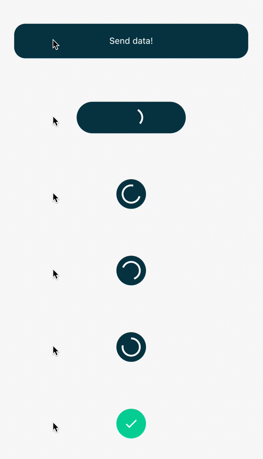
AnyAnimatedButton 是一個 Flutter 套件,提供可自定義的按鈕,支援在閒置、進度、成功與錯誤狀態之間的平滑動畫。它能視覺化顯示背景處理過程,提升使用者在表單提交或資料載入等動作中的回饋體驗。該按鈕支援多種自訂選項,包含顏色、圖示、標籤與動畫持續時間。設計為跨平台使用,可在 Android、iOS、Web、macOS、Windows 與 Linux 上順暢運作。非常適合需要即時反饋之應用程式來改善使用者體驗。
適用情境
表單提交並加載狀態
檔案上傳進度指示器
帶有成功/錯誤反饋的認證流程
帶有動畫過渡的入門流程
後台任務狀態可視化
主要特色
平滑的狀態轉換動畫
可自定義的成功與錯誤狀態
支援依狀態變更圖示與文字
跨平台相容性
可設定的動畫持續時間與緩動
可擴充的樣式選項
適合對象
尋求直覺式使用者介面回饋的開發者
頻繁執行非同步操作的應用程式
以使用者體驗為導向的行動與Web應用
快速原型化互動式按鈕
需要最少樣板程式碼的進度指示器專案
使用建議
需要理解 Flutter 的狀態管理
可能需要額外的邏輯來觸發狀態變更
多個實例的效能影響
限於預定義的動畫類型
不適合超出所提供狀態的複雜自定義動畫
原始 README
以下為關聯原始碼儲存庫的 README 原文快照,最新內容請造訪原始碼儲存庫。
any_animated_button
Very often after tapping a button we send some data or form to remote API and we need to signalize it to the user. This package makes it easy for us by creating expandable AnyAnimatedButton and AnyAnimatedButtonBloc.
Easy usage
AnyAnimatedButton depends on bloc pattern. To create custom button we need to create new bloc and
widget.
AnyAnimatedButtonBloc
We need to create class, which extends AnyAnimatedButtonBloc and override asyncAction.
AnyAnimatedButton is based on AnimatedContainer. To create our own button we need to create class, which extends CustomAnyAnimatedButton. CustomAnyAnimatedButton consists of 2 fields, which needs to be overridden:
bloc - AnyAnimatedButtonBloc? - bloc which should be connected with the button. If we won't pass it, the button won't animate
defaultParams - AnyAnimatedButtonParams - params object, which describes how button should look and behave
and 3 optional fields:
progressParams - AnyAnimatedButtonParams - params object for describing button in progress state
successParams - AnyAnimatedButtonParams - params object for describing button in success state
errorParams - AnyAnimatedButtonParams - params object for describing button in error state
AnyAnimatedButtonParams
The class that holds all the data about button look and behavior. All properties that we want to animate should be put directly inside all corresponding fields. Rest of them (like Text) should go to child field, which takes Widget.
The only required field is height, rest of them are optional.
We have got also 3 factory constructors, which describe default progress, error and success button state. We can reuse them with changed colors and size.
double.infinity - the button expands as much as he can
null - the button is as small as it can - it fits its content
fixed - we can set fixed width i.e. 200 and the button will always be this wide
Splash effect
There is one problem with InkWell splash effect. If we want the splash effect to work we need to put in child field firstly Material with transparent color → InkWell → rest of the child.
The package has built-in BlocListener, which makes it easier for you to listen to the state changes. AnyAnimatedButtonBlocListener<Input, Output, Failure> takes 3 generic types,Input is type of data that goes into the bloc, Output is type of data returned on success and Failure is the error which will be returned, when any error occurs in bloc.
updating text on button with width set to null does not work properly. The button width will adjust only to the first text width. The workaround is to set fixed width of the longer text instead of null.