搜尋套件、儲存庫與 APP 分類

套件詳情v1.0.2

bottom_personalized_dot_bar

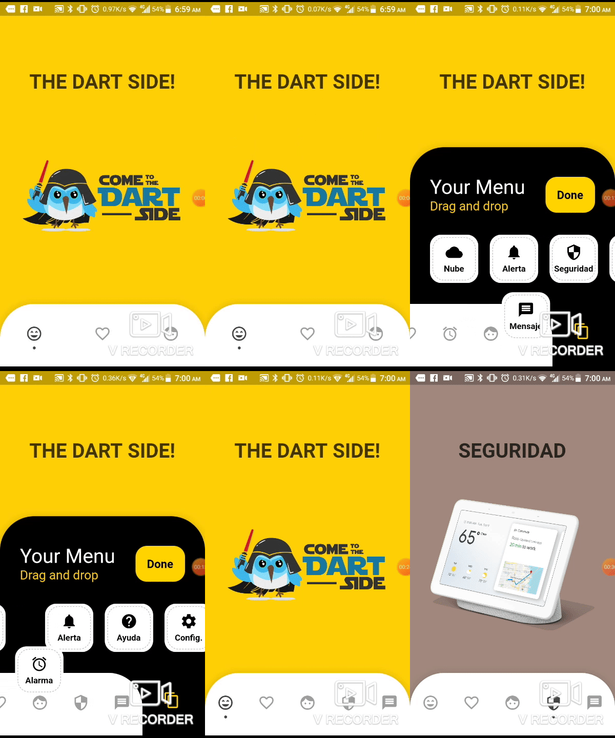
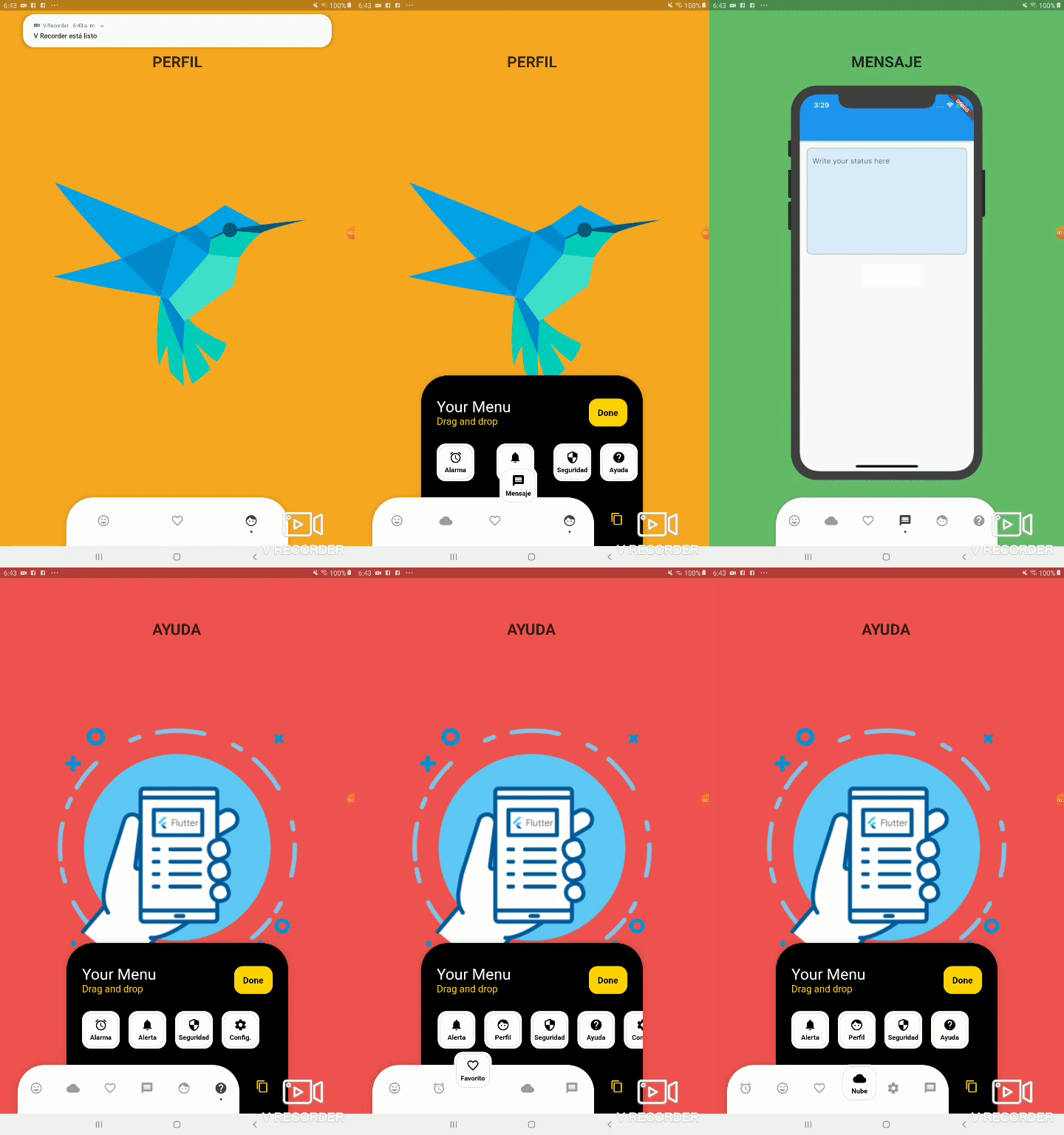
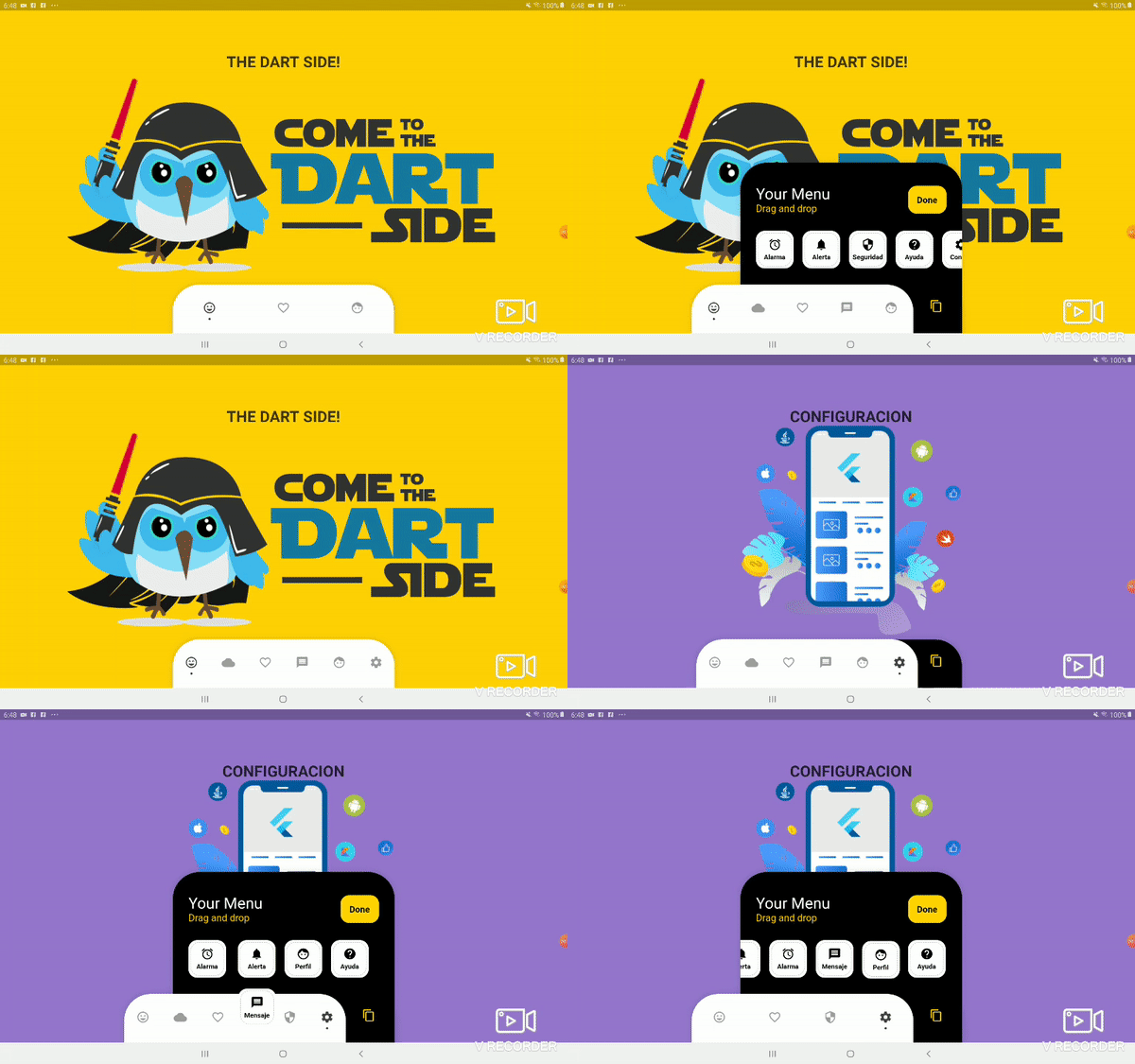
底部個人化點狀欄,拖曳並放置您的所有項目,以最佳方式自訂底部導覽。

近 30 天下載
51
喜歡數
98
Pub 分數
30

安裝套件

flutter pub add bottom_personalized_dot_bar

套件介紹

根據套件公開資料產生的選型評估,僅供參考。

一個可自訂的底部導航欄,在 Flutter 中允許使用者透過拖曳與放置項目來自訂其佈局。它提供動態且互動式的體驗,讓使用者完全掌控導航圖示的外觀與行為。適合需要彈性導航模式的應用程式,此套件透過直覺的自訂功能提升使用者參與度。該欄位支援順暢過渡與響應式設計,非常適合現代行動應用程式。

適用情境

  • 可自定義的應用導航
  • 使用者驅動的介面佈局
  • 互動式底部欄
  • 行動應用程式個性化
  • 動態UI重新排列

主要特色

  • 拖放項目重新排序
  • 完全可自定義的點狀指示器
  • 響應式設計支援
  • 與 Flutter 的輕鬆整合
  • 支援自訂樣式

適合對象

  • 尋求互動式導航的開發者
  • 以使用者為中心的設計應用程式
  • 可自訂的移動介面
  • 需要動態底部欄的Flutter專案
  • 注重設計的應用程式開發

使用建議

  • 有限的平台特定文件
  • 除了基本轉換外,沒有內建動畫
  • 需要手動處理狀態管理
  • 未針對大量項目進行優化
  • 可能需要為複雜主題添加額外的樣式

原始 README

以下為關聯原始碼儲存庫的 README 原文快照,最新內容請造訪原始碼儲存庫。

Bottom Personalized Dot Bar

A bottom navigation bar that you can customize with the options you need, without any limits. You can also customize the appearance of the navigation bar.

The development was inspired by the following design: personalized-tab-bar

You can see the source code of this lib inside the /lib folder.

Show some ❤️ and star the repo to support this project

Demo example (Mobile)

Demo example (Tablet 1)

Demo example (Tablet 2)

Package overview

  • [x] Drag and Drop your options!
  • [x] Change icon colors
  • [x] Listen to events 'Sort, Insert and Delete'
  • [x] Dynamically change the selected option
  • [x] Custom options
  • [x] Unlimit options
  • [x] Option to define custom item background color
  • [x] And more ...

Getting Started

Add the plugin:
dependencies:
  ...
  bottom_personalized_dot_bar: ^1.0.2
Import the package
import 'package:bottom_personalized_dot_bar/bottom_personalized_dot_bar.dart';
How to use?

Important! dont use 'bottomNavigationBar' of Scaffold, because it occupies the entire screen, you need to add it inside a Stack.

To add the Options list, you must create BottomPersonalizedDotBarItem, and each must have the unique attribute 'keyItem'.

To modify the selected option, you must update the attribute keyItemSelected of the BottomPersonalizedDotBar

String _itemSelected = 'item-1';
...
..
.
Scaffold(
  body: Stack(
    children: <Widget>[
      .... // Your App Home
      BottomPersonalizedDotBar(
          keyItemSelected: _itemSelected,
          doneText: 'Done',
          settingTitleText: 'Your Menu',
          settingSubTitleText: 'Drag and drop options',
          iconSettingColor: const Color(0xFFFFD201),
          buttonDoneColor: const Color(0xFFFFD500),
          settingSubTitleColor: const Color(0xFFFECE02),
          hiddenItems: <BottomPersonalizedDotBarItem>[
              BottomPersonalizedDotBarItem('item-4', icon: Icons.cloud, name: 'Nube', onTap: (itemSelected) { /* event selected */ }),
              BottomPersonalizedDotBarItem('item-5', icon: Icons.access_alarm, name: 'Alarma', onTap: (itemSelected) { /* event selected */ }),
              BottomPersonalizedDotBarItem('item-6', icon: Icons.message, name: 'Mensaje', onTap: (itemSelected) { /* event selected */ }),
              BottomPersonalizedDotBarItem('item-7', icon: Icons.notifications, name: 'Alerta', onTap: (itemSelected) { /* event selected */ }),
              BottomPersonalizedDotBarItem('item-8', icon: Icons.security, name: 'Seguridad', onTap: (itemSelected) { /* event selected */ }),
              BottomPersonalizedDotBarItem('item-9', icon: Icons.help, name: 'Ayuda', onTap: (itemSelected) { /* event selected */ }),
              BottomPersonalizedDotBarItem('item-10', icon: Icons.settings, name: 'Config.', onTap: (itemSelected) { /* event selected */ }),
          ],
          items: <BottomPersonalizedDotBarItem>[
              BottomPersonalizedDotBarItem('item-1', icon: Icons.sentiment_very_satisfied, name: 'Flutter', onTap: (itemSelected) { /* event selected */ }),
              BottomPersonalizedDotBarItem('item-2', icon: Icons.favorite_border, name: 'Favorito', onTap: (itemSelected) { /* event selected */ }),
              BottomPersonalizedDotBarItem('item-3', icon: Icons.face, name: 'Perfil', onTap: (itemSelected) { /* event selected */ }),
          ],
      ),
    ],
  ),
);

Customization

BottomPersonalizedDotBar
Attribute Description
items List of items to be displayed in the navigation bar
hiddenItems List of items that will be hidden
keyItemSelected Item key that is selected
width Navigation bar width
height Navigation bar height
borderRadius Navigation bar radius
selectedColorIcon Selected Icon color
unSelectedColorIcon Unselected Icon color
navigatorBackground Navigator Container Background color
settingBackground Setting Container Background color (Hidden items)
iconSetting Settings button icon
iconSettingColor Settings button icon color
settingTitleText Setting Title Text
settingTitleColor Setting Title color
settingSubTitleText Setting Sub-Title Text
settingSubTitleColor Setting Sub-Title color
doneText Done button Text
textDoneColor Text Done Color
buttonDoneColor Button done color
hiddenItemBackground Background of hidden item
iconHiddenColor Icon Hidden Color
textHiddenColor Text Hidden Color
dotColor Selection Indicator Color (Dot
boxShadow Shadow of container
onOrderHideItems Event when you sort the hidden options, this has as parameter the list of hidden options with the new order. onOrderHideItems: (List<BottomPersonalizedDotBarItem> hiddenItems) { /* Your action */ }
onOrderItems Event when ordering browser options, this has as parameter the list of options with the new order onOrderItems: (List<BottomPersonalizedDotBarItem> items) { /* Your action */ }
onAddItem Event when you add a new option to the navigation bar, this has as parameters the item you add and the list of options. onAddItem: (BottomPersonalizedDotBarItem itemAdd, List<BottomPersonalizedDotBarItem> items) { /* Your action */ }
onRemoveItem Event when you delete an option from the navigation bar, this has as parameters the element to delete and the list of hidden options. onRemoveItem: (BottomPersonalizedDotBarItem itemRemove, List<BottomPersonalizedDotBarItem> hiddenItems) { /* Your action */ }
BottomPersonalizedDotBarItem
Attribute Description
keyItem Unique key
icon Item icon
name Item name
onTap Event with you press the item. onTap: (String keyItem) { /* Your action */ }

所屬分類

依賴

依賴清單 1 項

原始碼儲存庫

使用此套件的專案

暫無相關資料。