📅 Calendar_Day_Slot_Navigator
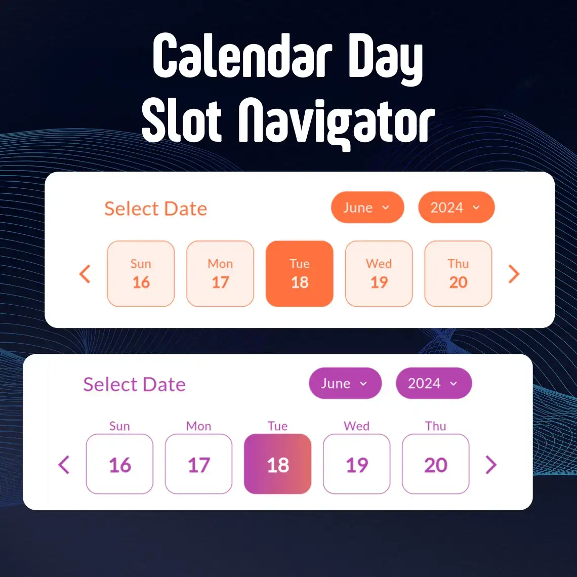
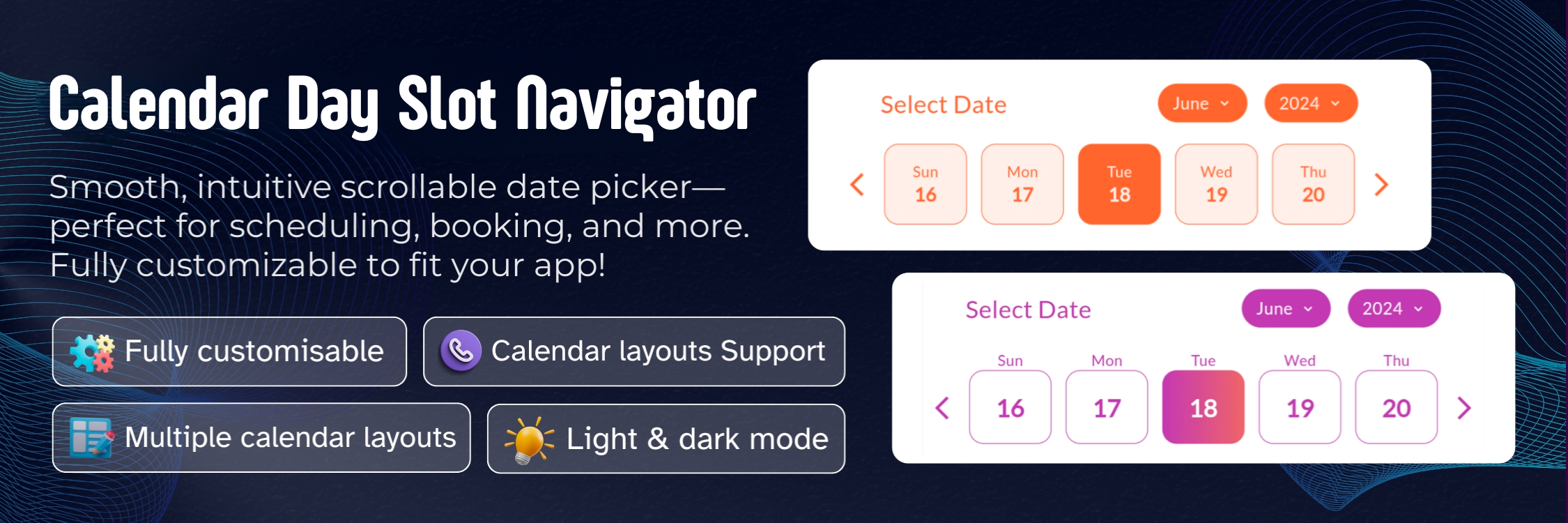
A powerful and highly customizable Flutter calendar widget that makes date selection beautiful and intuitive. Whether you're building a booking app, scheduling system, or any application that needs elegant date picking, CalendarSlot provides the flexibility and features you need.
✨ Features
🚀 Getting Started
Installation
Add calendar_day_slot_navigator to your project by including it in your pubspec.yaml:
dependencies:
  calendar_day_slot_navigator: ^0.0.1
Run pub get to install the package:
flutter pub get
Import
Import the package in your Dart file:
import 'package:calendar_day_slot_navigator/calendar_day_slot_navigator.dart' ;
💻 Usage Examples
Basic Implementation
Here's a simple example to get you started:
CalendarDaySlotNavigator (
slotLength: 5 ,
initialSelectedDate: DateTime .now (),
dayDisplayMode: DayDisplayMode .outsideDateBox,
headerText: "Select Date" ,
onDateSelect: (selectedDate) {
print ("Selected date: $selectedDate " );
},
)
Custom Styling
Add beautiful gradients and custom styling:
CalendarDaySlotNavigator (
slotLength: 7 ,
dayBoxHeightAspectRatio: 8 ,
initialSelectedDate: DateTime .now (),
dayDisplayMode: DayDisplayMode .insideDateBox,
isGradientColor: true ,
activeGradientColor: LinearGradient (
colors: [
Color (0xffb644ae ),
Color (0xff873999 ),
],
begin: Alignment .topLeft,
end: Alignment .bottomRight,
),
monthYearTabBorderRadius: 15 ,
dayBoxBorderRadius: 10 ,
headerText: "Select Your Preferred Date" ,
fontFamilyName: "Roboto" ,
isGoogleFont: true ,
dayBorderWidth: 0.5 ,
onDateSelect: (selectedDate) {
print ("Selected date: $selectedDate " );
},
)
Date Range Selection
Implement date range selection with specific active dates:
CalendarDaySlotNavigator (
dateSelectionType: DateSelectionType .activeRangeDates,
rangeDates: [
DateTime (2024 , 6 , 1 ),
DateTime (2024 , 6 , 2 ),
DateTime (2024 , 6 , 3 ),
DateTime (2024 , 6 , 4 ),
DateTime (2024 , 6 , 5 ),
],
onDateSelect: (selectedDate) {
print ("Selected date within range: $selectedDate " );
},
)
🛠️ Properties Guide
Essential Properties
Property
Type
Default
Description
slotLength
int?7
📏 Determines how many days are displayed in each row. Useful for different screen sizes and layouts.
dayBoxHeightAspectRatio
double?6.0
📐 Controls the height of day boxes relative to their width. Higher values make boxes shorter.
dayDisplayMode
DayDisplayModeoutsideDateBox
🎯 Determines where day names appear relative to date boxes. Choose between outsideDateBox or insideDateBox.
Styling Properties
Property
Type
Default
Description
activeColor
Color?Theme primary
🎨 Background color for selected dates
deActiveColor
Color?White
⚪️ Background color for unselected dates
isGradientColor
bool?false
🌈 Enable gradient backgrounds for dates
activeGradientColor
LinearGradient?null
🎨 Custom gradient for selected dates
deActiveGradientColor
LinearGradient?null
⚪️ Custom gradient for unselected dates
monthYearTabBorderRadius
double?10.0
📏 Border radius for month/year selection tabs
dayBoxBorderRadius
double?8.0
📏 Border radius for individual day boxes
dayBorderWidth
double?1.0
✏️ Width of borders around day boxes
Font Properties
Property
Type
Default
Description
fontFamilyName
String?System
🔤 Name of the font family to use
isGoogleFont
bool?false
📱 Set to true when using Google Fonts
Selection Properties
Property
Type
Description
dateSelectionType
DateSelectionType🎯 Controls which dates can be selected
rangeDates
List<DateTime>?📅 List of dates for range-based selection types
onDateSelect
Function(DateTime)?🖱️ Callback function when a date is selected
initialSelectedDate
DateTime📍 Sets the default selected date when calendar first loads
Date Selection Types Explained
activeAllDates
All dates in the calendar are selectable
Useful for unrestricted date picking
activePastDates
Only dates before today are selectable
Perfect for selecting historical dates
activeFutureDates
Only dates after today are selectable
Ideal for booking systems and scheduling
activeTodayAndPastDates
Today and all past dates are selectable
Good for recording past events including today
activeTodayAndFutureDates
Today and all future dates are selectable
Great for appointment scheduling
activeRangeDates
Only specified dates in rangeDates are selectable
Useful for custom date ranges
deActiveRangeDates
Specified dates in rangeDates are not selectable
Perfect for blocking out unavailable dates
📱 Display Modes
Outside Date Box Mode
dayDisplayMode: DayDisplayMode .outsideDateBox
Day names appear above the date boxes
Provides a clean, separated look
More space for date numbers
Inside Date Box Mode
dayDisplayMode: DayDisplayMode .insideDateBox
Day names appear inside the date boxes
More compact layout
Ideal for space-conscious designs
🎨 Styling Tips
Color Combinations
activeColor: Color (0xffb644ae ),
deActiveColor: Color (0xffF5F5F5 ),
Gradient Effects
isGradientColor: true ,
activeGradientColor: LinearGradient (
colors: [Color (0xffb644ae ), Color (0xff873999 )],
begin: Alignment .topLeft,
end: Alignment .bottomRight,
),
Border Styling
dayBoxBorderRadius: 12 ,
dayBorderWidth: 0.5 ,
💡 Best Practices
Responsive Design
Adjust slotLength based on screen width
Use appropriate dayBoxHeightAspectRatio for different screen sizes
Selection Types
Choose appropriate dateSelectionType for your use case
Always handle onDateSelect callback for user interactions
Accessibility
Use sufficient color contrast
Provide clear header text
Consider font size and readability
🤝 Contributing
Made with ❤️ by the DevCodeSpace