搜尋套件、儲存庫與 APP 分類

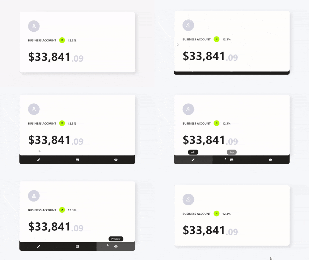
card_actions 封面
套件詳情v0.0.1

card_actions

使用我們的 Flutter 套件,為您的卡片增添自訂動作與增強功能。

AndroidiOSWebmacOSWindowsLinux
近 30 天下載
402
喜歡數
73
Pub 分數
150

安裝套件

flutter pub add card_actions

套件介紹

根據套件公開資料產生的選型評估,僅供參考。

Card Actions 是一個 Flutter 套件,可為卡片組件增強可自訂的操作與互動功能。它讓開發者能夠在卡片上加入滑動手势、點擊互動以及動態內容變更,進而提升使用者參與度。此套件專為清單、儀表板或基於卡片的 UI 所設計,支援 Android、iOS、Web、macOS、Windows 與 Linux 等多個平台。透過簡單的 pub add 命令,即可無縫整合至現有的 Flutter 項目中。其輕量級設計著重於效能與易用性,非常適合現代且具響應式的卡片介面。

適用情境

  • 互動式卡片滑動
  • 動態卡內容更新
  • 手勢驅動的卡片互動
  • 基於卡片的儀表板
  • 透過卡片操作取得使用者回饋
  • 跨平台卡片增強功能

主要特色

  • 滑動操作支援
  • 可自訂的點擊和手勢回應
  • 輕量且高效能
  • 多平台相容性
  • 與 Flutter 的輕鬆整合
  • 可擴充的操作處理程式

適合對象

  • 開發卡片密集型 UI 的開發者
  • 需要互動式卡片元件的應用程式
  • 跨平台移動與網頁應用
  • 使用可重複使用的卡片組件設計系統
  • 原型設計互動式版面

使用建議

  • 需要理解 Flutter 手勢系統
  • 可能需要額外的樣式來處理複雜互動
  • 最適合簡單到中等複雜度的卡片行為
  • 不適用於全螢幕導航
  • 僅限卡片級別互動

原始 README

以下為關聯原始碼儲存庫的 README 原文快照,最新內容請造訪原始碼儲存庫。

Features

  • ✨ Simple Use
  • ⚙️ Great Customization
  • 🌍 Expand the functionality of your cards
  • 🛑 Not use for mobile devices, will soon be available for use on those platforms.

Getting Started

To use this card actions package, you need to add the dependencies in pubspec.yaml file.

dependencies:
    card_actions: ^0.0.1

Use

To use card actions is very simple, just wrap your card with our CardActions widget,

CardActions(
    ...
    child: YourCard() // here would be your card
)
Basic Setup

CardActions needs the parameters width, height and actions

  • width is the width of the widget
  • height is the height of the widget
  • actions is a list of CardActionButton.
CardActions(
    width: //your card width
    height: // your card height
    actions: <CardActionButton>[
        CardActionButton(
            icon: Icon(
                Icons.edit,
                color: Colors.white,
            ), // Icon
            label: 'edit',
            onPress: () {},
        ), // CardActionButton
    ]
    child: yourCard(), // here would be your card 
)

You can add more buttons if you prefer

...
actions: [
    CardActionButton(
        icon: Icon(
            Icons.edit,
            color: Colors.white,
        ),
        label: 'edit',
        onPress: () {},
    ),
    CardActionButton(
        icon: Icon(
            Icons.payment_rounded,
            color: Colors.white,
        ),
        label: 'Pay',
        onPress: () {},
    ),
    CardActionButton(
        icon: Icon(
            Icons.remove_red_eye_sharp,
            color: Colors.white,
        ),
        label: 'Preview',
        onPress: () {},
    ),
]

Axis Direction

If you want to change the direction of the hover, you can use the axisDirection property of the CardAction to change it.

the axisDirection property receives a enum of type CardActionAxis at the moment we only have bottom and right.

CardActionAxis.bottom CardActionAxis.right

Example

To make this example, we will need to configure more things, but it will be very simple, the first thing is that we change the background color for it we have to use the property backgroundColor then an important part is that we change the design of the cursor when it is on top of the buttons and this we can do it in two ways:

  • In the CardAction we have the buttonsCursor property that serves to change the cursor to ALL the buttons.

  • In the CardActionButton we have the cursor property to change the cursor to that specific button.

Important. If you use both options at the same time the button will prioritize its own cursor setting over the global setting with buttonsCursor.

and finally we add the necessary functions to the buttons by means of its onPress method.

...
actions: [
    CardActionButton(
        icon: Icon(
            Icons.add,
            color: Colors.white,
            size: 30,
        ),
        label: 'Increment',
        onPress: increment // method to increase the counter,
    ),
    CardActionButton(
        icon: Icon(
            Icons.restore_sharp,
            color: Colors.white,
            size: 30,
        ),
        label: 'Reset',
        onPress: () {
            // reset the counter
            setState(() {
            counter = 0;
            });
        },
    ),
    CardActionButton(
        icon: Icon(
            Icons.remove,
            color: Colors.white,
            size: 30,
        ),
        label: 'Decrement',
        onPress: decrement // method for decrementing the counter
    ),
]

RoadMap

  • Add options to handle card animation.
  • Make it usable on mobile devices, but instead of hover, click on the card, or hold down.
  • Add more axes and even be able to use several at the same time.

Parameters

CardActions
Property Type Default Description
width double required widget width
height double required widget height
cardCursor MouseCursor SystemMouseCursors.basic the type of cursor displayed when hovering on the card
buttonsCursor MouseCursor SystemMouseCursors.basic the type of cursor displayed when hovering over buttons
borderRadius double 0 rounded card edges
showToolTip bool true Show/Hide toolTips
axisDirection CardActionAxis CardActionAxis.bottom CardActions Axis Direction
splashColor Color Colors.white24 Splash color when hovering
backgroundColor Color Color(0xff242120) Background color
closeCardWhenExecuteFunction bool false close the card when you press a button
CardActionButton
Property Type Default Description
icon Icon required Button icon
label String required text to be displayed in the Tool Tip
onPress VoidCallback required callback to be executed when you press the button
closeCardWhenPress bool false when you press the button, the card closes.
cursor MouseCursor? null Cursor displayed when hovering on the button

所屬分類

依賴

依賴清單 1 項

原始碼儲存庫

使用此套件的專案

暫無相關資料。