搜尋套件、儲存庫與 APP 分類

card_stack_widget 封面
套件詳情v0.1.6

card_stack_widget

一個垂直的可滑動關閉且可自訂的卡片堆疊,適用於 Flutter 應用程式

AndroidiOSWebmacOSWindowsLinux
近 30 天下載
286
喜歡數
88
Pub 分數
160

安裝套件

flutter pub add card_stack_widget

套件介紹

根據套件公開資料產生的選型評估,僅供參考。

一個 Flutter 套件,提供垂直堆疊的可滑動卡片,允許使用者上下滑動來瀏覽內容。每張卡片可以自訂獨特的版面、動畫與行為。非常適合用於互動式介面,例如測驗、產品展示或任務清單。此組件支援多個平台,包括 Android、iOS、Web、macOS、Windows 與 Linux,確保在各類裝置上表現一致。

適用情境

  • 基於卡片的互動式導航
  • 產品或商品發現介面
  • 測驗或調查應用
  • 透過滑動動作進行任務管理
  • 內容瀏覽,流暢過渡

主要特色

  • 垂直卡片堆疊
  • 滑動關閉手勢
  • 可自訂的卡片外觀
  • 跨平台相容性
  • 內建動畫支援
  • 可擴充的事件處理

適合對象

  • 開發基於卡片式介面的開發者
  • 需要滑動互動的應用
  • 跨平台 Flutter 專案
  • 互動式引導流程
  • 動態內容呈現

使用建議

  • 需要仔細處理手勢衝突
  • 大量卡片數量時可能影響效能
  • 自訂需要熟悉 Flutter 佈局
  • 有限的內建主題
  • 未針對水平堆疊進行優化
  • 依賴外部相依性以實現進階功能

原始 README

以下為關聯原始碼儲存庫的 README 原文快照,最新內容請造訪原始碼儲存庫。

📦 card_stack_widget

A vertical dismissible and customizable stack of cards for a Flutter application.

Usage

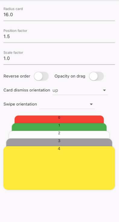
CardStackWidget requires a list of CardModel, in order to create a stack of cards. You can customize their swipe or dismiss orientation, change the scale or the position factor. You can also apply an opacity, that change on drag movement.

Below, you can find an example of the usage of CardStackWidget and CardModel:

CardStackWidget _buildCardStackWidget(BuildContext context) {
  final mockList = _buildMockList(context, size: 4);

  return CardStackWidget(
    opacityChangeOnDrag: true,
    swipeOrientation: CardOrientation.both,
    cardDismissOrientation: CardOrientation.both,
    positionFactor: 3,
    scaleFactor: 1.5,
    alignment: Alignment.center,
    reverseOrder: true,
    animateCardScale: true,
    dismissedCardDuration: const Duration(milliseconds: 150),
    cardList: mockList,
  );
}

/// Create a mock list of `CardModel` to use inside `CardStackWidget`
_buildMockList(BuildContext context, {int size = 0}) {
  final double containerWidth = MediaQuery
      .of(context)
      .size
      .width - 16;

  var list = <CardModel>[];
  for (int i = 0; i < size; i++) {
    var color = Color((Random().nextDouble() * 0xFFFFFF).toInt() << 0)
        .withOpacity(1.0);

    list.add(
      CardModel(
        backgroundColor: color,
        radius: 8,
        shadowColor: Colors.black.withOpacity(0.2),
        child: SizedBox(
          height: 310,
          width: containerWidth,
          child: Container(), // Whatever you want
        ),
      ),
    );
  }

  return list;
}

Preview

GIF example card widget 1 GIF example card widget 2

🚀 Supported properties

CardStackWidget:

  • cardList: List
  • scaleFactor: double
  • positionFactor: double
  • alignment: Alignment?
  • reverseOrder: bool
  • cardDismissOrientation: CardOrientation
  • swipeOrientation: CardOrientation
  • onCardTap: Function(CardModel)?
  • animateCardScale: Duration
  • dismissedCardDuration: bool
  • opacityChangeOnDrag: bool

CardModel:

  • key: Key?
  • shadowColor: Color
  • backgroundColor: Color
  • radius: Radius
  • border: BoxBorder?
  • child: Widget?
  • padding: EdgeInsets?
  • margin: EdgeInsets?
  • gradient: Gradient?
  • imageDecoration: DecorationImage?

所屬分類

原始碼儲存庫

使用此套件的專案

暫無相關資料。