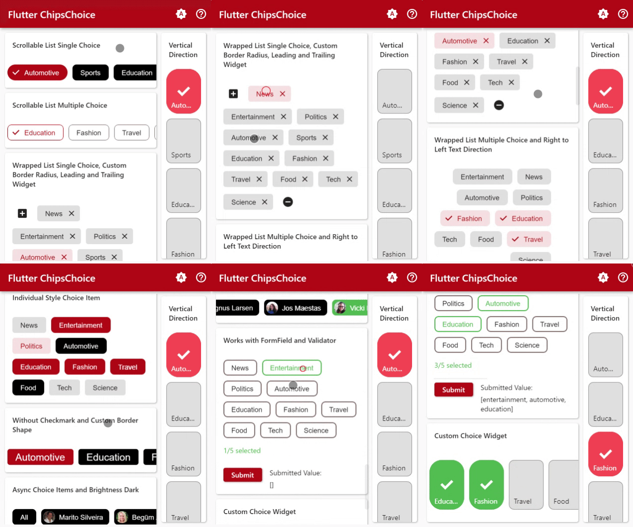
I'm sorry to announce that I'm no longer maintaining the chips_choice package. It's been a great project, but it's become too difficult to maintain.
In its place, I've released a new package called choice. The combination to smart_select and chips_choice with cleaner, more flexible, and composable API for creating inline or prompted choice widgets with single or multiple selection.
I hope you'll check out choice. I think you'll find it to be a great replacement for chips_choice.
Thanks for your understanding.
Lite version of smart_select package, zero dependencies, an easy way to provide a single or multiple choice chips.
To read more about classes and other references used by chips_choice, see the API Reference.
Single Choice
// available configuration for single choiceChipsChoice<T>.single({
// The current value of the single choice widget.@required T value,
// Called when single choice value changed@requiredC2Changed<T> onChanged,
// choice item list@requiredList<C2Choice<T>> choiceItems,
// Async loader of choice itemsC2ChoiceLoader<T> choiceLoader,
// other available configuration// explained below
...,
...,
})
// available configuration for multiple choiceChipsChoice<T>.multiple({
// The current value of the multiple choice widget.@requiredList<T> value,
// Called when multiple choice value changed@requiredC2Changed<List<T>> onChanged,
// choice item list@requiredList<C2Choice<T>> choiceItems,
// Async loader of choice itemsC2ChoiceLoader<T> choiceLoader,
// other available configuration// explained below
...,
...,
})
See the API References, to find out all of the parameters.
// available configuration for single and multiple choiceChipsChoice<T>.[single|multiple]({
// other available configuration// explained below
...,
...,
// Choice item styleC2ChipStyle choiceStyle,
// other available configuration// explained below
...,
...,
})
Custom Builder
// available configuration for single and multiple choiceChipsChoice<T>.[single|multiple]({
// other available configuration// explained below
...,
...,
// Builder for custom choice item labelC2Builder<T> choiceLabelBuilder,
// Builder for custom widget to display prior to the chip's [label].C2Builder<T>? choiceLeadingBuilder;
// Builder for custom widget to display next to the chip's [label].C2Builder<T>? choiceTrailingBuilder;
// Builder for custom choice itemC2Builder<T> choiceBuilder,
// Builder for spinner widgetWidgetBuilder spinnerBuilder,
// Builder for placeholder widgetWidgetBuilder placeholderBuilder,
// Builder for error widgetWidgetBuilder errorBuilder,
// other available configuration// explained below
...,
...,
})
Container Configuration
// available configuration for single and multiple choiceChipsChoice<T>.[single|multiple]({
// other available configuration// explained below
...,
...,
// Whether the chips is wrapped or scrollablebool wrapped,
// Container paddingEdgeInsetsGeometry padding,
// The direction to use as the main axis.Axis direction,
// Determines the order to lay children out vertically and how to interpret start and end in the vertical direction.VerticalDirection verticalDirection,
// Determines the order to lay children out horizontally and how to interpret start and end in the horizontal direction.TextDirection textDirection,
// if [wrapped] is [false], How the scroll view should respond to user input.ScrollPhysics scrollPhysics,
// if [wrapped] is [false], How much space should be occupied in the main axis.MainAxisSize mainAxisSize,
// if [wrapped] is [false], How the children should be placed along the main axis.MainAxisAlignment mainAxisAlignment,
// if [wrapped] is [false], How the children should be placed along the cross axis.CrossAxisAlignment crossAxisAlignment,
// if [wrapped] is [true], how the children within a run should be aligned relative to each other in the cross axis.WrapCrossAlignment wrapCrossAlignment,
// if [wrapped] is [true], determines how wrap will align the objectsWrapAlignment alignment,
// if [wrapped] is [true], how the runs themselves should be placed in the cross axis.WrapAlignment runAlignment,
// if [wrapped] is [true], how much space to place between children in a run in the main axis.double spacing,
// if [wrapped] is [true], how much space to place between the runs themselves in the cross axis.double runSpacing,
// Clip behaviorClip clipBehavior,
// String to display when choice items is emptyString placeholder,
// placeholder text styleTextStyle placeholderStyle,
// placeholder text alignTextAlign placeholderAlign,
// error text styleTextStyle errorStyle,
// error text alignTextAlign errorAlign,
// spinner sizedouble spinnerSize,
// spinner colorColor spinnerColor,
// spinner thicknessdouble spinnerThickness,
// other available configuration// explained below
...,
...,
})
Build Choice List
choiceItems property is List<C2Choice<T>>, it can be input directly as in the example below, more info about C2Choice can be found on the API Reference