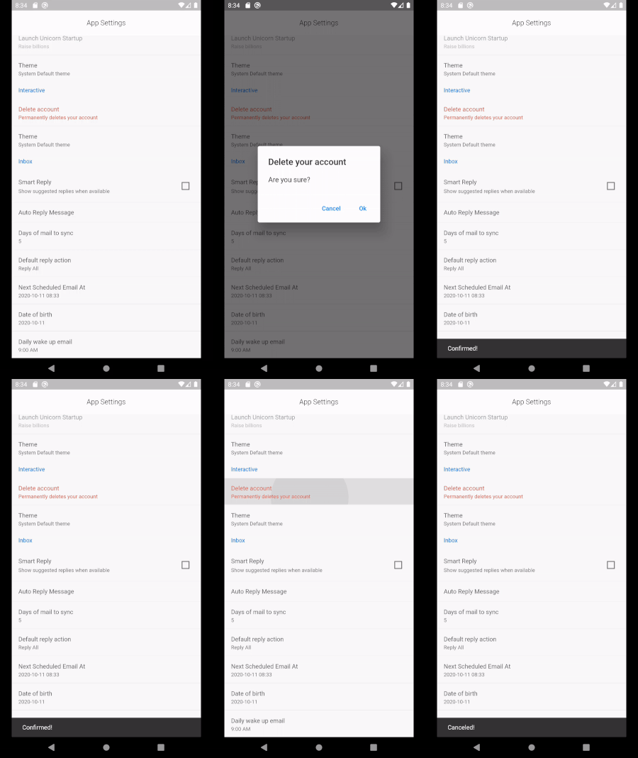
clean_settings
Settings UI generator with sane defaults.
Creating a settings screen requires the same boiler plate code over and over. Settings also need a rich set of widgets to cover all possible cases. This library aims to provide sane defaults while creating a setting screen.
Features
Setting Sections
Out-of-the-box widgets for multiple types
Read-only items
Widgets supported
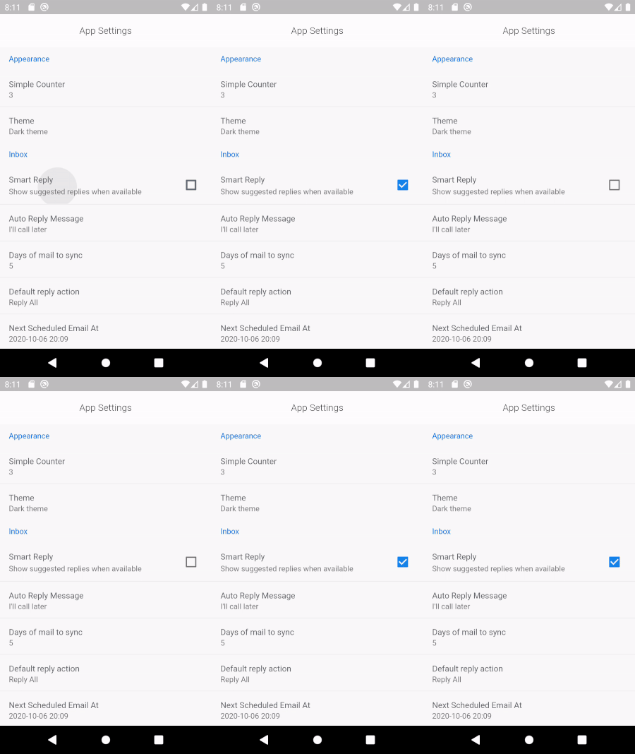
SettingCheckboxItem (
title: 'Smart Reply' ,
value: smartReply,
onChanged: (v) => setState (() => smartReply = v),
description: 'Show suggested replies when available' ),
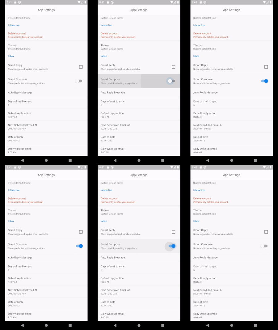
SettingSwitchItem (
title: 'Smart Compose' ,
value: smartCompose,
onChanged: (v) => setState (() => smartCompose = v),
description: 'Show predictive writing suggestions' ,
priority: ItemPriority .high,
),
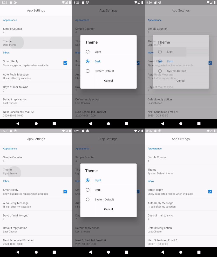
SettingRadioItem <String >(
title: 'Theme' ,
displayValue: '$theme theme' ,
selectedValue: theme,
items: [
SettingRadioValue ('Light' , 'Light' ),
SettingRadioValue ('Dark' , 'Dark' ),
SettingRadioValue ('System Default' , 'System Default' ),
],
onChanged: (v) => setState (() => theme = v),
),
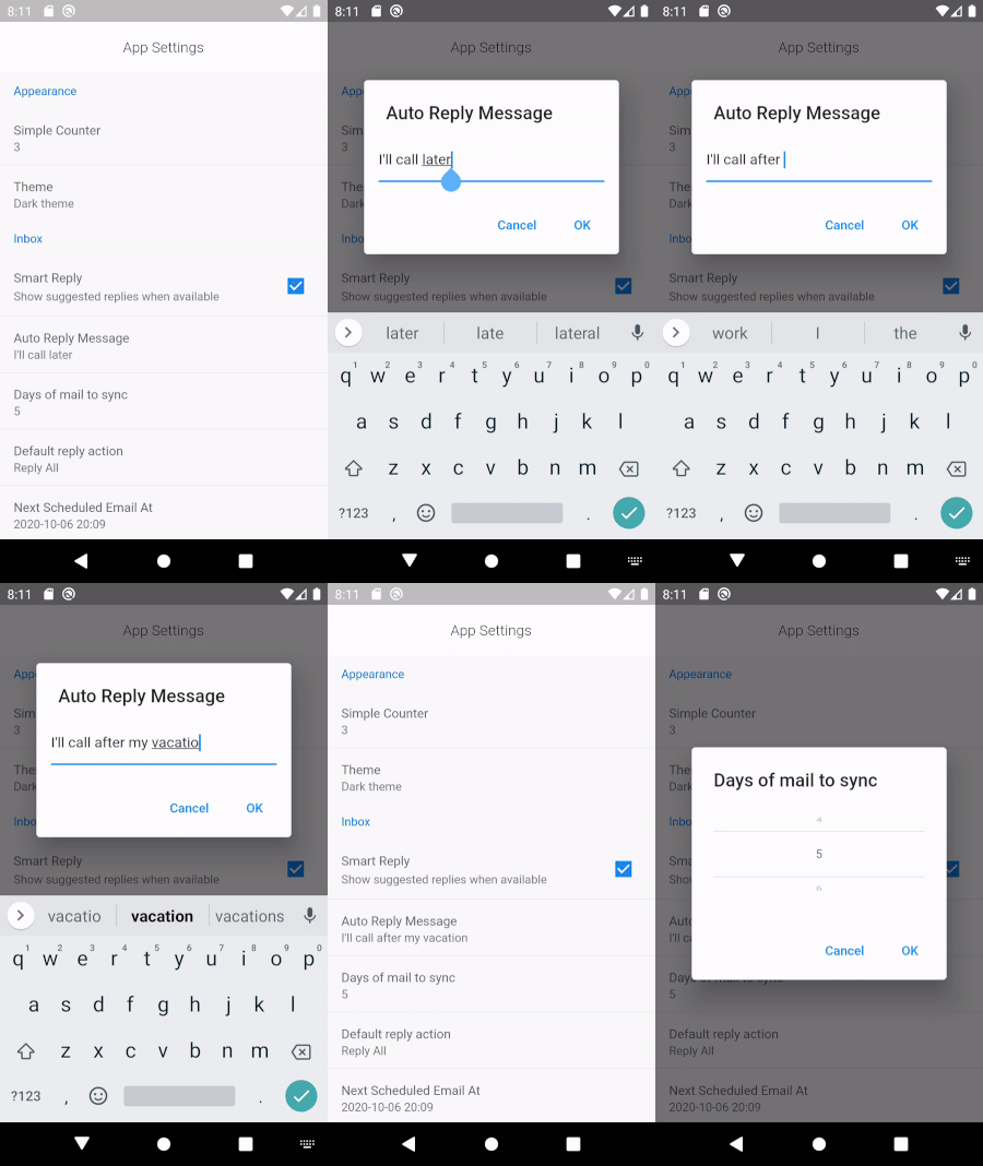
SettingTextItem (
title: 'Auto Reply Message' ,
displayValue: autoReplyMessage,
initialValue: autoReplyMessage,
hintText: 'Sent by system on away' ,
onChanged: (v) => setState (() => autoReplyMessage = v),
),
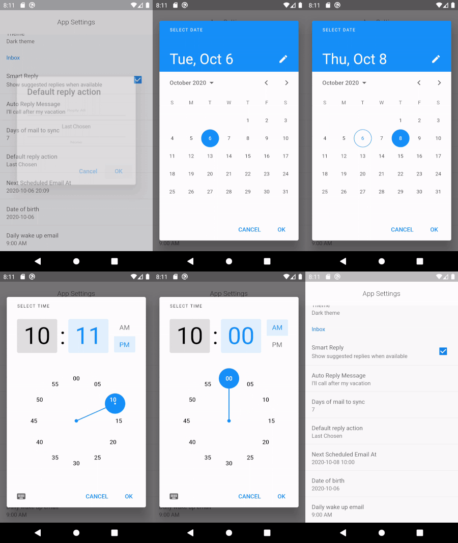
SettingDateTimeItem <DateTime >(
title: 'Next Scheduled Email At' ,
displayValue: scheduledEmailSlug,
onChanged: (v) => setState (() => scheduledEmailDateTime = v),
),
SettingDateTimeItem <DateTime >(
title: 'Date of birth' ,
displayValue: dateOfBirthSlug,
onChanged: (v) => setState (() => dateOfBirth = v),
timePicker: false ,
),
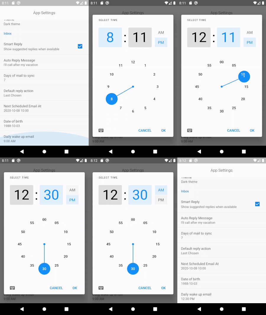
SettingDateTimeItem <TimeOfDay >(
title: 'Daily wake up email' ,
displayValue: dailyEmailAt.format (context),
onChanged: (v) => setState (() => dailyEmailAt = v),
datePicker: false ,
),
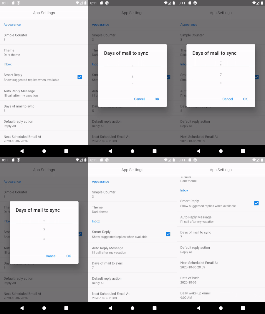
SettingWheelPickerItem (
title: 'Days of mail to sync' ,
displayValue: daysOfMailToSync.toString (),
initialValueIndex: daysOfMailToSync,
items: List .generate (10 , (index) => index.toString ()),
onChanged: (v) => setState (() => daysOfMailToSync = v),
),
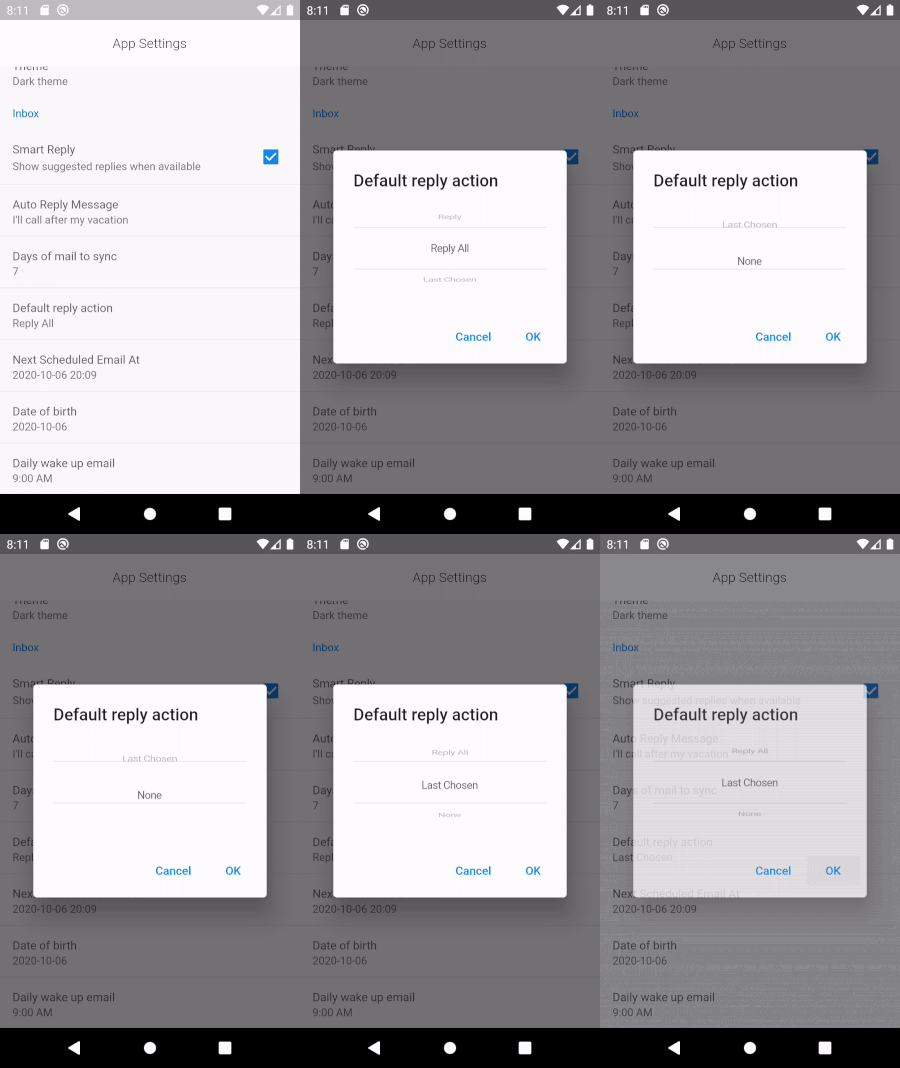
var replyOptions = ['Reply' , 'Reply All' , 'Last Chosen' , 'None' ];
SettingWheelPickerItem (
title: 'Default reply action' ,
displayValue: replyOptions[chosenReplyOptionIndex],
initialValueIndex: chosenReplyOptionIndex,
items: replyOptions,
onChanged: (v) => setState (() => chosenReplyOptionIndex = v),
),
SettingConfirmItem (
title: 'Delete account' ,
displayValue: 'Permanently deletes your account' ,
alertTitle: 'Delete your account' ,
alertMessage: 'Are you sure?' ,
priority: ItemPriority .high,
onConfirm: () => {},
onCancel: () => {},
),
SettingItem (
title: 'Simple Counter' ,
displayValue: counter.toString (),
onTap: () => setState (() => counter++),
),
Structure
Root - SettingContainer
\
\_ SettingSection
\
\_ SettingItem (or Variants )
Common Options
Set the priority of the item to one of:
ItemPriority.high - Shows red colorItemPriority.normal - Default colorItemPriority.low - Shows in green colorItemPriority.disabled - Disables the item
Example
Creates a simple Checkbox setting item
SettingContainer (
sections: [
SettingSection (
title: 'Appearance' ,
items: [
SettingCheckboxItem (
title: 'Smart Reply' ,
value: smartReply,
onChanged: (v) => setState (() => smartReply = v),
description: 'Show suggested replies when available' ),
],
),
],
)
Notes
Early version
API bound to change as more widgets get added
Please report bugs/issues/features
Buy Me A Coffee