collapsible_sidebar
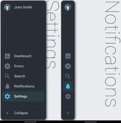
A collapsible sidebar for Flutter apps implementing the Material Design.
🌟 Version 2.0.7 ✨
Features
Material Design
Pre-built customizable tile widgets (CollapsibleItems)
Smooth Animation
Supports both LTR & RTL languages
Supports MULTI-LEVEL Menu
Alert Badges on CollapsibleItems
Supported platforms
Flutter Android
Flutter iOS
Flutter web
Flutter desktop
Contributors
A big thank you to all the contributors without whom this project would be impossible to maintain and enhance. 👏👏👏
Live preview
https://drunkonbytes.github.io/flutter_collapsible_sidebar
Note: this page is built with flutter-web. For a better user experience, please use a mobile device to open this link.
Installation
Add collapsible_sidebar: ^2.0.7 to your pubspec.yaml dependencies. And import it:
import 'package:collapsible_sidebar/collapsible_sidebar.dart' ;
How to use
Create a list of CollapsibleItems named _items (or whatever fancy name you like)
For a collapsible item with sub-items to be the default selected item MARK ALL OF ITS SUB-ITEMS WITH THE isSelected: true property.
List <CollapsibleItem > get _items {
return [
CollapsibleItem (
text: 'Shop' ,
iconImage: AssetImage ("assets/shop_icon.png" ),
icon: Icons .ac_unit,
onPressed: () => setState (() => _headline = 'Shop' ),
onHold: () => ScaffoldMessenger .of (context).showSnackBar (
SnackBar (content: const Text ("Shop" ))
),
isSelected: true ,
subItems: [
CollapsibleItem (
text: 'Cart' ,
icon: Icons .shopping_cart,
onPressed: () => setState (() => _headline = 'Cart' ),
onHold: () => ScaffoldMessenger .of (context).showSnackBar (
SnackBar (content: const Text ("Cart" ))
),
isSelected: true ,
)
]
),
CollapsibleItem (
text: 'Dashboard' ,
badgeCount: 7 ,
icon: Icons .assessment,
onPressed: () => setState (() => _headline = 'DashBoard' ),
onHold: () => ScaffoldMessenger .of (context).showSnackBar (
SnackBar (content: const Text ("DashBoard" ))
),
),
CollapsibleItem (
text: 'Ice-Cream' ,
icon: Icons .icecream,
onPressed: () => setState (() => _headline = 'Ice-Cream' ),
onHold: () => ScaffoldMessenger .of (context).showSnackBar (
SnackBar (content: const Text ("Ice-Cream" ))
),
),
CollapsibleItem (
text: 'Search' ,
icon: Icons .search,
onPressed: () => setState (() => _headline = 'Search' ),
onHold: () => ScaffoldMessenger .of (context).showSnackBar (
SnackBar (content: const Text ("Search" ))
),
),
];
}
Define the body of the app (the widget where the main working of the app will be) and name it say _body.
Widget _body (Size size, BuildContext context) {
return Container (
height: double .infinity,
width: double .infinity,
color: Colors .blueGrey[50 ],
child: .........,
);
}
Finally completely define the CollapsibleSidebar widget by adding the list of CollapsibleItems named _items, the body of the app named _body and the customizable parameters as needed:
CollapsibleSidebar (
items: _items,
avatarImg: _avatarImg,
title: 'John Smith' ,
body: _body (size, context),
)
Also you can use the isCollapsed condition depending how you want the state of the sidebar to change (collapsed/expanded)
for example [size.width]
CollapsibleSidebar (
isCollapsed: MediaQuery .of (context).size.width <= 800 ,
items: _items,
avatarImg: _avatarImg,
title: 'John Smith' ,
body: _body (size, context),
)
Parameters (customizable attributes)
Name
Data Type
Default Value
Description
isCollapsedbool
true
can set condition to control state of sidebar (collapsed/expanded) on some property change
collapseOnBodyTapbool
true
flag to enable/disable tapping on the body of the app (area other than the sidebar) to collapse the sidebar
itemsList<CollapsibleItems>---
List of CollapsibleItems
showTitlebool
true
can set to false to hide title and avatar Image
titleString
---
Title of the Collapsible Sidebar
titleBackbool
false
set to 'true' to use a back icon instead of avatar picture
titleBackIconIcons
Icons.arrow_back
the back icon is 'arrow_back' by default (customizable)
onTitleTapFunction
---
custom callback function called when title avatar or back icon is pressed
onHoverPointerSystemMouseCursors
SystemMouseCursors.click
the default hover mouse pointer is set to 'click' type by default (customizable)
textStyleTextStyle
---
custom style for sidebar title
titleStyleTextStyle
---
custom style for collapsible items text
toggleTitleStyleTextStyle
---
custom style for toggle button title
avatarImgImage
---
Image to be displayed
bodyWidget
---
The main body of the app (the underlying main widget other than the sidebar)
heightdouble
double.infinity
height of the Sidebar
minWidthdouble
80
Width of Sidebar when Collapsed
maxWidthdouble
270
Width of Sidebar when Expanded
borderRadiusdouble
15
Radius of the borders
iconSizedouble
40
Size of the icons
customContentPaddingLeftdouble
-1
Padding to the left of CollapsibleItems (keep value less than 0 for default padding)
toggleTitleString
'Collapse'
title text of Toggle Button
toggleButtonIconIcons
Icons.chevron_right
Icon of the Toggle button
backgroundColorColor
Color(0xff2B3138)
The background color
avatarBackgroundColorColor
Color(0xff6A7886)
The avatar background color
selectedIconBoxColor
Color(0xff2F4047)
Color of Icon Box when selected
selectedIconColorColor
Color(0xff4AC6EA)
Color of Icon when selected
selectedTextColorColor
Color(0xffF3F7F7)
Color of text when selected
unselectedIconColorColor
Color(0xff6A7886)
Color of Icon when not selected
unselectedTextColorColor
Color(0xffC0C7D0)
Color of text when not selected
badgeBackgroundColorColor
Color(0xffFF6767)
Background color of badges on Collapsible Items
badgeTextColorColor
Color(0xffF3F7F7)
Badge Text color of badges on Collapsible Items
durationDuration
Duration(milliseconds: 500)
Animation duration for collapsed->expanded & vice-versa
curveCurves
Curves.fastLinearToSlowEaseIn
Animation curve for collapsed->expanded & vice-versa
screenPaddingdouble
4
Padding to the screen
topPaddingdouble
0
space between image avatar and icons
bottomPaddingdouble
0
space between icons and toggle button
itemPaddingdouble
10
space between collapsible items
customItemOffsetX double
-1
X axis offset for collapsible items (keep value less than 0 for default offset)
fitItemsToBottombool
true
fit all icons to the end of the space between image avatar and toggle button
showToggleButtonbool
true
flag to enable/disable showing the toggle button
sidebarBoxShadowList<BoxShadow>[BoxShadow(color: Colors.blue, blurRadius: 10, spreadRadius: 0.01, offset: Offset(3, 3),),]
Just like the "BoxDecoration" parameter of a "Container"
License
Apache 2.0