搜尋套件、儲存庫與 APP 分類

control_style 封面
套件詳情v0.1.2

control_style

為基於 Flutter 的文字欄位、按鈕和其他控制項應用額外的裝飾。這可讓介面自訂更加完善。

AndroidiOSWebmacOSWindowsLinux
近 30 天下載
1.7萬
喜歡數
25
Pub 分數
160

安裝套件

flutter pub add control_style

套件介紹

根據套件公開資料產生的選型評估,僅供參考。

ControlStyle 是一個 Flutter 套件,透過應用可自訂的裝飾來增強文字欄位和按鈕等 UI 控制項的視覺外觀。它讓開發者能輕鬆調整標準組件的外觀與感覺,而無需撰寫重複的樣式程式碼。支援所有主要平台,可簡化介面自訂,實現一致且精緻的設計。此套件可透過簡單的 pub add 命令順暢整合至現有的 Flutter 專案中。

適用情境

  • 自定義文字欄位邊框
  • 增強按鈕美學
  • 建立統一的UI主題
  • 改善表單輸入的視覺效果
  • 簡化設計一致性
  • 向控制項添加裝飾效果

主要特色

  • 與 Flutter 小部件的輕鬆整合
  • 跨平台相容性
  • 可擴充的裝飾系統
  • 所需的樣板程式碼最少
  • 支援響應式設計
  • 主題感知樣式

適合對象

  • 尋求視覺精緻的UI設計師
  • 開發表單的開發者
  • 維護一致設計系統的團隊
  • 需要自定控件外觀的應用
  • 具有嚴格UI截止日期的專案
  • Flutter 初學者探索 widget 樣式

使用建議

  • 可能需要為複雜佈局進行額外設定
  • 僅限視覺增強(無功能變更)
  • 依賴於 Flutter 的渲染管道
  • 大量裝飾控制項可能帶來的效能影響
  • 不適用於非視覺化自訂需求
  • 需要理解 Flutter 的 widget 樹

原始 README

以下為關聯原始碼儲存庫的 README 原文快照,最新內容請造訪原始碼儲存庫。

Applies additional appearance settings to Flutter text fields, buttons and other controls. Currently supports: outer shadow, inner shadow, border, inner gradient.

Try it out: example

Intro

The Flutter library provides limited opportunities to set up the appearance of controls. You usually make this customisation by wrapping the components into a Container widget and configuring it using the decoration parameter. Such an approach has limitations as it leads to increasing the volume of work and complicating the code. Especially time consuming in this case is creating animations for switching between different appearances depending on a state of a control.

In addition, this approach works incorrectly when you are adding shadows to text fields in combination with errorText and helperText:

Container issue

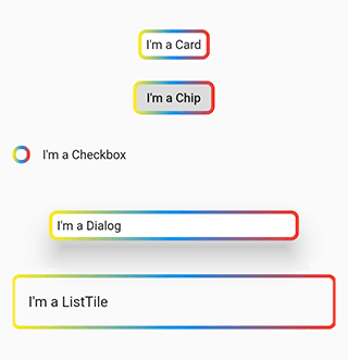
This package helps to solve the aforementioned problem. It provides the most common customisation features for control elements which have shape field such as buttons, text fields, Card, Chip, Checkbox, Dialog, Drawer, inks, ListTile, Material, NavigationBar.

The package provides the same customisation parameters to all controls, which allows for identically decorating any of the controls.

final outlinedShape = DecoratedOutlinedBorder(
  borderGradient: const GradientBorderSide(
    gradient: LinearGradient(colors: [Colors.yellow, Colors.blue, Colors.red]),
    width: 2,
  ),
  child: RoundedRectangleBorder(borderRadius: BorderRadius.circular(8)),
);

...
  Column(children: [
    const SizedBox(height: 16),
    Card(child: const Padding(padding: EdgeInsets.all(8.0), child: Text("I'm a Card")), shape: outlinedShape),
    const SizedBox(height: 16),
    Chip(label: const Text("I'm a Chip"), shape: outlinedShape),
    const SizedBox(height: 16),
    Row(children: [Checkbox(value: false, onChanged: (value) {}, shape: outlinedShape), const Text("I'm a Checkbox")]),
    const SizedBox(height: 16),
    Dialog(child: const Padding(padding: EdgeInsets.all(8.0), child: Text("I'm a Dialog")), shape: outlinedShape),
    const SizedBox(height: 16),
    ListTile(title: const Text("I'm a ListTile"), shape: outlinedShape),
    const SizedBox(height: 16),
  ]);
...

Control examples

Features

Demo

The package enables outer shadow, inner shadow, border and inner gradient styles for Flutter’s standard controls. These can be applied without using external control widgets.

Usage

You can customize all your controls at once via the theme setting of MaterialApp, or separate controls through changing their own styles.

To use the plugin with inputs, you need to wrap InputBorder with DecoratedInputBorder and configure its parameters.

For example, the code:

    MaterialApp(
      theme: ThemeData(
        inputDecorationTheme: InputDecorationTheme(
          border: OutlineInputBorder(
            borderRadius: BorderRadius.circular(8),
          ),
        ),
      ),
    );

should be updated to:

    MaterialApp(
      theme: ThemeData(
        inputDecorationTheme: InputDecorationTheme(
          border: DecoratedInputBorder(
            shadow: const [
              BoxShadow(
                color: Colors.blue,
                blurRadius: 12,
              )
            ],
            child: OutlineInputBorder(
              borderRadius: BorderRadius.circular(8),
            ),
          ),
        ),
      ),
    );

For buttons, you need to wrap OutlinedBorder with DecoratedOutlinedBorder and configure its parameters.

Hence, this code:

    MaterialApp(
      theme: ThemeData(
        primarySwatch: Colors.blue,
        outlinedButtonTheme: OutlinedButtonThemeData(
            style: ElevatedButton.styleFrom(
          shape: RoundedRectangleBorder(
            borderRadius: BorderRadius.circular(8),
          ),
        )),
      ),
    );

should be updated to:

    MaterialApp(
      theme: ThemeData(
        primarySwatch: Colors.blue,
        outlinedButtonTheme: OutlinedButtonThemeData(
            style: ElevatedButton.styleFrom(
          shape: DecoratedOutlinedBorder(
            shadow: const [
              BoxShadow(
                color: Colors.blue,
                blurRadius: 12,
              )
            ],
            child: RoundedRectangleBorder(
              borderRadius: BorderRadius.circular(8),
            ),
          ),
        )),
      ),
    );

The examples above show how to decorate all the controls at once.

In case you need to decorate separate element, you need to configure its styles:

    TextField(
      decoration: InputDecoration(
          border: DecoratedInputBorder(
        shadow: const [
          BoxShadow(
            color: Colors.blue,
            blurRadius: 12,
          )
        ],
        child: OutlineInputBorder(
          borderRadius: BorderRadius.circular(8),
        ),

      )),
    );

    ...

    ElevatedButton(
      onPressed: () {},
      child: const Text("Button"),
      style: ElevatedButton.styleFrom(
          shape: DecoratedOutlinedBorder(
        shadow: const [
          BoxShadow(
            color: Colors.blue,
            blurRadius: 12,
          )
        ],
        child: RoundedRectangleBorder(
          borderRadius: BorderRadius.circular(8),
        ),
      )),
    );
Animation

To configure element state change animations, use the usual Flutter’s approach.

TextButton(
  onPressed: () {},
  child: const Text("Text button"),
  style: ButtonStyle(
    shape: MaterialStateProperty.resolveWith((states) {
      return DecoratedOutlinedBorder(
        shadow: [
          GradientShadow(
            gradient: states.contains(MaterialState.pressed)
                ? const LinearGradient(colors: [Colors.red, Colors.green, Colors.cyan])
                : const LinearGradient(colors: [Colors.blue, Colors.blue]),
            blurRadius: 12,
          )
        ],
        child: RoundedRectangleBorder(borderRadius: BorderRadius.circular(8)),
      );
    }),
  ),
)

Animation

Outer shadow

Add the shadow parameter to DecoratedInputBorder or DecoratedOutlinedBorder.

For adding a single-colour shadow, use BoxShadow.

TextButton(
  onPressed: () {},
  child: const Text("Text button"),
  style: TextButton.styleFrom(
      shape: DecoratedOutlinedBorder(
    shadow: const [
      BoxShadow(
        color: Colors.blue,
        blurRadius: 12,
      )
    ],
    child: RoundedRectangleBorder(borderRadius: BorderRadius.circular(8)),
  )),
);

Color shadow

For applying a gradient-shadow, use GradientShadow. It is different from BoxShadow only in that instead of color it uses the gradient parameter.

TextButton(
  onPressed: () {},
  child: const Text("Text button"),
  style: TextButton.styleFrom(
      shape: DecoratedOutlinedBorder(
    shadow: const [
      GradientShadow(
        gradient: LinearGradient(colors: [Colors.red, Colors.green, Colors.cyan]),
        blurRadius: 12,
      )
    ],
    child: RoundedRectangleBorder(borderRadius: BorderRadius.circular(8)),
  )),
)

Gradient shadow

Inner shadow

Add innerShadow for DecoratedInputBorder or DecoratedOutlinedBorder.

For adding a single-colour shadow, use BoxShadow.

TextButton(
  onPressed: () {},
  child: const Text("Text button"),
  style: TextButton.styleFrom(
      shape: DecoratedOutlinedBorder(
    innerShadow: const [
      BoxShadow(
        color: Colors.blue,
        blurRadius: 12,
      )
    ],
    child: RoundedRectangleBorder(borderRadius: BorderRadius.circular(8)),
  )),
)

Inner shadow

For applying a gradient-shadow, use GradientShadow. It is different from BoxShadow only in that instead of color it uses the gradient parameter.

TextButton(
  onPressed: () {},
  child: const Text("Text button"),
  style: TextButton.styleFrom(
      shape: DecoratedOutlinedBorder(
    innerShadow: const [
      GradientShadow(
        gradient: LinearGradient(colors: [Colors.red, Colors.green, Colors.cyan]),
        blurRadius: 12,
      )
    ],
    child: RoundedRectangleBorder(borderRadius: BorderRadius.circular(8)),
  )),
)

Inner gradient shadow

Background

Add the backgroundGradient parameter of the Gradient type to DecoratedInputBorder or DecoratedOutlinedBorder.

TextButton(
  onPressed: () {},
  child: const Text("Text button"),
  style: ButtonStyle(
    shape: MaterialStateProperty.resolveWith((states) {
      return DecoratedOutlinedBorder(
        backgroundGradient: LinearGradient(colors: [Colors.blue.withOpacity(0.5), Colors.blue.withOpacity(0.2)]),
        child: RoundedRectangleBorder(borderRadius: BorderRadius.circular(8)),
      );
    }),
  ),
)

Background gradient

Border

Add the borderGradient or GradientBorderSide parameter to DecoratedInputBorder or DecoratedOutlinedBorder. This parameters differ from the Flutter’ BorderSide in that they use gradient parameter instead of color.

TextButton(
  onPressed: () {},
  child: const Text("Text button"),
  style: ButtonStyle(
    shape: MaterialStateProperty.resolveWith((states) {
      return DecoratedOutlinedBorder(
        borderGradient: const GradientBorderSide(
          gradient: LinearGradient(colors: [Colors.red, Colors.green, Colors.blue]),
          width: 3,
        ),
        child: RoundedRectangleBorder(borderRadius: BorderRadius.circular(8)),
      );
    }),
  ),
)

Gradient border

BorderShadow in Detail

The wrappers DecoratedInputBorder and DecoratedOutlinedBorder reach an element’s border through the child parameter and apply stylization above the default border of this element. In case of an outer shadow, the shadow’s part above the control then gets cut off in order to create an illusion of the shadow being located behind the control.

how it works

Decorative styles are applied above the layer that contains an element’s border. Hence, when it comes to buttons, such stylisation overlaps the inner area of an element. Using transparent colours hence used to address this issue. This limitation is due to Flutter itself.

Background overlap issue

Compatibility

The following borders have been tested.

Inputs:

  • UnderlineInputBorder
  • OutlineInputBorder

Buttons:

  • BeveledRectangleBorder
  • CircleBorder
  • ContinuousRectangleBorder
  • RoundedRectangleBorder
  • StadiumBorder

Issues

  • Shadows may overlap nearby elements.

Shadow overlap issue

  • The decoration of the inner area of the button overlaps the button itself.

Background overlap issue

所屬分類

原始碼儲存庫

使用此套件的專案

暫無相關資料。