搜尋套件、儲存庫與 APP 分類

convex_bottom_bar 封面
套件詳情v3.2.0

convex_bottom_bar

一個 Flutter 套件,用於實作 ConvexAppBar,在底欄中顯示凸形標籤。支援主題設定。

AndroidiOSWebmacOSWindowsLinux
近 30 天下載
1.8萬
喜歡數
2950
Pub 分數
150

安裝套件

flutter pub add convex_bottom_bar

套件介紹

根據套件公開資料產生的選型評估,僅供參考。

ConvexBottomBar 是一個 Flutter 套件,提供視覺上獨特的凸形底端導航列,具備平滑動畫與可自訂主題。它透過提供圓潤且動態的標籤設計,提升標準底端導航體驗,在 Android、iOS、Web、macOS、Windows 與 Linux 平台上皆能突出表現。此套件支援主題自訂,讓開發者能將欄位外觀與應用程式設計語言相符。適合尋求現代、吸引人的導航介面之應用。

適用情境

  • 現代移動應用導航
  • 可自訂的底部標籤
  • 跨平台 UI 一致性
  • 透過視覺設計提升使用者參與度
  • 注重美學吸引力的應用程式

主要特色

  • 凸形標籤設計
  • 內建動畫效果
  • 主題支援
  • 跨平台相容性
  • 與 Flutter 應用輕鬆整合
  • 響應式標籤互動

適合對象

  • 注重設計的 Flutter 應用程式
  • 旨在實現獨特導航的移動應用
  • 想要動畫底部欄的開發者
  • 針對多個平台的專案
  • 使用 Flutter 的 UI/UX 設計師

使用建議

  • 可能需要為複雜主題添加額外的樣式
  • 對低階設備的效能影響
  • 超出內建選項的自訂功能有限
  • 不適合極簡設計
  • 與其他組件可能存在佈局衝突

原始 README

以下為關聯原始碼儲存庫的 README 原文快照,最新內容請造訪原始碼儲存庫。

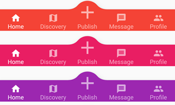
appBar preview

pub.dev github coverage likes popularity build status license

English | 简体中文


The official BottomAppBar can only display a notch FAB with an app bar, and sometimes we need a convex FAB. BottomAppBar and NotchShape's implementation inspires this ConvexAppBar.

Online example can be found at https://appbar.codemagic.app.

convex_bottom_bar is now a Flutter Favorite package!

Here are some supported style:

fixed react badge chip
fixedCircle reactCircle flip
textIn titled tab image
button fixed corner

How to use

Typically ConvexAppBar can work with Scaffold by setup its bottomNavigationBar.

The ConvexAppBar has two constructors. The ConvexAppBar() will use the default style to simplify the tab creation.

Add this to your package's pubspec.yaml file, use the latest version Pub:

dependencies:
  convex_bottom_bar: ^latest_version
import 'package:convex_bottom_bar/convex_bottom_bar.dart';

Scaffold(
  bottomNavigationBar: ConvexAppBar(
    items: [
      TabItem(icon: Icons.home, title: 'Home'),
      TabItem(icon: Icons.map, title: 'Discovery'),
      TabItem(icon: Icons.add, title: 'Add'),
      TabItem(icon: Icons.message, title: 'Message'),
      TabItem(icon: Icons.people, title: 'Profile'),
    ],
    onTap: (int i) => print('click index=$i'),
  )
);

Flutter Version Support
As Flutter is developing fast. There can be breaking changes. We will be trying to support the stable version and beta version through different package versions.

Stable Flutter Version Package Version More
>=3.7.0 >=3.2.0 Since v3.7.0, the stable version changed the DefaultTabController api
>=1.20 >=2.4.0 Since v1.20, the stable version changed the Stack api
<1.20 <=2.3.0 Support for stable version such as v1.17, v1.12 is not going to be updated

Features

  • Provide multiple internal styles
  • Ability to change the theme of AppBar
  • Provide builder API to customize a new style
  • Add badge on the tab menu
  • Elegant transition animation
  • Provide hook API to override some of the internal styles
  • RTL support

Table of contents

Theming

The bar will use default style, you may want to theme it. Here are some supported attributes:

Attributes Description
backgroundColor AppBar background
gradient gradient will override backgroundColor
height AppBar height
color tab icon/text color
activeColor tab icon/text color when selected
curveSize size of the convex shape
top top edge of the convex shape relative to AppBar
cornerRadius draw the background with topLeft and topRight corner; Only work with fixed tab style
style style to describe the convex shape: fixed, fixedCircle, react, reactCircle, ...
chipBuilder custom badge builder, use ConvexAppBar.badge for default badge

Badge

If you need to add a badge on the tab, use the ConvexAppBar.badge to get it done.

badge demo

ConvexAppBar.badge({0: '99+', 1: Icons.assistant_photo, 2: Colors.redAccent},
  items: [
    TabItem(icon: Icons.home, title: 'Home'),
    TabItem(icon: Icons.map, title: 'Discovery'),
    TabItem(icon: Icons.add, title: 'Add'),
  ],
  onTap: (int i) => print('click index=$i'),
);

The badge() method accepts an array of badges; The badges is a map with tab items. Each value of entry can be either String, IconData, Color or Widget.

Single Button

If you only need a single button, checkout the ConvexButton.

button

Scaffold(
  appBar: AppBar(title: const Text('ConvexButton Example')),
  body: Center(child: Text('count $count')),
  bottomNavigationBar: ConvexButton.fab(
    onTap: () => setState(() => count++),
  ),
);

Style Hook

Hook for internal tab style. Unlike the ConvexAppBar.builder, you may want to update the tab style without defining a new tab style.

Warning:
This hook is limited and can lead to overflow broken if the size you provide does not match with internal style.

StyleProvider(
  style: Style(),
  child: ConvexAppBar(
    initialActiveIndex: 1,
    height: 50,
    top: -30,
    curveSize: 100,
    style: TabStyle.fixedCircle,
    items: [
      TabItem(icon: Icons.link),
      TabItem(icon: Icons.import_contacts),
      TabItem(title: "2020", icon: Icons.work),
    ],
    backgroundColor: _tabBackgroundColor,
  ),
)
class Style extends StyleHook {
  @override
  double get activeIconSize => 40;

  @override
  double get activeIconMargin => 10;

  @override
  double get iconSize => 20;

  @override
  TextStyle textStyle(Color color) {
    return TextStyle(fontSize: 20, color: color);
  }
}

RTL Support

RTL is supported internally, and if you define the TextDirection inside the app, the AppBar should work fine. Both RTL and LTR can be configured through Directionality:

Directionality(
  textDirection: TextDirection.rtl,
  child: Scaffold(body:ConvexAppBar(/*TODO ...*/)),
)

Custom Example

If the default style does not match your situation, try with ConvexAppBar.builder(), allowing you to custom nearly all the tab features.

Scaffold(
  bottomNavigationBar: ConvexAppBar.builder(
    count: 5,
    backgroundColor: Colors.blue,
    itemBuilder: Builder(),
  )
);

// user defined class
class Builder extends DelegateBuilder {
  @override
  Widget build(BuildContext context, int index, bool active) {
    return Text('TAB $index');
  }
}

Full custom example can be found at example.

FAQ

Please file feature requests and bugs at the issue tracker.

Donate

You like the package ? Buy me a coffee :)

ko-fi

所屬分類

原始碼儲存庫

使用此套件的專案

所在榜單