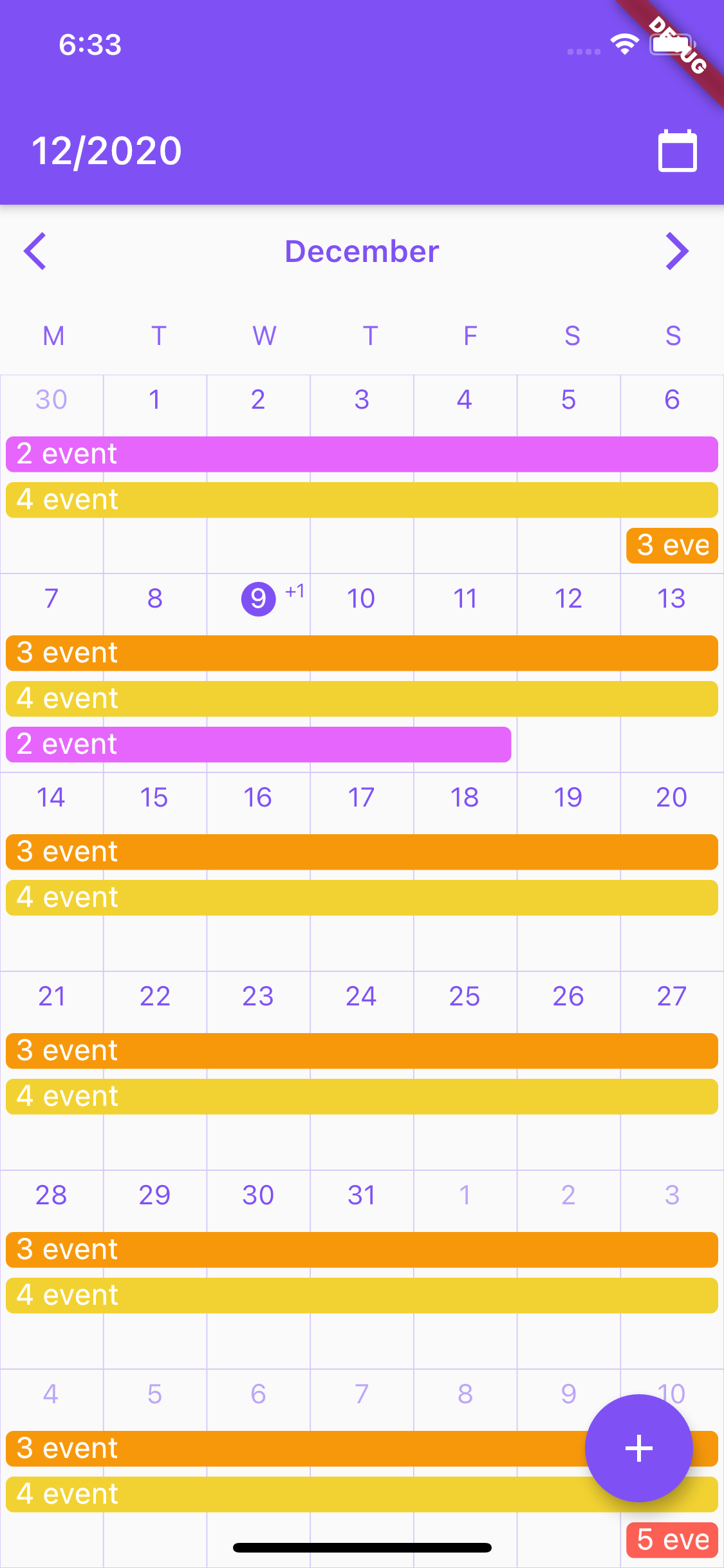
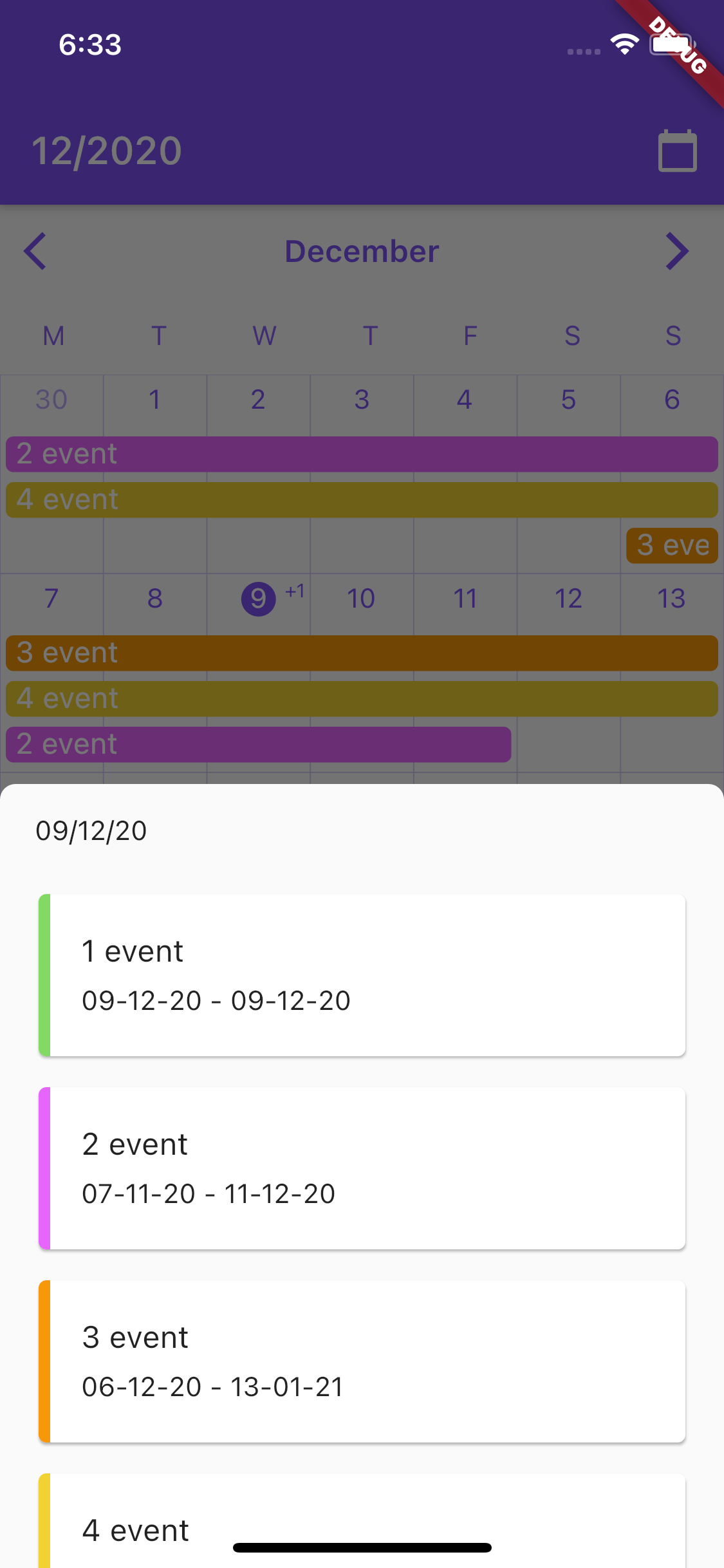
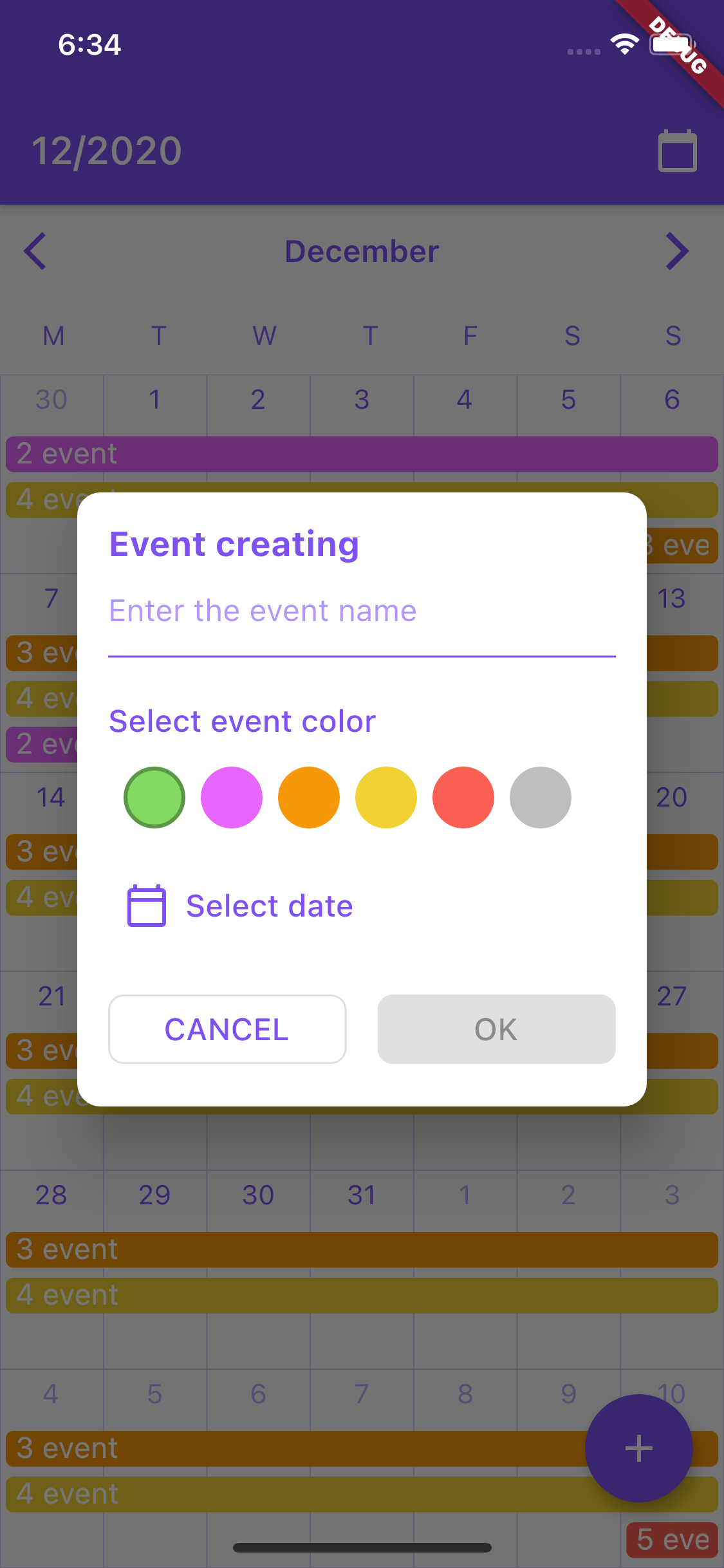
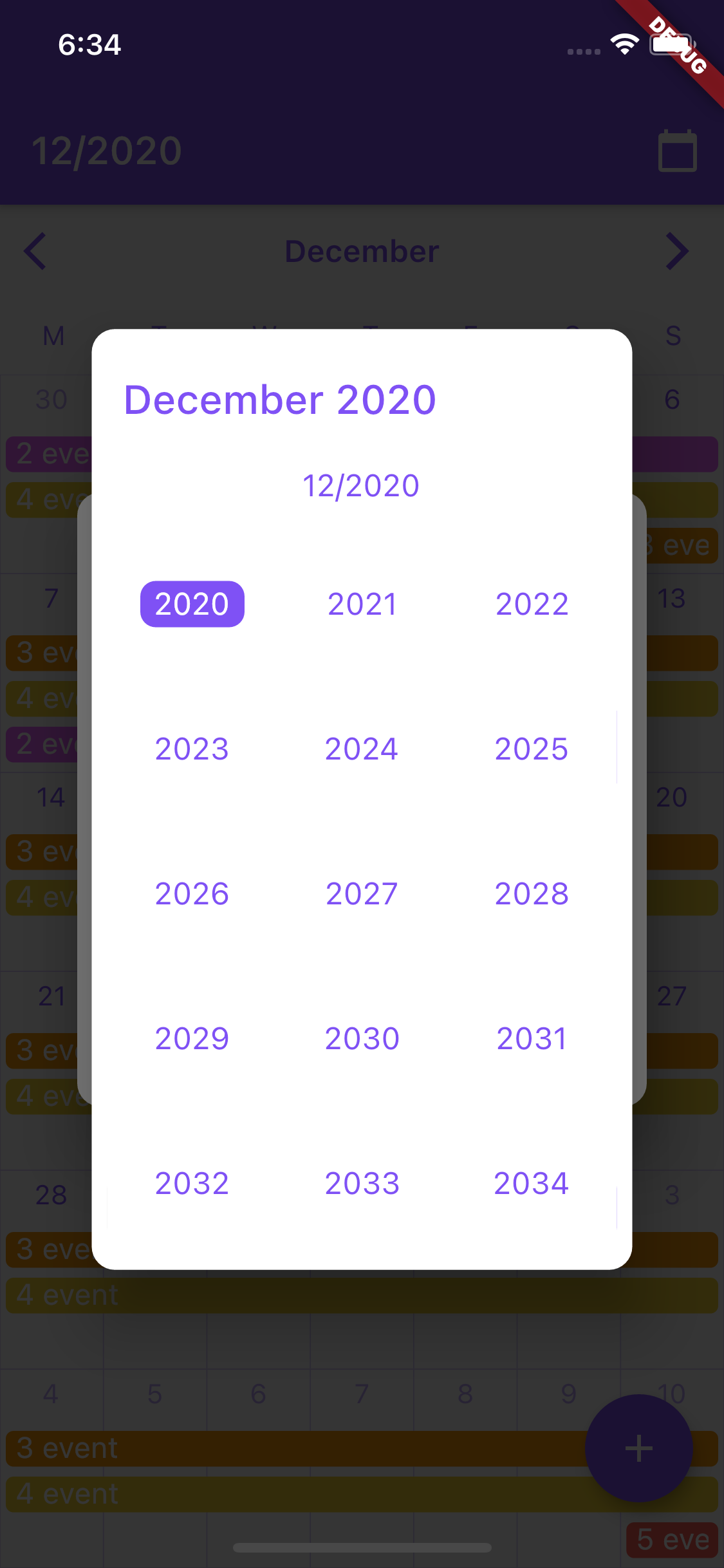
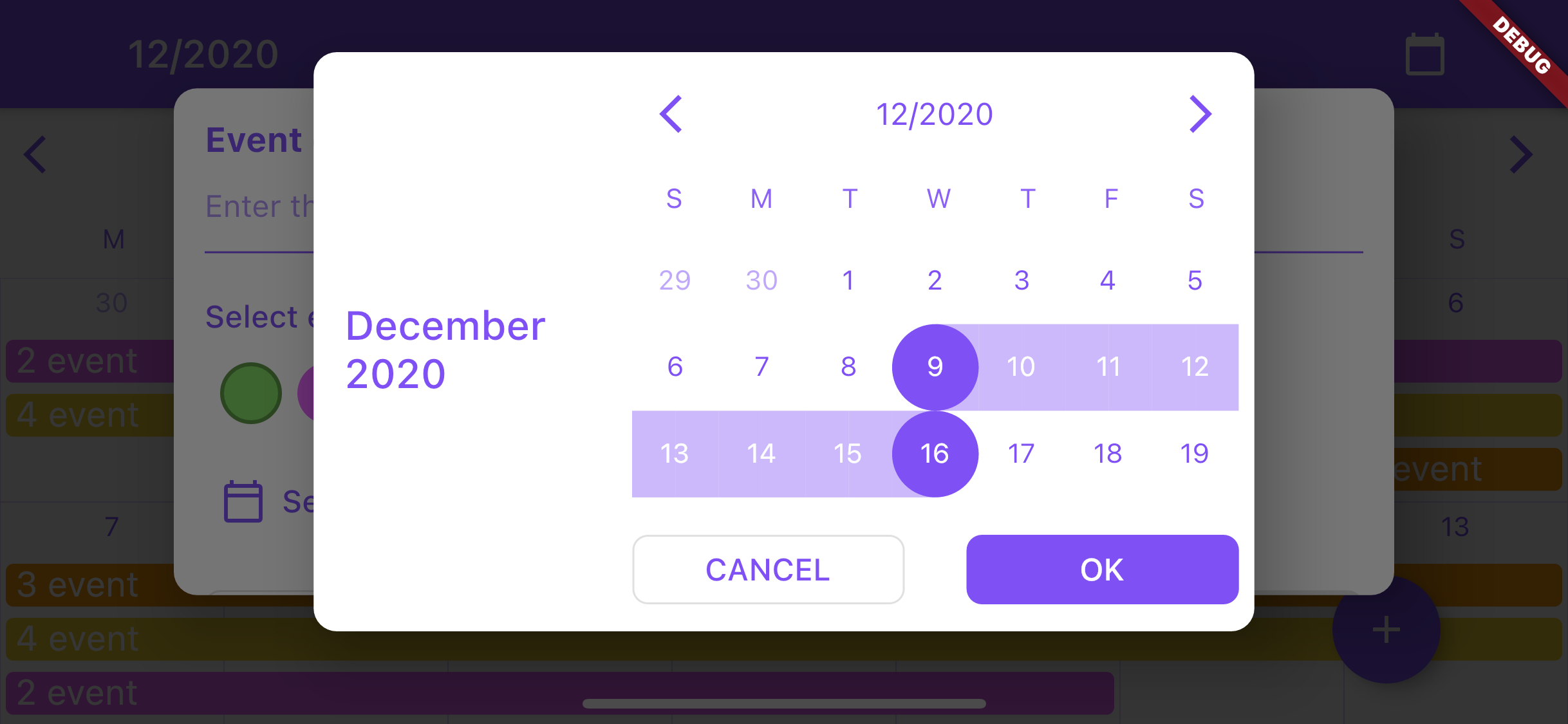
Note: avoid using setState calls frequently on the page where the CrCalendar widget is used to improve performance.
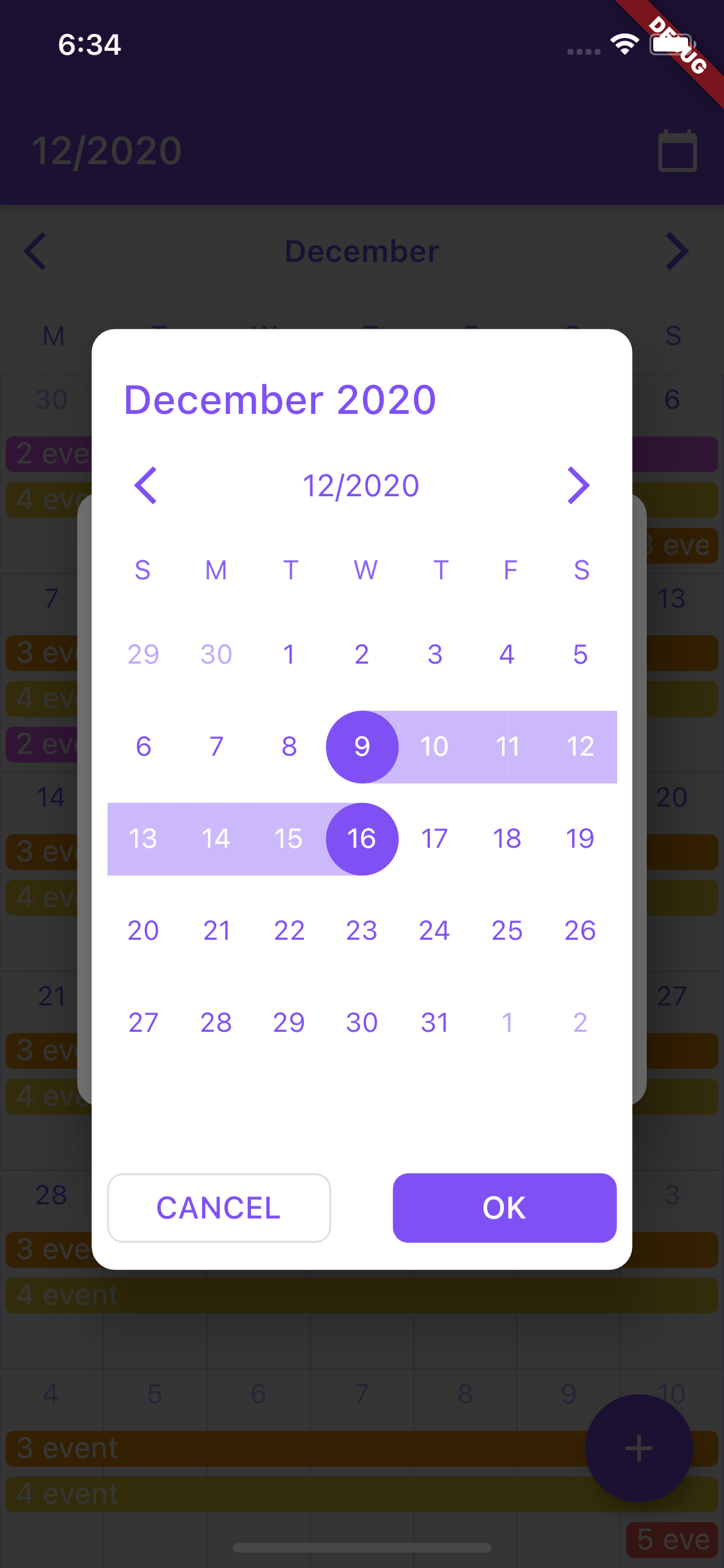
Usage of CrCalendar date picker dialog
DatePickerProperties parameters:
Type
Name
Description
Default value
Color
backgroundColor
Background color for date picker dialog and year selection widget.
Colors.white
DateTime
initialPickerDate
Initial date to be opened on dialog creation.
-
EdgeInsets
padding
Picker dialog padding.
EdgeInsets.all(8)
DayItemBuilder
dayItemBuilder
Builder for day item in dialog.
-
TouchMode
pickerMode
Picker selection mode.
-
WeekDaysBuilder
weekDaysBuilder
Builder for row of days over month view.
-
DateTitleBuilder
pickerTitleBuilder
Title builder for widget on top of picker dialog.
-
Alignment
pickerTitleAlignInLandscape
Alignment of picker title in landscape mode.
Alignment.centerLeft
Widget
backButton
Back button for picker control bar.
-
Widget
forwardButton
Forward button for picker control bar.
-
DateTitleBuilder
controlBarTitleBuilder
Builder for control bar title showed between backButton and forwardButton.
-
bool
showControlBar
Option for hiding control bar.
true
YearPickerItemBuilder
yearPickerItemBuilder
Builder for confirm selection button.
-
PickerButtonBuilder
okButtonBuilder
Builder for confirm selection button.
-
PickerButtonBuilder
cancelButtonBuilder
Builder for cancel button.
-
bool
forceSixWeek
Force showing six week rows in month view.
false
WeekDays
firstWeekDay
First day of date picker calendar.
WeekDays.sunday
DateTime
minDate
Earliest allowable date.
-
DateTime
maxDate
Latest allowable date.
-
LandscapeDaysResizeMode
landscapeDaysResizeMode
LandscapeDaysResizeMode.adaptive - days cells will change their height according to parent height LandscapeDaysResizeMode.scrollable - days cells will change their height according to parent height as long as it is larger than the cells width. The month scrolls if there is not enough space
LandscapeDaysResizeMode.adaptive
Base usage:
/// Show calendar in pop up dialog for selecting date range for calendar event.void_showDatePicker(BuildContext context) {
showCrDatePicker(
context,
properties: DatePickerProperties(
firstWeekDay: WeekDays.monday,
okButtonBuilder: (onPress) =>
ElevatedButton(child: constText('OK'), onPressed: onPress),
cancelButtonBuilder: (onPress) =>
OutlinedButton(child: constText('CANCEL'), onPressed: onPress),
initialPickerDate: DateTime.now(),
),
);
}