搜尋套件、儲存庫與 APP 分類

create_date_picker 封面
套件詳情v1.0.2

create_date_picker

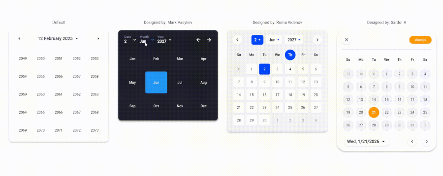
99% 可自訂的日期選擇器

AndroidiOSWebmacOSWindowsLinux
近 30 天下載
193
喜歡數
7
Pub 分數
150

安裝套件

flutter pub add create_date_picker

套件介紹

根據套件公開資料產生的選型評估,僅供參考。

適用於Flutter應用的高度可自訂日期選擇器,提供廣泛的樣式與設定選項。專為需要在多個平台完全控制日期選擇介面外觀與行為的開發者設計。此套件支援Android、iOS、Web、macOS、Windows及Linux,確保無論裝置如何都能提供一致的使用者體驗。著重於彈性與易於整合,讓開發者能精確調整選擇器的外觀與感受,以符合應用程式設計。

適用情境

  • 表單中的自定義日期選擇
  • 為移動和網路應用量身訂做的使用者介面
  • 跨平台日期選擇器
  • 透過獨特樣式增強使用者體驗
  • 整合到複雜的輸入工作流程中

主要特色

  • 99% 可自訂設計
  • 支援所有主要平台
  • 豐富的樣式選項
  • 與 Flutter 的輕鬆整合
  • 可設定的日期範圍和格式
  • 響應式版面適配

適合對象

  • 需要完整UI控制的開發者
  • 需要獨特日期選擇器美學的應用
  • 跨平台 Flutter 專案
  • 注重設計的應用程式
  • 重視跨裝置一致性的團隊

使用建議

  • 需要手動樣式設定以進行進階自訂
  • 對初學者來說可能有學習曲線
  • 與標準選擇器相比,內建主題較少
  • 重度自定義帶來的效能影響
  • 依賴外部 GitHub 倉庫以取得更新

原始 README

以下為關聯原始碼儲存庫的 README 原文快照,最新內容請造訪原始碼儲存庫。

CreateDatePicker Package

The CreateDatePicker package enables you to create a fully customizable date picker. You can create your own component without worrying about the functionality and place it anywhere to match your design

The example app running in Browser

Table of Contents

Integration Steps

To integrate the package into your Flutter application is very easy, you just need to add the Widget and customize every component and place it anywhere with the builder property:

    CreateDatePicker(
            width: 450,
            initialViewState: ViewState.date,
            initialDate: DateTime(2027, 6, 2),
            minDateTime: DateTime(2024, 5, 1),
            maxDateTime: DateTime(2029, 5, 1),
            restrictedDates: restrictedDates,
            weekLabels: weekLabels,
            monthLabels: monthLabels,
            leftArrowBuilder: _leftArrowBuilder,
            rightArrowBuilder: _rightArrowBuilder,
            dateViewButtonBuilder: _dateViewButtonBuilder,
            monthViewButtonBuilder: _monthViewButtonBuilder,
            yearViewButtonBuilder: _yearViewButtonBuilder,
            weekdayCellBuilder: _weekdayCellBuilder,
            dateCellBuilder: _dateCellBuilder,
            monthCellBuilder: _monthCellBuilder,
            yearCellBuilder: _yearCellBuilder,
            onViewStateChanged: _changeViewState,
            onSelectedDateChanged: _onSelectedDateChanged,
            builder: _createDatePickerBuilder,
        ),

NOTE: To place all the component together and anywhere, use builder property.

Available Parameters in CreateDatePicker
  • initialViewState: The initial view state of the picker (date, month, or year).

  • initialDate: The initially selected date.

  • minDateTime: The minimum selectable date.

  • maxDateTime: The maximum selectable date.

  • restrictedDates: A list of dates that cannot be selected.

  • weekLabels: Labels for the days of the week (e.g., Sunday, Monday). Must contain exactly 7 items.

  • monthLabels: Labels for the months of the year (e.g., January, February). Must contain exactly 12 items.

  • width: The width of the picker.

  • elevation: Sets the default elevation of the date picker.

  • popupMenuOffset: Offset for the popup menu.

  • popupMenuPosition: Position of the popup menu (above or below the trigger).

  • builder: Custom builder for the entire picker. Allows placing and customizing components using individual builders.

  • leftArrowBuilder: Custom builder for the left navigation arrow.

  • rightArrowBuilder: Custom builder for the right navigation arrow.

  • popupSelectedDateBuilder: Custom builder for the popup displaying the selected date.

  • dateViewButtonBuilder: Custom builder for the button to switch to the date view.

  • monthViewButtonBuilder: Custom builder for the button to switch to the month view.

  • yearViewButtonBuilder: Custom builder for the button to switch to the year view.

  • weekdayCellBuilder: Custom builder for the weekday cells.

  • dateCellBuilder: Custom builder for the date cells.

  • monthCellBuilder: Custom builder for the month cells.

  • yearCellBuilder: Custom builder for the year cells.

  • onViewStateChanged: Callback triggered when the view state changes.

  • onSelectedDateChanged: Callback triggered when the selected date changes.

Upcoming Updates

Currently, the package is only for a single datetime picker. Support for multiple pickers will be coming soon.

Contributing

Contributions are welcome! Please open an issue or submit a pull request if you have any improvements or bug fixes.

License

This project is licensed under the MIT License. See the LICENSE file for details.

Support Me

If you find this package helpful and want to support its development, consider making a donation. Thank you for your support!

Support via PayPal

所屬分類

原始碼儲存庫

使用此套件的專案

暫無相關資料。