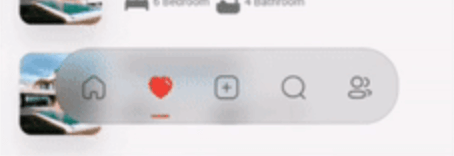
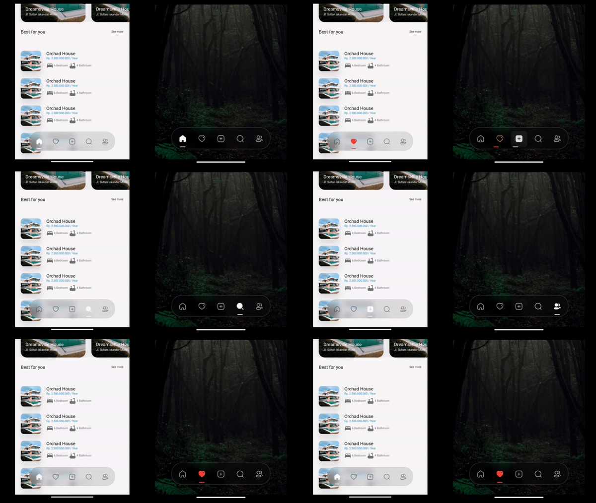
Crystal Bottom Navigation Bar
A highly flexible bottom navigation bar that allows you to tailor it to your specific needs without any constraints. Elevate your UI/UX with seamless animations, customizable appearance—including the option to incorporate blur effects—and the ability to fully personalize the interface.
Simple BottomBar
With Border
Simple BottomBar
With Badge
CRYSTAL BOTTOM NAVIGATION BAR
Blur navigation bar
Frosted navigation bar
Floating navigation bar
Rounded navigation bar
Modern navigation bar
Getting Started
To install, add it to your pubspec.yaml file:
dependencies:
    crystal_navigation_bar:
import 'package:crystal_navigation_bar/crystal_navigation_bar.dart' ;
How to use it
Use CrystalNavigationBar constructor in Your app with in Scaffold's bottomNavigationBar:
Make sure extendBody in Scaffold should be true to use Floating behavior
extendBody: true,
if you do not want to make round navigation bar with show body behind the navbar
you have to make that
extendBody: false,
Widget build (BuildContext context) {
return Scaffold (
body: Center (),
extendBody: true ,
bottomNavigationBar: CrystalNavigationBar (
currentIndex: _SelectedTab .values.indexOf (_selectedTab),
onTap: _handleIndexChanged,
indicatorColor: Colors .white,
items: [
],
),
);
}
basic implementation
Widget build (BuildContext context) {
return Scaffold (
extendBody: true ,
body: SizedBox (
height: MediaQuery .of (context).size.height,
child: Image .network (
"https://images.pexels.com/photos/1671325/pexels-photo-1671325.jpeg?auto=compress&cs=tinysrgb&w=1260&h=750&dpr=2" ,
fit: BoxFit .fitHeight,
),
),
bottomNavigationBar: Padding (
padding: const EdgeInsets .only (bottom: 10 ),
child: CrystalNavigationBar (
currentIndex: _SelectedTab .values.indexOf (_selectedTab),
unselectedItemColor: Colors .white70,
backgroundColor: Colors .black.withOpacity (0.1 ),
borderWidth: 2 ,
outlineBorderColor: Colors .white,
onTap: _handleIndexChanged,
items: [
CrystalNavigationBarItem (
icon: IconlyBold .home,
unselectedIcon: IconlyLight .home,
selectedColor: Colors .white,
badge: Badge (
label: Text (
"9+" ,
style: TextStyle (color: Colors .white),
),
),
),
CrystalNavigationBarItem (
icon: IconlyBold .heart,
unselectedIcon: IconlyLight .heart,
selectedColor: Colors .red,
),
CrystalNavigationBarItem (
icon: IconlyBold .plus,
unselectedIcon: IconlyLight .plus,
selectedColor: Colors .white,
),
CrystalNavigationBarItem (
icon: IconlyBold .search,
unselectedIcon: IconlyLight .search,
selectedColor: Colors .white),
CrystalNavigationBarItem (
icon: IconlyBold .user_2,
unselectedIcon: IconlyLight .user,
selectedColor: Colors .white,
),
],
),
),
);
}
The constructor has 19 attributes related to the Widget:
items: A list of tabs to display, example Home, Profile,Search, etcheight: The height of CrystalNavigationBar, [Default] & [Minimum] height is 105,currentIndex: The tab to display.onTap:Returns the index of the tab that was tapped.outlineBorderColor : Border Color of the Bottom bar.borderWidth : Border Width of the Bottom bar.badge : Badge to display. (to display notification count etc).selectedItemColor:The color of the icon and text when the item is selected.unselectedItemColor: The color of the icon and text when the item is not selected.margin:A convenience field for the margin surrounding the entire widget.itemPadding:The padding of each item.duration: The transition duration.curve: The transition curve.indicatorColor:The color of the tab indicator.marginR:margin for the bar to give some radius .paddingR:padding for the bar to give some radius.borderRadius:border radius for nav bar.backgroundColor:background colors for the nav bar.boxShadow: floating nav bar shadow ,it takes List of BoxShadowenableFloatingNavBar: make Floating nav bar enabled.enablePaddingAnimation: enable the animation on item during item change.splashColor: Color of the item's Splash Color. To disable, use Colors.transparent.
iconly package is used for Icons in the demo/example
Adjust Colors of background, unselectedItemColor, selectedItemColor according to your UI for better Design.
Example Usage
See Example Code for more info.
Contributing
Every pull request is welcome.
Contributors
Imtiaz Ahmad