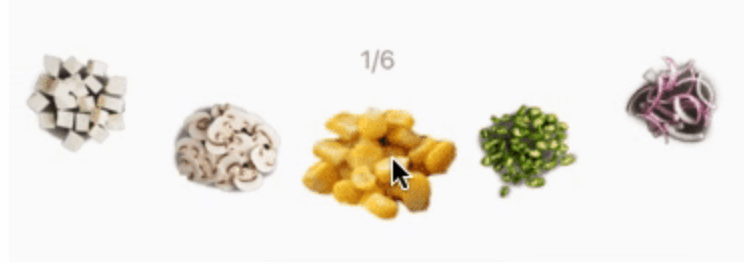
Curved Carousel





A Flutter package for easy implementation of curved carousel.
Easy to use
CurvedCarousel(
      itemBuilder: (context, i) {
        return Item(img: listItem[i].img, selectionChange: (bool){
          print('onTap:: ${listItem[i].name}')
        }, selected: listItem[i].selected,key: ValueKey(listItem[i].selected),);
      },
      itemCount: listItem.length,
      middleItemScaleRatio: 1.5,
)
Attributes
itemBuilder : builder function returns widget of given index
itemCount : total widgets
viewPortSize : how much size a single item will have, the fractional value lies between 0 and 1, 1 means full size
curveScale : it specifies curviness
disableInfiniteScrolling : by default, infinite scrolling is enable, but if you want to disable it make it true
scaleMiddleItem : scales middle item of carousel, by default it is true
middleItemScaleRatio : it is scaling parameter for middle item
tiltItemWithcurve : does the items angle need to be follow to curve, by default this is true
horizontalPadding : a padding to apply horizontally to the carousel, the default is no padding
animationDuration : a duration of the item change animation in milliseconds, the default value is 300
onChangeEnd : a function to trigger when the item change animation is done
onChangeStart : a function to trigger when the item change animation is start
moveAutomatically : allow to change the current selected item automatically, default is set to false.
automaticMoveDelay : the delay between automatic movements, default is 5000
reverseAutomaticMovement : reverse the direction of the automatic movement, default is false