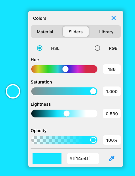
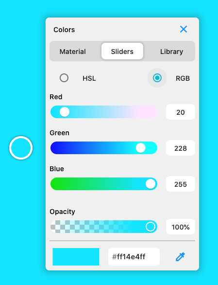
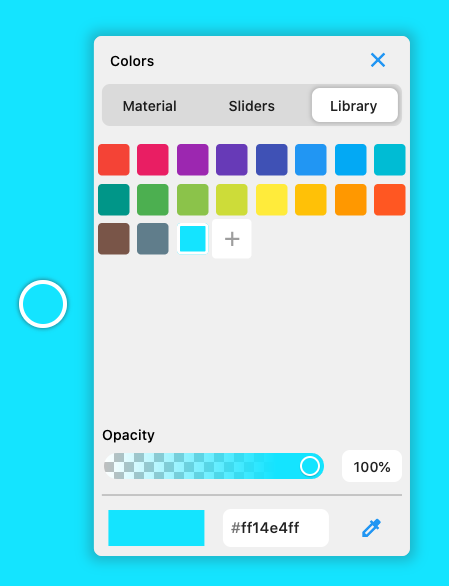
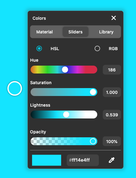
Cyclop 
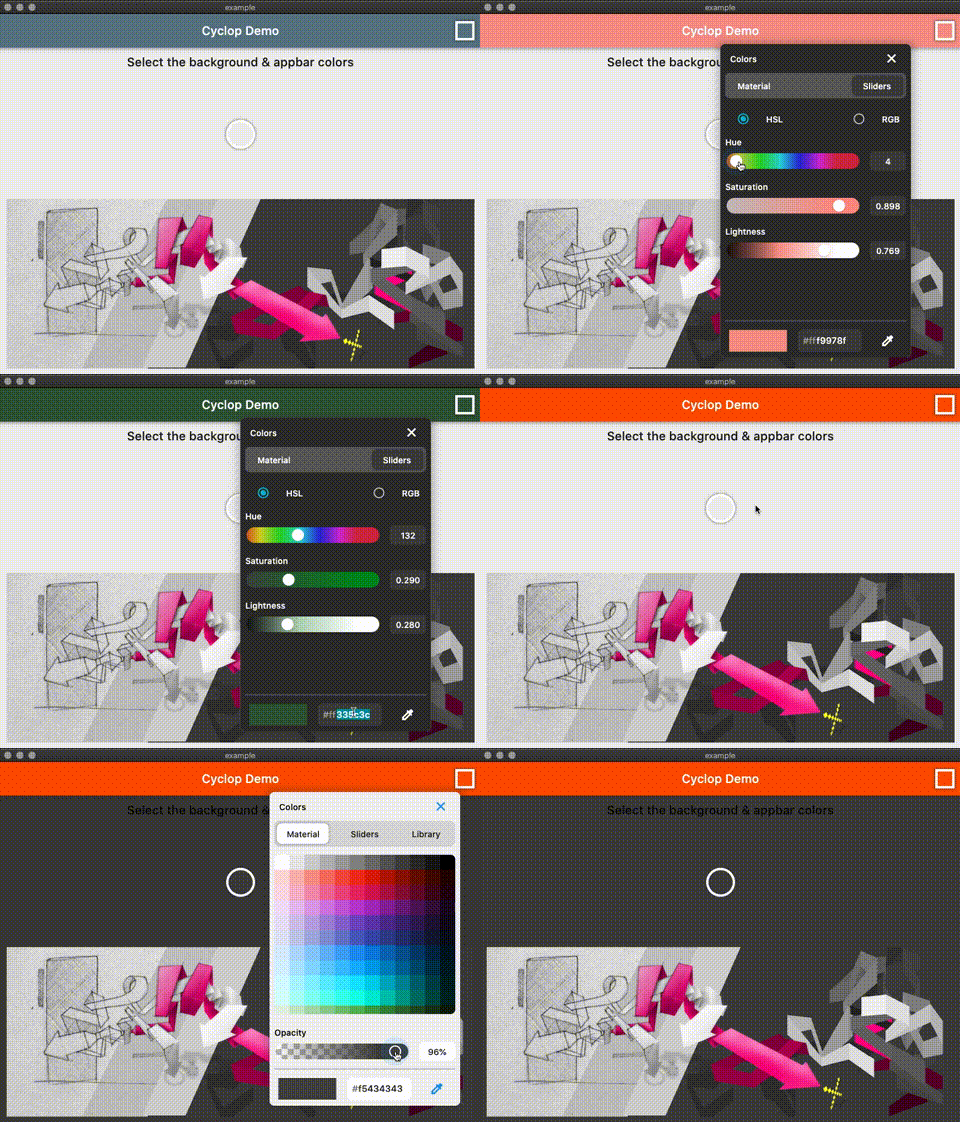
A flutter colorpicker with an eyedropper tool. Works on mobile, desktop & web ( CanvasKit)
Eyedropper
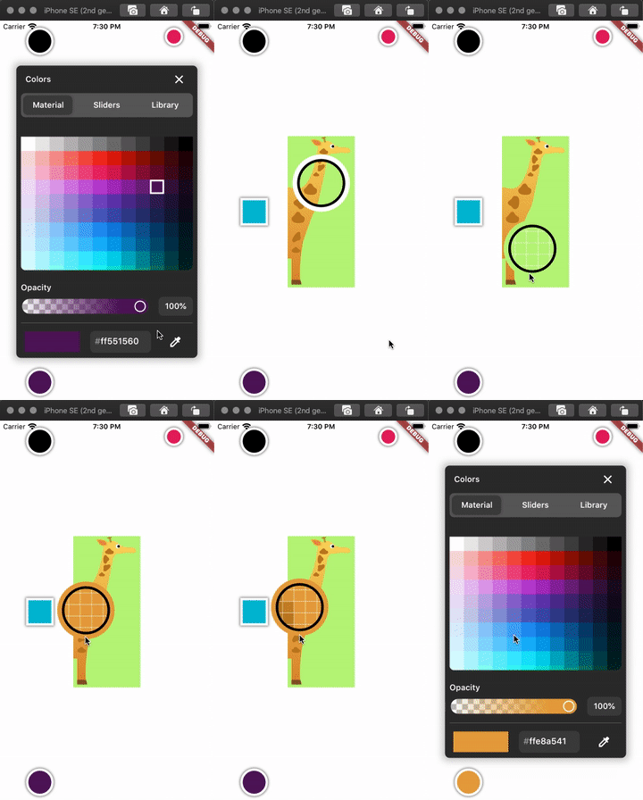
Select a color from your Flutter mobile or desktop screen.
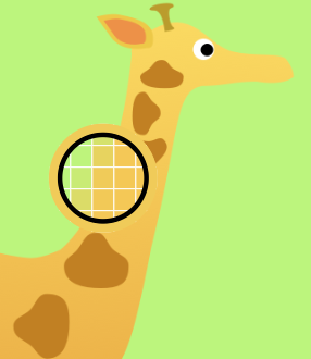
To use the eyedropper you need to wrap the app in the EyeDrop widget.
@override
Widget build(BuildContext context) {
return EyeDrop(
child: Builder(
builder: (context) => Scaffold(
backgroundColor: backgroundColor,
body: Container(
child: ColorButton(
key: Key('c1'),
color: color1,
config: ColorPickerConfig(enableEyePicker = true),
size: 32,
elevation: 5,
boxShape: BoxShape.rectangle,
swatches: swatches,
onColorChanged: (value) => setState(() => color1 = value),
),
),
),
),
);
}
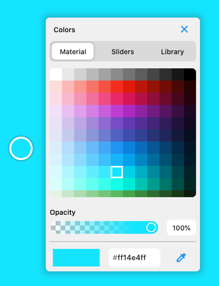
Customisable
- disable opacity slider
- disable eye dropping
- disable swatch library
- Circle or Square color buttons
ColorButton(
key: Key('c1'),
color: color1,
config: ColorPickerConfig(
this.enableOpacity = true,
this.enableLibrary = false,
this.enableEyePicker = true,
),
boxShape: BoxShape.rectangle,
size: 32,
swatches: swatches,
onColorChanged: (value) => setState( () => color1 = value ),
);
ColorButton(
key: Key('c2'),
color: color2,
config: ColorPickerConfig(enableEyePicker: false),
size: 64,
swatches: swatches,
onColorChanged: (value) => setState( () => color2 = value ),
onSwatchesChanged: (newSwatches) => setState(() => swatches = newSwatches),
);