Desktop

Minimal Desktop widgets for Flutter.
- Navigation
- Data
- List table
- Date form field
- Text form field
- Dialogs
- Dialog
- Message
- Tooltip
- Date picker
- Drawer
- Input
- Button
- Context menu
- Dropdown menu
- Hyperlink
- Slider
- Checkbox
- Radio
- Toggle switch
- Status
- Text
- Text field
- Selectable text
- Scrollbar
Gallery
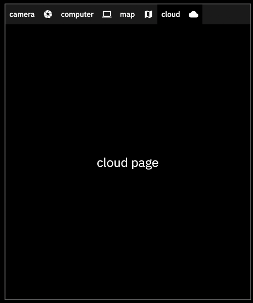
Navigation
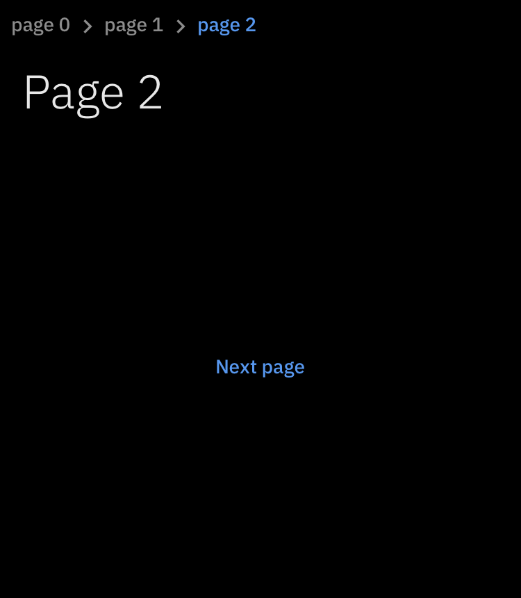
| Breadcrumb |
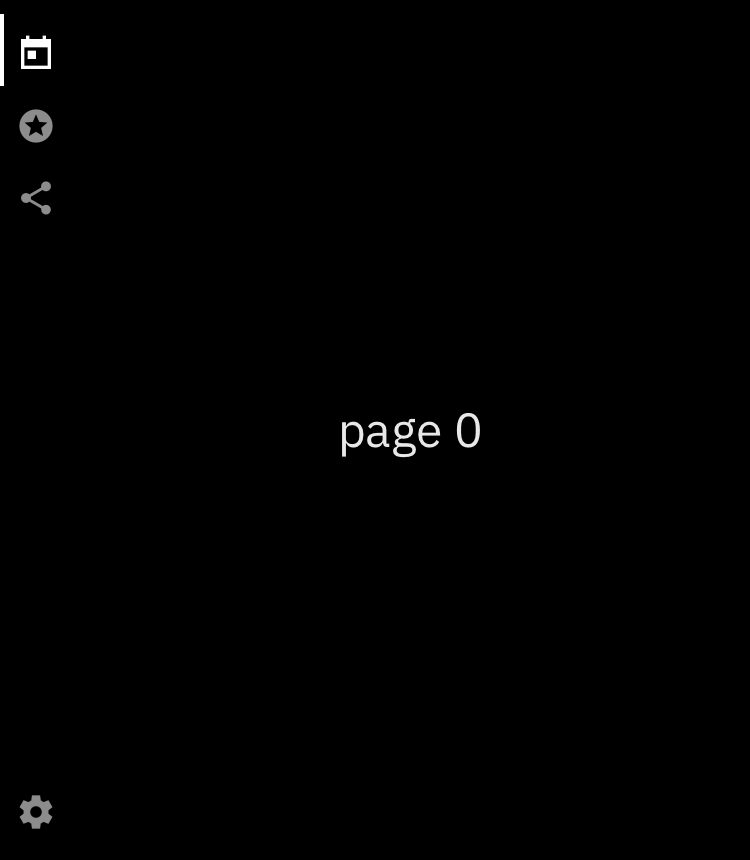
Nav |
 |
 |
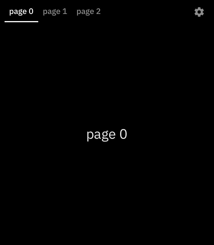
| Nav Horizontal |
Tree |
 |
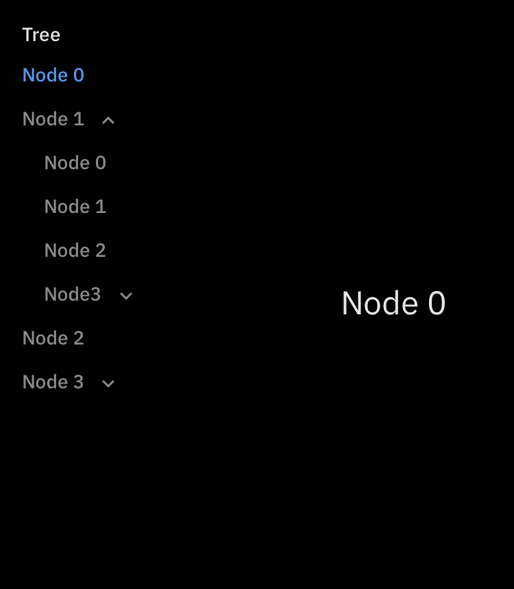 |
| Tab |
Custom Tab |
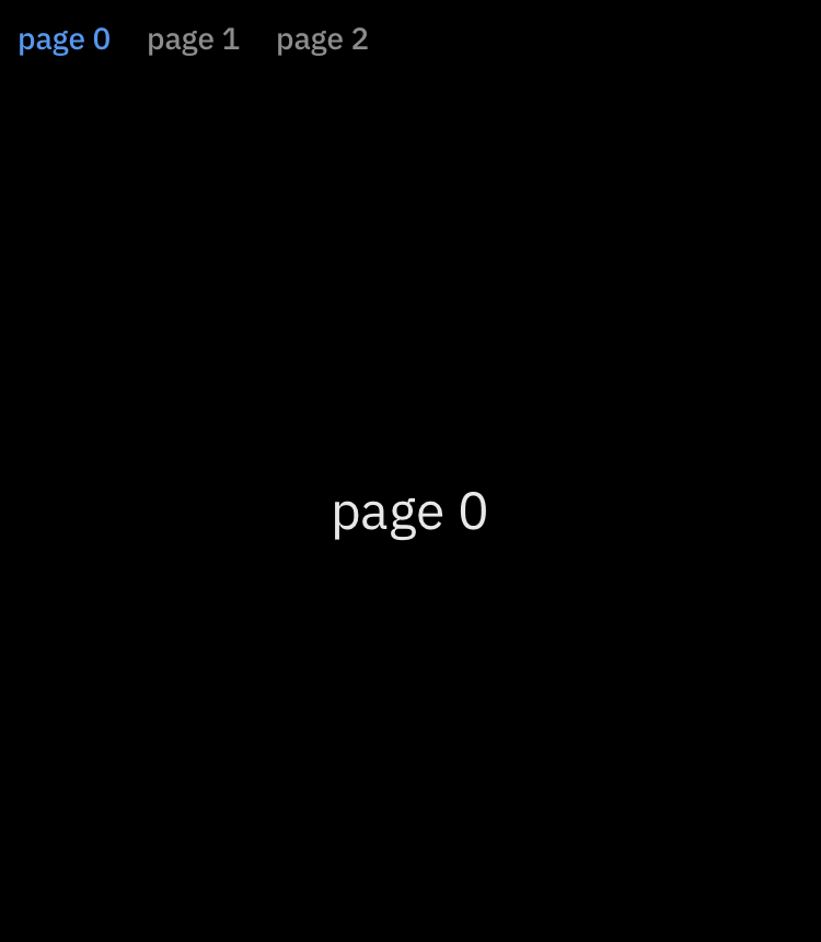 |
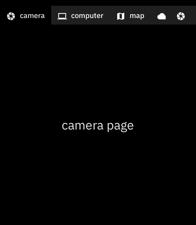 |
Data
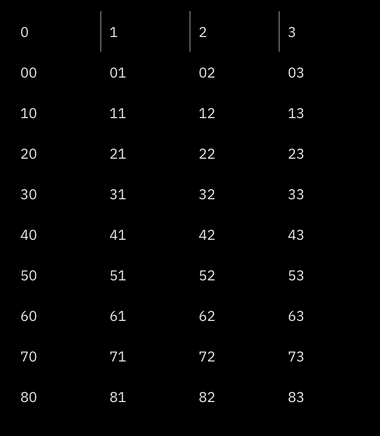
| List Table |
List Table Borderless |
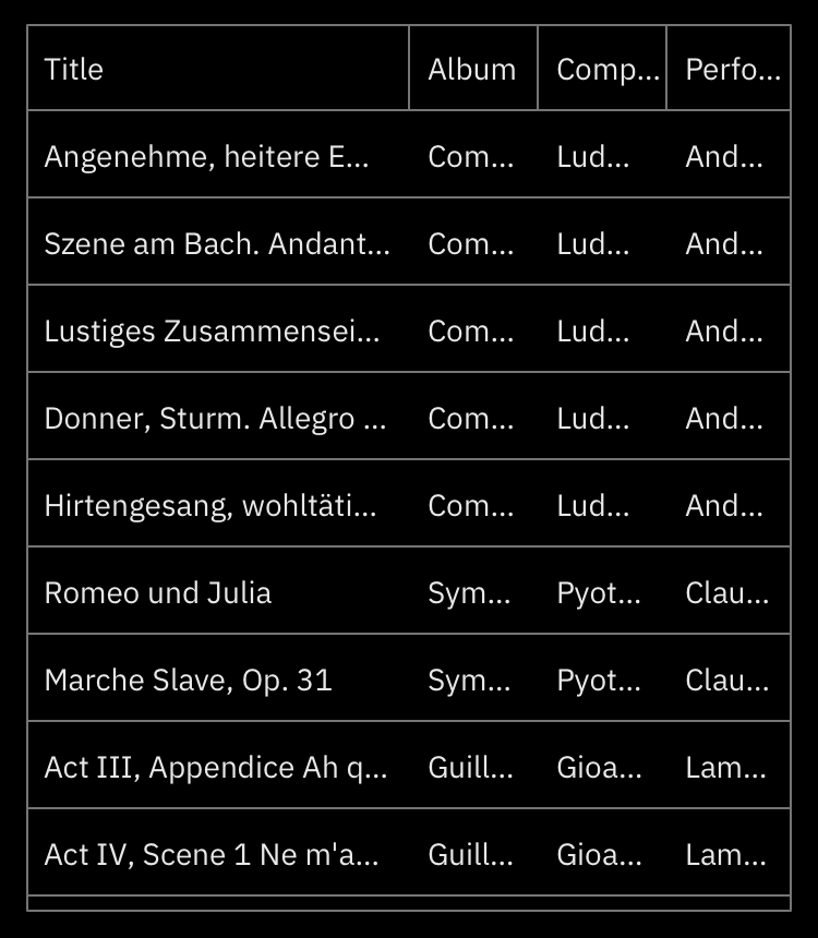 |
 |
| Text Form Field |
Date Form Field |
 |
 |
Dialogs
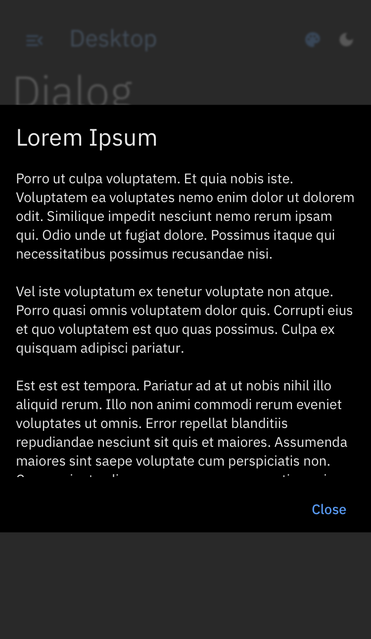
| Dialog |
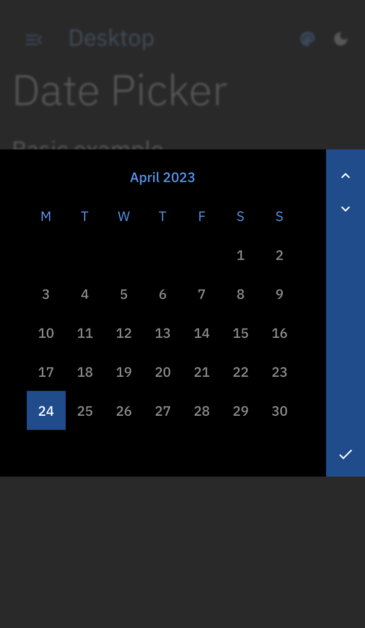
Date Picker |
 |
 |
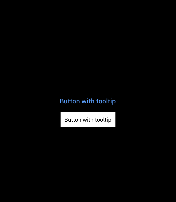
| Tooltip |
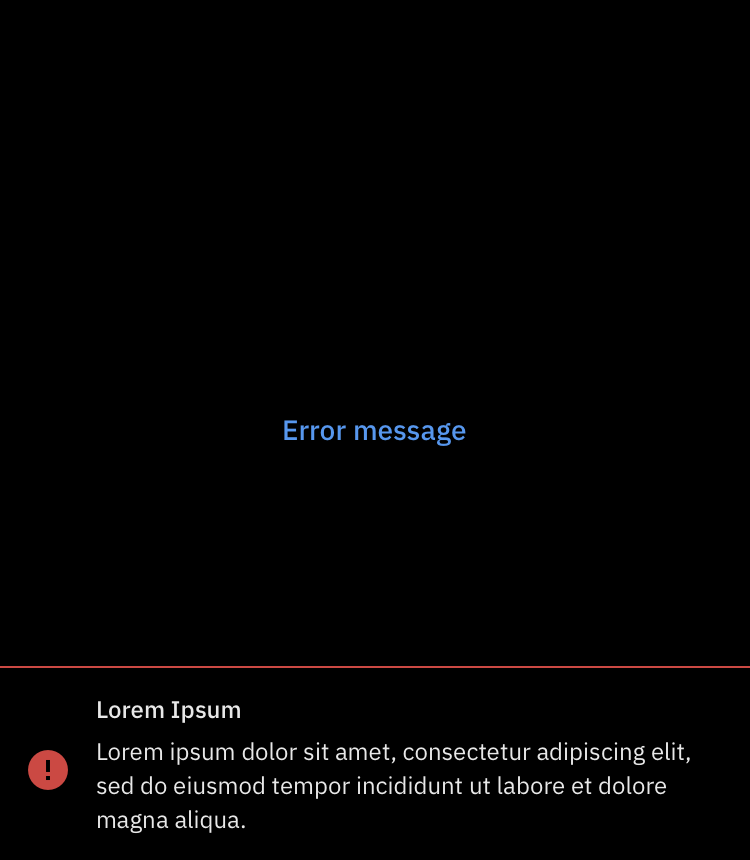
Message |
 |
 |
Input
| Button |
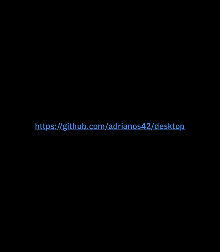
Hyperlink |
 |
 |
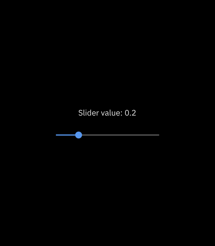
| Slider |
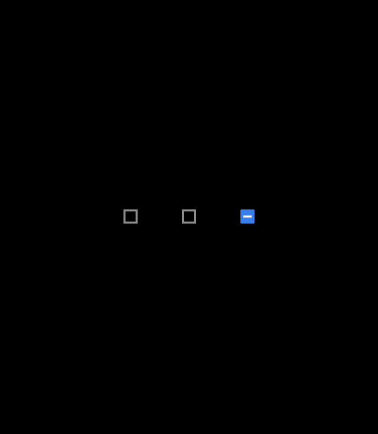
Checkbox |
 |
 |
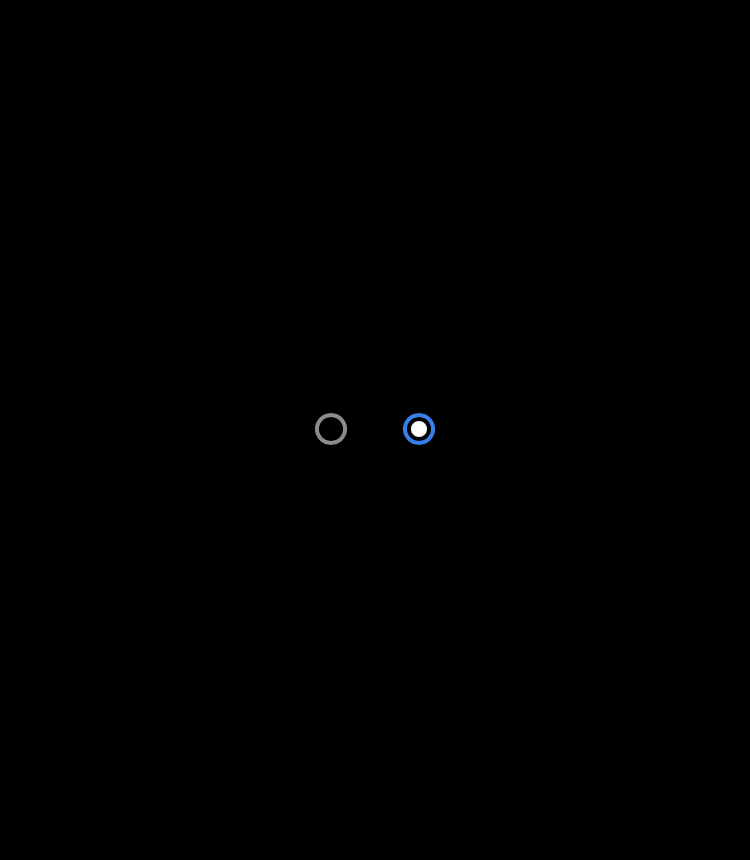
| Radio |
Toggle Switch |
 |
 |
Status
| Linear Progress Indicator |
Circular Progress Indicator |
 |
 |
See Gallery, for more examples.
Example
DesktopApp(
  theme: ThemeData(
    brightness: Brightness.dark,
    primaryColor: PrimaryColors.royalBlue.primaryColor,
  ),
  home: Nav(
    trailingMenu: [
      NavItem(
        title: 'settings',
        builder: (context) => NavDialog(
          child: Container(
            alignment: Alignment.center,
            padding: EdgeInsets.all(32.0),
            width: 600.0,
            child: Text(
              'Settings page',
              style: textTheme.subtitle,
            ),
          ),
        ),
        icon: Icons.settings,
      ),
    ],
    items: [
      NavItem(
        builder: (context) => Center(
            child: Text(
          'Home',
          style: textTheme.title,
        )),
        title: 'Home',
        icon: Icons.today,
      ),
      NavItem(
        builder: (context) => Center(
            child: Text(
          'Library',
          style: textTheme.title,
        )),
        title: 'Library',
        icon: Icons.today,
      ),
    ],
  ),
)
Project structure
desktop - The main package.docs - The folder with the html page built by the docs_web component.docs_web - The implementation of desktop documentation.