搜尋套件、儲存庫與 APP 分類

dialogs 封面
套件詳情v0.0.7

dialogs

此 Flutter 套件提供經過精心設計的對話方塊,並具備自訂選項。

AndroidiOSWebmacOSWindowsLinux
近 30 天下載
137
喜歡數
26
Pub 分數
130

安裝套件

flutter pub add dialogs

套件介紹

根據套件公開資料產生的選型評估,僅供參考。

dialogs 套件為 Flutter 應用程式提供一組美觀設計、可自訂的對話方塊元件。專注於細節與使用者體驗,提供跨平台的一致且現代化的對話方塊介面。開發者可輕鬆整合並調整對話方塊,以符合應用程式的設計語彙,支援樣式、動畫與行為的自訂選項。該套件支援 Android、iOS、Web、macOS、Windows 與 Linux,確保跨平台相容性。非常適合以精緻方式顯示警示、確認與自訂模態框。

適用情境

  • 顯示警告訊息
  • 處理使用者確認
  • 建立自定樣式對話方塊
  • 顯示載入指示器
  • 實現表單驗證反饋
  • 增強跨平台的UI一致性

主要特色

  • 美觀、現代的設計
  • 豐富的自訂選項
  • 跨平台支援
  • 與 Flutter 的輕鬆整合
  • 內建動畫
  • 響應式版面處理

適合對象

  • 尋求精緻對話方塊的Flutter開發人員
  • 需要在跨平台保持一致的使用者介面的應用程式
  • 強調使用者體驗的專案
  • 希望快速實現對話的開發者
  • 專注於設計一致性的團隊
  • 需要輕量級對話解決方案的應用程式

使用建議

  • 僅限對話組件
  • 自訂可能需要學習特定的 API
  • 不適合複雜的導航流程
  • 依賴於 Flutter 的 Material 或 Cupertino 主題
  • 可能需要額外的樣式來處理非標準用例
  • 無內建國際化支援

原始 README

以下為關聯原始碼儲存庫的 README 原文快照,最新內容請造訪原始碼儲存庫。

Dialogs - dialogs

This flutter package provides aesthetically designed dialog box with customization options.

Now comes with legacy_progress_dialog

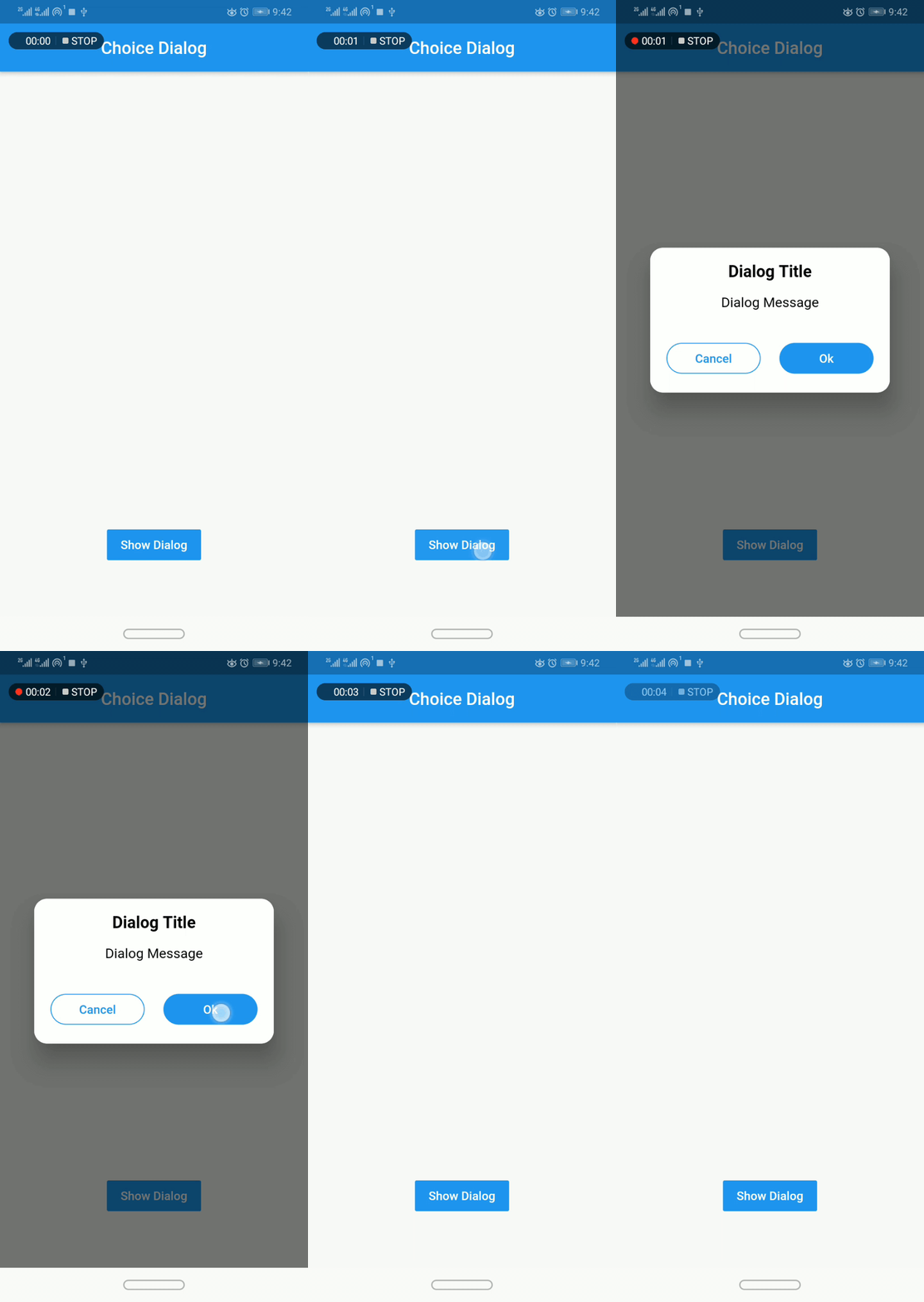
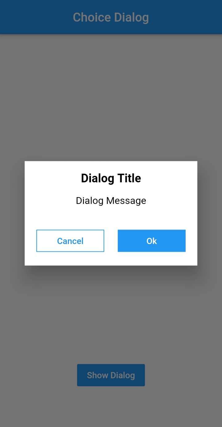
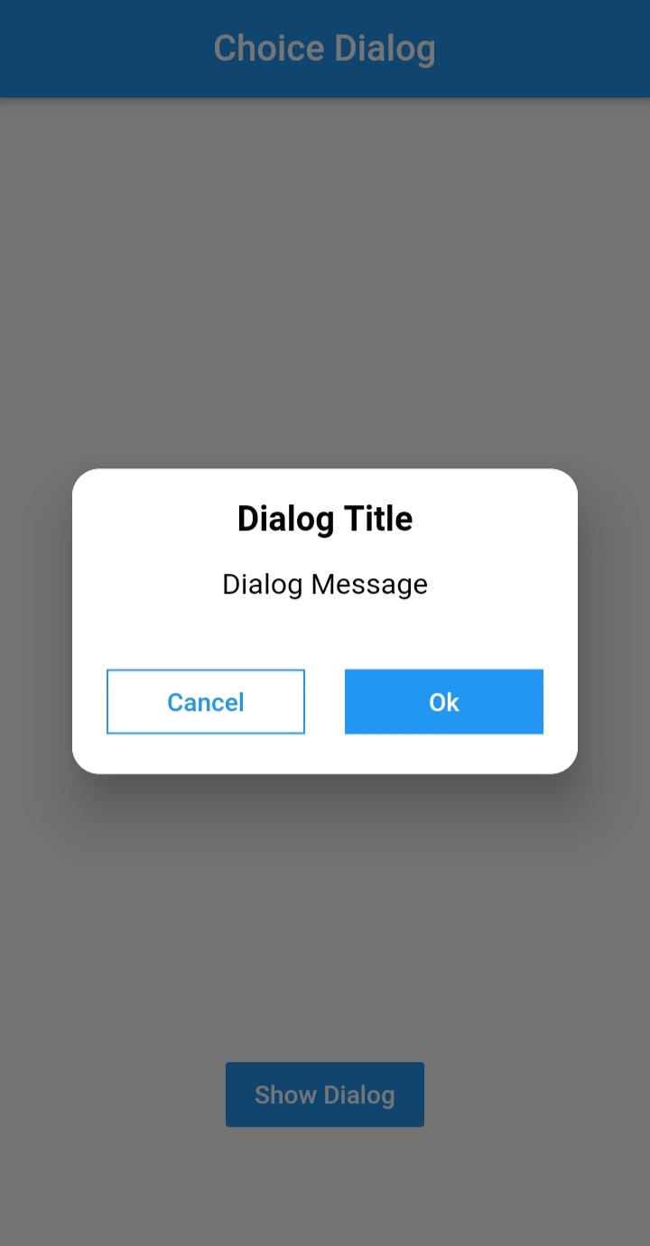
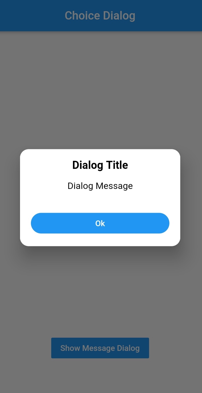
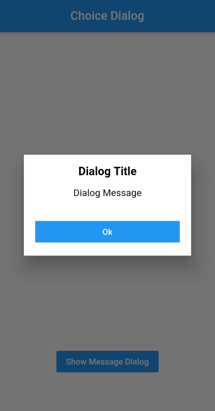
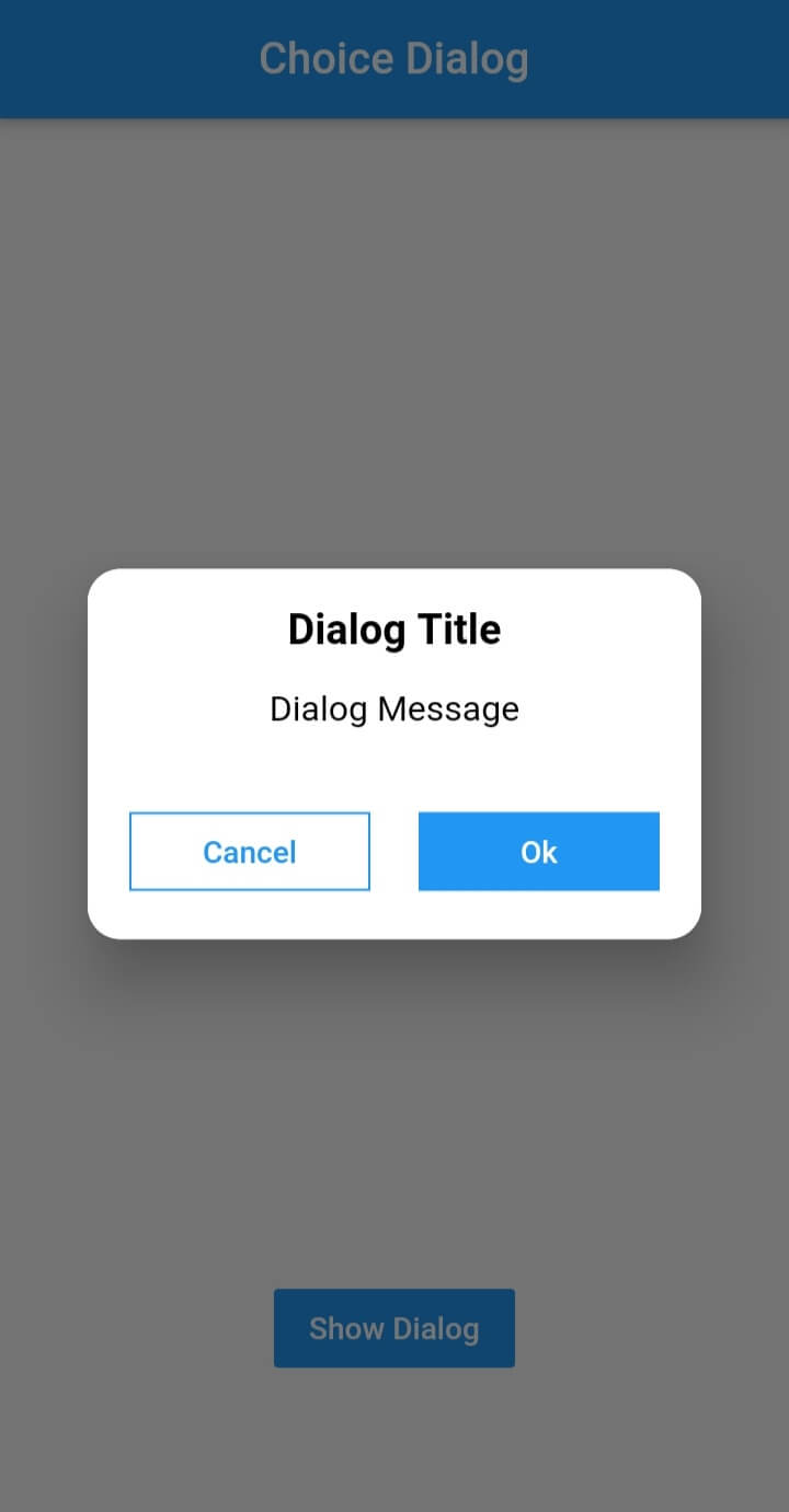
Choice Dialog

Choice Dialog Choice Dialog Rectangular Choice Dialog Rectangular Buttons

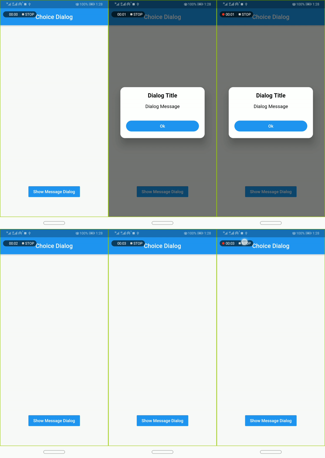
Message Dialog

Message Dialog Gif Message Dialog Message Dialog

Pub Version GitHub Workflow Status Github Stars GitHub

Simple Usage

To use this plugin, add dialogs as a dependency in your pubspec.yaml file.

Implementation:
  • import 'package:dialogs/dialogs.dart';
ChoiceDialog
  • use ChoiceDialog().show() function to display the dialog.

ChoiceDialog().show(context);

##OR


final choiceDialog = ChoiceDialog();
choiceDialog.show(context);

MessageDialog
  • use MessageDialog().show() function and call the Choice Dialog .

MessageDialog().show(context);

OR


final messageDialog = MessageDialog();
choiceDialog.show(context);

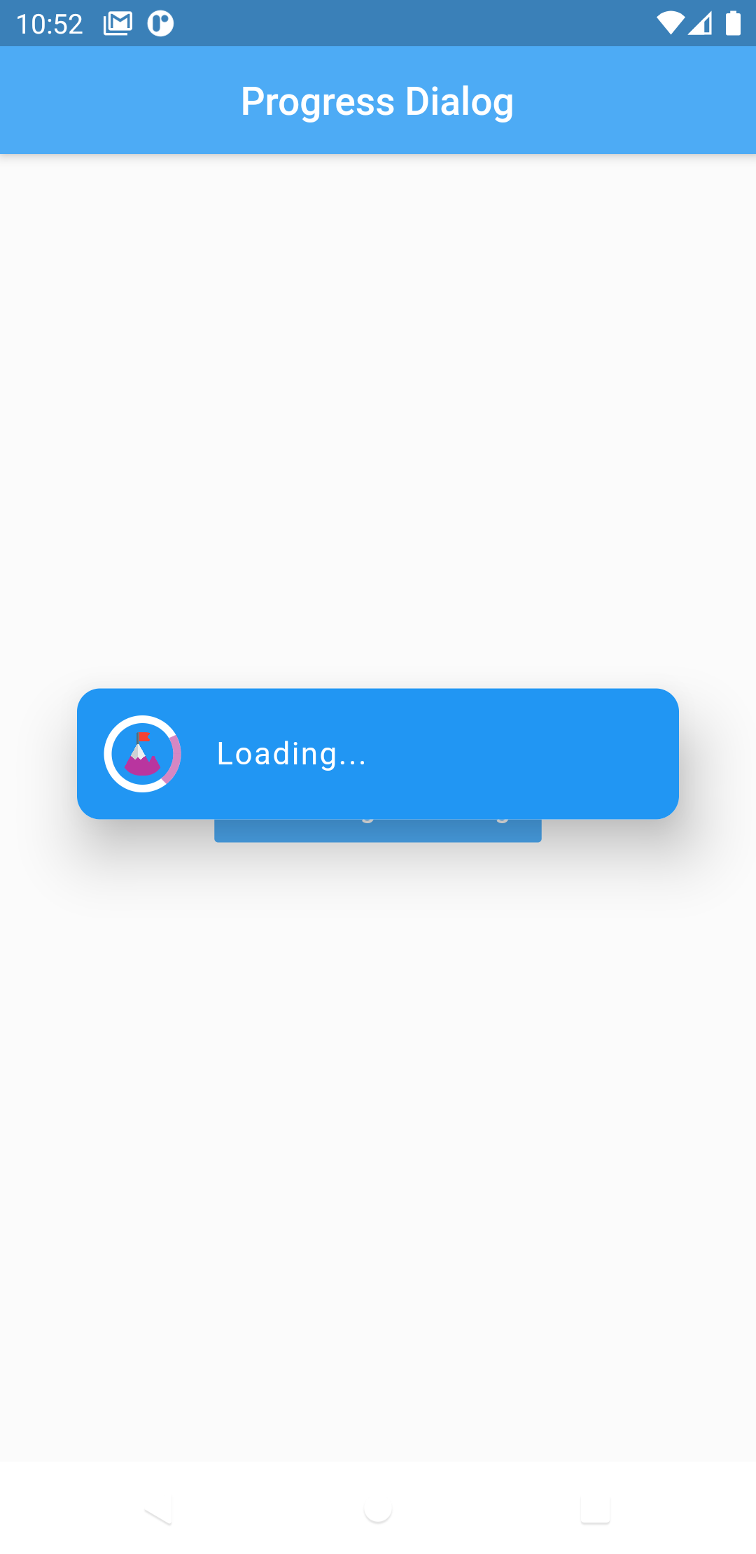
Show progress dialog :
//Create an instance of ProgressDialog
ProgressDialog progressDialog = ProgressDialog(
                  context: context,
                  backgroundColor: Colors.blue,
                  textColor: Colors.White,
                );
// show dialog
progressDialog.show();

//close dialog
progressDialog.dismiss();

You are good to go 💯


In order to add the ChoiceDialog, MessageDialog to your app, there are several attributes that are important parameters that you might need frequently:

Attribute Type Default Required Description
buttonOkOnPressed Function() Navigator.pop(context) No This function will be registered as the callback of 'Ok' button.
buttonCancelOnPressed Function() Navigator.pop(context) No This function will be registered as the callback of 'Cancel' button.
dialogRadius double 15.0 No Determines the borderRadius of dialog box.
buttonRadius double 18.0 No Determines the borderRadius of action buttons.
iconButtonOk Icon null No Renders a FlatButton with the provided icon for positive action.
iconButtonCancel Icon null No Renders a FlatButton with the provided icon for negative action.


show() also provides some useful parameters of showDialog() function

Attribute Type Default Required Description
context BuildContext Null Yes The context argument is used to look up the Navigator and Theme for the dialog.
barrierDismissible bool true No Indicates whether tapping on the barrier will dismiss the dialog.
barrierColor Color Colors.black54 No Specifies the color of the modal barrier that darkens everything below the dialog.

CREDITS

Contributors

Made with contributors-img.

所屬分類

原始碼儲存庫

使用此套件的專案

暫無相關資料。