搜尋套件、儲存庫與 APP 分類

dotted_decoration 封面
套件詳情v3.0.0

dotted_decoration

虛線裝飾是一個方便的套件,用於繪製虛線分隔線、矩形、圓形或圓角矩形的虛線邊框。

AndroidiOSWebmacOSWindowsLinux
近 30 天下載
10.5萬
喜歡數
156
Pub 分數
150

安裝套件

flutter pub add dotted_decoration

套件介紹

根據套件公開資料產生的選型評估,僅供參考。

dotted_decoration 套件為 Flutter 應用程式提供了一種簡單且彈性的方法來建立虛線與邊框。它讓開發者能夠繪製虛線分隔線,以及在矩形、圓形或圓角矩形周圍繪製邊框,支援自訂點的大小、間距與顏色。非常適合用於分隔線、輪廓或裝飾性強調等 UI 元素,無需複雜的自定繪圖即可提升視覺設計。此套件輕量級,並相容於所有主要平台,包含 Android、iOS、Web、macOS、Windows 與 Linux。

適用情境

  • 在列表中創建虛線分隔符
  • 向卡片或容器添加虛線邊框
  • 設計圓形或圓點輪廓
  • 增強表單欄位樣式
  • 建構自定義 UI 分隔符
  • 添加裝飾性線條圖案

主要特色

  • 易用的虛線裝飾類
  • 支援矩形、圓形和圓角矩形
  • 可自訂的點大小與間距
  • 可設定的顏色與筆畫寬度
  • 跨平台相容性
  • 輕量且依賴極少

適合對象

  • 尋求裝飾性元素的UI設計師
  • 開發表單或清單的開發者
  • 需要視覺分離或強調的應用
  • 具有一致設計系統的專案
  • Flutter 初學者探索自訂裝飾

使用建議

  • 僅限基本的點狀圖案
  • 不支援虛線或自訂描邊樣式
  • 可能需要手動對齊以實現精確佈局
  • 不適合高性能量化動畫
  • 最適合靜態或低頻率渲染

原始 README

以下為關聯原始碼儲存庫的 README 原文快照,最新內容請造訪原始碼儲存庫。

dotted_decoration

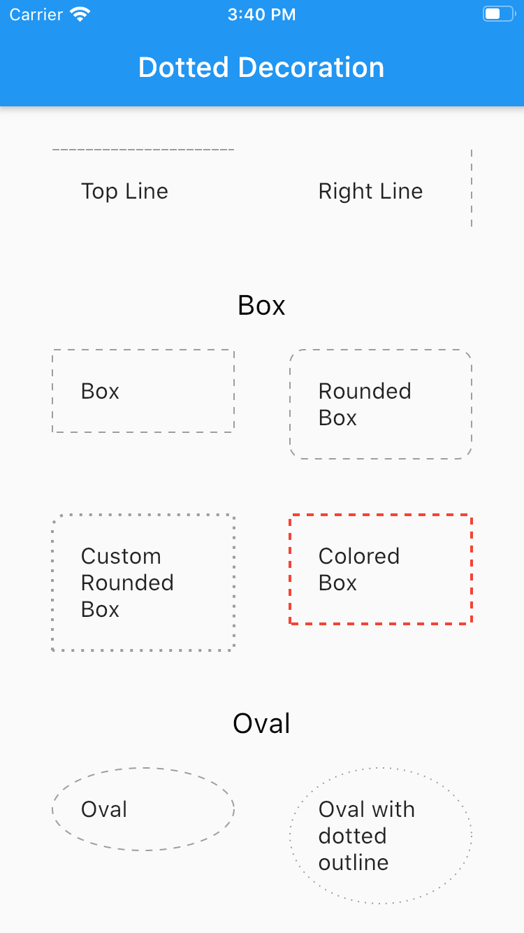
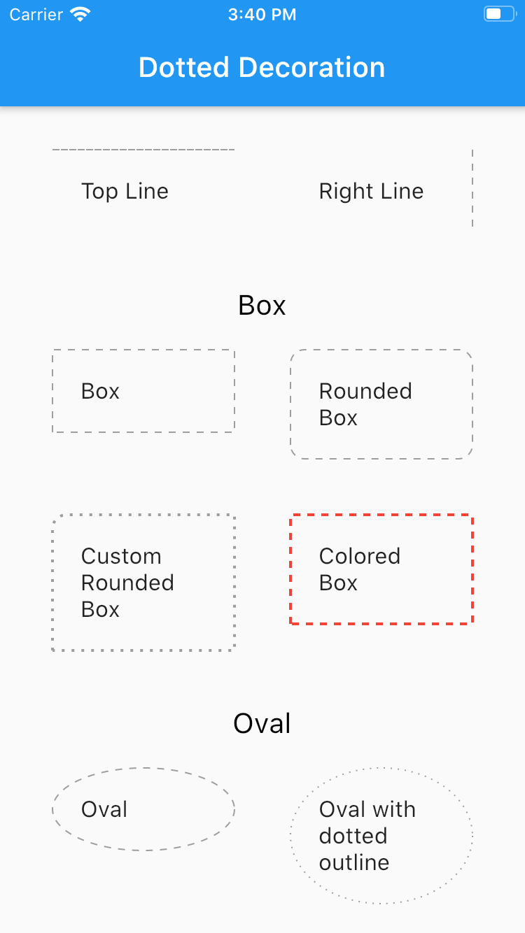
Dotted line decoration is custom decoration as simple as BoxDocoration can be used in Container widget to draw dotted divider, dotted border for rectangle, oval or circle.

Preview

Flutter Dotted Decoration screenshot

Installing

To use this package, add dotted_decoration as a dependency in your pubspec.yaml file.

Usage

Create a container widget and assign DottedDecoration as decoration

Container(
    decoration: DottedDecoration()
    child: Text('Dotted Decoration')
)
Container(
    decoration: DottedDecoration()
    child: Text('Dotted Decoration')
)

To draw line

DottedDecoration(
  shape: Shape.line, linePosition: LinePosition.bottom),

To add rounded rection

DottedDecoration(
  shape: Shape.box,
  borderRadius: BorderRadius.circular(10), //remove this to get plane rectange
),

To add circle

//make sure width & height of container is same to get perfect circle or else it will end up in oval
DottedDecoration(shape: Shape.circle, dash: <int>[1, 4]);

Parameters

Shape

Kind of outline shape, default shape is Shape.line.

shape: Shape.line shape: Shape.box shape: Shape.oval

linePosition

Where line is located, default shape is LinePosition.bottom.

linePosition: LinePosition.bottom linePosition: LinePosition.left linePosition: LinePosition.right linePosition: LinePosition.top

dash

Border line order, first in dash and second is space.

dash: <int>[2, 5]

strokeWidth

Line width.

strokeWidth: 2

color

Color of line, default shape is Colors.grey.

color: Colors.red

所屬分類

原始碼儲存庫

使用此套件的專案