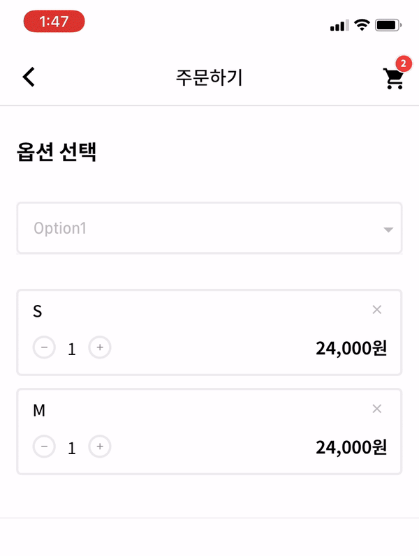
Flutter Dropdown_Below
A Flutter Dropdown library which is customize flutter dropdownbutton widget.


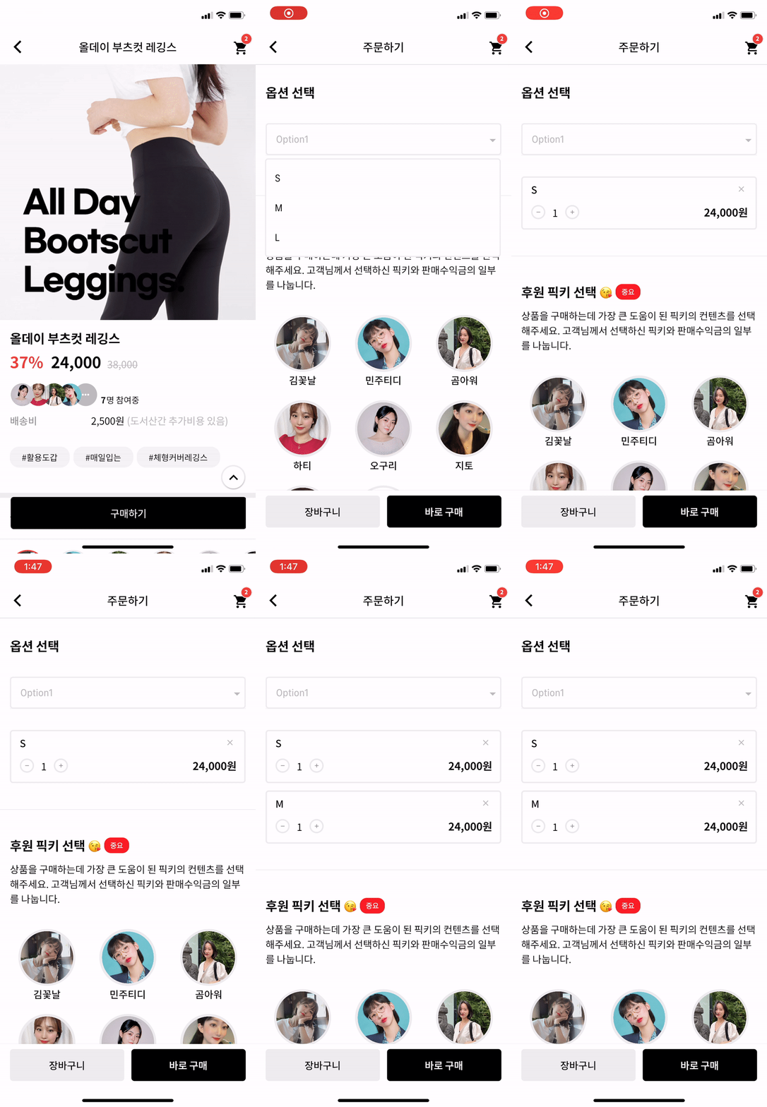
Options
| options |
description |
type |
required |
| itemWidth |
dropdown item's box width |
double |
X |
| itemTextstyle |
dropdown item's text style |
double |
X |
| boxTextstyle |
seletced box text style |
TextStyle |
X |
| boxPadding |
seletced box inner padding |
EdgeInsetsGeometry |
X |
| boxHeight |
seletced box height |
double |
X |
| boxWidth |
seletced box width |
double |
X |
| hint |
text before you choose item |
Widget |
X |
| value |
selected item |
T |
X |
| boxDecoration |
box's border, borderRadius, color |
BoxDecoration |
X |
| icon |
widget which is right beside |
Widget |
X |
| items |
itemsList |
List<DropdownMenuItem> |
O |
| onChange |
change item function |
ValueChanged |
O |
How to make it Work?
Description for example.
1. datas
_testList's type is always be a list.
If you want to use map or other type, you can customize this package.
  List _testList = [{'no': 1, 'keyword': 'blue'},{'no': 2, 'keyword': 'black'},{'no': 3, 'keyword': 'red'}];
  List<DropdownMenuItem> _dropdownTestItems;
  var _selectedTest;
2. initState & build items to correct type
If you want to customize item's child widget ex) Text -> Container, You can change any widget you want.
  @override
  void initState() {
    _dropdownTestItems = buildDropdownTestItems(_testList);
    super.initState();
  }

  List<DropdownMenuItem> buildDropdownTestItems(List _testList) {
    List<DropdownMenuItem> items = List();
    for (var i in _testList) {
      items.add(
        DropdownMenuItem(
          value: i,
          child: Text(i['keyword']),
        ),
      );
    }
    return items;
  }
3. change function
  onChangeDropdownTests(selectedTest) {
    print(selectedTest);
    setState(() {
      _selectedTest = selectedTest;
    });
  }
4. UI
Dropdown Widget.
    DropdownBelow(
      itemWidth: 200,
      itemTextstyle: TextStyle(fontSize: 14, fontWeight: FontWeight.w400, color: Colors.black),
      boxTextstyle: TextStyle(fontSize: 14, fontWeight: FontWeight.w400, color: Color(0XFFbbbbbb)),
      boxPadding: EdgeInsets.fromLTRB(13, 12, 0, 12),
      boxHeight: 45,
      boxWidth: 200,
      hint: Text('choose item'),
      value: _selectedTest,
      items: _dropdownTestItems,
      onChanged: onChangeDropdownTests,
    ),
5. Question
IF you want to make itemBox dropdown when you enter the page?
Put this code to initState like this.
Timer(Duration(milliseconds: 200), () {
    CustomDropdownButtonState state = dropdownKey1.currentState;
    state.callTap();
});
And put key to Widget like this.
DropdownBelow(
  key: dropdownKey1,
  itemWidth: 200,
  itemTextstyle: TextStyle(fontSize: 14, fontWeight: FontWeight.w400, color: Colors.black),
  boxTextstyle: TextStyle(fontSize: 14, fontWeight: FontWeight.w400, color: Color(0XFFbbbbbb)),
  boxPadding: EdgeInsets.fromLTRB(13, 12, 0, 12),
  boxHeight: 45,
  boxWidth: 200,
  hint: Text('choose item'),
  value: _selectedTest,
  items: _dropdownTestItems,
  onChanged: onChangeDropdownTests,
)
Actually, dropdown widget is made by Navigation. So, it can work.