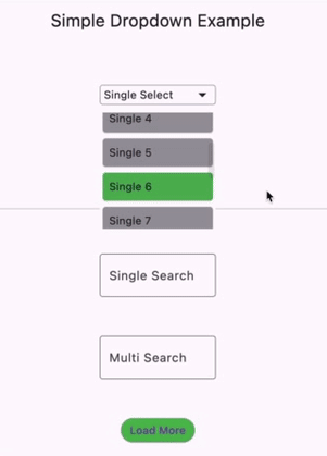
/// The widget that will be used to trigger the dropdown./// It can be a button, a text field, or any other widget.////// if [enabled] is true, the widget will be interactive automatically to open and dismiss the dropdown menu/// when tapping inside/outside of the dropdown button/trigger;////// otherwise, you need to call [DropdownController.open] and [DropdownController.dismiss] manually.finalWidgetBuilder builder;
/// The controller that will be used to manage the dropdown menu and items.////// See also:/// * [DropdownController.single]/// * [DropdownController.multi]finalDropdownController<T> controller;
/// Delegate that will be used to build the dropdown menu.////// See also:/// * [ListViewMenuBuilderDelegate]/// * [CustomMenuBuilderDelegate]finalDropdownMenuBuilderDelegate<T> delegate;
/// The decoration that will be used to decorate the dropdown menu./// It only takes effect when the menu is displaying.////// See also:/// * [OverlayedDropdownMenu], the dropdown menu widget used to display the items.finalBoxDecoration? menuDecoration;
/// The constraints that will be used to constrain the dropdown menu./// It only takes effect when the menu is displaying./// It will work with [crossAxisConstrained] to constrain the dropdown menu if applicable.finalBoxConstraints? menuConstraints;
/// The position that will be used to position the dropdown menu.////// See also/// * [DropdownMenuPosition]finalDropdownMenuPosition menuPosition;
/// Whether the dropdown menu should be constrained by the cross axis of the dropdown trigger./// It will work with [menuConstraints] to constrain the dropdown menu if applicable./// It only takes effect when the menu is displaying.////// Typically, it is specific if the dropdown menu should have the same width as the dropdown trigger.finalbool crossAxisConstrained;
/// Whether the dropdown menu should be dismissed when the user taps outside of both it and the dropdown button.finalbool dismissible;
/// if true, the dropdown will be interactive automatically;/// otherwise, you need to call [DropdownController.open] and [DropdownController.dismiss] manually.finalbool enabled;
/// Whether the dropdown button/trigger built from [builder] should listen to the controller./// As a result, the button [builder] will be rebuilt when [DropdownController] changes, like selected itemsfinalbool enableListen;
SimpleDropdown.list
SimpleDropdown.list({
super.key,
requiredthis.builder,
requiredthis.controller,
this.menuConstraints,
this.menuDecoration,
this.enableListen = true,
this.menuPosition = constDropdownMenuPosition(),
this.crossAxisConstrained = true,
this.dismissible = true,
this.enabled = true,
/// The builder that will be used to build the items in the dropdown menu.requiredMenuItemBuilder<T> itemBuilder,
/// The builder that will be used to build the separator in the dropdown menu./// it would use [LiveView.separated] internally to build the dropdown menu if provided.IndexedWidgetBuilder? separatorBuilder,
/// The builder that will be used to build the loading indicator in the dropdown menu./// Default to a [CircularProgressIndicator] if not provided.WidgetBuilder? loadingBuilder,
/// The builder that will be used to build the empty list indicator in the dropdown menu./// Default to Text("No items") if not provided.WidgetBuilder? emptyListBuilder,
}) : delegate = ListViewMenuBuilderDelegate<T>(
itemBuilder: itemBuilder,
position: menuPosition,
separatorBuilder: separatorBuilder,
loadingBuilder: loadingBuilder,
emptyListBuilder: emptyListBuilder,
);
SimpleDropdown.custom
SimpleDropdown.custom({
super.key,
requiredthis.builder,
requiredthis.controller,
/// The builder that will be used to build the dropdown menu.requiredDropdownMenuBuilder<T> menuBuilder,
this.menuConstraints,
this.menuDecoration,
this.enableListen = true,
this.menuPosition = constDropdownMenuPosition(),
this.crossAxisConstrained = true,
this.dismissible = true,
this.enabled = true,
}) : delegate = CustomMenuBuilderDelegate<T>(menuBuilder);
DropdownController
Single Selection
/// A single selection dropdown controller.////// [unselectable] indicates whether the selected item can be unselected,/// if true, either tapping the same selected item or [select] null item will unselect it;/// otherwise, it will be ignored.////// Only one item can be selected at a time.factoryDropdownController.single({
// Default is false.bool? unselectable,
/// The initial items that will be shown in the dropdown menu,/// but you can only set one of them as selected.List<DropdownItem<T>>? items,
}) = SingleSelectionDropdownController;
Multiple Selection
/// A multiple selection dropdown controller.////// [unselectable] indicates whether the selected item can be unselected,/// if true, tapping the same selected item will unselect it;/// otherwise, it will be ignored.factoryDropdownController.multi({
// Default is false.bool? unselectable,
/// The initial items that will be shown in the dropdown menu,/// you can set multiple of them as selected.List<DropdownItem<T>>? items,
}) = MultiSelectionDropdownController;
Methods
void open({VoidCallback? onOpened}): open the dropdown menu
void dismiss({VoidCallback? onDismissed}): dismiss the dropdown menu
void rebuildMenu() : refresh the dropdown menu if it is opened
void dispose(): dispose the controller
void select(T? value, {bool dismiss = true, bool refresh = true}): mark the item's as selected
dismiss: whether to dismiss the dropdown menu no matter if the value is selected or not
refresh: whether to refresh the dropdown menu after the value is selected
DropdownItem<T>? getLastSelected(): get the last selected item
for single selection, it always returns the current selected item
for multiple selection, it returns the last selected item
List<DropdownItem<T>> getAllSelectedItems(): get all selected items
for single selection, it always returns the current selected item
for multiple selection, it returns all selected items
Future<void> load(DropdownItemLoader<T> loader, {bool replace = false, bool Function(Object)? onException}): load items from the loader
replace: whether to replace the current items with the loaded items. If not, the loaded items will be appended to the current items.
onException: a callback to handle the exception thrown by the loader
void search<K extends Object>(K query, {required DropdownItemMatcher<K, T> matcher}): search the items by the query
matcher: a function to match the query with each item.
void setItems(List<DropdownItem<T>> items, {bool replace = false, bool rebuild = true}): set the items to the controller
replace: whether to replace the current items with the new items.
If not, the new items will be appended to the current items.
If yes, the controller would clear internal state and reinitialize itself with the new items.
rebuild: whether to rebuild the dropdown menu after the items are set.
void setAsHistoryItems(Object key, List<DropdownItem<T>> items,{bool rebuild = false}): set the items as an history entry and place it on the top of the history entries, like search history
key: the key to identify the history items
rebuild: whether to rebuild the dropdown menu after the items are set.
void restore({bool onlyOnce = false}): restore the initial and loaded items.
onlyOnce: if true, only pop the top history entry; otherwise, it will clear all history entries to show the initial and loaded items.