搜尋套件、儲存庫與 APP 分類

dropdown_textfield 封面
套件詳情v1.2.0

dropdown_textfield

下拉文字框是一種材質設計的文字框。下拉按鈕是一個我們可以用來從一組值中選擇一個唯一值或多個值的組件。

AndroidiOSWebmacOSWindowsLinux
近 30 天下載
5950
喜歡數
181
Pub 分數
140

安裝套件

flutter pub add dropdown_textfield

套件介紹

根據套件公開資料產生的選型評估,僅供參考。

DropdownTextfield 是一個 Flutter 套件,結合了 TextField 與 DropdownButton,讓使用者能在材質設計介面中從清單中選擇一個或多個值。它透過在文字輸入欄位內提供直覺的下拉選取體驗來增強表單輸入。此組件支援單一與多值選取,適用於動態資料輸入情境。它在所有主要平台(包含 Android、iOS、Web、macOS、Windows 及 Linux)皆相容。

適用情境

  • 具有可選選項的表單輸入
  • 表單中的多選下拉選單
  • 符合材質設計規範的選項欄位
  • 動態資料過濾
  • 使用者友善的值選擇介面

主要特色

  • 單值與多值選擇
  • 材質設計整合
  • 跨平台相容性
  • 可自定義的下拉項目
  • 與現有表單的輕鬆整合

適合對象

  • 開發表單密集型應用的開發者
  • 尋求符合材質設計規範的組件之設計師
  • 需要靈活選擇輸入的應用
  • 跨平台 Flutter 項目
  • 需要下拉功能的UI組件

使用建議

  • 需要適當的狀態管理來支援多選
  • 可能需要針對自訂主題進行樣式調整
  • 限於預定義的值集
  • 不適合非常大的資料集
  • 依賴於父組件的佈局約束

原始 README

以下為關聯原始碼儲存庫的 README 原文快照,最新內容請造訪原始碼儲存庫。

Flutter DropdownTextfield

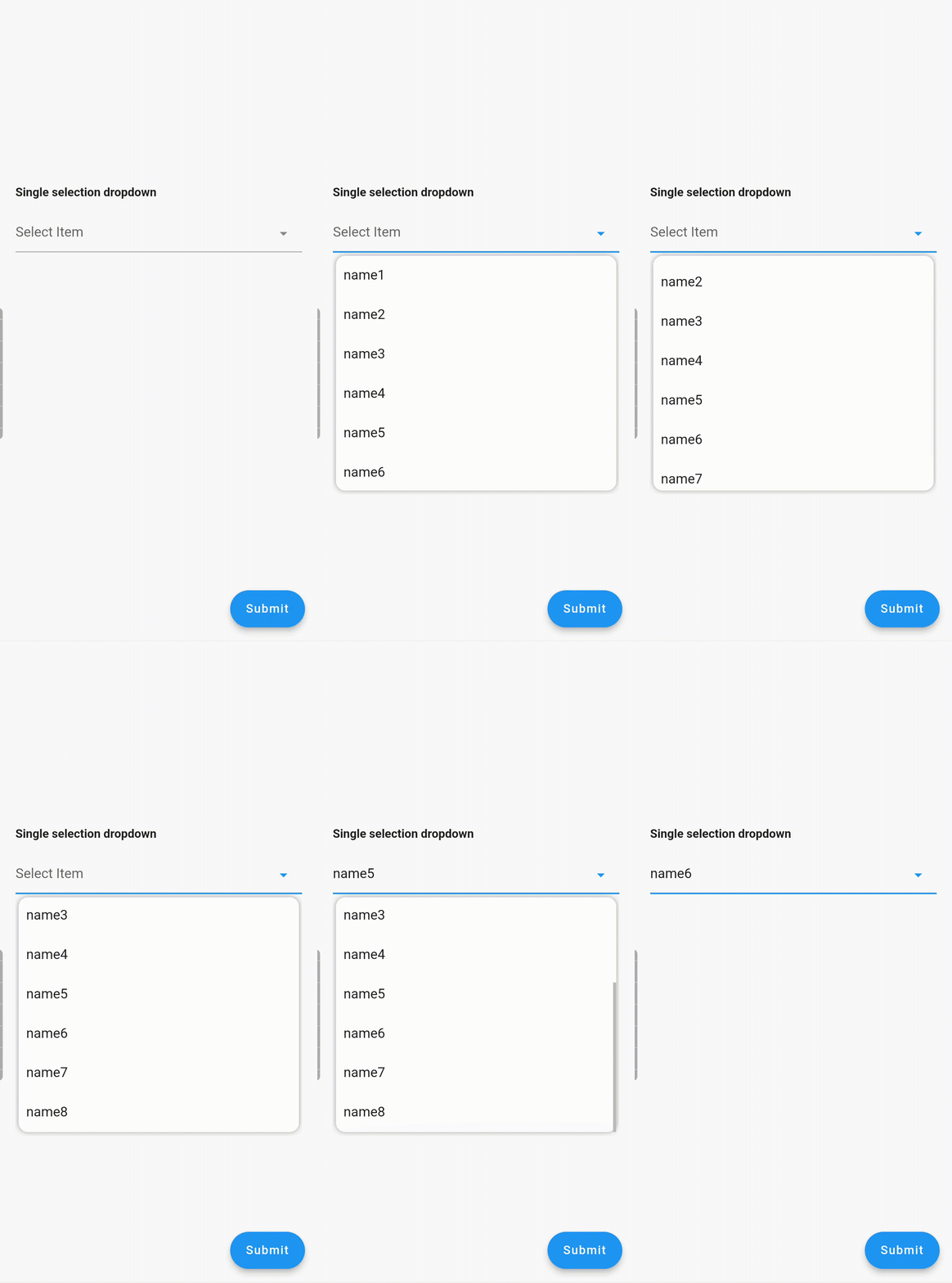
A DropdownTextfield is a Material Design TextField. The DropDownButton is a widget that can be used to select one unique value or multiple values from a set of options.

Key Features

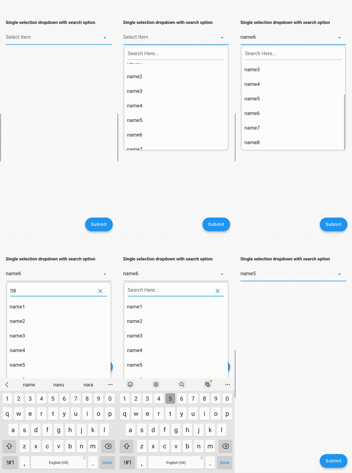
  1. Searchable dropdown
  2. Single & multi-selection
  3. Material dropdown
  4. Easily customizable UI
  5. Easy implementation into StatelessWidget
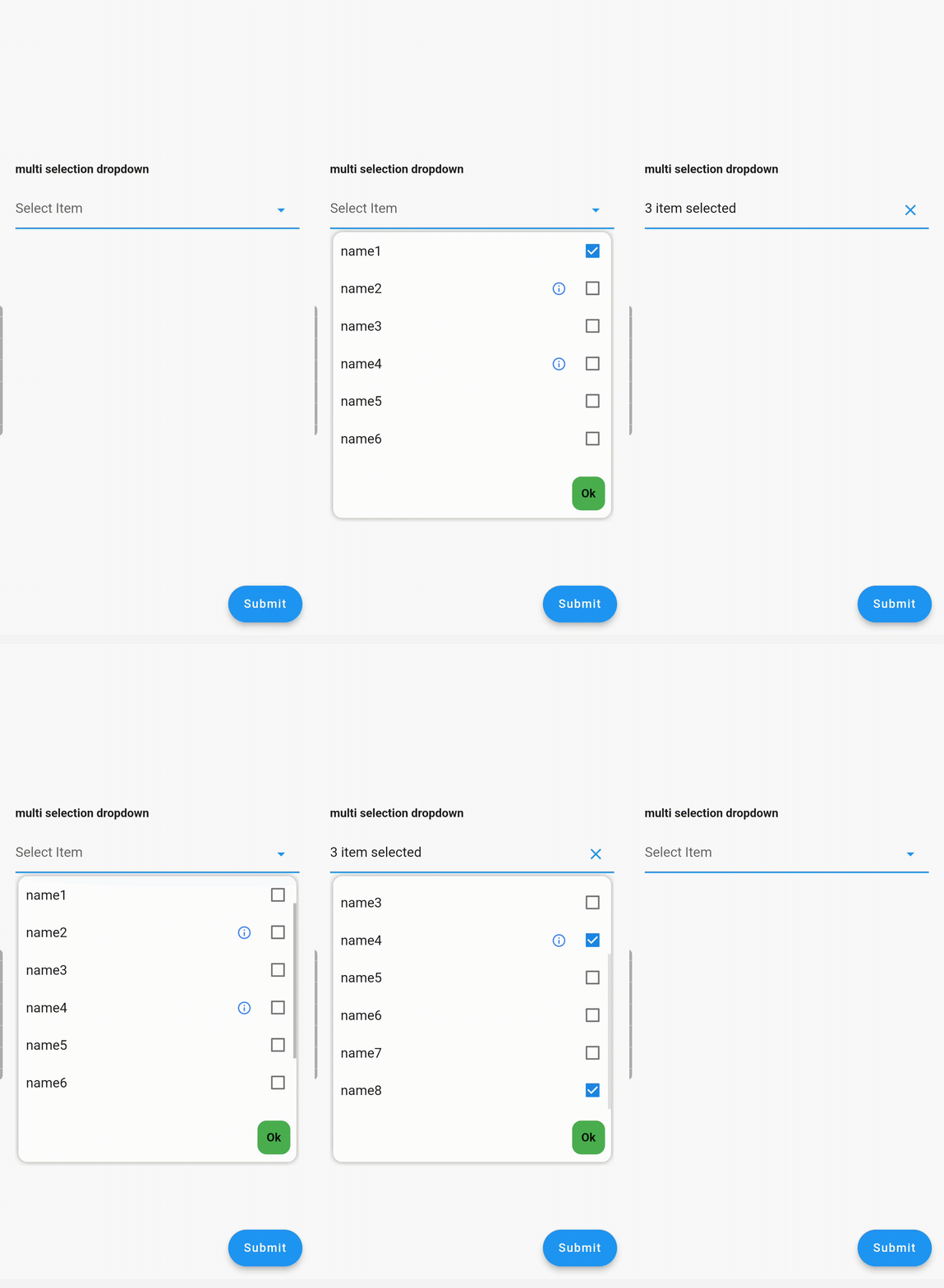
  6. ToolTip dialogue for multi-selection dropdown items

Examples

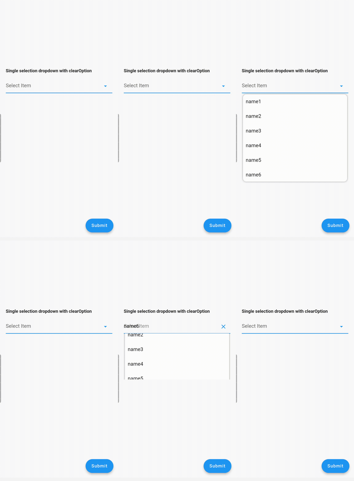
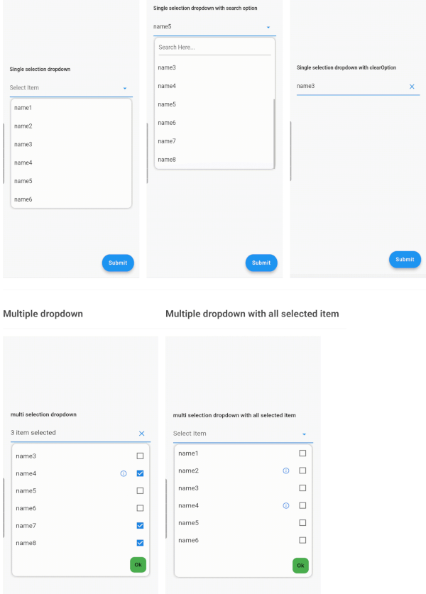
Single Dropdown Single Dropdown with Search Option Single Dropdown with Clear Option
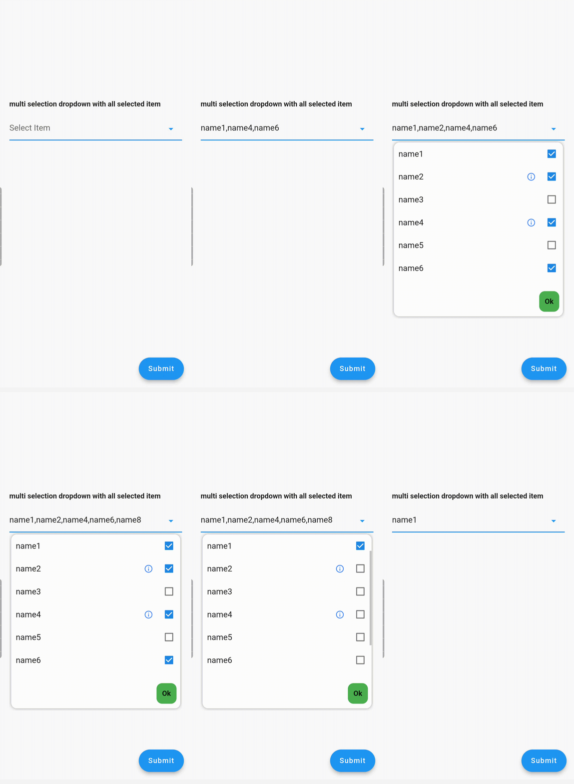
Multiple Dropdown Multiple Dropdown with All Selected Items

Usage

Controllers

You need to use SingleValueDropDownController for single dropdown and MultiValueDropDownController for multiple dropdown.

Properties
  • dropdownRadius: Defines the radius of the dropdown list. Default value is 12.
  • boxDecoration: Add custom BoxDecoration to decorate the dropdown container styling
  • boxMargin: Add custom margins to the dropdown container and override the default vertical: 5, horizontal: 4 margins
  • initialValue: Sets the initial value. If null or not in the dropDownList, it will not display any value.
  • dropDownList: A list of dropdown values of type <DropDownValueModel>.
  • onChanged: Listens for item selection changes. Returns a single DropDownValueModel object for single selection dropdown, and a list of DropDownValueModel objects for multi-selection dropdown.
  • textFieldDecoration: Overrides the default text field decoration.
  • dropDownIconProperty: Customizes the dropdown icon size and color.
  • isEnabled: Set to false to disable the text field. Default value is true.
  • enableSearch: Set to true to enable the search option in the dropdown. Currently available only for single selection dropdown.
  • displayCompleteItem: Set to true to display the complete list of selected items in the text field. Otherwise, it will display as "number_of_items selected".
  • dropDownItemCount: Maximum number of dropdown items to display. Default value is 6.
  • searchKeyboardType: Overrides the default search keyboard type. Applicable only if enableSearch=true.
  • searchTextStyle: Text style for the search text field.
  • searchAutofocus: Set to true to autofocus the search text field. Applicable only if enableSearch=true. Default value is false.
  • searchShowCursor: Set to false to hide the cursor from the search text field. Applicable only if enableSearch=true.
  • clearOption: Set to false to hide the clear suffix icon button from the text field.
  • clearIconProperty: Customizes the clear icon size and color.
  • listSpace: Space between the text field and the list. Default value is 0.
  • listPadding: Padding for dropdown list items.
  • submitButtonText: Text for the multi-dropdown submit button.
  • submitButtonColor: Color of the multi-dropdown submit button.
  • submitButtonTextStyle: Text style for the multi-dropdown submit button.
  • listTextStyle: Text style for dropdown list items.
  • checkBoxProperty: Customizes the properties of multiple checkboxes.

Contributing

Seeking contributions to improve the DropdownTextfield! If you have ideas for new features, optimizations, or bug fixes, please feel free to open a pull request or issue on our GitHub repository. Your contributions are greatly appreciated and will help make this package even better.

所屬分類

依賴

依賴清單 2 項

原始碼儲存庫

使用此套件的專案

暫無相關資料。