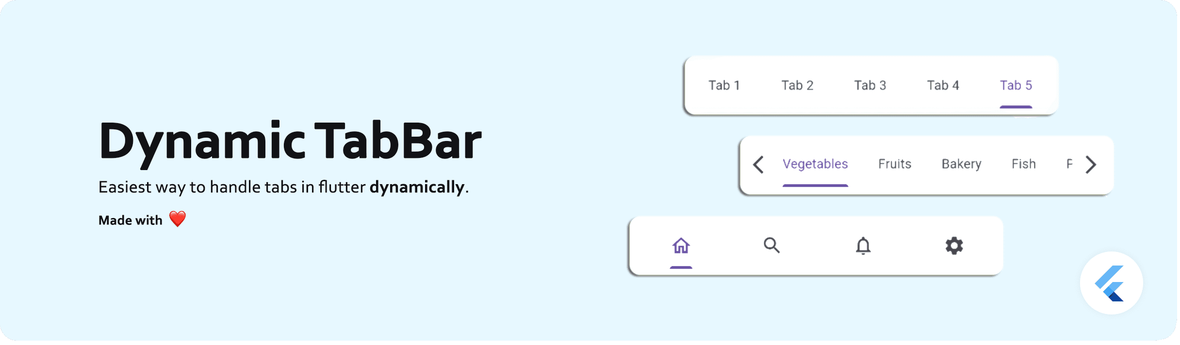
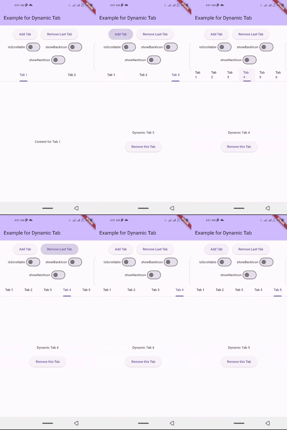
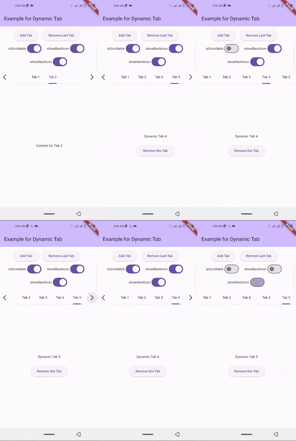
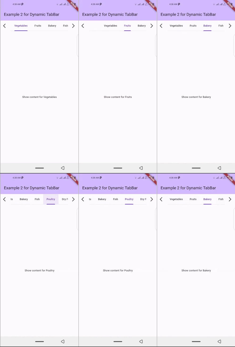
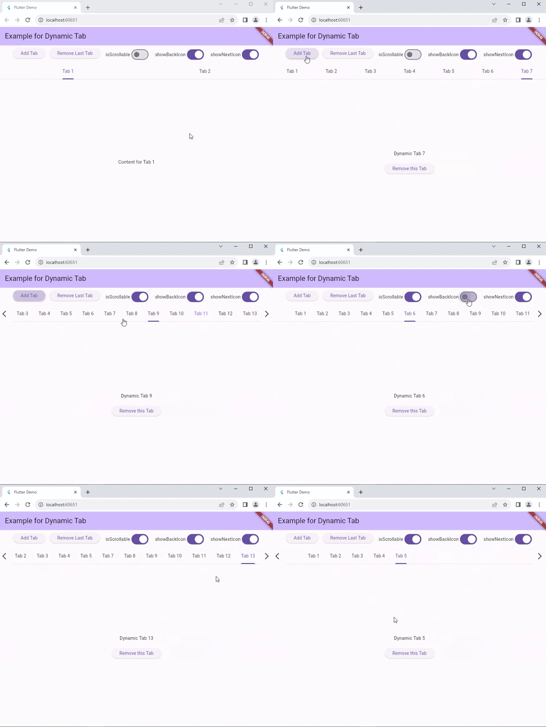
A Flutter package that simplifies the implementation of dynamic TabBar in your application.
With DynamicTabBarWidget, users can effortlessly manage and navigate through a list of Tabs. The widget is designed to auto-update as Tabs are added or removed, providing a seamless and dynamic user experience.
Dynamic Tab Management: Users can push or pop items in the List<TabData> tabs array, and the DynamicTabBarWidget will auto-update accordingly.
Tab Navigation: Implement the onTabChanged callback to handle tab change events.
Customization Options: Customize the appearance and behavior of the DynamicTabBarWidget using parameters like backIcon, nextIcon, showBackIcon, and showNextIcon.
Tab Position : Specify the position to which cursor moves to after adding new Tab using the onAddTabMoveTo property.
🧰 Parameters
dynamicTabs: List of TabData objects representing the dynamic tabs.
isScrollable: Set to true to enable scrollable tabs.
onTabChanged: Callback function triggered when a tab is changed.
onAddTabMoveTo: Enum value (MoveToTab.idol, MoveToTab.last) specifying where a tab navigator should move when Tab is added.
backIcon: Custom icon for the "Back" button, If isScrollable is false, this property is ignored.
nextIcon: Custom icon for the "Next" button.
showBackIcon: Boolean to show or hide the Back icon button, If isScrollable is false, this property is ignored.
showNextIcon: Boolean to show or hide the Next icon button, If isScrollable is false, this property is ignored.
leading: Custom leading Widget if needed.
trailing: Custom trailing Widget if needed.
TabBar default properties...
and TabBarView default properties...
📚 How to use
isScrollable
isScrollable: false
isScrollable: true
showBackIcon
If isScrollable is false, this property is ignored.
showBackIcon: false
showBackIcon: true
showNextIcon
If isScrollable is false, this property is ignored.
showNextIcon: false
showNextIcon: true
backIcon
We can use custom Icon for back button, If isScrollable is false, this property is ignored.
backIcon: Icon()
backIcon: null
Icon(Icons.keyboard_double_arrow_left)
Default back icon will be used
nextIcon
We can use custom Icon for next button, If isScrollable is false, this property is ignored.
nextIcon: Icon()
nextIcon: null
Icon(Icons.keyboard_double_arrow_right)
Default back icon will be used
💻 Example
Check out the example app in the example directory for a complete example with additional parameters.