搜尋套件、儲存庫與 APP 分類

套件詳情v0.0.2

easy_dashboard

一個用來輕鬆建立儀表板佈局及其他導航功能的套件。目標是讓響應式儀表板的製作變得簡單。

AndroidiOSLinuxmacOSWebWindows
近 30 天下載
84
喜歡數
51
Pub 分數
150

安裝套件

flutter pub add easy_dashboard

套件介紹

根據套件公開資料產生的選型評估,僅供參考。

Easy Dashboard 是一個 Flutter 套件,專為簡化響應式儀表板佈局與導航介面的建立而設計。它透過內建的響應式設計模式支援,讓開發者能快速構建可在行動裝置、網頁與桌面端順暢運作的自適應 UI。此套件著重於減少重複程式碼,並提升開發複雜儀表板系統時的生產力。

適用情境

  • 建構管理面板
  • 建立響應式資料儀表板
  • 設計多螢幕導航
  • 開發跨平台監控應用
  • 基於佈局的儀表板實作

主要特色

  • 響應式版面支援
  • 內建的導航工具
  • 跨平台相容性
  • 所需的最小設定
  • Flexible widget 組合

適合對象

  • Flutter 開發人員建構管理介面
  • 需要快速儀表板原型設計的團隊
  • 需要在各種設備上實現響應式UI的專案
  • 專注於UI一致性的開發人員
  • 具有複雜導航結構的應用程式

使用建議

  • 可能需要針對高度獨特的版面進行自訂
  • 除了基本範例外,文件內容有限
  • 最適合標準儀表板模式
  • 不適合非儀表板介面
  • 依賴於 Flutter 的渲染效能

原始 README

以下為關聯原始碼儲存庫的 README 原文快照,最新內容請造訪原始碼儲存庫。

Easy Dashboard

Pub

easy dashboard

Provides an easy way to build dashboard layout for your app , but still yet very customizable .

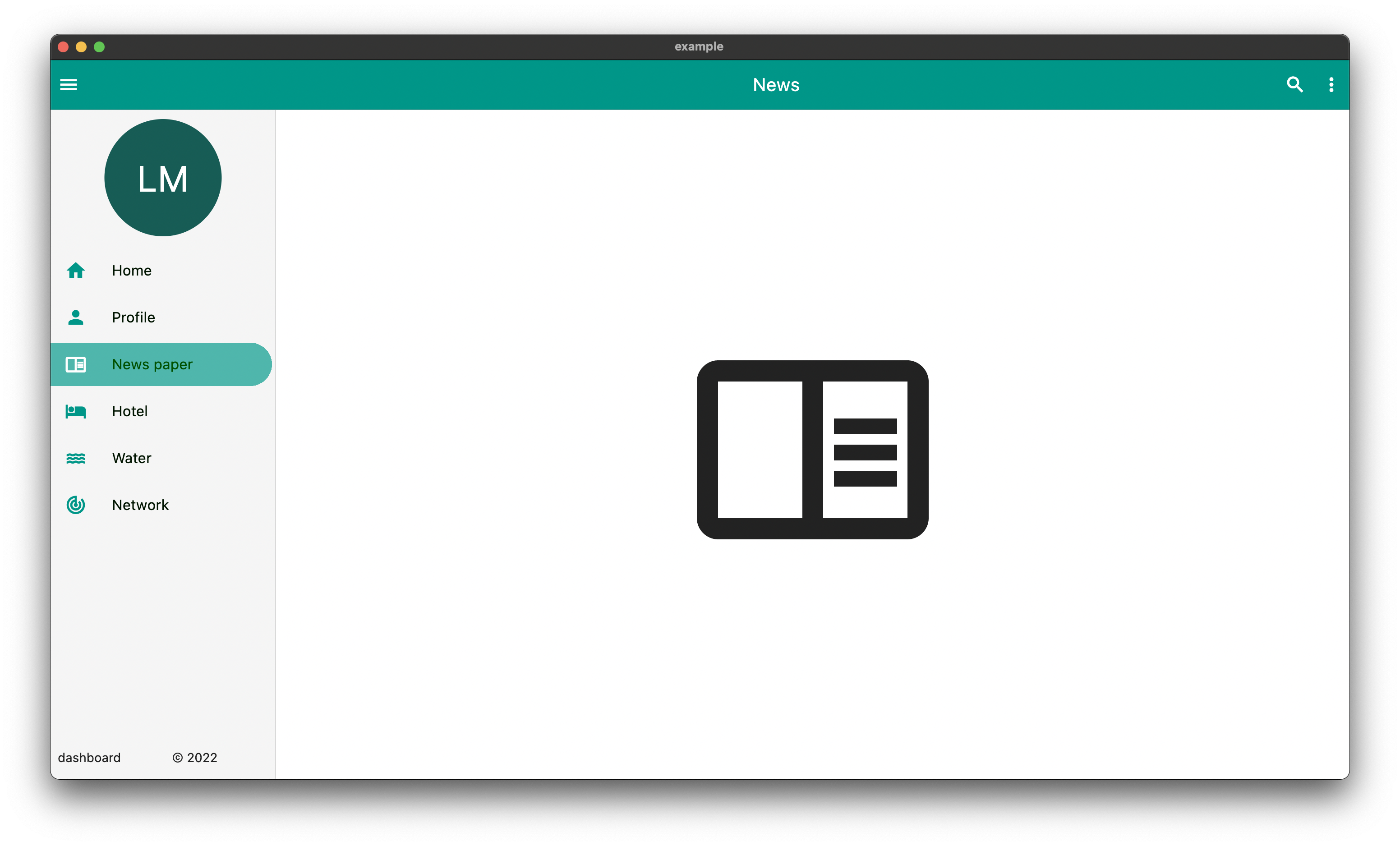
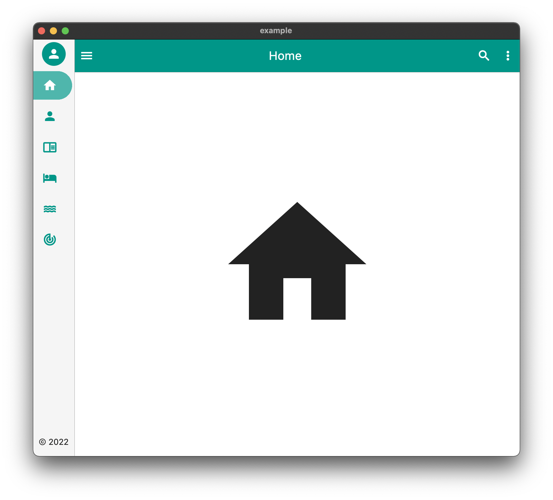
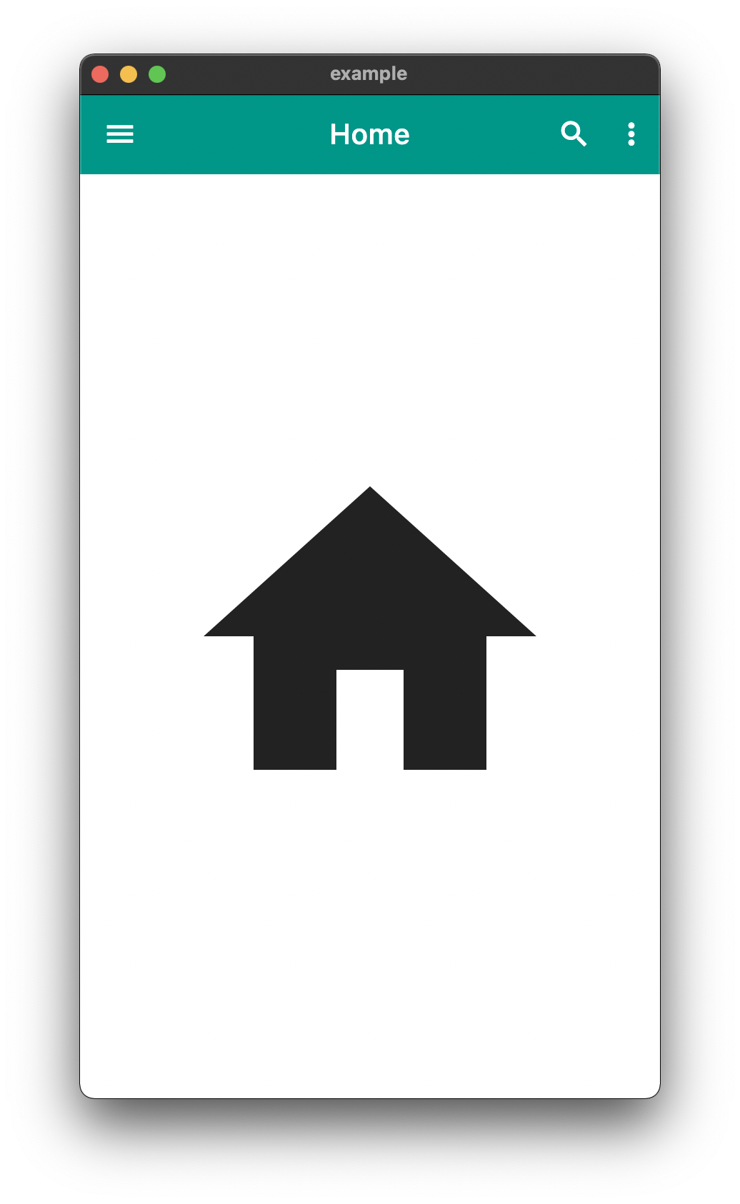
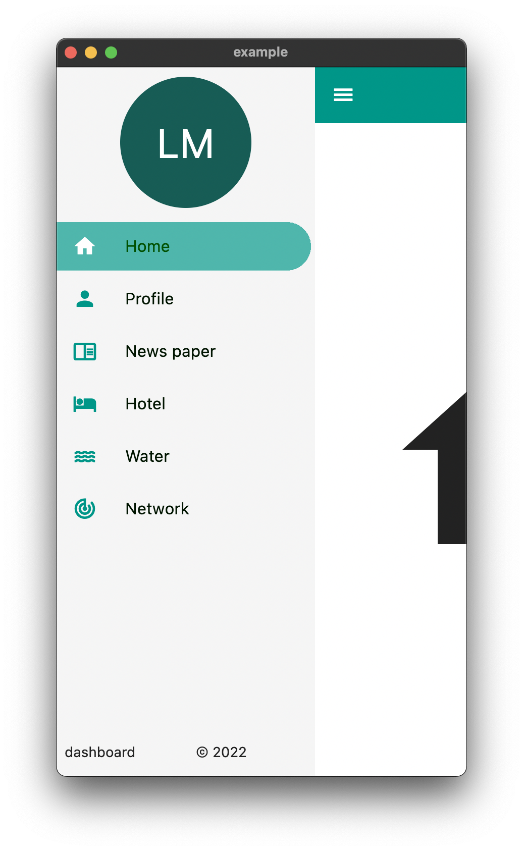
DeskTop Tablet Mobile

The above is an example of an app created with the package

Example Usage

  Widget build(BuildContext context) {
    return EasyDashboard(
      controller: controller,
      navigationIcon: const Icon(Icons.menu, color: Colors.white),
      appBarActions: actions,
      centerTitle: true,
      appBarColor: Colors.teal,
      sideBarColor: Colors.grey.shade100,
      tabletView: const TabletView(
        fullAppBar: false,
        border: BorderSide(width: 0.5, color: Colors.grey),
      ),
      desktopView: const DesktopView(
        fullAppBar: true,
        border: BorderSide(width: 0.5, color: Colors.grey),
      ),
      drawer: (Size size, Widget? child) {
        return EasyDrawer(
          iconColor: Colors.teal,
          hoverColor: Colors.grey.shade300,
          tileColor: Colors.grey.shade100,
          selectedColor: Colors.black.withGreen(80),
          selectedIconColor: Colors.white,
          textColor: Colors.black.withGreen(20),
          selectedTileColor: Colors.teal.shade400.withOpacity(.8),
          tiles: tiles,
          topWidget: SideBox(
            scrollable: true,
            height: 150,
            child: topOpenWidget,
          ),
          bottomWidget: SideBox(
            scrollable: false,
            height: 50,
            child: bottomOpenWidget,
          ),
          bottomSmallWidget: SideBox(
            height: 50,
            child: bottomSmallWidget,
          ),
          topSmallWidget: SideBox(
            height: 50,
            child: topSmallWidget,
          ),
          size: size,
          onTileTapped: (body) {
            controller.switchBody(body);
          },
        );
      },
    );
  }

The above example can be found in the /example folder

API

component usage
body The default body for the dashboard
duration The Duration of the animation when the [EasyDashboard] is opened or closed among others.
mobileBreakpoint The pixels at which the ui breaks into the mobile view
tabletBreakpoint The pixels at which the ui breaks into the tablet view
mobileView Display properties while in tablet view such as dashboard style
tabletView Display properties while in tablet view such as dashboard style
desktopView Display properties while in desktop view such as dashboard style
tabletMode What to show when the mobile break point is reached,
mobileMode What to show when the tablet break point is reached
desktopMode What to show when the desktop break point is reached
floatingActionButtonLocation Floating Action Button Location
floatingActionButton Floating Action Button
systemOverlayStyle System Overlay Style
floatingActionButtonAnimator Floating Action Button Animator
appBarHeight The height of the app bar
centerTitle Whether or not the appbar title is centered
backgroundColor General background color of the [EasyDashboard]
navigationIcon The icon that will control the responsive navigation of the [EasyDashboard]
navigationIconSplashRadius The splash radius of the navigation icon when pressed
appBarColor The color of the app bar
sideBarColor The color of the sidebar navigation
appBarActions A list of Widgets for the [AppBar]actions
drawer An drawer widget that will be displayed on the left side of the [EasyDashboard].
You can use the pre-built [EasyDrawer] to create a faster easier drawer .

Issues and Feedback

This is a fairly new package
Please feel free to report any issues you face
Also PR's and additional feedback is appreciated

所屬分類

原始碼儲存庫

使用此套件的專案

暫無相關資料。