EasyFormz Package
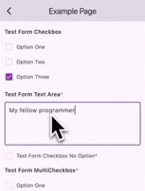
The purpose of this package is to facilitate the creation of dynamic forms based on data received from the server. The package provides several basic components, including form types such as 'input', 'textarea', 'dropdown', 'checkbox', 'multicheckbox', 'radio', 'date', and 'time'. Additionally, users have the flexibility to create custom forms if none of the predefined form types suit their needs.
Table of Contents
Available Form Types
Input : Single-line text input.Textarea : Multi-line text input.Dropdown : Dropdown selection.Checkbox : Single checkbox.Multicheckbox : Multiple checkboxes.Radio : Radio button selection.Date : Date picker for selecting a date.Time : Time picker for selecting a time.
Using the EasyFormz Widget
To integrate the package into your Flutter application, follow these steps:
Add the EasyFormz widget to your widget tree:
EasyFormz (controller: controller)
Initialize the form controller with the desired form data & Keep your UI in sync by listening to changes on the form controller. Example:
late final EasyFormzController controller = EasyFormzController (forms: forms);
@override
Widget build (BuildContext context) {
return Scaffold ();
}
The forms data should be look like this
final forms = [
FormConfig (
id: '412' ,
type: 'input' ,
formKey: 'dynamic_input_key' ,
label: 'Test Form Input' ,
props: FormProps (isRequired: true ),
),
FormConfig (
id: '702' ,
type: 'dropdown' ,
formKey: 'dynamic_dropdown_key' ,
label: 'Test Form Dropdown' ,
props: FormProps (
isRequired: true ,
options: [
FormOption (label: 'Option One' , value: 'ONE' ),
FormOption (label: 'Option Two' , value: 'TWO' ),
FormOption (label: 'Option Three' , value: 'Three' ),
],
),
),
FormConfig (
id: '432' ,
type: 'radio' ,
formKey: 'dynamic_radio_key' ,
label: 'Test Form Radio' ,
props: FormProps (
isRequired: false ,
options: [
FormOption (label: 'Option One' , value: 'ONE' ),
FormOption (label: 'Option Two' , value: 'TWO' ),
FormOption (label: 'Option Three' , value: 'THREE' ),
],
),
),
FormConfig (
id: '612' ,
type: 'checkbox' ,
formKey: 'dynamic_checkbox_key' ,
label: 'Test Form Checkbox' ,
props: FormProps (
isRequired: false ,
options: [
FormOption (label: 'Option One' , value: 'ONE' ),
FormOption (label: 'Option Two' , value: 'TWO' ),
FormOption (label: 'Option Three' , value: 'THREE' ),
],
),
),
FormConfig (
id: '612' ,
type: 'textarea' ,
formKey: 'dynamic_textarea_key' ,
label: 'Test Form Text Area' ,
props: FormProps (isRequired: true ),
),
FormConfig (
id: '232' ,
type: 'checkbox' ,
formKey: 'dynamic_checkboxNoOption_key' ,
label: 'Test Form Checkbox No Option' ,
props: FormProps (isRequired: true ),
),
FormConfig (
id: '132' ,
type: 'multicheckbox' ,
formKey: 'dynamic_multiCheckbox_key' ,
label: 'Test Form MultiCheckbox' ,
props: FormProps (
isRequired: true ,
options: [
FormOption (label: 'Option One' , value: 'ONE' ),
FormOption (label: 'Option Two' , value: 'TWO' ),
FormOption (label: 'Option Three' , value: 'THREE' ),
],
),
),
FormConfig (
id: '162' ,
type: 'date' ,
formKey: 'dynamic_date_key' ,
label: 'Test Form Date' ,
props: FormProps (isRequired: false ),
),
FormConfig (
id: '164' ,
type: 'time' ,
formKey: 'dynamic_time_key' ,
label: 'Test Form Time' ,
props: FormProps (isRequired: true ),
),
];
Let's say you have a list of form page then you can do like the following example:
final formPages = [
FormPage (
id: 'gweorj29' ,
label: 'Example Page 1' ,
description: 'This form displays all the existing forms available' ,
formConfigs: forms1,
),
FormPage (
id: 'gweorj29' ,
label: 'Example Page 2' ,
description: 'This form displays all the existing forms available' ,
formConfigs: forms2,
),
];
To diplay all the form pages as a ListTile
ListView .separated (
itemCount: formPages.length,
separatorBuilder: (context, index) {
return const SizedBox (height: 16 );
},
itemBuilder: (context, index) {
final form = formPages[index];
return Card (
margin: const EdgeInsets .symmetric (horizontal: 16 ),
clipBehavior: Clip .antiAlias,
child: ListTile (
onTap: () {
Navigator .push (
context,
MaterialPageRoute (
builder: (context) => FormScreen (form: form),
),
);
},
title: Text (
form.label,
style: Theme .of (context).textTheme.titleMedium,
),
subtitle: Text (
form.description,
style: Theme .of (context).textTheme.bodySmall,
),
),
);
},
),
Inside the FormScreen get the form parameter like the following example:
late final EasyFormzController controller = EasyFormzController (forms: widget.form.formConfigs);
@override
Widget build (BuildContext context) {
return Scaffold ();
}
Custom Form Creation
In scenarios where the provided form types do not meet specific requirements, users can easily create custom forms tailored to their needs.
Basic Component Builder
To change any in-built form component such as inputBuilder, etc, consider the following example:
EasyFormz (
controller: controller,
inputBuilder: (config, onValueChanged) => Padding (
padding: const EdgeInsets .all (16 ),
child: TextFormField (
onChanged: (value) {
onValueChanged (value);
},
),
),
);
Custom Form Component Builder
To create a custom form component based on the form configuration using the customBuilder, consider the following example:
EasyFormz (
controller: controller,
customBuilder: (config, onValueChanged) {
if (config.type == 'custom_form' ) {
return CustomDropdown (
config: config,
onChanged: (value) => onValueChanged (value),
);
}
},
);
Custom Error Component Builder
Custom error component is available by using the errorBuilder, consider the following example:
EasyFormz (
controller: controller,
errorBuilder: (config) {
return CustomErrorBox (
label: '${config.label} cannot be rendered' ,
);
},
);
Customizing the Easy Form Theme
To personalize the appearance of the dynamic form, you can modify the theme settings using the theme parameter. Below is an example of customizing the theme for a EasyFormz:
EasyFormz (
controller: controller,
theme: EasyFormzTheme ()
)
Contributing
Contributions are welcome! Please open an issue or submit a pull request if you have any improvements or bug fixes.
License
This project is licensed under the MIT License. See the LICENSE file for details.
Support Me
If you find this package helpful and want to support its development, consider making a donation. Thank you for your support!