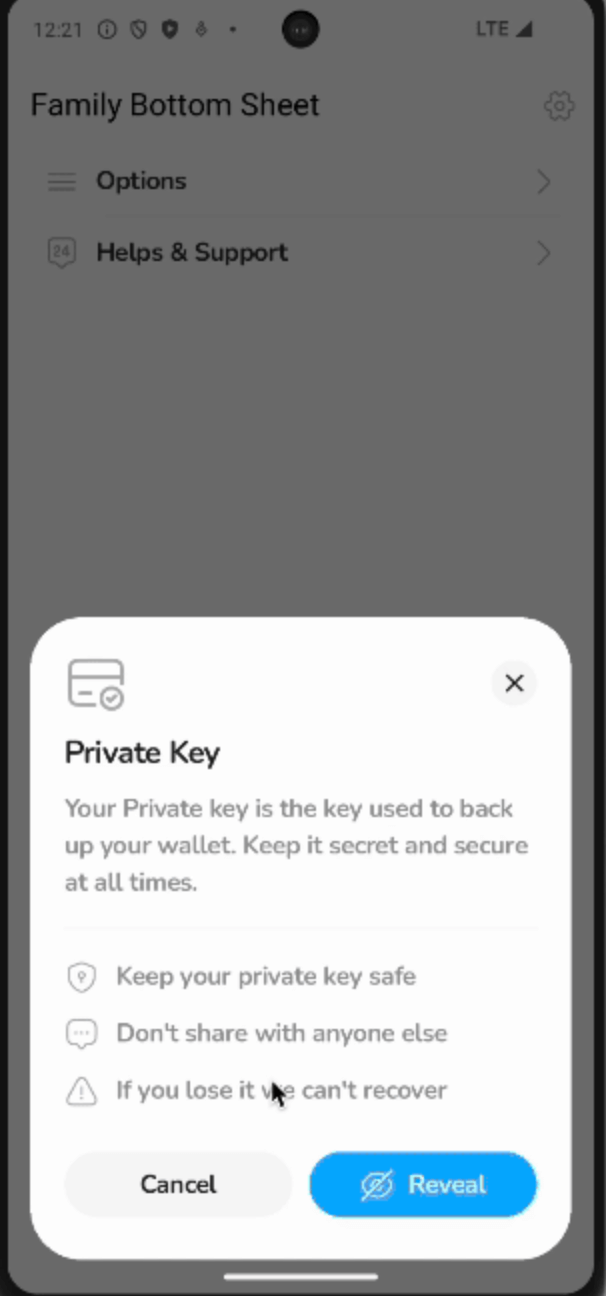
A customizable, navigation-friendly bottom sheet library for Flutter — designed with an API that feels familiar to showModalBottomSheet, while enabling advanced use cases like internal navigation and custom animations.
Inspired by Family's App Design System
This library was originally built as a clone of the dynamic tray system for the Family app — designed to handle complex user flows, internal navigation, and visually consistent modal sheets throughout the product.
Why does this exist?
In many apps, a modal bottom sheet isn't just a single static view — it's a flow.
We needed a solution that could:
Handle multiple pages inside a modal sheet
Animate smoothly between pages
Maintain visual consistency with system sheets
Be flexible for future use cases
Stay Flutter-idiomatic and lightweight
This package generalizes those patterns into a library you can use in your own apps.
If you want something more similar to the look and feel of the Flutter bottom sheet, use the FamilyModalSheet.showMaterialDefault method. It comes with sensible defaults that resemble the standard Flutter modal bottom sheet, but still allows for full customization if needed.
Returns the number of pages currently in the stack
Customization
FamilyModalSheet.show exposes a wide range of configuration options — allowing you to fine-tune both the bottom sheet container and the content area independently.
This design gives you full control while following a clean, opinionated API similar to Flutter's showModalBottomSheet.
Content Area Customization (the page stack region)
builder - Build the current page widget. This is typically the first page in your sheet's navigation stack
contentBackgroundColor - Background color for the content area
mainContentBorderRadius - Optional border radius to apply around the content area.
mainContentPadding - Optional padding applied inside the content area, wrapping all pages.
safeAreaMinimum - Minimum safe area padding (can also be used to add bottom padding to the bottom sheet).
mainContentAnimationStyle - Custom animation configuration for transitions between pages (push/pop).
Bottom Sheet Container Customization (the outer modal appearance)
backgroundColor - Background color for the entire sheet (defaults to Colors.transparent)
elevation - Shadow elevation for the sheet container
shape - Custom shape for the sheet container (usually a rounded rectangle).
clipBehavior - Clip behavior for the sheet container shape
constraints - Optional size constraints for the entire sheet
barrierColor - Color of the modal barrier behind the sheet
barrierLabel - Accessibility label for the barrier
sheetAnimationStyle - Animation configuration for how the sheet appears/disappears from the screen
Behavior & Interaction Customization
enableDrag - Whether the sheet can be dismissed via swipe down gesture.
showDragHandle- Optionally display a drag handle at the top of the sheet.
isDismissible- Whether tapping outside the sheet dismisses it.
isScrollControlled- Expand the sheet beyond its default max height (good for full-screen sheets).
scrollControlDisabledMaxHeightRatio- When isScrollControlled is false, this ratio determines the maximum height the sheet can occupy relative to the screen height
useSafeArea- Whether to automatically apply safe area insets to the outer sheet.
useRootNavigator- Whether to push the sheet to the root navigator.
routeSettings- Optional route metadata.
anchorPoint- Controls where the sheet's entrance animation originates.
transitionAnimationController- Provide a custom animation controller if you want to synchronize with other animations.
Inspiration
This package is inspired by the Family app's bottom sheet design system — where bottom sheets act as dynamic navigation surfaces for key user flows.
This package is also inspired by work by the Wolt team on wolt_modal_sheet package
If you have a suggestion that would make this better, please fork the repo and create a pull request. You can also simply open an issue with the tag "enhancement". Don't forget to give the project a star! Thanks again!