搜尋套件、儲存庫與 APP 分類

flip_board 封面
套件詳情v1.0.0

flip_board

FlipBoards 是 FlipWidgets 的組合,FlipWidgets 是一種透過翻轉動畫來實現內容變化的組件。包含 FlipFraseBoard、FlipMatrix、FlipClock 等。

AndroidiOSWebmacOSWindowsLinux
近 30 天下載
1360
喜歡數
115
Pub 分數
150

安裝套件

flutter pub add flip_board

套件介紹

根據套件公開資料產生的選型評估,僅供參考。

FlipBoard 是一個 Flutter 套件,透過翻轉動畫實現內容的動態過渡。它提供可重複使用的組件,如 FlipFraseBoard、FlipMatrix 和 FlipClock,每個組件皆設計為平滑動畫化其顯示內容的變更。此套件基於 Flutter 的動畫系統建構,支援 Android、iOS、Web、macOS、Windows 及 Linux 等多個平台。該套件非常適合建立吸引人的使用者介面,在狀態變更過程中提供視覺回饋,從而提升使用者體驗。

適用情境

  • 動畫數位鐘錶
  • 動態文字顯示
  • 互動式資料網格
  • 使用者介面轉換
  • 遊戲得分計數器
  • 表單中的視覺反饋

主要特色

  • 平滑的翻轉動畫
  • 預建構的專用板卡
  • 跨平台相容性
  • 與 Flutter 的輕鬆整合
  • 可自訂翻轉方向與速度
  • 響應式內容更新

適合對象

  • 開發互動式儀表板的開發者
  • 尋求動態 UI 元素的設計師
  • 需要視覺狀態轉換的應用程式
  • 教育類或遊戲類應用
  • 即時資料視覺化工具

使用建議

  • 可能影響低階裝置的效能
  • 超出翻轉效果之外的自訂功能有限
  • 需要了解 Flutter 的 widget 生命週期
  • 不適用於簡單的靜態內容
  • 動畫可能會在極簡設計中造成干擾
  • 依賴於 Flutter 動畫框架的穩定性

原始 README

以下為關聯原始碼儲存庫的 README 原文快照,最新內容請造訪原始碼儲存庫。

Flip Board

pub package license

Widgets to build displays that resemble Mechanical Flip Boards.

The basic component is a stateful FlipWidget that renders flip transitions for a stream of items and an itemBuilder.

The package also includes other widgets that compose this basic component in useful Flip Boards:

Flip Widget

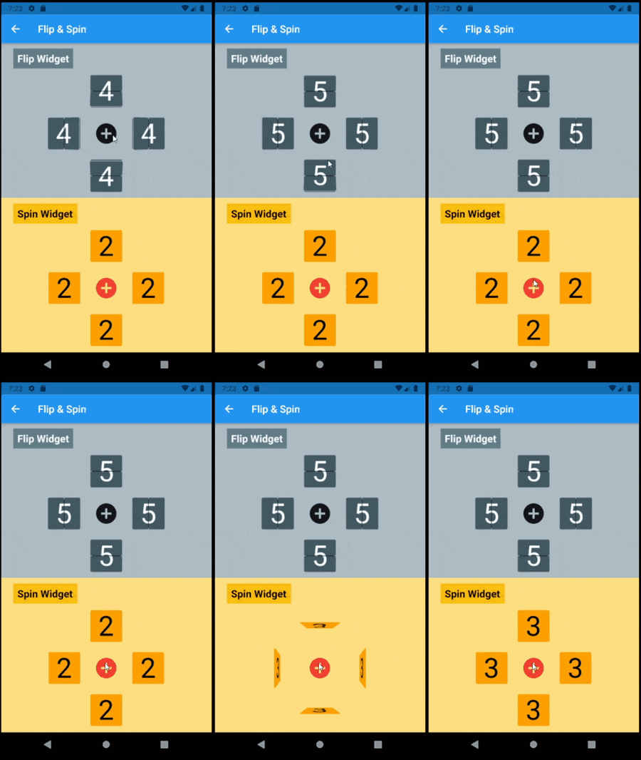
The most distinctive characteristic of a FlipWidget is its flip type to define the type of movement that will animate items rendering, either FlipType.middleFlip or FlipType.spinFlip.

This widget renders flip animations in a configured Axis and AxisDirection, animating the transition to each new item received in the given item stream. It is commonly used to display digits and letters but can actually render any widget you build through the given itemBuilder.

It is constructed with four required parameters (besides many optional parameters):

  • flipType: either FlipType.middleFlip or FlipType.spinFlip
  • itemStream: stream of items to be flipped as they are received
  • itemBuilder: builder to create a widget out of each item
  • flipDirection: AxisDirection to animate new items flip

Please check the class documentation to see all options.

Middle Flip

When we think of Mechanical Flip Boards as we used to see in airports and sport score boards we think on a Vertical MiddleFlip Widget or, most likely, on a composition (row) of them.

Its construction could look like:

FlipWidget({
  flipType: FlipType.middleFlip,
  itemStream: _stream,
  itemBuilder: _itemBuilder,
  flipDirection: AxisDirection.down,
});
Spin Flip

With FlipType.spinFlip this widget will render a Flip Card animation when new items arrive in the stream.

It has a similiar constructor, something like:

FlipWidget({
  flipType: FlipType.spinFlip,
  itemStream: _stream,
  itemBuilder: _itemBuilder,
  flipDirection: AxisDirection.right,
});

Example page that shows both types and all flipping directions (full code in examples folder):

  @override
  Widget build(BuildContext context) =>
    Center(
      child: Column(
        mainAxisAlignment: MainAxisAlignment.center,
        children: [
          _flipWheel,
          _spinWheel,
        ],
      ),
    );

  Widget get _flipWheel =>
    Center(
      child: Column(
        mainAxisSize: MainAxisSize.min,
        children: [
          _wheelTitle('Flip Widget'),
          _flipWidget(AxisDirection.up),
          Row(
            mainAxisSize: MainAxisSize.min,
            children: [
              _flipWidget(AxisDirection.left),
              _button,
              _flipWidget(AxisDirection.right),
            ],
          ),
          _flipWidget(AxisDirection.down),
        ],
      ),
    );

  Widget _flipWidget(AxisDirection direction) =>
    FlipWidget(
      flipType: FlipType.middleFlip,
      itemStream: _flipController.stream,
      itemBuilder: _itemBuilder,
      initialValue: _nextFlipValue,
      flipDirection: direction,
      hingeWidth: 1.0,
      hingeLength: 56.0,
      hingeColor: Colors.black,
    );

  Widget _itemBuilder(BuildContext context, int? value) =>
    Container(
      width: 64.0,
      height: 64.0,
      alignment: Alignment.center,
      decoration: BoxDecoration(
        borderRadius: const BorderRadius.all(Radius.circular(4.0)),
        border: Border.all(),
      ),
      child: Text(
        (value ?? 0).toString(),
        style: TextStyle(fontSize: 54.0),
      ),
    );

  void _flip() => _flipController.add(++_nextFlipValue % 10);

Flip Boards

Basic FlipWidgets are usually composed in a layout, this package provides a few configurable compositions of FlipWidgets of the same type and orientation, sometimes varying some elements direction within that axis orientation.

All these composed widgets are described below and explored in the examples folder.

Flip Matrix Board

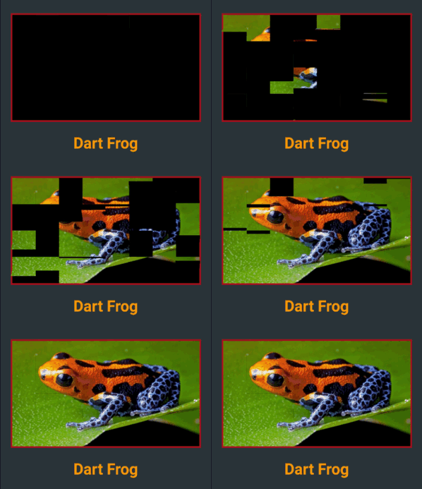
There two classes of FlipMatrixBoard that animate the display in a matrix of FlipWidgets. The first class displays a single child, an image in the given example. The second class animates the display of a stream of items, also given as a stream of images in the example below.

The board is configured with the number of rows and columns, flipping orientation and animation speed and delays parameters.

  • FlipMatrixBoardSingleChild

    Widget get _flipImage =>
      Container(
        decoration: BoxDecoration(
          border: Border.all(width: 3.0, color: Colors.red[900]!),
        ),
        child: FlipMatrixBoardSingleChild.assetImage(
          imageName: 'assets/horizontal/dart-frog.jpg',
          backgroundColor: Colors.black,
          axis: Axis.vertical,
          width: 364.0,
          height: 205.0,
          columnCount: 8,
          rowCount: 4,
        ),
      );
  • FlipMatrixBoardStream

    Widget get _flipWidget =>
      Container(
        decoration: BoxDecoration(border: Border.all(color: Colors.blue)),
        child: FlipMatrixBoardStream<String>(
          itemStream: _controller.stream,
          itemBuilder: _itemBuilder,
          axis: Axis.vertical,
          width: 375.0,
          height: 200.0,
          columnCount: 8,
          rowCount: 4,
        ),
      );

Flip Clock

FlipClock will default to Theme colors but can be further customized through constructor parameters.

The default flip direction is AxisDirection.down and the default animation curve is a custom curve that acceletares like gravity and bounces back at the end (like a mechanical bang).

In the example below some colors are inherited by a parent ThemeData from the amber color scheme. While some colors are defined in the constructor invocation:

  Widget _flipClock(ColorScheme colors) =>
    Container(
      decoration: BoxDecoration(
        color: colors.onPrimary,
        borderRadius: const BorderRadius.all(Radius.circular(8.0)),
      ),
      padding: const EdgeInsets.all(16.0),
      child: FlipClock(
        digitSize: 54.0,
        width: 46.0,
        height: 62.0,
        separatorColor: colors.primary,
        hingeColor: Colors.black,
        showBorder: true,
      ),
    );

Flip Countdown Clock

FlipCountdownClock is similar, it requires a duration parameter and may be configured with an onDone callback function.

Countdown default flip direction is AxisDirection.up, the opposite of FlipClock, with no panel bang animation.

In the following example most colors are configured with constructor parameters:

  Widget _flipCountdown(ColorScheme colors) => 
    Container(
      decoration: BoxDecoration(
        color: colors.secondary,
        borderRadius: BorderRadius.circular(8.0),
      ),
      padding: const EdgeInsets.all(24.0),
      child: FlipCountdownClock(
        duration: const Duration(minutes: 1),
        digitSize: 54.0,
        width: 46.0,
        height: 62.0,
        digitColor: colors.surface,
        backgroundColor: colors.onSurface,
        separatorColor: colors.onSurface,
        borderColor: colors.primary,
        hingeColor: colors.surface,
        borderRadius: const BorderRadius.all(Radius.circular(8.0)),
        onDone: () => print('Buzzzz!'),
      ),
    );

Flip Frase Board

This composed widget displays a Frase Board that will animate each letter up to the the given frase letters.

Flip type, initial and end colors, delays and more are all customized at constructor level. Check the class documentation for a run over all configurations.

The provided example looks like this:

This page displays a variety of frase boards, one of them would be constructed like this:

  Widget _flipFraseBoard(FlipType type, Axis axis, String frase) =>
    FlipFraseBoard(
      flipType: type,
      axis: axis,
      startLetter: 'A',
      endFrase: frase,
      fontSize: 30.0,
      hingeWidth: 0.6,
      hingeColor: Colors.black,
      borderColor: Colors.black,
      endColors: _flipEndColors,
      letterSpacing: 2.0,
    );

Game

We created a simple game to use a FlipWidget in a more complex context. Check the code in the example folder to see the complete implementation.

Uhaaa! Flip Game

Flip cards untill you make all three cards match the same painting.

There are two valid actions:

  • a first tap on a card: will flip that card
  • a second consecutive tap on a card: wil flip the other two cards
Can you win? Good luck!

所屬分類

依賴

依賴清單 1 項

原始碼儲存庫

使用此套件的專案