搜尋套件、儲存庫與 APP 分類

floating_bottom_bar 封面
套件詳情v0.0.4

floating_bottom_bar

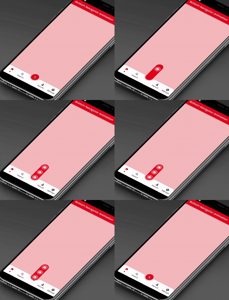
此套件為位於中心和底部標籤按鈕的浮動操作按鈕提供滑動動畫。

AndroidiOSWebmacOSWindowsLinux
近 30 天下載
1410
喜歡數
115
Pub 分數
150

安裝套件

flutter pub add floating_bottom_bar

套件介紹

根據套件公開資料產生的選型評估,僅供參考。

floating_bottom_bar 套件透過為位於中心且底部標籤按鈕的浮動操作按鈕添加流暢的滑動動畫來增強使用者介面。專為 Flutter 應用設計,它能與底端導航列無縫整合,為 Android、iOS、Web、macOS、Windows 和 Linux 平台提供引人入勝且互動性強的體驗。該套件支援可自訂的過渡效果和響應式版面,非常適合注重直覺導航與視覺吸引力的現代應用設計。

適用情境

  • 增強移動應用導航
  • 建立動畫浮動操作按鈕
  • 提升儀表板中的使用者參與度
  • 設計響應式底部導航
  • 向網頁應用添加動態UI元素
  • 支援多平台應用開發

主要特色

  • FAB 的平滑滑動動畫
  • 居中對齊的浮動操作按鈕
  • 底部標籤整合
  • 跨平台相容性
  • 可自定義的過渡效果
  • 響應式佈局支援

適合對象

  • Flutter 開發者尋找動畫 UI
  • 需要直覺式底部導航的應用程式
  • 設計師專注於互動元件
  • 多平台應用程式建構工具
  • 行動與網頁應用程式使用者體驗增強

使用建議

  • 需要 Flutter SDK 2.0 或更高版本
  • 可能影響低階裝置的效能
  • 超出動畫之外的自訂功能有限
  • 最適合簡單的導航模式
  • 依賴於平台特定的渲染
  • 不適合複雜的導航層次結構

原始 README

以下為關聯原始碼儲存庫的 README 原文快照,最新內容請造訪原始碼儲存庫。

floating_bottom_bar

This package will animate a floating action button at the center and icons at the bottomNavigationBar using AnimatedContainer and SlideTransition respectively.

Floating Bottom Bar

Floating Bottom Bar

Usage

Example
    bottomNavigationBar: AnimatedBottomNavigationBar(
      barColor: Colors.white,
      controller: FloatingBottomBarController(initialIndex: 1),
      bottomBar: [
        BottomBarItem(
          icon: const Icon(Icons.home, size: example.Dimens.iconNormal),
          iconSelected: const Icon(Icons.home,
              color: example.AppColors.cherryRed,
              size: example.Dimens.iconNormal),
          title: example.Strings.home,
          dotColor: example.AppColors.cherryRed,
          onTap: (value) {
            setState(() {
              index = value;
            });
            log('Home $value');
          },
        ),
        BottomBarItem(
          icon:
              const Icon(Icons.photo, size: example.Dimens.iconNormal),
          iconSelected: const Icon(Icons.photo,
              color: example.AppColors.cherryRed,
              size: example.Dimens.iconNormal),
          title: example.Strings.search,
          dotColor: example.AppColors.cherryRed,
          onTap: (value) {
            setState(() {
              index = value;
            });
            log('Search $value');
          },
        ),
        BottomBarItem(
          icon:
              const Icon(Icons.person, size: example.Dimens.iconNormal),
          iconSelected: const Icon(Icons.person,
              color: example.AppColors.cherryRed,
              size: example.Dimens.iconNormal),
          title: example.Strings.person,
          dotColor: example.AppColors.cherryRed,
          onTap: (value) {
            setState(() {
              index = value;
            });
            log('Profile $value');
          },
        ),
        BottomBarItem(
          icon: const Icon(Icons.settings,
              size: example.Dimens.iconNormal),
          iconSelected: const Icon(Icons.settings,
              color: example.AppColors.cherryRed,
              size: example.Dimens.iconNormal),
          title: example.Strings.settings,
          dotColor: example.AppColors.cherryRed,
          onTap: (value) {
            setState(() {
              index = value;
            });
            log('Settings $value');
          },
        ),
      ],
      bottomBarCenterModel: BottomBarCenterModel(
        centerBackgroundColor: example.AppColors.cherryRed,
        centerIcon: const FloatingCenterButton(
          child: Icon(
            Icons.add,
            color: AppColors.white,
          ),
        ),
        centerIconChild: [
          FloatingCenterButtonChild(
            child: const Icon(
              Icons.home,
              color: AppColors.white,
            ),
            onTap: () => log('Item1'),
          ),
          FloatingCenterButtonChild(
            child: const Icon(
              Icons.access_alarm,
              color: AppColors.white,
            ),
            onTap: () => log('Item2'),
          ),
          FloatingCenterButtonChild(
            child: const Icon(
              Icons.ac_unit_outlined,
              color: AppColors.white,
            ),
            onTap: () => log('Item3'),
          ),
        ],
      ),
    ),
Required parameters
bottomBar:

This property takes List as a parameter which are use to show the icons in the bottomNavigationBar.

bottomBarCenterModel:

BottomBarCenterModel class is model class for bottom menu. It takes icon, iconSelected, title, titleStyle as parameters.

controller:

FloatingBottomBarController is used to give the initial index to the bottom bar to have the pre selected item form the bottom bar.

Guideline for contributors

Contribution towards our repository is always welcome, we request contributors to create a pull request to the develop branch only.

Guideline to report an issue/feature request

It would be great for us if the reporter can share the below things to understand the root cause of the issue.

  • Library version
  • Code snippet
  • Logs if applicable
  • Device specification like (Manufacturer, OS version, etc)
  • Screenshot/video with steps to reproduce the issue

LICENSE!

Animated Segment is MIT-licensed.

Let us know!

We’d be really happy if you send us links to your projects where you use our component. Just send an email to sales@mindinventory.com And do let us know if you have any questions or suggestion regarding our work.

所屬分類

依賴

依賴清單 1 項

原始碼儲存庫

使用此套件的專案

暫無相關資料。