搜尋套件、儲存庫與 APP 分類

flutter_advanced_switch 封面
套件詳情v3.2.2

flutter_advanced_switch

一個進階的開關控制項提供豐富的 API 用於小部件自訂,為您的應用開啟全新的外觀與感受。

AndroidiOSWebmacOSWindowsLinux
近 30 天下載
2.4萬
喜歡數
166
Pub 分數
160

安裝套件

flutter pub add flutter_advanced_switch

套件介紹

根據套件公開資料產生的選型評估,僅供參考。

Flutter Advanced Switch 是一個可自訂的開關組件,提供豐富的 API 以實現廣泛的樣式與行為自訂。它讓開發者能夠建立視覺上獨特的開關,具備流暢的動畫、自訂軌道與滑塊設計,以及在所有主要平台上的響應式互動。適用於需要獨特切換控制項的現代 UI,透過精緻且互動性強的元件提升使用者體驗。此套件支援 Android、iOS、Web、macOS、Windows 與 Linux,確保跨平台的一致性。

適用情境

  • 自定切換介面
  • 表單中的增強使用者回饋
  • 現代應用UI設計
  • 互動式設定面板
  • 跨平台切換組件
  • 儀表板中的視覺區分

主要特色

  • 高度可自訂的軌道與滑塊
  • 平滑的動畫過渡
  • 跨平台相容性
  • 豐富的樣式選項
  • 響應式觸控反饋
  • 可設定的狀態與行為

適合對象

  • 尋求視覺彈性的UI設計師
  • 開發現代應用程式的開發者
  • 需要一致切換使用者體驗的團隊
  • 具有複雜表單互動的應用程式
  • 針對多個平台的專案

使用建議

  • 需要了解 Flutter widget 自訂
  • 可能會稍微增加套件大小
  • 樣式複雜度可能影響開發速度
  • 有限的內建主題
  • 對於不需要自訂的簡單開關切換,並非理想選擇

原始 README

以下為關聯原始碼儲存庫的 README 原文快照,最新內容請造訪原始碼儲存庫。

flutter_advanced_switch

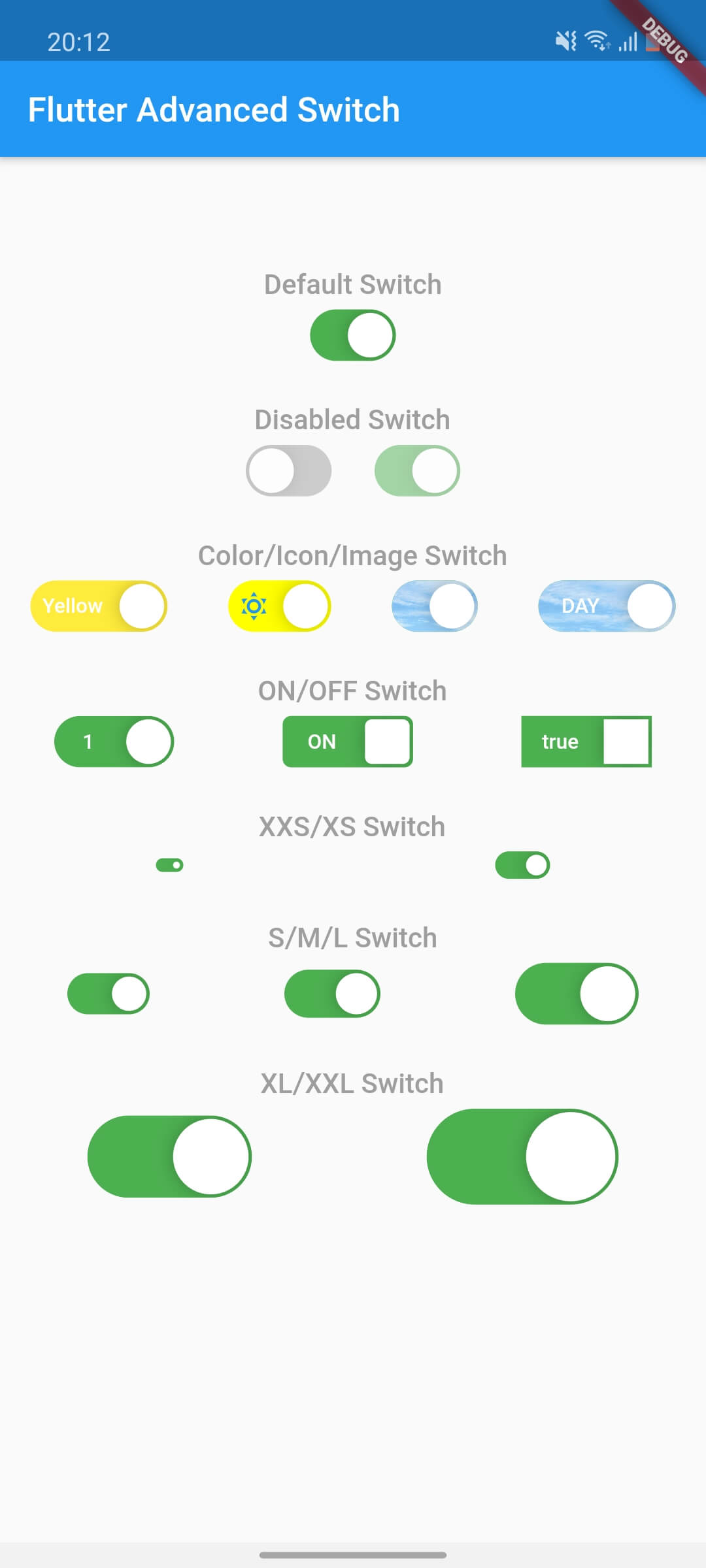
A highly customizable switch widget for Flutter with support for custom colors, text, icons, images, and more.

APP_ICON

Switch Light Switch Dark
Flutter Advanced Switch Off State Flutter Advanced Switch On State

Features

  • ✅ Fully customizable colors, sizes, and shapes
  • ✅ Support for text labels and icons
  • ✅ Background images for active/inactive states
  • ✅ Custom thumb widget support
  • ✅ Smooth animations
  • ✅ Enabled/disabled states
  • ✅ Controller-based or callback-based state management
  • ✅ Customizable thumb padding
  • ✅ Null-safe

Getting Started

In the pubspec.yaml of your flutter project, add the following dependency:

dependencies:
  flutter_advanced_switch: ^3.2.0

Import in your project:

import 'package:flutter_advanced_switch/flutter_advanced_switch.dart';

Usage

Basic Switch
class MyWidget extends StatefulWidget {
  @override
  State<MyWidget> createState() => _MyWidgetState();
}

class _MyWidgetState extends State<MyWidget> {
  final _controller = ValueNotifier<bool>(false);

  @override
  void dispose() {
    _controller.dispose();
    super.dispose();
  }

  @override
  Widget build(BuildContext context) {
    return AdvancedSwitch(
      controller: _controller,
    );
  }
}
Using Callback Instead of Controller
AdvancedSwitch(
  initialValue: false,
  onChanged: (value) {
    print('Switch value: $value');
  },
)
Customized Switch
final _controller = ValueNotifier<bool>(false);

AdvancedSwitch(
  controller: _controller,
  activeColor: Colors.green,
  inactiveColor: Colors.red,
  activeChild: const Text('ON'),
  inactiveChild: const Text('OFF'),
  width: 70.0,
  height: 35.0,
  decoration: BoxDecoration(
    borderRadius: BorderRadius.circular(20),
  ),
)
With Custom Thumb
final _controller = ValueNotifier<bool>(false);

AdvancedSwitch(
  controller: _controller,
  thumb: ValueListenableBuilder<bool>(
    valueListenable: _controller,
    builder: (_, value, __) {
      return Icon(
        value ? Icons.check : Icons.close,
        size: 16,
      );
    },
  ),
)
With Background Images
final _controller = ValueNotifier<bool>(false);

AdvancedSwitch(
  controller: _controller,
  activeImage: const AssetImage('assets/images/day.png'),
  inactiveImage: const AssetImage('assets/images/night.png'),
  activeChild: const Text('DAY'),
  inactiveChild: const Text('NIGHT'),
  width: 80,
)
With Icons
final _controller = ValueNotifier<bool>(false);

AdvancedSwitch(
  controller: _controller,
  activeChild: const Icon(Icons.wb_sunny, size: 16),
  inactiveChild: const Icon(Icons.nightlight_round, size: 16),
  activeColor: Colors.orange,
  inactiveColor: Colors.indigo,
  width: 60,
)
Listening to State Changes
class _MyWidgetState extends State<MyWidget> {
  final _controller = ValueNotifier<bool>(false);

  @override
  void initState() {
    super.initState();
    _controller.addListener(() {
      setState(() {
        // React to state changes
        print('Switch is now: ${_controller.value}');
      });
    });
  }

  @override
  void dispose() {
    _controller.dispose();
    super.dispose();
  }

  @override
  Widget build(BuildContext context) {
    return Column(
      children: [
        AdvancedSwitch(controller: _controller),
        Text('Switch is ${_controller.value ? "ON" : "OFF"}'),
      ],
    );
  }
}

Parameters

Parameter Description Type Default
controller Controls the state of the switch. If provided, the switch will use this controller to manage its state. ValueNotifier<bool>? null
activeColor The background color when the switch is in the active (on) state. Color Color(0xFF4CAF50)
inactiveColor The background color when the switch is in the inactive (off) state. Color Color(0xFF9E9E9E)
activeChild A widget to display on the left side when the switch is active. Widget? null
inactiveChild A widget to display on the right side when the switch is inactive. Widget? null
activeImage An optional background image to display when the switch is active. ImageProvider? null
inactiveImage An optional background image to display when the switch is inactive. ImageProvider? null
decoration The decoration to apply to the switch container. Typically used to set the border radius and shape. BoxDecoration BorderRadius.circular(15)
width The width of the switch. double 50.0
height The height of the switch. The thumb size is automatically calculated based on this value. double 30.0
enabled Whether the switch is enabled. If false, the switch will be displayed with reduced opacity and will not respond to user interactions. bool true
disabledOpacity The opacity to apply when the switch is disabled. double 0.5
thumb A custom widget to use as the thumb (the sliding part of the switch). If null, a default white rounded rectangle with a shadow will be used. Widget? null
thumbPadding The padding around the thumb. This creates space between the thumb and the switch edges. double 1.0
initialValue The initial state of the switch when controller is not provided. This value is only used when controller is null. bool false
onChanged Called when the user toggles the switch. The switch will call this callback with the new value. If null and no controller is provided, the switch will be disabled. ValueChanged<bool>? null

Demo

Flutter Advanced Switch Preview

所屬分類

原始碼儲存庫

使用此套件的專案

暫無相關資料。