搜尋套件、儲存庫與 APP 分類

套件詳情v1.1.1+1

flutter_bootstrap5

許多 Bootstrap 5 功能的 Flutter 實現。

AndroidiOSWebmacOSWindowsLinux
近 30 天下載
16
喜歡數
28
Pub 分數
150

安裝套件

flutter pub add flutter_bootstrap5

套件介紹

根據套件公開資料產生的選型評估,僅供參考。

Flutter Bootstrap5 是一個 Flutter 套件,將許多 Bootstrap 5 組件與實用工具帶入 Flutter 應用程式。它讓開發者能使用熟悉的 Bootstrap 5 語法與類別來實現響應式、以行動裝置為首要設計。此套件支援所有主要平台,包含 Android、iOS、Web、macOS、Windows 與 Linux,非常適合跨平台專案。透過利用 Bootstrap 的格線系統、字型、按鈕、表單等,開發者可加速 UI 開發,並在各裝置上維持一致的樣式。

適用情境

  • 建構響應式網頁和行動應用程式
  • 使用 Bootstrap 模式快速進行 UI 原型設計
  • 跨平台應用程式開發
  • 建立一致的設計系統
  • 在Flutter中實現基於Bootstrap的佈局

主要特色

  • Bootstrap 5 組件相容性
  • 響應式網格系統
  • 所有目標平台的支援
  • CSS 類別樣式
  • 與現有 Flutter 專案的輕鬆整合

適合對象

  • 熟悉 Bootstrap 的開發人員
  • 優先考慮設計一致性的團隊
  • 需要快速UI開發的項目
  • 跨平台應用程式建構工具
  • 專注於前端的Flutter開發者

使用建議

  • 可能會增加套件大小
  • 超出 Bootstrap 類的自訂功能有限
  • 依賴外部CSS邏輯
  • 不是完整的 Bootstrap 替代品
  • 需要理解 Bootstrap 概念

原始 README

以下為關聯原始碼儲存庫的 README 原文快照,最新內容請造訪原始碼儲存庫。

FlutterBootstrap5 🚀

This package is used to support the creation of responsive web applications with Flutter. It is based on the well-known CSS framework Bootstrap 5 and offers many features that can also be found in Bootstrap.

If you like this package it would be nice if you would give a Like ❤️ and a Star ⭐ to support the project!


If you want to have a quick overview of the most important functions and test them directly, you can do so here

FLUTTER BOOTSTRAP 5 EXAMPLE WEBSITE

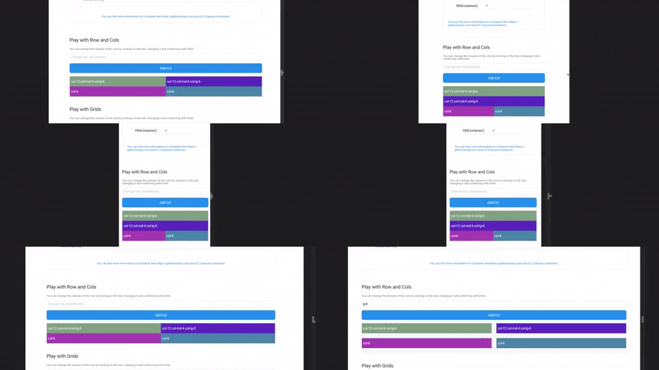
Small Example

Small Example

Getting Started

Configure Flutter Bootstrap5

To use Flutter Bootstrap5 anywhere in your app, you don't have to do anything but wrap your MaterialApp with the [FlutterBootstrap5] widget.

        FlutterBootstrap5(
            builder: (ctx) => MaterialApp(...),
        );
App Theming

You have various possibilities to customize Flutter Bootstrap5 for your needs. You can also leave it at the default values to get the default behavior of a Bootstrap5 app.

Currently the following customization options are supported:

BreakPoints

To set your own BreakPoints, you can simply pass the BreakPoints class to the [FlutterBootstrap5] widget. By default the current BreakPoints of Bootstrap5 CSS are used

        class _BootstrapBreakPoints {
          static const BreakPoint xs = BreakPoint(minWidth: 0, maxWidth: 576);
          static const BreakPoint sm = BreakPoint(minWidth: 576, maxWidth: 768);
          static const BreakPoint md = BreakPoint(minWidth: 768, maxWidth: 992);
          static const BreakPoint lg = BreakPoint(minWidth: 992, maxWidth: 1200);
          static const BreakPoint xl = BreakPoint(minWidth: 1200, maxWidth: 1400);
          static const BreakPoint xxl =
          BreakPoint(minWidth: 1400, maxWidth: double.infinity);
        }
Container BreakPoints

Beside the normal BreakPoints you can also define your own BreakPoints for the [FB5Container]. These determine which width a [FB5Container] should have at a certain BreakPoint.

By default the current Container BreakPoints of Bootstrap5 CSS are used

      class _BootstrapContainerBreakPoints {
        static const double xs = double.infinity;
        static const double sm = 540;
        static const double md = 720;
        static const double lg = 960;
        static const double xl = 1140;
        static const double xxl = 1320;
      }
Default Fontsize

With the parameter defaultFontSize you can specify the default font size to be used for the calculation of "rem" values. Bootstrap CSS uses rem to calculate margins, paddings and also font size. Similarly, these values are also calculated in Flutter Bootstrap5 depending on the defaultFontSize.

The default value is 16.0

Typography

Flutter Bootstrap5 uses a font size calculation mechanism based on Bootstrap CSS. So font sizes change dynamically depending on the screen size.

To customize this behavior you can pass the [FB5Typography] class to FlutterBootstrap5.

Use the theme in your MaterialApp

After configuring [FlutterBootstrap5] to your liking, you can now pass the theme to your MaterialApp to take full advantage of Flutter Bootstrap 5.

        MaterialApp(
            title: 'Flutter Bootstrap5 Demo',
            theme: BootstrapTheme.of(ctx).toTheme( [PASS YOUR THEME TO OVERRIDE BOOTSTRAP THEME IF YOU WANT TO] ),
            home: const Home(),
        ),

So now let's talk about the features

Currently supported Bootstrap classes

NOTE! Responsive support indicates whether the use of -xs, -sm, -md, -lg, -xl, and-xxl is supported
Description Base class Variations Responsive Support
Width of a column col col-{1-12}, ✓
Columns per row row-cols row-cols-{1-*}, ✓
Padding p p-{1-5},p{t,b,s,e,x,y}-{1-5},p{t,b,s,e,x,y}-custom-{0.0-*} ✓
Margin m m-{1-5},p{t,b,s,e,x,y}-{1-5},m{t,b,s,e,x,y}-custom-{0.0-*} ✓
Gutter g g-{1-5},g{x,y}-{1-5},g{x,y}-custom-{0.0-*} ✓
Order order order-{0-*} ✓
Display d d-none, d-block, ✓
Align Items align-items align-items-{start, center, end} ✓
Align Self align-self align-self-{start, center, end} ✓
Justify Content justify-content justify-content-{start, around, between, evenly, center, end} ✓

Widgets

FB5Container

FB5 containers are the Flutter implementation of Bootstrap Container. You can test the resize behavior of the containers on the FLUTTER BOOTSTRAP 5 EXAMPLE WEBSITE.

The following container types are supported:

    FB5Container(child: child);
    FB5Container.sm(child: child);
    FB5Container.md(child: child);
    FB5Container.lg(child: child);
    FB5Container.xl(child: child);
    FB5Container.xxl(child: child);
    FB5Container.fluid(child: child);
FB5Row

FB5Row are the Flutter implementation of Bootstrap Row. They get a list of FB5Col which are then arranged and displayed according to the classNames.

    FB5Row(
        classNames: 'mt-5 px-xs-3 px-lg-0 gx-4',
        children: [
            FB5Col(
                classNames: 'col-12',
                child: const GettingStarted(),
            ),
            FB5Col(
                classNames: 'col-12 mt-5',
                child: const Containers(),
            ),
            FB5Col(
                classNames: 'mt-5',
                child: const TestingArea(),
            ),
            FB5Col(
                classNames: 'my-5',
                child: const GridArea(),
            ),
       ],
  ),
FB5Col

FB5Col are the flutter implementation of the Bootstrap Col. They should be used inside a FB5Row and change their representation according to the classNames.

        FB5Col(
            classNames: 'col-12 col-lg-6 col-xl-4 m-3 m-xl-2 d-none d-sm-block',
            child: child,
        ),
FB5Grid

FB5Grid are used to represent a grid system of your children. They should not contain FB5Cols. FB5Grid automatically adjusts the size of the children so that a row of children always has the same height.

    FB5Grid(
      classNames: 'row-cols-3',
      children: [
          ...
      ],
    ),

Helper

BootstrapTheme

Information about the current screen size and breakpoint is returned by the BootstrapTheme. For this, nothing more is necessary than to execute the following function.

    final screenData = BootstrapTheme.of(context);

It also offers useful functions. For example, the query whether the current breakpoint is larger or smaller than a certain breakpoint.

    final screenData = BootstrapTheme.of(context);
    screenData.currentBreakPoint.isBreakPointOrSmaller(screenData.breakPoints.xl);

    screenData.currentBreakPoint.isBreakPointOrLarger(screenData.breakPoints.xl);
Functions

There are some helper functions to add bootstrap functionality to Flutter widgets:

    // e.g. add a 4rem margin-top to a Container
    Container(
      margin: margin(context, 'mt-4'),
    );

    // e.g. add a 2rem padding to a Container
    Container(
      margin: padding(context, 'p-2'),
    );
    
    // add a borderRadius to a Container
    Container(
      decoration: BoxDecoration(
        borderRadius: rounded(context), // rounded1 rounded2 rounded3 rounded4 rounded5 roundedPill
      ),
    );

    // add a border to a Container
    Container(
      decoration: BoxDecoration(
        border: borderPrimary(context), // borderSecondary, borderSuccess, borderDanger, etc...
      ),
    );


    // responsiveValue & responsiveValueOrNull
    // if you need different values for different breakPoints
    final width = responsiveValue<double>(context, defaultValue: 300.0, md: 350.0, xl: 400.0);

所屬分類

依賴

依賴清單 2 項

原始碼儲存庫

使用此套件的專案

暫無相關資料。