flutter_calendar_carousel


An accessible, theme-aware Flutter calendar with lazy month and week paging,
controlled dates, typed events, and concise customization APIs.
Upgrading from 2.x? Version 3.0 is intentionally breaking. The 2.x
compatibility layer, package-owned event models, and legacy styling flags
have been removed. Review the complete
2.x-to-3.0 migration guide before upgrading.
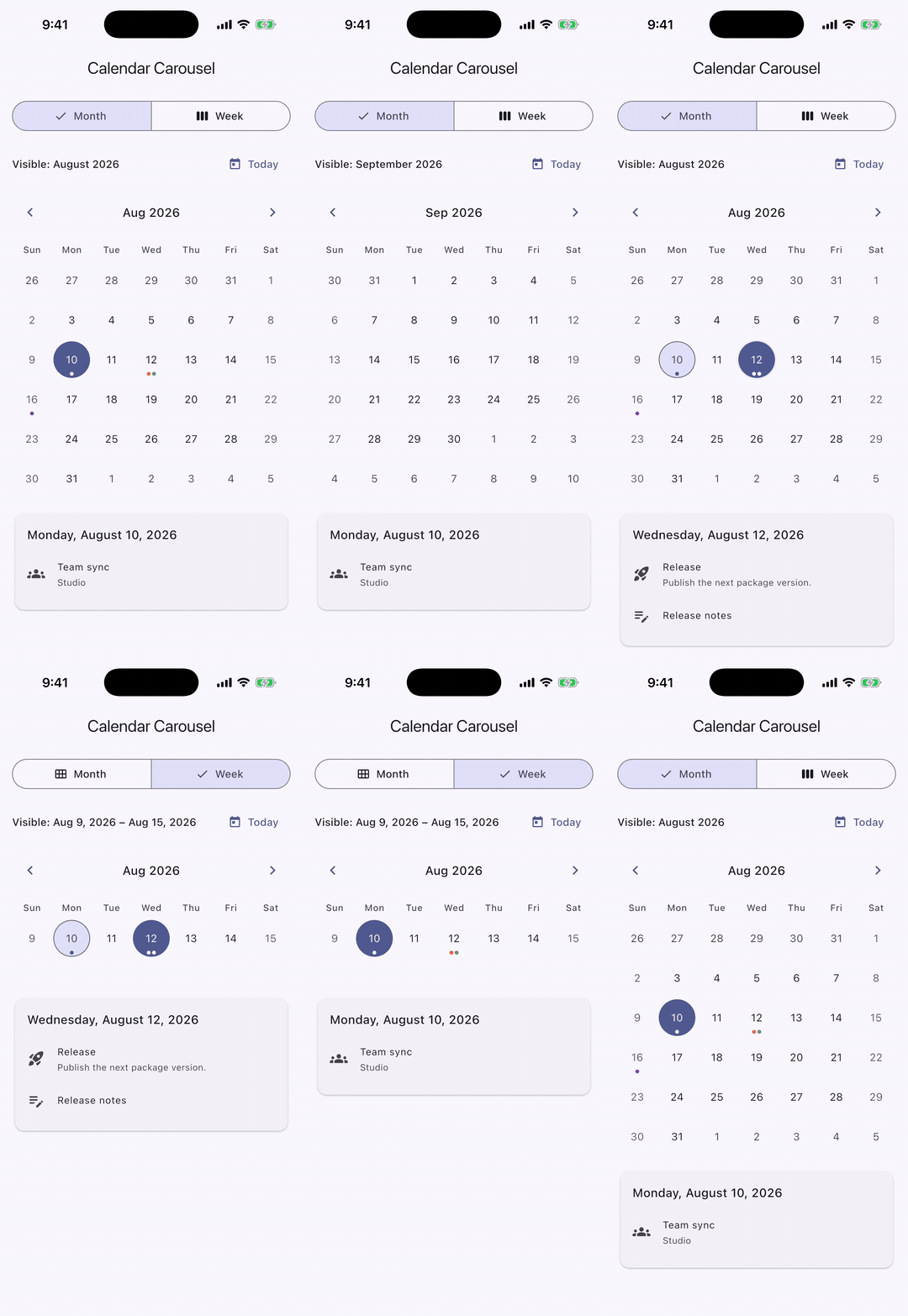
The example demonstrates controlled selection, event markers, and consistent
month and week navigation.
Install
flutter pub add flutter_calendar_carousel
import 'package:flutter/material.dart';
import 'package:flutter_calendar_carousel/flutter_calendar_carousel.dart';
The package requires Dart >=3.8.0 <4.0.0.
Quick start
Give the calendar a bounded height and keep selection in your widget state:
class CalendarExample extends StatefulWidget {
  const CalendarExample({super.key});

  @override
  State<CalendarExample> createState() => _CalendarExampleState();
}

class _CalendarExampleState extends State<CalendarExample> {
  DateTime _selectedDate = DateTime.now();
  DateTime _focusedDate = DateTime.now();

  @override
  Widget build(BuildContext context) {
    return SizedBox(
      height: 420,
      child: CalendarCarousel<String>.month(
        selectedDate: _selectedDate,
        focusedDate: _focusedDate,
        onDateSelected: (DateTime date, List<String> events) {
          setState(() {
            _selectedDate = date;
            _focusedDate = date;
          });
        },
        onPageChanged: (DateTime pageAnchor) {
          setState(() => _focusedDate = pageAnchor);
        },
      ),
    );
  }
}
Use CalendarCarousel<T>.week(...) for a seven-day page. Use the default
constructor with view: CalendarView.month or CalendarView.week when the view
changes at runtime.
Selection and navigation
selectedDate and focusedDate are controlled values:
selectedDate determines which day is visually selected. A tap does not
mutate it; update it from onDateSelected.focusedDate requests the visible month or week. Update it for external
navigation such as a Today button.onPageChanged reports the first day of the visible month or the configured
first day of the visible week.
Omit onDateSelected to render dates without tap actions. Use isDateEnabled
for per-date availability, and firstDate/lastDate for the navigable range.
The default range spans 100 years before and after today's civil date.
Application events
The calendar accepts your application model directly. Index events by local,
date-only keys and resolve them with eventsForDate:
class Meeting {
  const Meeting(this.title, this.color);

  final String title;
  final Color color;
}

final Map<DateTime, List<Meeting>> meetingsByDate =
    <DateTime, List<Meeting>>{
      DateTime(2026, 8, 15): const <Meeting>[
        Meeting('Release', Colors.indigo),
      ],
    };

List<Meeting> meetingsForDate(DateTime date) =>
    meetingsByDate[date] ?? const <Meeting>[];

Widget buildMeetingCalendar() => CalendarCarousel<Meeting>.month(
  focusedDate: DateTime(2026, 8, 15),
  eventsForDate: meetingsForDate,
  markerBuilder: (BuildContext context, CalendarDayDetails<Meeting> day) {
    return Align(
      alignment: Alignment.bottomCenter,
      child: Icon(Icons.circle, size: 6, color: day.events.first.color),
    );
  },
);
eventsForDate can run again during rebuilds, so keep it synchronous, pure,
and inexpensive. CalendarDayDetails.events and the list passed to
onDateSelected are immutable snapshots. A custom markerBuilder runs once
for each visible date with events; returning null hides that date's marker.
Without a custom builder, the built-in marker renders at most
theme.marker.maxVisible dots and an optional overflow count. Its English
semantic fallback is 1 event or <count> events; localize that announcement
without replacing the visual marker:
final markerTheme = CalendarCarouselThemeData(
  marker: CalendarMarkerStyle(
    semanticLabelBuilder: (BuildContext context, int count) =>
        count == 1 ? '1 appointment' : '$count appointments',
  ),
);
Configuration and theming
Related options are grouped instead of exposed as dozens of constructor
parameters:
Widget buildStyledCalendar() => CalendarCarousel<Meeting>.month(
  header: const CalendarHeaderConfig(
    enableDatePicker: true,
    showNavigationButtons: true,
  ),
  weekdays: const CalendarWeekdayConfig(
    format: CalendarWeekdayFormat.short,
  ),
  layout: const CalendarLayoutConfig(
    fixedSixWeeks: true,
    showOutsideDays: false,
  ),
  paging: const CalendarPagingConfig(axis: Axis.horizontal),
  theme: const CalendarCarouselThemeData(
    selected: CalendarDayStyle(
      backgroundColor: Colors.indigo,
      textStyle: TextStyle(color: Colors.white),
    ),
    marker: CalendarMarkerStyle(color: Colors.deepOrange, maxVisible: 3),
  ),
);
The day-style priority is base → weekend → outside month → with events →
dayStyleResolver → today → disabled → selected. Partial styles inherit
unspecified values from the ambient Material theme. Outside-month position and
styling apply only to month pages; every date in a seven-day week page reports
CalendarMonthPosition.current.
When paging.viewportFraction is below one, month pages suppress outside-month
dates even if showOutsideDays is true. This prevents a page and its visible
preview from rendering the same civil date twice.
Use dayStyleResolver for date-specific colors and shapes. Use dayBuilder
when the visual content itself must change:
final CalendarDayBuilder<Meeting> meetingDayBuilder =
    (BuildContext context, CalendarDayDetails<Meeting> day) {
      if (day.events.isEmpty) return null;
      return Center(
        child: Text('${day.date.day} ★', style: day.style.textStyle),
      );
    };
Returning null from dayBuilder keeps the default day number.
Dates and locales
The calendar treats DateTime values as civil year/month/day carriers and
compares only those components. Resolver and callback values use local midnight
when it exists. If a timezone transition skips midnight but not the complete
date, Dart normalizes the value to the first representable local time (often
01:00). If a historical offset change skips the complete civil day, the
calendar uses UTC midnight as a lossless carrier for the same year, month, and
day. Always compare and index calendar data by those components rather than by
hour, instant, timezone offset, or isUtc.
locale accepts a Flutter Locale and defaults to
Localizations.localeOf(context). Week labels, weekend detection, semantic
date labels, and header formatting follow it. The built-in picker uses that
locale when the app provides matching Material localizations and otherwise
falls back safely. firstDayOfWeek accepts CalendarWeekday; when omitted,
locale data decides.
Using with material_ui
The calendar renders with the in-framework Material libraries
(package:flutter/material.dart). If your app has migrated to the standalone
material_ui package, wrap the app—or at least the calendar's subtree—in
MaterialUiCompatibilityBridge so the calendar can resolve
MaterialLocalizations and inherit your theme:
import 'package:material_ui/material_ui.dart';

MaterialApp(
  builder: (context, child) => MaterialUiCompatibilityBridge(child: child!),
  home: const HomeScreen(),
)
Place the bridge around the navigator child as shown so the built-in date
picker is covered too. If you already use builder, incorporate the bridge
into it. The bridge forwards colorScheme, textTheme, visualDensity, and
platform only; app-level component themes such as DatePickerThemeData are
not forwarded, so the built-in picker follows the bridged color scheme and text
theme.
Migrating the package itself to material_ui and cupertino_ui is tracked in
#431.
Accessibility and responsive layouts
When at least one date callback is configured, each date is one accessible
button with a localized full-date label, selected state, and the available tap
or long-press actions. A calendar with no date callbacks exposes readable date
labels instead of announcing disabled buttons. dayBuilder and markerBuilder
are placed inside the date semantics. Return visual content only—do not nest a
button, gesture detector, or another interactive control. When a custom marker
conveys information not repeated elsewhere, wrap it in a non-interactive
Semantics label such as the localized event count.
Test custom content at the narrowest supported width and largest text scale.
The default header, weekday labels, day numbers, and overflow markers scale
down within their available bounds. Below 120 logical pixels wide, the default
header divides its width evenly between the previous, title, and next actions
so all three remain available without overflowing. On wide, low-height month
layouts, the calendar automatically raises the preferred day aspect ratio so
every week remains visible instead of clipping later rows. In severely constrained
heights, it preserves the day grid and a 24-logical-pixel budget per possible
row by hiding the header before the weekday row; custom header and weekday
content is bounded to the same layout. Below 144 logical pixels, a six-week
month cannot physically retain 24 pixels per row; with vertical page previews,
that threshold is 144 / viewportFraction. The calendar still renders every
row without overflow. dayPadding only insets visuals—the complete grid cell
remains the date's hit and semantics target.
Performance contract
- Month and week pages are generated lazily; the full configured date range is
never materialized.
- Date arithmetic uses civil components, avoiding daylight-saving drift.
eventsForDate, dayStyleResolver, and builders should be pure and cheap.- The default marker does work proportional to
maxVisible, not the total
number of events.
- A custom marker builder is called once per event-bearing visible day build;
bound any per-event work inside it.
Migrating from 2.x to 3.0
3.0 intentionally removes the compatibility layer. There are no deprecated
shims or model adapters.
| 2.x API |
3.0 replacement |
CalendarCarousel(..., weekFormat: false) |
CalendarCarousel.month(...) |
CalendarCarousel(..., weekFormat: true) |
CalendarCarousel.week(...) |
selectedDateTime |
selectedDate |
targetDateTime |
focusedDate |
onDayPressed |
onDateSelected |
onDayLongPressed |
onDateLongPressed |
onCalendarChanged |
onPageChanged |
minSelectedDate, maxSelectedDate |
firstDate, lastDate |
inactiveDates, disableDayPressed |
isDateEnabled or omit onDateSelected |
String locale |
Flutter Locale |
Integer firstDayOfWeek |
CalendarWeekday |
Event, EventInterface, EventList, markedDatesMap |
Application model + date-only map + eventsForDate |
MarkedDate, MultipleMarkedDates |
dayStyleResolver |
customDayBuilder |
dayBuilder(context, CalendarDayDetails<T>) |
Marker widget/icon/overflow options, maxDot, showIconBehindDayText |
markerBuilder and CalendarMarkerStyle |
markedDateCustomShapeBorder, markedDateCustomTextStyle |
theme.withEvents |
| Individual day/today/selected/weekend/inactive colors, text, borders, shapes, and alignment |
CalendarCarouselThemeData and CalendarDayStyle |
| Header visibility, icons, title interaction, margins, callbacks |
CalendarHeaderConfig, CalendarHeaderStyle, or CalendarHeaderConfig.builder |
weekDay*, WeekdayFormat, customWeekDayBuilder |
CalendarWeekdayConfig, CalendarWeekdayFormat, CalendarWeekdayStyle |
staticSixWeekFormat, showOnlyCurrentMonthDate, childAspectRatio, dayPadding |
CalendarLayoutConfig |
isScrollable, scrollDirection, pageScrollPhysics, viewportFraction |
CalendarPagingConfig |
width, height |
Parent constraints such as SizedBox |
pageSnapping |
Removed; calendar pages always snap |
customGridViewPhysics, shouldShowTransform |
Removed with no replacement |
Deep imports from classes/ |
Import the package entrypoint only |
Example app
See the example app
for controlled month/week switching, application events, custom markers,
theming, date-picker navigation, and large-text responsive behavior.
Support
Report bugs and feature requests in the
GitHub issue tracker.
If this package helps your project, you can support its maintenance through
Buy Me a Coffee or
PayPal.
Released under the MIT License.

