搜尋套件、儲存庫與 APP 分類

flutter_custom_dialog 封面
套件詳情v1.3.0

flutter_custom_dialog

語義對話 | Made In YY.inc | 歡迎貢獻

近 30 天下載
281
喜歡數
213
Pub 分數
60

安裝套件

flutter pub add flutter_custom_dialog

套件介紹

根據套件公開資料產生的選型評估,僅供參考。

一個由 YY.inc 開發的 Flutter 語意對話套件,旨在提供可存取且可自訂的對話元件。它強調正確的語意以改善螢幕閱讀器支援與使用者體驗。此套件為開源,並歡迎社群貢獻。基於 Flutter 的 widget 系統建構,讓開發者能以最少的樣板程式碼建立一致且可重複使用的對話。非常適合需要包容性 UI 設計與結構化對話互動的應用程式。

適用情境

  • 注重可存取性的應用程式
  • 可重用的對話框組件
  • 螢幕閱讀器相容介面
  • 自定義模態對話框
  • 開源協作開發

主要特色

  • 語義可存取性
  • 可自訂的對話方塊內容
  • 開源貢獻模式
  • 最小化樣板程式碼
  • 跨平台相容性

適合對象

  • 注重可訪問性的開發人員
  • 建構可重用 UI 組件的團隊
  • 開源貢獻者
  • 具有複雜對話需求的Flutter專案

使用建議

  • 需要理解 Flutter 語義
  • 有限的平台特定自訂
  • 無內建動畫
  • 社群驅動的更新
  • 依賴外部維護

原始 README

以下為關聯原始碼儲存庫的 README 原文快照,最新內容請造訪原始碼儲存庫。

✨ flutter_custom_dialog

pub package

[Language ~~] English | 中文文档

Global dialog function encapsulation, with a semantic way to fill the content inside the dialog, the current function provided

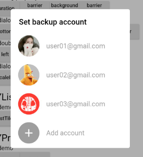
  1. Support for a few semantic component methods to populate the component content inside dialog
  2. Support for customizing semantic components for developers to freely populate component content inside dialog
  3. Support setting dialog background color, foreground color, position, animation, click the external disappear and other functions, see the details below
  4. Support no Context call dialog, see below

🎖 Installing

1、install

dependencies:
  flutter_custom_dialog: ^1.3.0

2、import

import 'package:flutter_custom_dialog/flutter_custom_dialog.dart';

🎖 Example

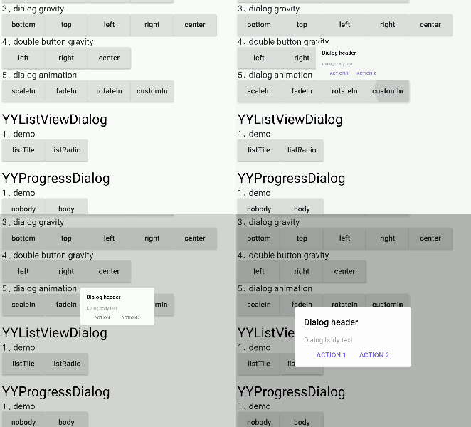
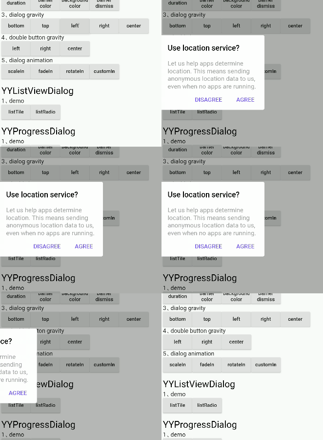
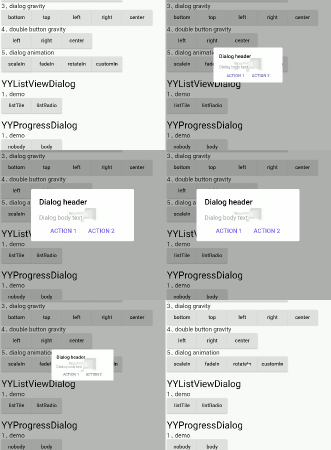
dialog_demo


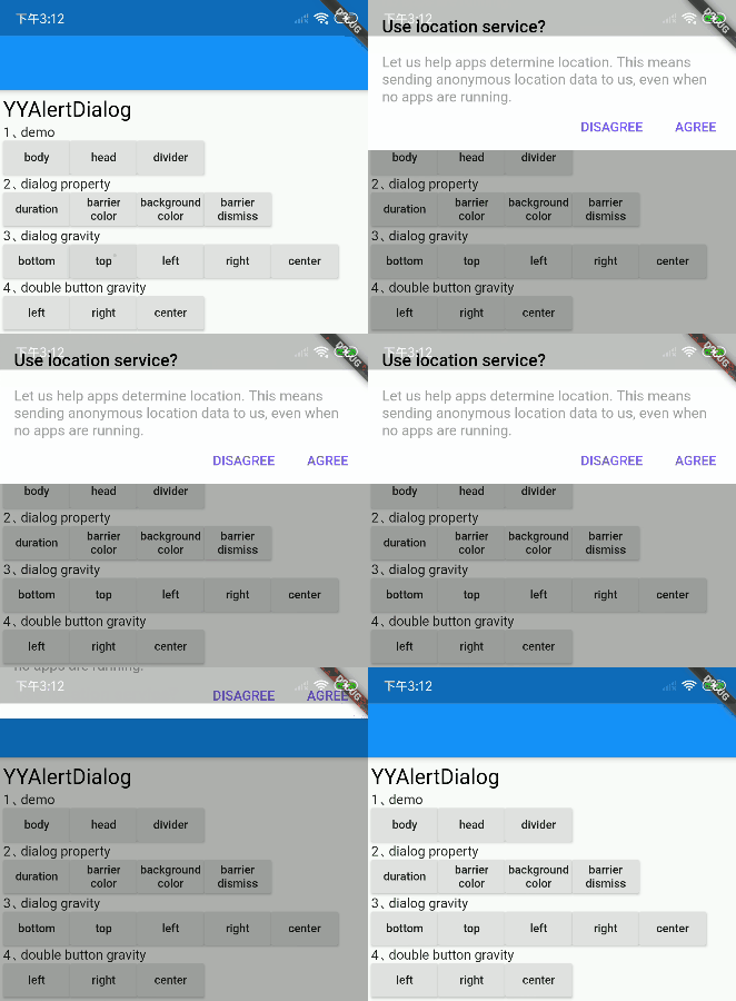
divider
✅

body
✅

head&body
✅

listTile
✅

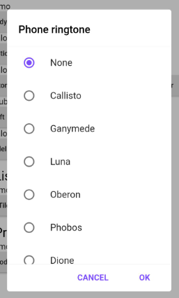
ListRadio
✅

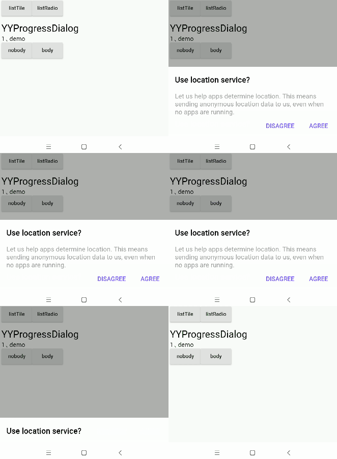
progress
✅

progress&body
✅

bottom sheet
✅

notice
✅

pop menu
✅ Support for custom locations

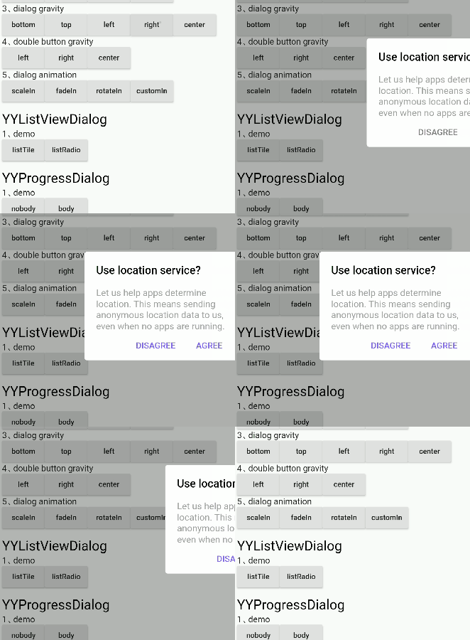
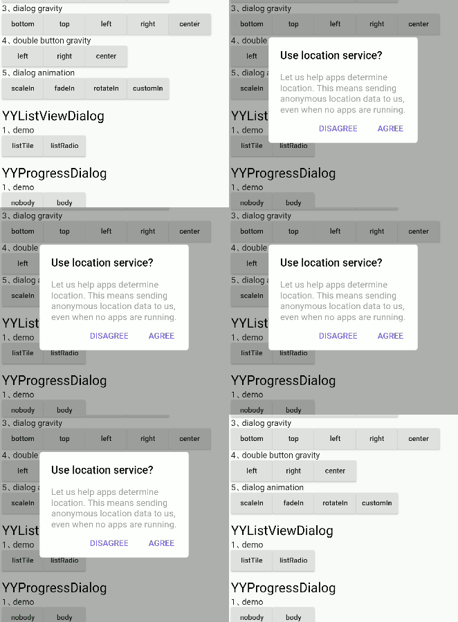
dialog_gravity


bottom
✅

top
✅

left
✅

right
✅

center
✅

left bottom
✅

left top
✅

right bottom
✅

right top
✅

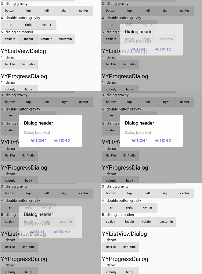
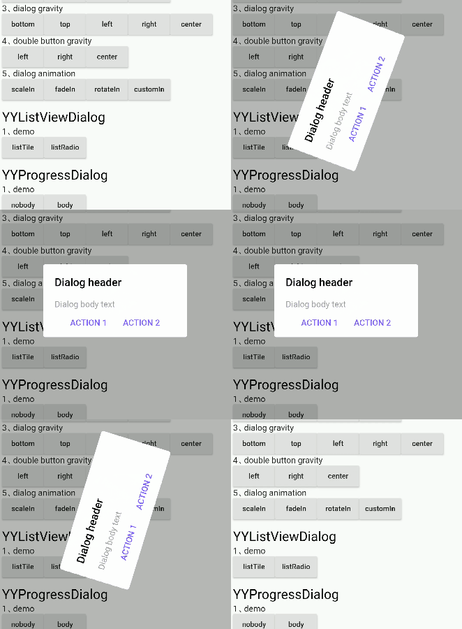
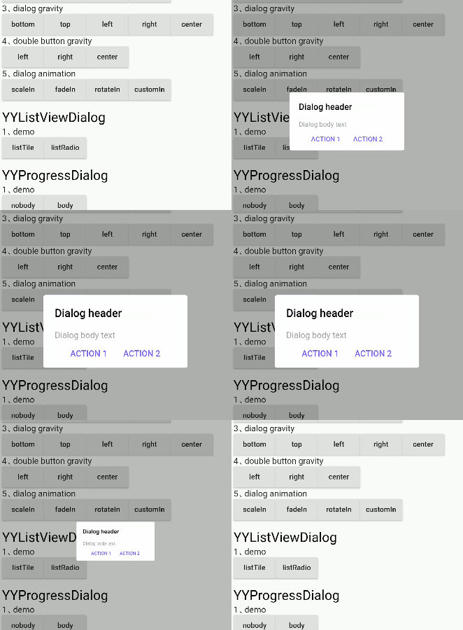
dialog_animation


scaleIn
✅

fadeIn
✅

rotateIn
✅

customIn
✅ Support for custom animations

⚡ Dialog Property

dialog property Settings can be called through the method of member variables, as detailed in the following table

YYDialog YYNoticeDialog() {
  return YYDialog().build()
    ..width = 120
    ..height = 110
    ..backgroundColor = Colors.black.withOpacity(0.8)
    ..borderRadius = 10.0
    ..showCallBack = () {
      print("showCallBack invoke");
    }
    ..dismissCallBack = () {
      print("dismissCallBack invoke");
    }
    ..widget(Padding(
      padding: EdgeInsets.only(top: 21),
      child: Image.asset(
        'images/success.png',
        width: 38,
        height: 38,
      ),
    ))
    ..widget(Padding(
      padding: EdgeInsets.only(top: 10),
      child: Text(
        "Success",
        style: TextStyle(
          fontSize: 15,
          color: Colors.white,
        ),
      ),
    ))
    ..animatedFunc = (child, animation) {
      return ScaleTransition(
        child: child,
        scale: Tween(begin: 0.0, end: 1.0).animate(animation),
      );
    }
    ..show();
}

Supported attributes

property description default
width Dialog width 0
height Dialog height Adaptive component height
duration Dialog animation time 250 ms
gravity Where the dialog appears center
gravityAnimationEnable The dialog appears with the default animation available false
margin The margin of a dialog EdgeInsets.all(0.0)
barrierColor Dialog barrierColor 30% of black
decoration Dialog decoration null
backgroundColor Dialog backgroundColor white
borderRadius Dialog borderRadius 0.0
constraints Dialog constraints no constraints
animatedFunc Animation of dialog Emerge from the middle
showCallBack dialog show callbacks not
dismissCallBack dialog dismiss callbacks not
barrierDismissible Whether to click to pop up the external disappear true
useRootNavigator Whether to use root navigation true
  • After setting gravity, set gravityAnimationEnable = true if animation is needed
  • If the decoration property is set, the backgroundColor and borderRadius are not in effect; they are mutually exclusive

Supported method

method description
show[x,y] show dialog
dismiss dismiss dialog
isShowing Is the dialog showing

⚡ Semantic Widget

The contents of the components inside the dialog are encapsulated by semantic functions in advance to quickly build the dialog, as shown in the following table

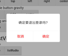
YYDialog YYAlertDialogWithDivider(BuildContext context) {
  return YYDialog().build(context)
    ..width = 220
    ..borderRadius = 4.0
    ..text(
      padding: EdgeInsets.all(25.0),
      alignment: Alignment.center,
      text: "确定要退出登录吗?",
      color: Colors.black,
      fontSize: 14.0,
      fontWeight: FontWeight.w500,
    )
    ..divider()
    ..doubleButton(
      padding: EdgeInsets.only(top: 10.0),
      gravity: Gravity.center,
      withDivider: true,
      text1: "取消",
      color1: Colors.redAccent,
      fontSize1: 14.0,
      fontWeight1: FontWeight.bold,
      onTap1: () {
        print("取消");
      },
      text2: "确定",
      color2: Colors.redAccent,
      fontSize2: 14.0,
      fontWeight2: FontWeight.bold,
      onTap2: () {
        print("确定");
      },
    )
    ..show();
}

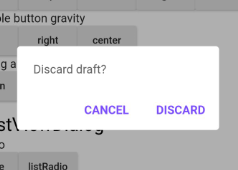
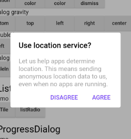
Semantic components supported

method description
text text widget
doubleButton two-button widget
listViewOfListTile listTile widget
listViewOfRadioButton listRadio widget
divider divider widget
widget custom semantic widget

⚡ Custom Widget

Customize dialog interior component content

  • Since the existing semantic components only assist in the rapid UI construction, they are far from meeting the requirements in actual project development
  • So it provides the ability to insert custom semantic components into dialog

Insert the component into the dialog through 'widget()'

YYDialog YYDialogDemo(BuildContext context) {
  return YYDialog().build(context)
    ..width = 220
    ..height = 500
    ..widget(
      Padding(
        padding: EdgeInsets.all(0.0),
        child: Align(
          alignment: Alignment.centerLeft,
          child: Text(
            "",
            style: TextStyle(
              color: Colors.black,
              fontSize: 14.0,
              fontWeight: FontWeight.w100,
            ),
          ),
        ),
      ),
    )
    ..show();
}

⚡ Without the Context to invoke

  • Application scenario: after the network request comes back, there is no Context to refer to in the callback, at this time, the Context needs to be initialized in advance, and then the dialog can be called without the Context

1、init

Call static methods before show dialog YYDialog.init(context);

class AppHome extends StatelessWidget {
  Widget build(BuildContext context) {
    //1、init context
    YYDialog.init(context);
    //2、Subsequent use may not be required context
    ......
  }
}

2、use

direct use YYDialog,Note that it must be called build()

YYDialog YYAlertDialogBody() {
  return YYDialog().build()
    ..width = 240
    ..text(
      text: "Hello YYDialog",
      color: Colors.grey[700],
    )
    ..show();
}

🔥🔥 Attention

1、dismiss

  • Do not use 'Navigator.pop(context)' to make the popover disappear, or you will close your page
  • This problem has been solved internally in YYDialog, and you can simply call 'dismiss()' supplied internally
var yyDialog = YYDialog();
yyDialog?.dismiss();

Bugs/Requests

  • If your application has problems, please submit your code and effect to Issue.
  • Pull request are also welcome.

About

  • QQ:510402535
  • QQ群:798874340
  • e-mail:xyj510402535@qq.com
  • g-mail:xyj51042535@gmail.com
  • Blog:http://blog.csdn.net/qq_30379689
  • Github:https://github.com/AndroidHensen

License

Apache License 2.0

所屬分類

原始碼儲存庫

使用此套件的專案