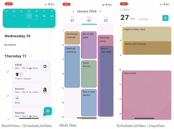
一個功能豐富的 Flutter 套件,提供高度可自訂的日曆檢視,用於顯示天、週和月。它讓開發者能夠根據多樣設計需求,客製化日曆的外觀與行為。該套件支援所有主要平台——包含 Android、iOS、Web、macOS、Windows 與 Linux,確保一致的使用者體驗。此套件非常適合需要動態日期選擇、活動排程或個人化日期顯示的應用程式。其彈性 API 可深入自訂樣式、導航與互動模式。
適用情境
事件排程應用
每日計畫介面
日期選擇器整合
旅行預訂系統
任務管理工具
預約訂位平台
主要特色
完全可自定義的使用者介面
支援多種檢視模式(天、週、月)
跨平台相容性
可擴充的事件處理
可設定的日期範圍
主題和樣式選項
適合對象
開發以日期為中心的應用程式開發者
需要響應式日曆組件的團隊
需要本地化日期格式的應用程式
希望對日曆佈局進行視覺控制的設計人員
具有複雜排程邏輯的專案
使用建議
需要了解 Flutter 的 widget 系統
複雜的使用案例可能需要額外的狀態管理
自訂樣式可能會增加開發時間
有限的內建地區化支援
大資料集的效能影響
依賴外部相依性以實現進階功能
原始 README
以下為關聯原始碼儲存庫的 README 原文快照,最新內容請造訪原始碼儲存庫。
flutter_customizable_calendar
flutter_customizable_calendar is a feature-rich Flutter package that offers highly customizable calendar views for displaying days, weeks, and months. It allows developers to tailor the appearance of the calendar and supports the addition, dynamic editing, and removal of events and breaks.
MonthView + ScheduleListView
Week View
ScheduleListView + DaysView
Check out the example app to get the full code for the above examples.
Key Features
Various Views: The package provides three main views: DaysView, WeekView, MonthView and ScheduleListView each catering to different time spans.
Customization: Users can easily customize the appearance of the calendar using themes for different components such as DaysListTheme, TimelineTheme, DaysRowTheme, MonthDayTheme, DraggableEventTheme, FloatingEventsTheme, TimeMarkTheme, and DisplayedPeriodPickerTheme. There are also corresponding custom builders available for each widget.
Dynamic Event Editing: The calendar supports dynamic editing of events in each view. Utilizing callbacks like onEventUpdated and onDiscardChanges, users can seamlessly update or discard changes made to events.
Event Types: The package supports various event types, including SimpleEvent, TaskDue, and Break. You can easily create your own type that extends the corresponding abstract event class.
Adding Events Dynamically: Users can add events dynamically. The provided example showcases how to implement this feature using a bottom sheet and onDateLongPress callback.
Comprehensive Example: The package comes with a comprehensive example app that demonstrates its usage and features. The example code is available on GitHub.
Getting started
Add the following dependency to your pubspec.yaml file:
dependencies:flutter_customizable_calendar:^0.3.7
Then, run:
$ flutter pub get
Usage
Adding events dynamically
This code snippet showcases how to handle long presses on dates in the DaysView and dynamically add different types of events such as Simple Event, Task Due, and Break. The provided callback (_onDateLongPress) creates a bottom sheet with options,and based on the user's selection, it adds the corresponding event to the calendar.
Effortlessly edit events dynamically in the calendar by utilizing the provided callbacks for each view: DaysView, WeekView, and MonthView. The visual representation below illustrates the dynamic editing feature across different views:
Days View
Week View
To enable dynamic editing, you need to utilize the provided callbacks for each view. By implementing these callbacks, you can capture events when they are updated or discarded, allowing for seamless dynamic editing within your calendar views. The following code snippets demonstrate how to integrate the event editing functionality using the onEventUpdated and onDiscardChanges callbacks:
The AllDayEventsTheme class provides a customizable theme for rendering all-day events in a day view. This theme allows you to control various aspects of the visual appearance of the all-day events.
Properties
showMoreButtonTheme: An instance of AllDayEventsShowMoreButtonTheme that provides customization options for the "Show More" button.
listMaxRowsVisible: Maximum number of rows to show for all-day events.
eventHeight: Height of each individual all-day event.
textStyle: Text style for the all-day events.
containerPadding: Padding for the container of all-day events.
eventPadding: Padding for each all-day event.
eventMargin: Margin for each all-day event.
borderRadius: Border radius for the all-day events.
elevation: Elevation over a day view.
shape: Shape and border of the views.
margin: Padding between the views.
The AllDayEventsShowMoreButtonTheme class provides customization options for the "Show More" button, which is used when there are more all-day events than can be displayed.
Properties
height: Height of the "Show More" button.
textStyle: Text style for the "Show More" button.
backgroundColor: Background color of the "Show More" button.
borderRadius: Border radius for the "Show More" button.
padding: Padding for the "Show More" button.
margin: Margin for the "Show More" button.
You can also create a custom builder for Show more button.
In this case, you need to handle button clicks yourself.
The package supports custom events. To create a custom event, you need to extend the EditableCalendarEvent class. The following code snippet demonstrates how to create a custom event with image background:
You can override the default long-press actions for each view. The following code snippet demonstrates how to override the default long-press overrideOnEventLongPress callback. This can be also used if you don't need editor functionality.
Enhance the visual appeal of your calendar views by customizing various themes for the DaysView, WeekView, and MonthView widgets. The flexibility of flutter_customizable_calendar allows you to achieve a personalized look for each view. Below are examples showcasing the visual changes applied to each view along with the corresponding code snippets:
The TimelineTheme class provides a comprehensive set of customization parameters for rendering the Timeline view. This theme allows you to fine-tune various aspects of the visual appearance of the Timeline, including the padding, cell extent, time scale, floating events, and draggable events.
Properties
padding: External padding of the scrollable view.
cellExtent: In minutes, used to render and position events on the timeline.
timeScaleTheme: Customization parameters of the time scale.
floatingEventsTheme: Customization parameters of all the floating events views.
draggableEventTheme: Customization parameters of the draggable event view.
The TimeScaleTheme class provides customization options for the TimeScale view, allowing you to control the appearance of the time scale within the Timeline.
Properties
width: Width of the view (needed for setting padding).
hourExtent: Distance between two hours.
currentTimeMarkTheme: Customization parameters for the current time mark.
drawHalfHourMarks: Whether a half-hour mark is needed to show.
halfHourMarkTheme: Customization parameters for a half-hour mark.
drawQuarterHourMarks: Whether a quarter-hour mark is needed to show.
quarterHourMarkTheme: Customization parameters for a quarter-hour mark.
hourFormatter: Hour string formatter.
textStyle: Hour text style.
marksAlign: Scale marks alignment.
The TimeMarkTheme class provides customization options for time marks within the TimeScale.
Properties
length: Length of the line.
color: Color of the line.
strokeWidth: Thickness of the line.
strokeCap: The kind of finish to place on the end of the line.
The MonthDayTheme class provides customization options for the DaysList within the Timeline, allowing you to control the appearance of day cards.
Properties
dayColor: Color of the day card.
currentDayColor: Color of the current day card.
dayNumberBackgroundColor: Background color of the day number.
currentDayNumberBackgroundColor: Background color of the current day number.
spacingColor: Color of spacing between day views.
dayNumberTextStyle: Text style of the day number.
currentDayNumberTextStyle: Text style of the current day number.
crossAxisSpacing: Cross-axis spacing between day views.
mainAxisSpacing: Main-axis spacing between day views.
dayNumberHeight: Height of day number container.
dayNumberMargin: Margin of day number container.
dayNumberPadding: Padding of day number container.
The FloatingEventsTheme class provides customization options for floating events views within the Timeline.
Properties
elevation: Elevation over a day view.
shape: Shape and border of the views.
margin: Paddings between the views.
dayTheme: Theme for day events.
weekTheme: Theme for week events.
monthTheme: Theme for month events.
The ViewEventTheme class provides customization options for event views within the floating events views.
Properties
titleStyle: Text style for the event title.
The DraggableEventTheme class provides customization options for the draggable event view within the Timeline.
animationDuration: Duration of the view's animation.
animationCurve: Allows changing the animation's behavior (use a Curve which supports changing a value between [0...1]).
The DisplayedPeriodPickerTheme class provides customization options for the DisplayedPeriodPicker within the Timeline.
Properties
margin: External padding.
elevation: The z-coordinate at which to place the view.
backgroundColor: Background color.
foregroundColor: Foreground color.
shape: Shape and border of the view.
width: View width.
height: View height.
periodFormatter: Displayed period formatter.
textStyle: Typographical style for text.
prevButtonTheme: Theme for the left button.
nextButtonTheme: Theme for the right button.
The DisplayedPeriodPickerButtonTheme class provides customization options for buttons within the DisplayedPeriodPicker.
Properties
color: Color of the button.
padding: Space to surround the icon inside the bounds of the button.
borderRadius: Radius of the button's corners when it has a background color.
child: Widget below this widget in the tree.
The DaysRowTheme class provides customization options for the days row within the Timeline.
Properties
height: Row height.
hideWeekday: Whether weekday is needed to show.
weekdayFormatter: Weekday string formatter.
weekdayStyle: Weekday text style.
hideNumber: Whether number is needed to show.
numberFormatter: Number string formatter.
numberStyle: Number text style.
The DaysListTheme class provides customization options for the DaysList within the Timeline.
Properties
padding: List item padding.
height: List height.
physics: How the page view should respond to user input.
itemExtent: List item extent.
itemTheme: Theme of the list item.
The DaysListItemTheme class provides further customization options for list items within the DaysList of the Timeline.
Properties
margin: List item external padding.
elevation: The z-coordinate at which to place the event view.
background: Background color.
backgroundFocused: Background color if the item is focused. If null, the foreground color is used.
foreground: Foreground color (used to set text color).
foregroundFocused: Foreground color if the item is focused. If null, the background color is used.
shape: Shape and border of the item.
shapeFocused: Shape and border if the item is focused. If null, the shape property is used.
numberFormatter: Number string formatter.
numberStyle: Number text style.
numberStyleFocused: Number text style if the item is focused.
hideWeekday: Whether weekday is needed to show.
weekdayFormatter: Weekday string formatter.
weekdayStyle: Weekday text style.
weekdayStyleFocused: Weekday text style if the item is focused.
Instead of themes, you can also use the corresponding builders for each individual component.
Custom constructor for a list of days for DaysView
/// The builder for the days list/// [focusedDate] - the date which is currently focused/// [events] - the events which are displayed on the timelinefinalWidgetFunction(
BuildContext context,
DateTime focusedDate,
List<T> events,
)? daysListBuilder;
Custom month builder for DaysView
/// The builder for the month picker/// @events - the events which are displayed on the timeline/// @focusedDate - the date which is currently focusedfinalWidgetFunction(
BuildContext,
DateTime focusedDate,
List<T> events,
)? monthPickerBuilder;
Custom day builder for ScheduleListView
/// Custom day builder/// Allows to specify custom builder for day/// Make sure you don't have many widgets with 0 height in your builder/// If you don't need empty days, you can set/// [ignoreDaysWithoutEvents] to true/// [events] - list of events for the [date]finalWidgetFunction(
List<CalendarEvent> events,
DateTime date,
)? dayBuilder;
Custom month picker builder for ScheduleListView
/// The builder for the month picker./// If you want to use your own month picker, you need/// to specify this builder./// [nextMonth] - callback which allows to go to the next month/// [prevMonth] - callback which allows to go to the previous month/// [toTime] - callback which allows to go to the specific month/// These 3 are the same as those available through the [ScheduleListViewController]finalWidgetFunction(
voidFunction() nextMonth,
voidFunction() prevMonth,
voidFunction(DateTime time) toTime,
DateTime currentTime,
)? monthPickerBuilder;
Custom month day builder for MonthView
/// Custom day cell builder/// [events] - list of events on day/// [day] - day datefinalWidgetFunction(
BuildContext context,
List<T> events,
DateTime day,
)? monthDayBuilder;
Custom month picker builder for MonthView
/// The month picker builder/// [prevMonth] - callback which allows to go to the previous month/// [nextMonth] - callback which allows to go to the next month/// These 2 callbacks are the same as [MonthViewController.prev]/// and [MonthViewController.next]/// [focusedDate] - the date which is currently focusedfinalWidgetFunction(
BuildContext,
voidFunction() prevMonth,
voidFunction() nextMonth,
DateTime focusedDate,
)? monthPickerBuilder;
Saver config
The SaverConfig allows users to configure a customized appearance for the saving indicator.
Configure the SaverConfig for a customized appearance: