搜尋套件、儲存庫與 APP 分類

flutter_date_picker_timeline 封面
套件詳情v0.3.3

flutter_date_picker_timeline

一個作為水平時間軸的可自定義格里高利和賈拉利日期選擇器

AndroidiOSWebmacOSWindowsLinux
近 30 天下載
103
喜歡數
86
Pub 分數
130

安裝套件

flutter pub add flutter_date_picker_timeline

套件介紹

根據套件公開資料產生的選型評估,僅供參考。

一個可自定義的 Flutter 日期選擇器,以水平時間軸形式顯示日期,支援格里高利曆與伊朗歷(波斯曆)。它透過流暢的捲動與視覺反饋,讓使用者能直觀地選擇日期。此套件專為需要跨長時間段進行日期導航的應用程式設計,例如排程、規劃或基於日曆的工作流程。它可在所有主要平台(包含 Android、iOS、Web、macOS、Windows 與 Linux)上運作。

適用情境

  • 排程應用程式
  • 基於日曆的任務規劃器
  • 事件預訂介面
  • 旅行行程管理
  • 長期專案時間表

主要特色

  • 支援格里曆與傑拉利曆
  • 水平可滾動的時間軸介面
  • 可自定義的外觀和樣式
  • 跨平台相容性
  • 平滑的日期導航
  • 可設定的日期範圍與選擇模式

適合對象

  • 需要長時間日期選擇的應用程式
  • 面向波斯語使用者的開發者
  • 需要雙日曆支援的專案
  • UI 豐富的日曆實作
  • 跨平台 Flutter 應用程式

使用建議

  • 可能需要額外的樣式才能實現最佳使用者體驗
  • 處理非常大的日期範圍時的效能
  • 除了日期選擇外,內建驗證功能有限
  • 依賴外部本地化支援非英文語言環境

原始 README

以下為關聯原始碼儲存庫的 README 原文快照,最新內容請造訪原始碼儲存庫。

Flutter Date Picker Timeline

Flutter Date Picker Timeline Banner pub package

💥 Gregorian and Jalali customizable date picker as a horizontal timeline 💥

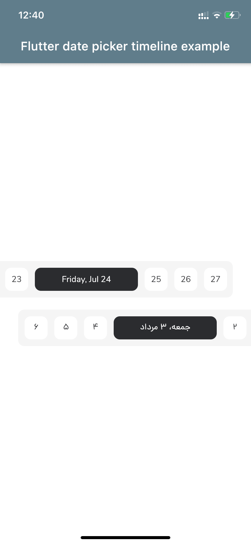
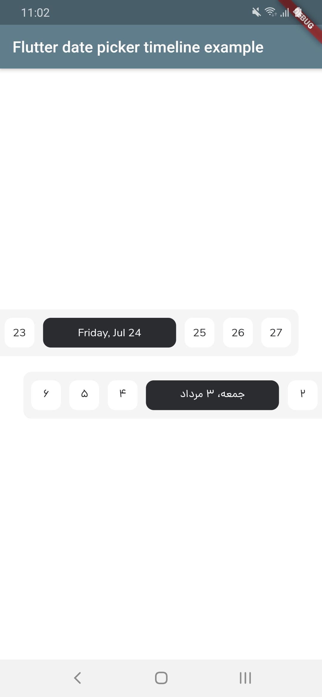
Screenshot iOS      Screenshot android


Let's get started

1 - Depend on it
Add it to your package's pubspec.yaml file
dependencies:
  flutter_date_picker_timeline: ^0.3.3
2 - Install it
Install packages from the command line
flutter pub get
3 - Import it
Import it to your project
import 'package:flutter_date_picker_timeline/flutter_date_picker_timeline.dart';

How to use?

Use the FlutterDatePickerTimeline Widget
FlutterDatePickerTimeline(
    startDate: DateTime(2020, 07, 01),
    endDate: DateTime(2020, 12, 30),
    initialSelectedDate: DateTime(2020, 07, 24),
    onSelectedDateChange: (DateTime dateTime) {
        print(dateTime);
      },
    )
Constructor:
FlutterDatePickerTimeline({
    Key key,
    // Determines the [FlutterDatePickerTimeline] mode.
    this.calendarMode = CalendarMode.gregorian,
    // The first date of [FlutterDatePickerTimeline].
    @required this.startDate,
    // The last date of [FlutterDatePickerTimeline].
    @required this.endDate,
    // Initially selected date.
    this.initialSelectedDate,
    // Initially focused date(If nothing is provided, a [initialSelectedDate] will be used).
    this.initialFocusedDate,
    // Used for setting the textDirection of [FlutterDatePickerTimeline].
    this.textDirection,
    // Used for setting the width of selected items.
    this.selectedItemWidth = 170,
    // Used for setting the width of unselected items.
    this.unselectedItemWidth = 38,
    // Used for setting the height of selected and unselected items.
    this.itemHeight = 38,
    // Used for setting the radius of selected and unselected items background.
    this.itemRadius = 10,
    // Used for setting the padding of [ListView].
    this.listViewPadding = const EdgeInsets.only(right: 5.5, left: 5.5),
    // Used for setting the margin of selected items.
    this.selectedItemMargin = const EdgeInsets.only(right: 5.5, left: 5.5),
    // Used for setting the margin of unselected items.
    this.unselectedItemMargin = const EdgeInsets.only(right: 5.5, left: 5.5),
    // Used for setting the color of selected items background.
    this.selectedItemBackgroundColor = const Color(0xFF2B2C30),
    // Used for setting the color of unselected items background.
    this.unselectedItemBackgroundColor = Colors.white,
    // Used for setting the style of selected items [Text].
    this.selectedItemTextStyle,
    // Used for setting the style of unselected items [Text].
    this.unselectedItemTextStyle,
    // Called whenever any date gets selected.
    @required this.onSelectedDateChange,
  }) : super(key: key);

Props

props types defaultValues
calendarMode CalendarMode CalendarMode.gregorian
startDate DateTime
endDate DateTime
initialSelectedDate DateTime?
initialFocusedDate DateTime? If nothing is provided, a [initialSelectedDate] will be used
textDirection TextDirection? If nothing is provided, a [calendarMode] will be used. (CalendarMode.gregorian -> TextDirection.ltr , CalendarMode.jalali -> TextDirection.rtl)
selectedItemWidth double 170
unselectedItemWidth double 38
itemHeight double 38
itemRadius double 10
listViewPadding EdgeInsets const EdgeInsets.only(right: 5.5, left: 5.5)
selectedItemMargin EdgeInsets const EdgeInsets.only(right: 5.5, left: 5.5)
unselectedItemMargin EdgeInsets const EdgeInsets.only(right: 5.5, left: 5.5)
selectedItemBackgroundColor Color const Color(0xFF2B2C30)
unselectedItemBackgroundColor Color Colors.white
selectedItemTextStyle TextStyle? TextStyle(fontFamily: widget.calendarMode == CalendarMode.gregorian ? 'nunito' : 'dana', package: 'flutter_date_picker_timeline', color: widget.unselectedItemBackgroundColor)
unselectedItemTextStyle TextStyle? TextStyle(fontFamily: widget.calendarMode == CalendarMode.gregorian ? 'nunito' : 'dana', package: 'flutter_date_picker_timeline', color: widget.selectedItemBackgroundColor)
onSelectedDateChange DateChangeListener

所屬分類

依賴

依賴清單 3 項

原始碼儲存庫

使用此套件的專案

暫無相關資料。