flutter_emoji_gif_picker
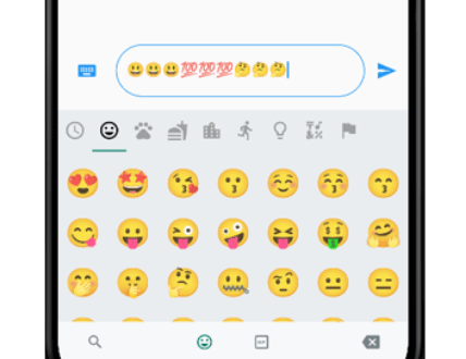
An emoji picker that was designed based on WhatsApp's picker model. Provides same functionalities with an easy usage.
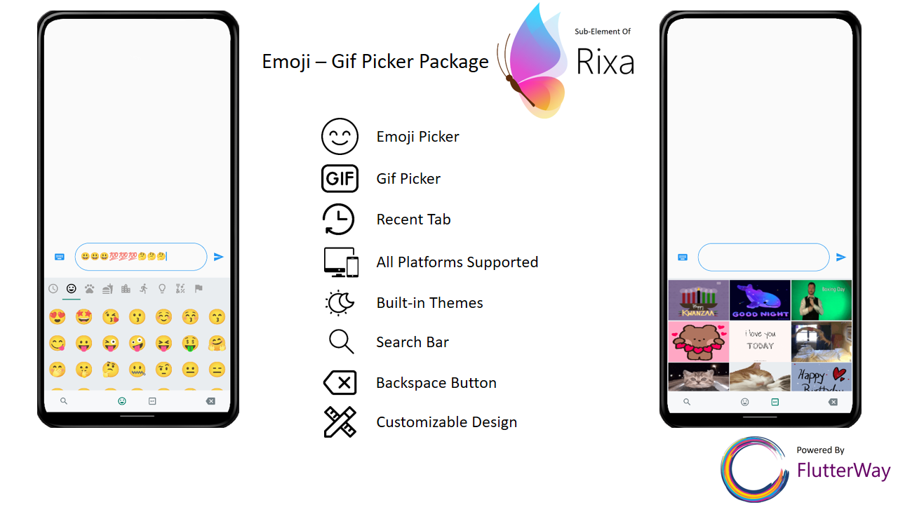
Features
Includes Emoji Icon Widget, Textfield
Includes Gif menu(via Giphy Api)
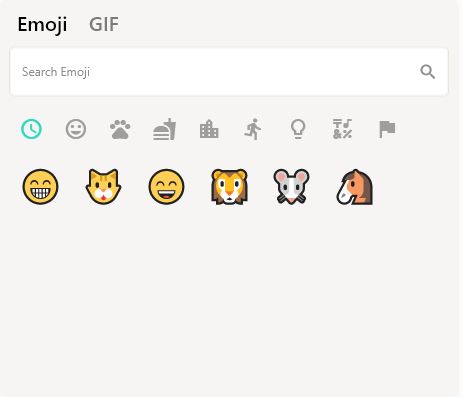
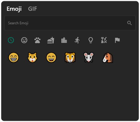
Ready to use Dark/Light Mode
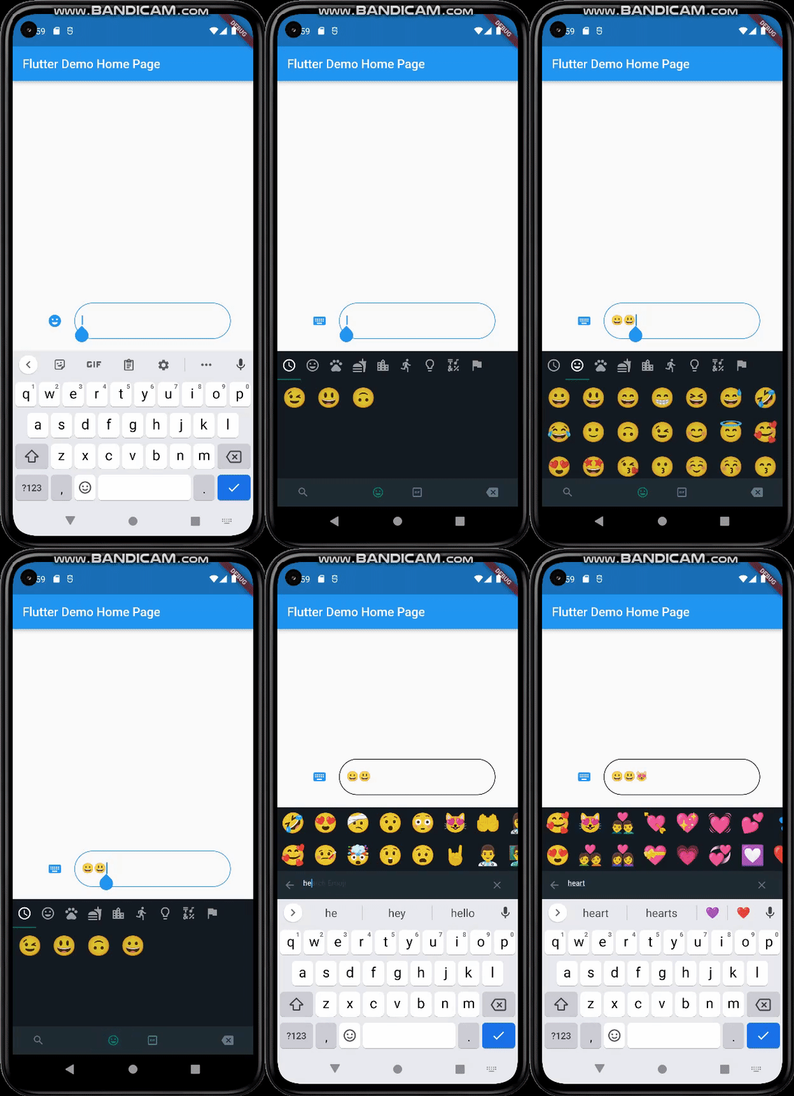
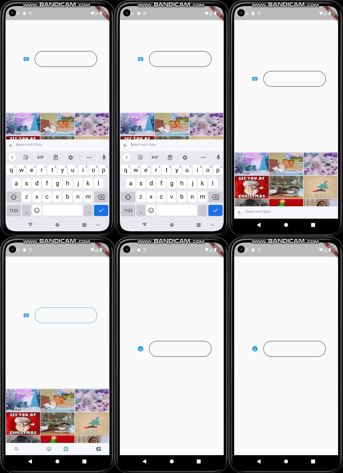
Freed of known keyboard issues of other emoji pickers
Back Button Event with same functionality as WhatsApp
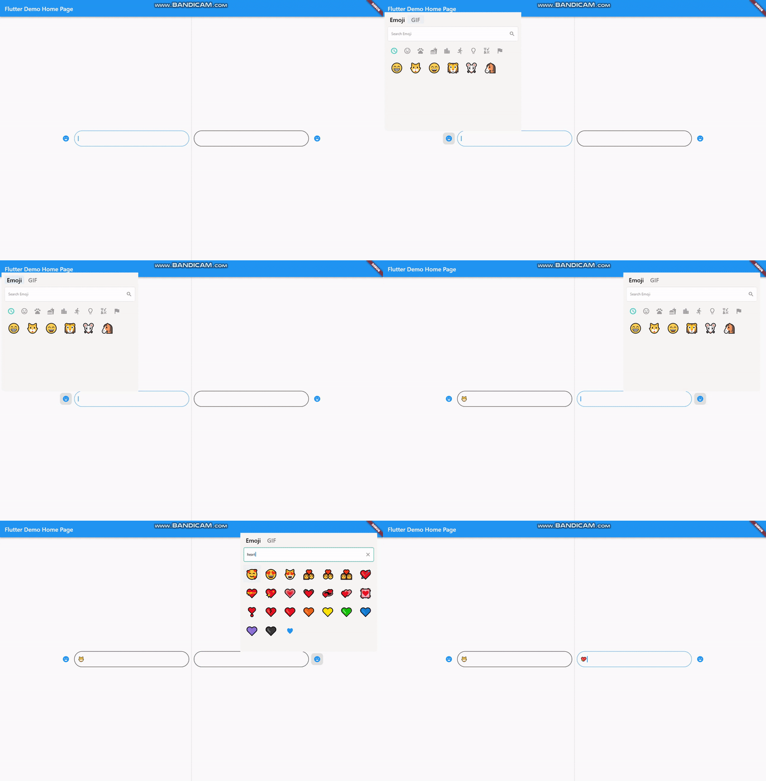
All platforms are supported
Lightweight
Instant loading times
Customizable design
Search bar for emoji / gif
Page resizing option with menu is provided
Getting Started
Basic Setup
It's simple and ready to use. Pick either dark / light mode and set your giphyApiKey. GiphyApiKey is required for gif menu to function / show.
EmojiGifPickerPanel .setup (
giphyApiKey: "yourgiphyapikey" , mode: Mode .light);
Custom Setup
EmojiGifPickerPanel .setup (
sizes: MenuSizes (width: 2000 , height: 500 ),
texts: MenuTexts (
searchEmojiHintText: "Search Emoji?" ,
searchGifHintText: "Search with Giphy" ),
colors: MenuColors (
backgroundColor: const Color (0xFFf6f5f3 ),
searchBarBackgroundColor: Colors .white,
searchBarBorderColor: const Color (0xFFe6e5e2 ),
searchBarEnabledColor: Colors .white,
searchBarFocusedColor: const Color (0xFF00a884 ),
menuSelectedIconColor: const Color (0xFF1d6e5f ),
buttonColor: const Color (0xFF909090 ),
iconBackgroundColor: null ,
iconHoveredBackgroundColor: const Color .fromARGB (255 , 224 , 224 , 224 ),
indicatorColor: Colors .transparent,
),
styles: MenuStyles (
menuSelectedTextStyle:
const TextStyle (fontSize: 20 , color: Colors .black),
menuUnSelectedTextStyle:
const TextStyle (fontSize: 20 , color: Color (0xFF7a7a7a )),
searchBarHintStyle:
const TextStyle (fontSize: 12 , color: Color (0xFF8d8d8d )),
searchBarTextStyle:
const TextStyle (fontSize: 12 , color: Colors .black)),
giphyApiKey: "yourgiphyapikey" ,
mode: Mode .light);
Change Your MateralApp builder
return MaterialApp (
theme: ThemeData (
primarySwatch: Colors .blue,
),
builder: (context, child) {
return Stack (
children: [
child!,
EmojiGifMenuStack (),
],
);
},
home: const MyHomePage (),
);
Should Emoji-Gif picker resize your page ?
If you want your emoji-gif picker to resize your page when opened, your page needs to be wrapped with EmojiGifMenuLayout and set fromStack:false in your picker icon widget. Otherwise emoji-gif picker will cover its own space on your page
EmojiGifMenuLayout (
child: YourDesign (),
)
EmojiGifPickerIcon (
id: "1" ,
onGifSelected: (gif) {},
fromStack: false ,
controller: controller,
icon: Icon (Icons .emoji_emotions),
),
Back Button Problem
When the back button is pressed, if you want your emoji-gif picker menu to close instead of switching to another page, you must wrap your scaffold with WillPopScope to achieve this functionality
return WillPopScope (
onWillPop: (() async {
return EmojiGifPickerPanel .onWillPop ();
}),
child: Scaffold (
EmojiGifPickerIcon & EmojiGifTextfield
These widgets are required in order to show picker menu.
Give an id to your picker widget this way you can use these widgets in multiple places on the same page. Don't forget to give your TextEditingController in EmojiGifPickerIcon.
With viewEmoji, viewGif parameters, you can control which menu opens or not.
Icon
EmojiGifPickerIcon (
id: "1" ,
onGifSelected: (gif) {},
controller: controller,
viewEmoji: true ,
viewGif: true ,
icon: Icon (Icons .emoji_emotions),
)
TextField
EmojiGifTextField (
id: "1" ,
)
Full View Example
Row (
mainAxisAlignment: MainAxisAlignment .center,
children: [
EmojiGifPickerIcon (
id: "2" ,
onGifSelected: (gif) {},
controller: controller2,
icon: Icon (Icons .emoji_emotions),
),
SizedBox (
width: MediaQuery .of (context).size.width * 0.6 ,
child: EmojiGifTextField (
id: "2" ,
decoration: InputDecoration (
enabledBorder: OutlineInputBorder (
borderSide: BorderSide (color: Colors .black),
borderRadius: BorderRadius .circular (30 )),
focusedBorder: OutlineInputBorder (
borderSide: BorderSide (color: Colors .blue),
borderRadius: BorderRadius .circular (30 )),
),
)),
],
Ready to use Example
import 'package:flutter/material.dart' ;
import 'package:emoji_gif_picker_menu/emoji_gif_picker_menu.dart' ;
void main () {
EmojiGifPickerPanel .setup (
giphyApiKey: "yourgiphyapikey" , mode: Mode .light);
runApp (const MyApp ());
}
class MyApp extends StatelessWidget const MyApp ({super .key});
@override
Widget build (BuildContext context) {
return MaterialApp (
theme: ThemeData (
primarySwatch: Colors .blue,
),
builder: (context, child) {
return Stack (
children: [
child!,
EmojiGifMenuStack (),
],
);
},
home: const MyHomePage (),
);
}
}
class MyHomePage extends StatefulWidget const MyHomePage ({super .key});
@override
State <MyHomePage > createState () => _MyHomePageState ();
}
class _MyHomePageState extends State <MyHomePage > TextEditingController controller = TextEditingController ();
@override
Widget build (BuildContext context) {
return WillPopScope (
onWillPop: (() async {
return EmojiGifPickerPanel .onWillPop ();
}),
child: Scaffold (
resizeToAvoidBottomInset: true ,
body: EmojiGifMenuLayout (
child:
Row (mainAxisAlignment: MainAxisAlignment .center, children: [
EmojiGifPickerIcon (
id: "1" ,
onGifSelected: (gif) {},
controller: controller,
icon: Icon (Icons .emoji_emotions),
),
SizedBox (
width: MediaQuery .of (context).size.width * 0.3 ,
child: EmojiGifTextField (
id: "1" ,
decoration: InputDecoration (
enabledBorder: OutlineInputBorder (
borderSide: BorderSide (color: Colors .black),
borderRadius: BorderRadius .circular (30 )),
focusedBorder: OutlineInputBorder (
borderSide: BorderSide (color: Colors .blue),
borderRadius: BorderRadius .circular (30 )),
),
)),
]),
)));
}
}
Customizable
EmojiGifPickerPanel is a panel that allows you to edit the design to your liking. You can customize the features as shown below :
EmojiGifPickerPanel .setPosition (MenuPosition (bottom: 0 ));
EmojiGifPickerPanel .setSizes (MenuSizes (width: 2000 , height: 500 ));
EmojiGifPickerPanel .setTexts (MenuTexts (
searchEmojiHintText: "Search Emoji?" ,
searchGifHintText: "Search with Giphy" ),
noRecents: Text ("No Recent" ),
);
EmojiGifPickerPanel .setColors (MenuColors (
backgroundColor: const Color (0xFFf6f5f3 ),
searchBarBackgroundColor: Colors .white,
searchBarBorderColor: const Color (0xFFe6e5e2 ),
searchBarEnabledColor: Colors .white,
searchBarFocusedColor: const Color (0xFF00a884 ),
menuSelectedIconColor: const Color (0xFF1d6e5f ),
buttonColor: const Color (0xFF909090 ),
iconBackgroundColor: null ,
iconHoveredBackgroundColor: const Color .fromARGB (255 , 224 , 224 , 224 ),
indicatorColor: Colors .transparent,
));
EmojiGifPickerPanel .setStyles (MenuStyles (
menuSelectedTextStyle: const TextStyle (fontSize: 20 , color: Colors .black),
menuUnSelectedTextStyle:
const TextStyle (fontSize: 20 , color: Color (0xFF7a7a7a )),
searchBarHintStyle:
const TextStyle (fontSize: 12 , color: Color (0xFF8d8d8d )),
searchBarTextStyle: const TextStyle (fontSize: 12 , color: Colors .black)));
This package was possible to create with :