Flutter Material Pickers









A flutter package containing commonly used material design picker dialogs. Some are new, some wrap existing or built in pickers with a common dialog and access function.
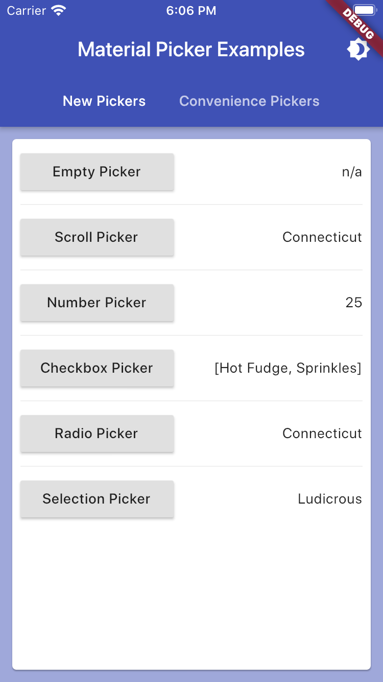
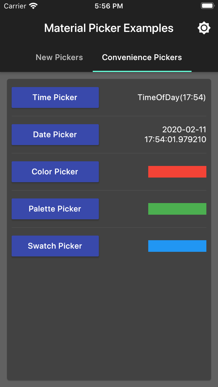
It includes:
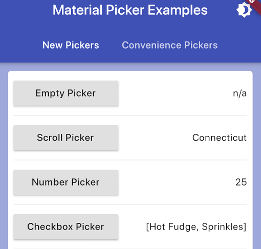
- New Pickers
showMaterialScrollPicker:
- Allows selection of a string via a slot machine carousel
showMaterialNumberPicker:
- Allows selection of a number via a slot machine carousel
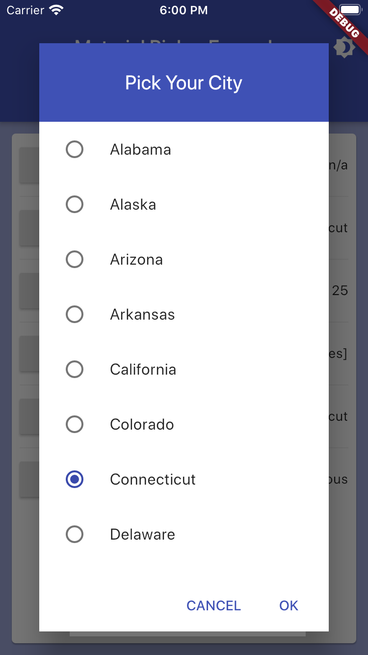
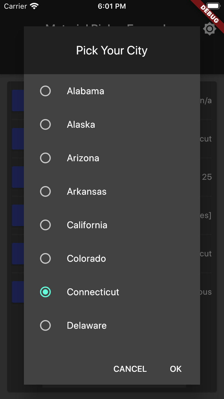
showMaterialRadioPicker:
- Allows selection of a single from a radio list
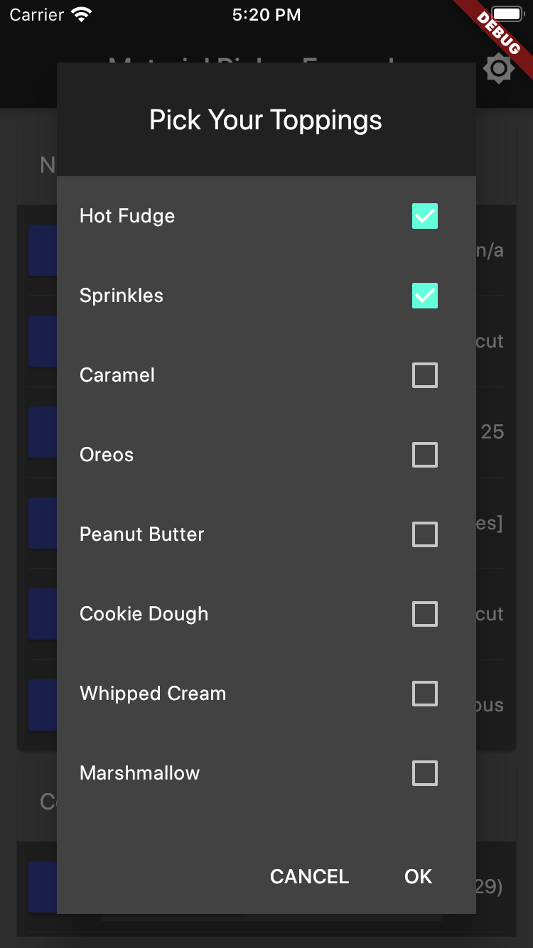
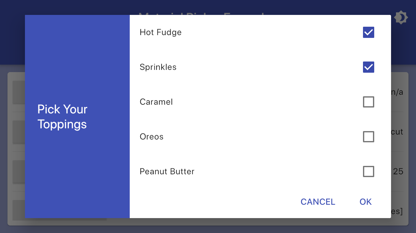
showMaterialCheckboxPicker:
- Allows selection of many values from a checkbox list
showMaterialSelectionPicker:
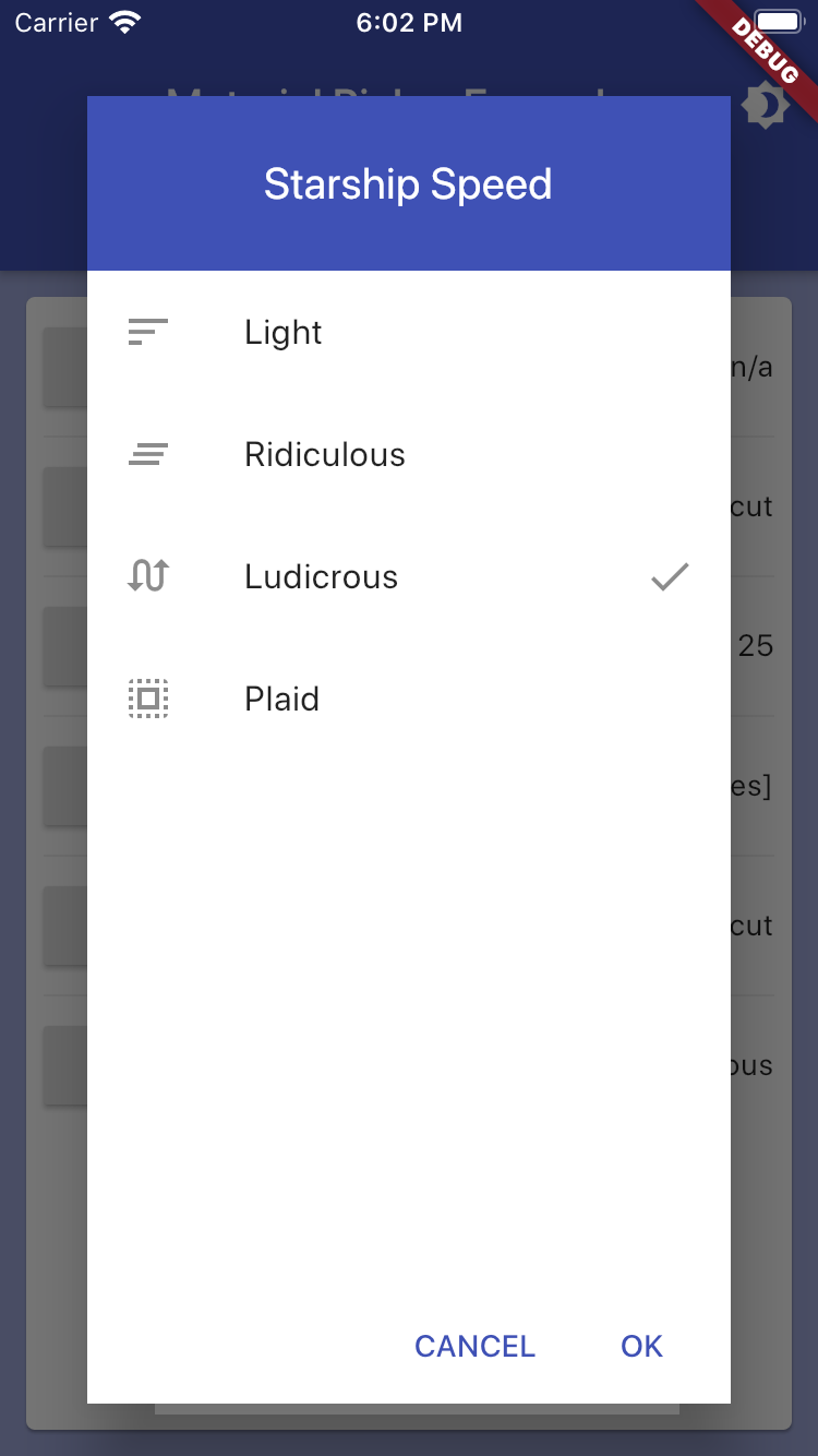
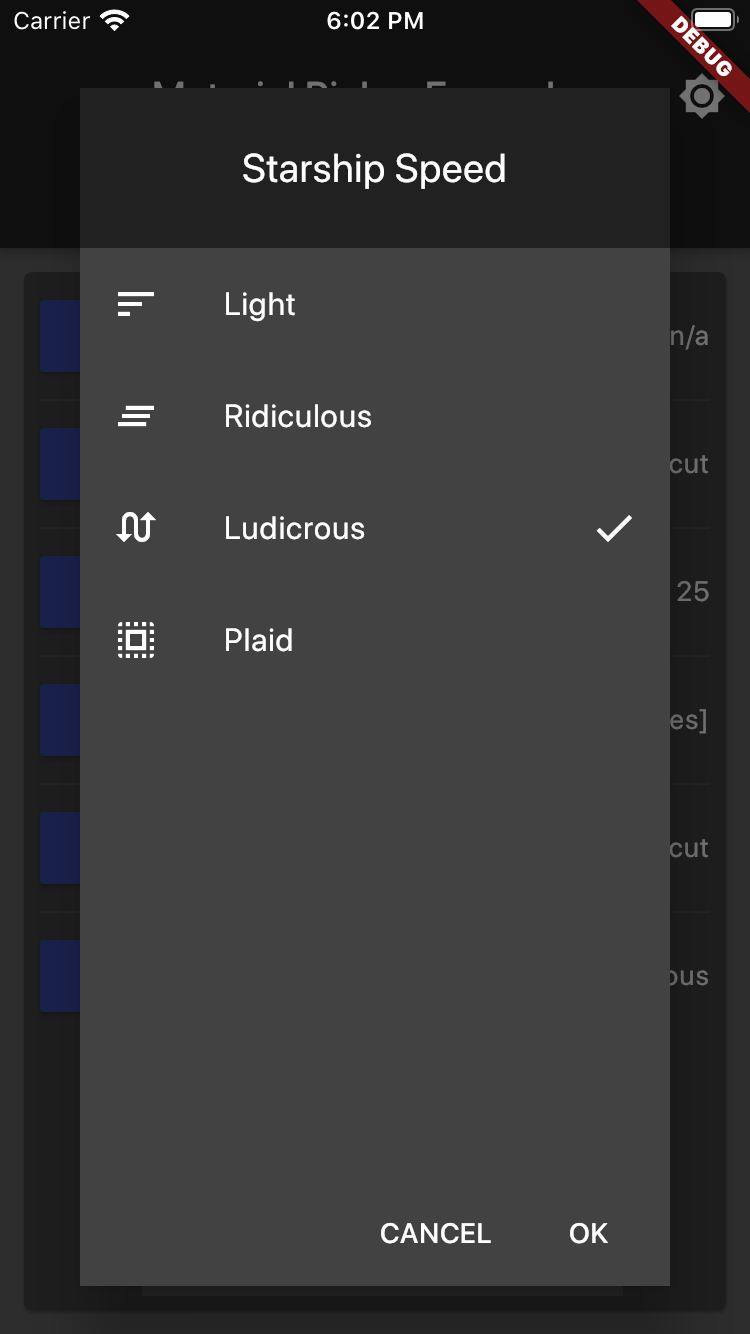
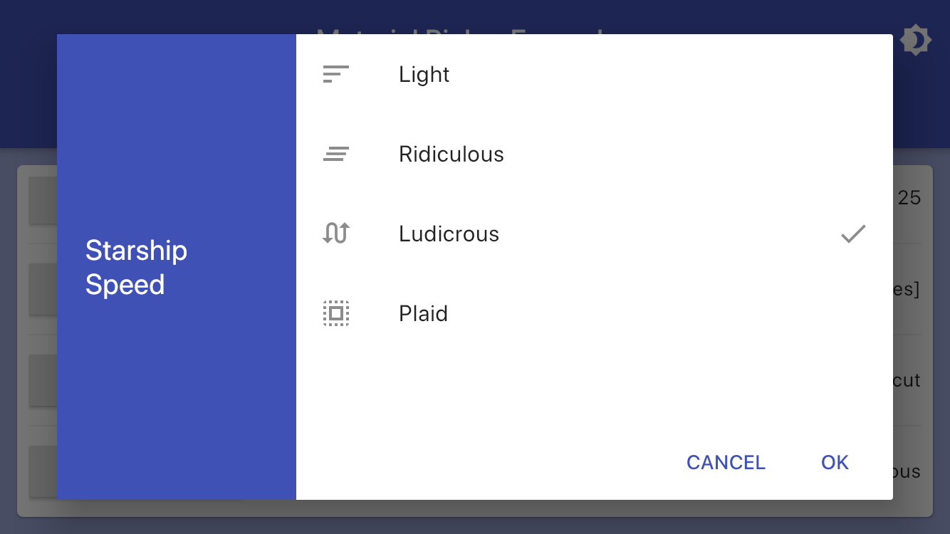
- Allows selection of a single value via an icon label list
- Convenience Pickers
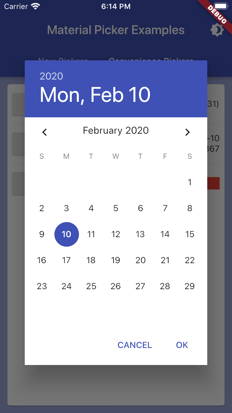
showMaterialDatePicker:
- Allows selection of a date (uses the core date picker)
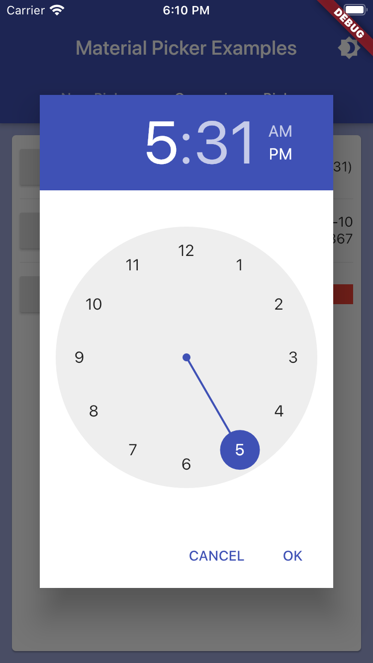
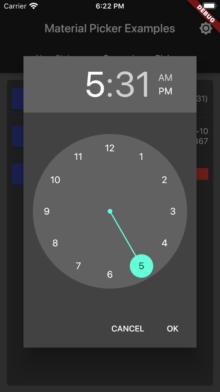
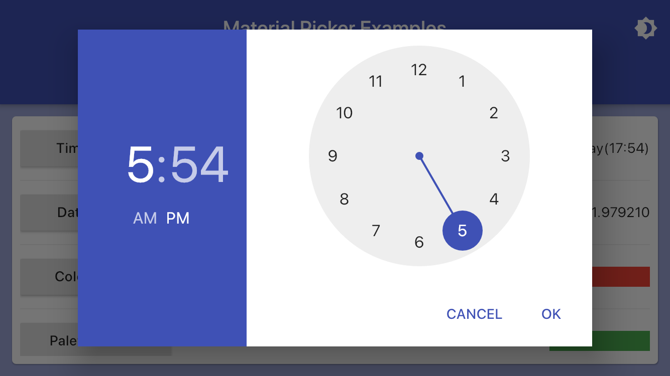
showMaterialTimePicker:
- Allows selection of a time (uses the core time picker)
showMaterialColorPicker:
- Allows RGB selection of a color (uses the ColorPicker of flutter_colorpicker)
showMaterialPalettePicker:
- Allows Material palette selection of a color (uses the MaterialPicker of flutter_colorpicker)
showMaterialSwatchPicker:
- Allows selection of a color from swatches (uses the BlockPicker of flutter_colorpicker)
showMaterialFilePicker:
- Allows selection of a file using the device's default picker
- Dialog
showMaterialResponsiveDialog:
- Extends Dialog by making it responsive to screen orientation changes
All helpers implement an onChange handler to return picked option(s).
All helpers return Future<T> with the picked option(s).
There are some breaking changes in 3.0.0 (from 2.1.1).
- Pickers accept generic types passed to pickers and helpers.
- There's no need to pass several lists (items, values, icons), just pass
one list of generic type objects.
- A selected item of generic type is passed as
selectedItem not
selectedValue to match name of items.
- To convert an item to a string displayed to a user either override
toString() in generic type class or pass transformer callback which
accepts an item and returns a String. (see examples)
- To provide item's icon in SelectionPicker (and alikes), pass iconizer
callback which accepts an item and returns an Icon. (see example)
Example Usage
Empty Dialog Example
Although not a picker, per se, the showMaterialEmptyPicker helper displays the universal material design dialog wrapper that the pickers appear in. Using this directly, however, allows any content to be injected into the content area by passing in a custon Widget as the child. This code shows the basic structure of all the helpers:
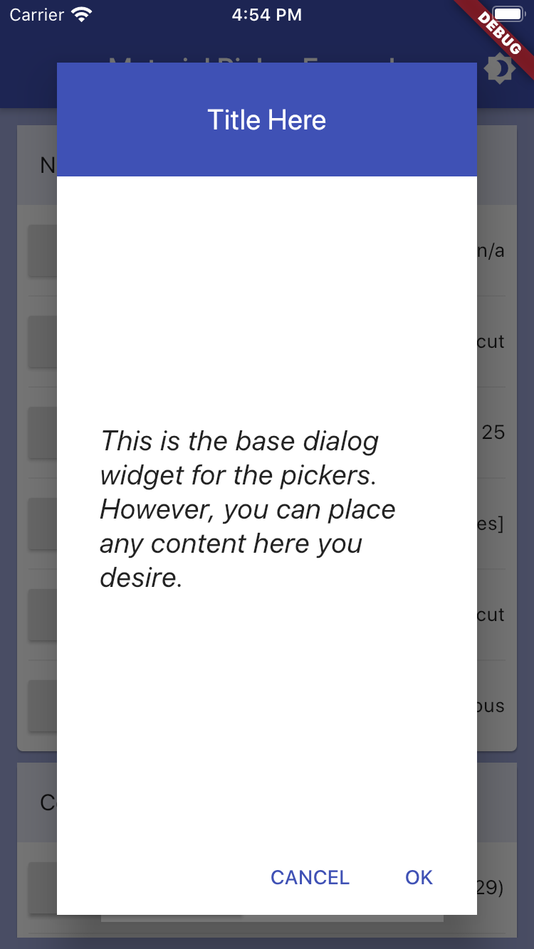
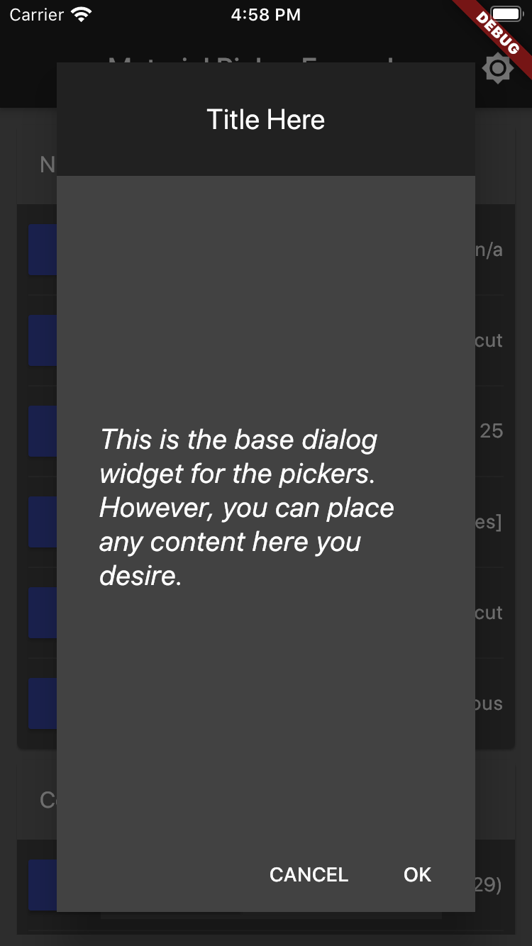
showMaterialResponsiveDialog(
    context: context,
    child: Center(
        child: Container(
            padding: EdgeInsets.all(30.0),
            child: Text('Any content here.'),
            style: TextStyle(
                fontSize: 20.0,
                fontStyle: FontStyle.italic,
            ),
        ),
    ),
);
Scroll Picker Example
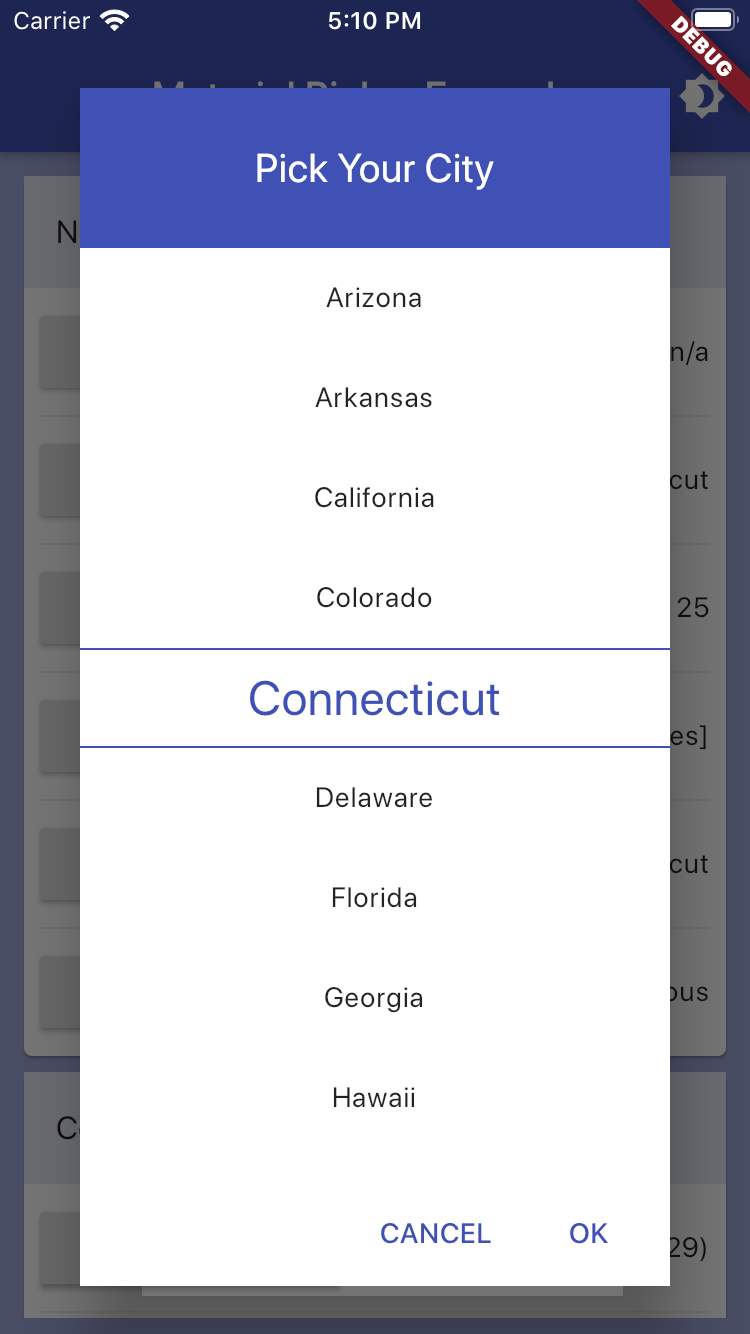
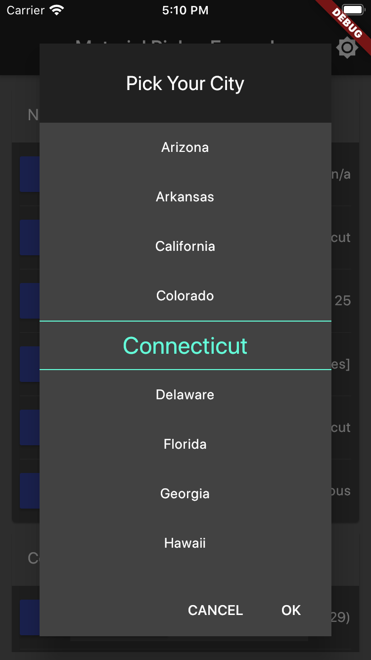

class StateModel {
  const StateModel(this.name, this.code);
  final String code;
  final String name;

  @override
  String toString() => name;
}
static const List<StateModel> usStates = <StateModel>[
  StateModel('Alabama', 'AL'),
  StateModel('Alaska', 'AK'),
  StateModel('Arizona', 'AZ'),
  StateModel('Arkansas', 'AR'),
  StateModel('California', 'CA'),
  StateModel('Colorado', 'CO'),
  StateModel('Connecticut', 'CT'),
  ...
];
StateModel selectedUsState = usStates[0];

showMaterialScrollPicker<StateModel>(
    context: context,
    title: 'Pick Your State',
    items: usStates,
    selectedItem: selectedUsState,
    onChanged: (value) => setState(() => selectedUsState = value),
);
Number Picker Example
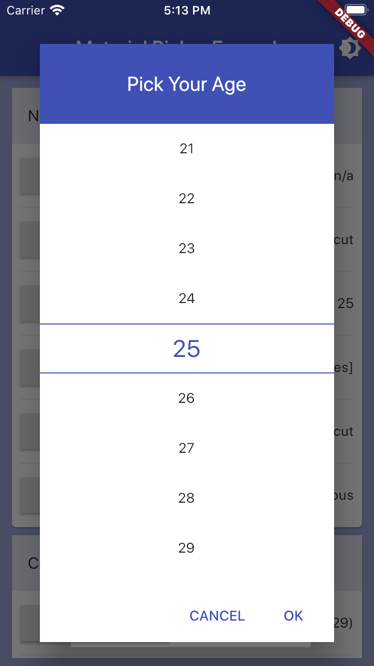
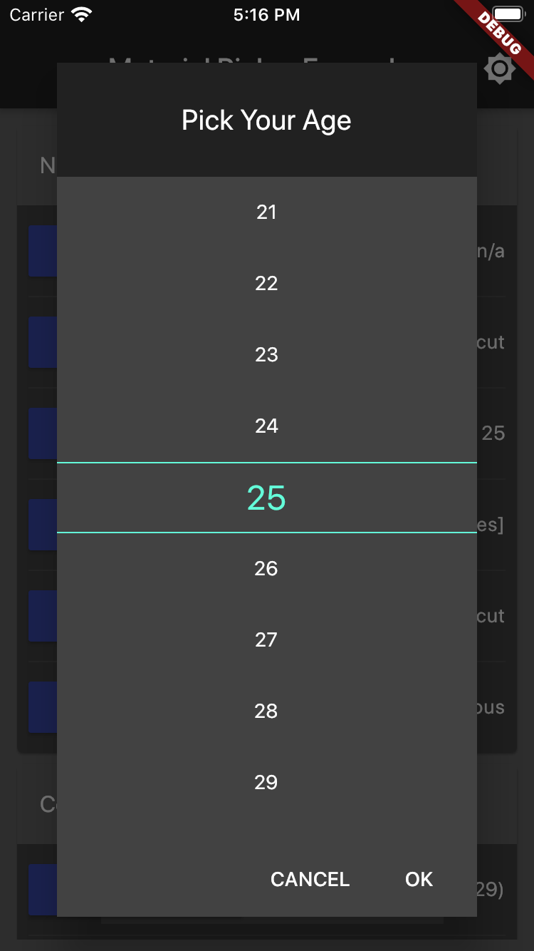
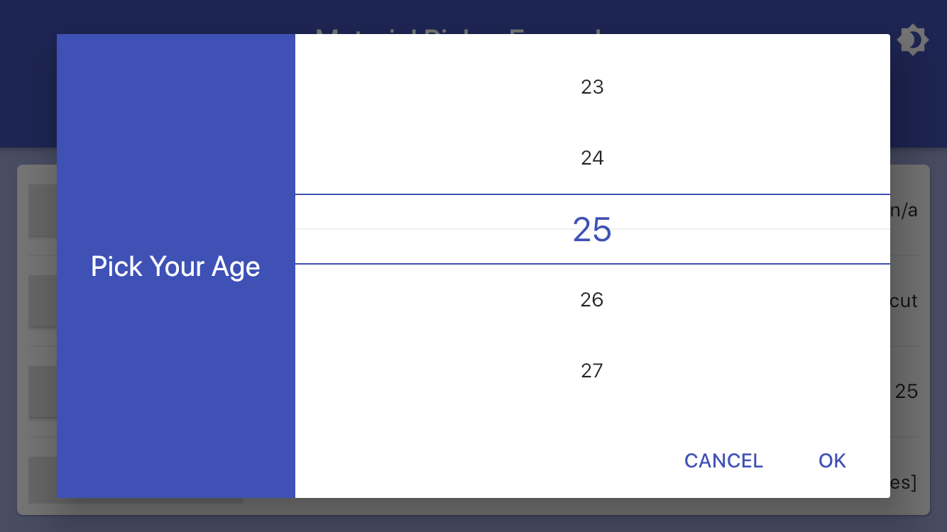
var age = 25;

showMaterialNumberPicker(
  context: context,
  title: 'Pick Your Age',
  maxNumber: 100,
  minNumber: 14,
  selectedNumber: age,
  onChanged: (value) => setState(() => age = value),
);
Checkbox Picker Example
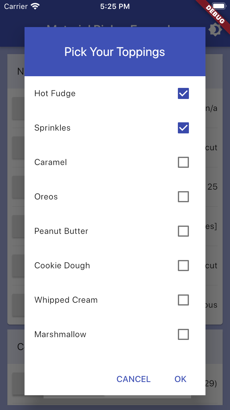
class ToppingModel {
  const ToppingModel(this.name, this.code);
  final String code;
  final String name;

  @override
  String toString() => name;
}
static const List<ToppingModel> iceCreamToppings = <ToppingModel>[
  ToppingModel('Hot Fudge', 'FUDGE'),
  ToppingModel('Sprinkles', 'SPRINK'),
  ToppingModel('Caramel', 'CARM'),
  ToppingModel('Oreos', 'OREO'),
  ...
];
List<ToppingModel> selectedIceCreamToppings = [
  iceCreamToppings[0],
  iceCreamToppings[2],
];

showMaterialCheckboxPicker<ToppingModel>(
  context: context,
  title: 'Pick Your Toppings',
  items: iceCreamToppings,
  selectedItems: selectedIceCreamToppings,
  onChanged: (value) => setState(() => selectedIceCreamToppings = value),
);
Radio Picker Example
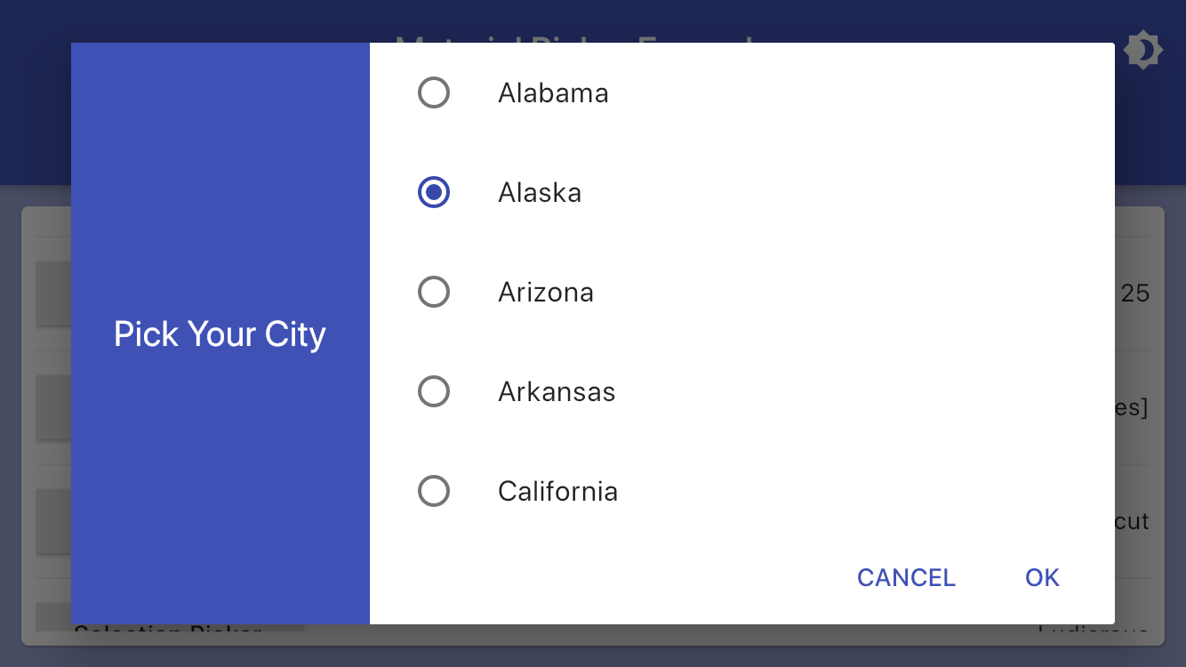
class StateModel {
  const StateModel(this.name, this.code);
  final String code;
  final String name;

  @override
  String toString() => name;
}
static const List<StateModel> usStates = <StateModel>[
  StateModel('Alabama', 'AL'),
  StateModel('Alaska', 'AK'),
  StateModel('Arizona', 'AZ'),
  StateModel('Arkansas', 'AR'),
  StateModel('California', 'CA'),
  StateModel('Colorado', 'CO'),
  StateModel('Connecticut', 'CT'),
  ...
];
StateModel selectedUsState = usStates[3];

showMaterialRadioPicker<StateModel>(
  context: context,
  title: 'Pick Your State',
  items: usStates,
  selectedItem: selectedUsState,
  onChanged: (value) => setState(() => selectedUsState = value),
);
Selection Picker Example
class SpeedModel {
const SpeedModel(this.name, this.icon);
final String name;
final Icon icon;
}
static const List<SpeedModel> speedOptions = <SpeedModel>[
SpeedModel('Light', Icon(Icons.sort)),
SpeedModel('Ridiculous', Icon(Icons.clear_all)),
SpeedModel('Ludicrous', Icon(Icons.swap_calls)),
SpeedModel('Plaid', Icon(Icons.select_all)),
];
SpeedModel speed = speedOptions[2];
showMaterialSelectionPicker(
context: context,
title: "Starship Speed",
items: speedOptions,
selectedItem: speed,
icons: speedIcons,
transformer: (item) => item.name,
iconizer: (item) => item.icon,
onChanged: (value) => setState(() => speed = value),
);
Time Picker Example
var time = TimeOfDay.now();

showMaterialTimePicker(
  context: context,
  selectedTime: time,
  onChanged: (value) => setState(() => time = value),
);
Date Picker Example
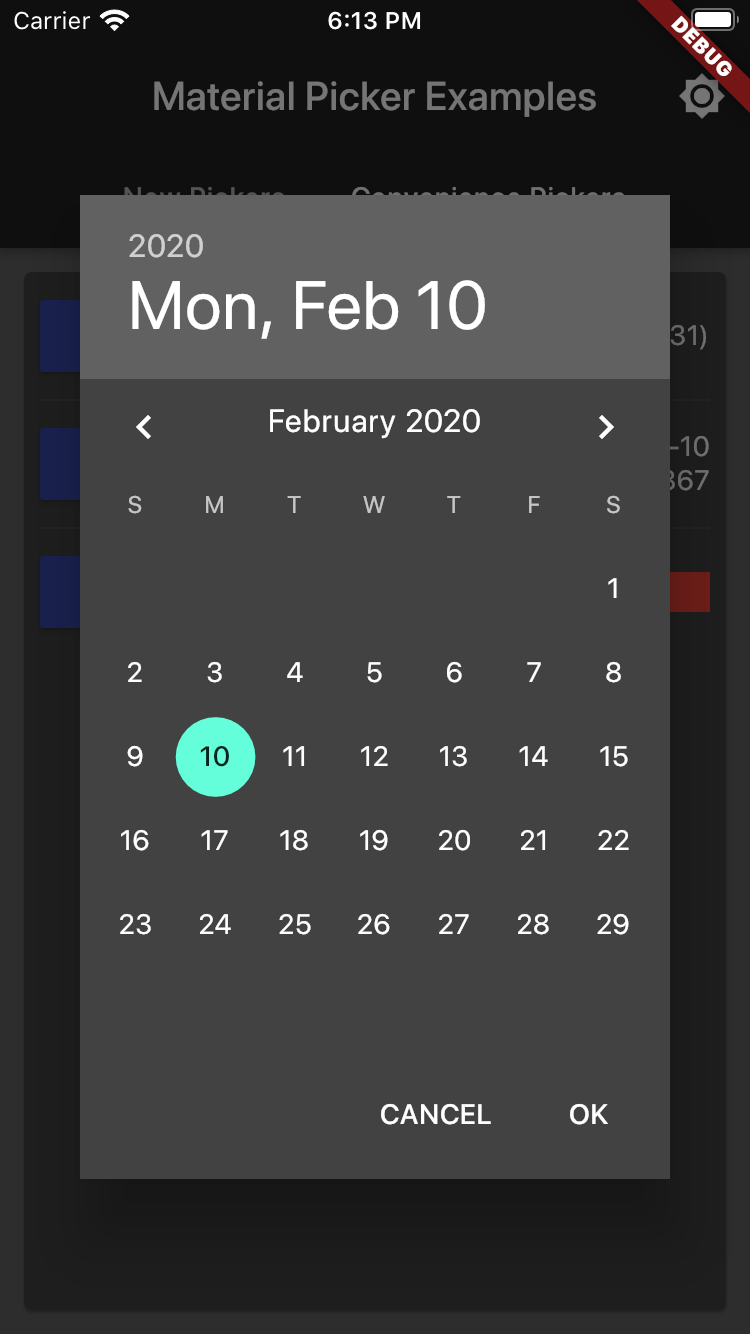
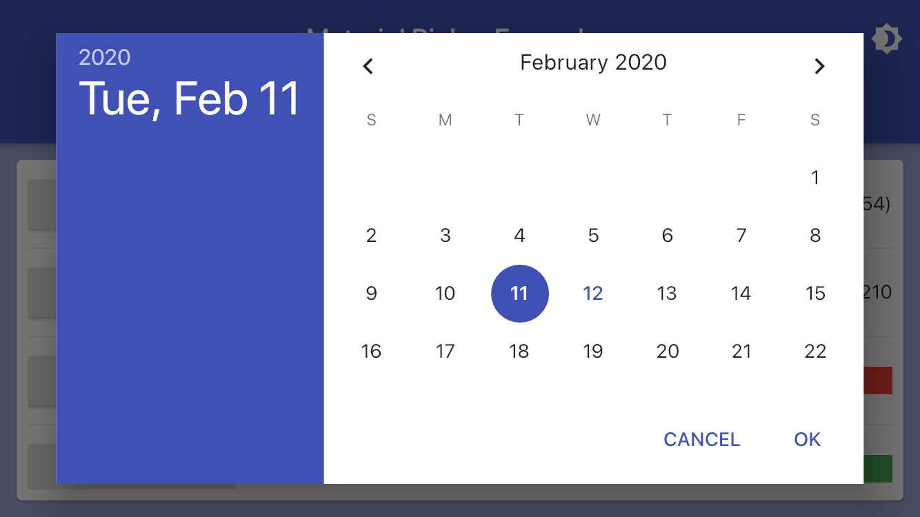
var date = DateTime.now();

showMaterialDatePicker(
  context: context,
  selectedDate: date,
  onChanged: (value) => setState(() => date = value),
);
Color Picker Example
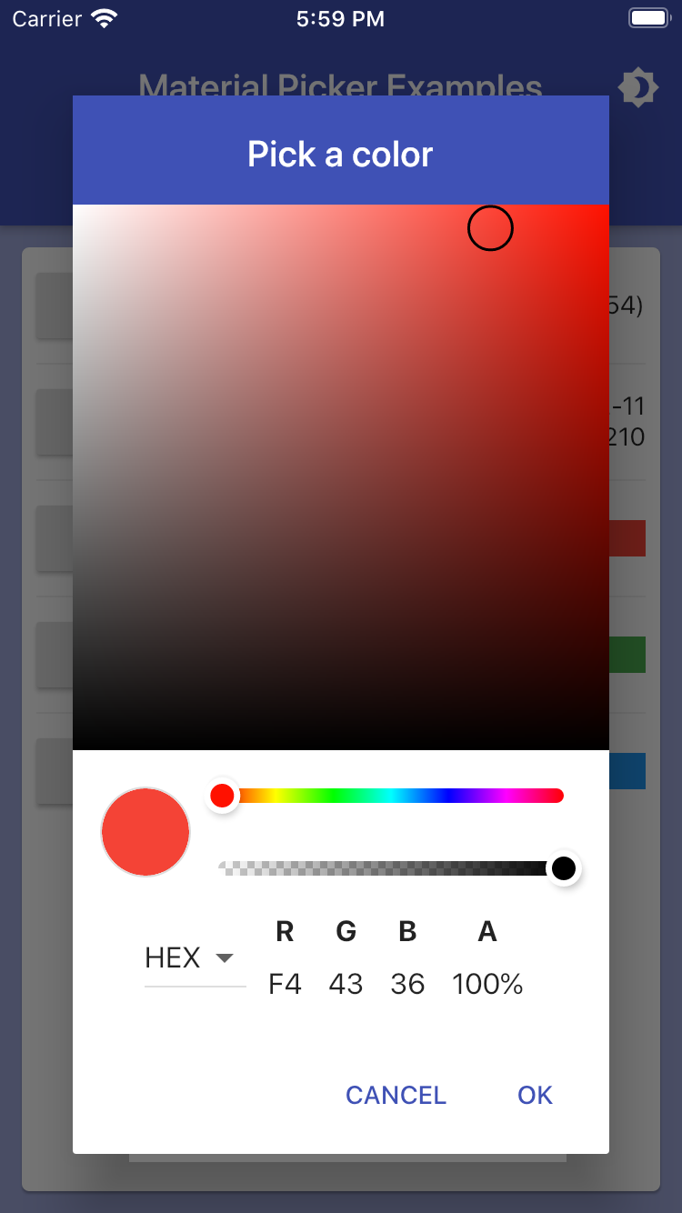
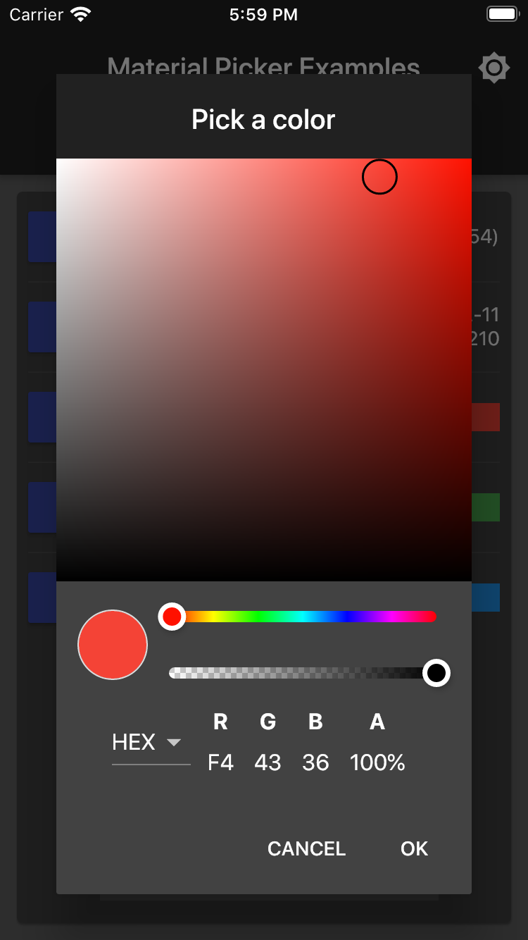
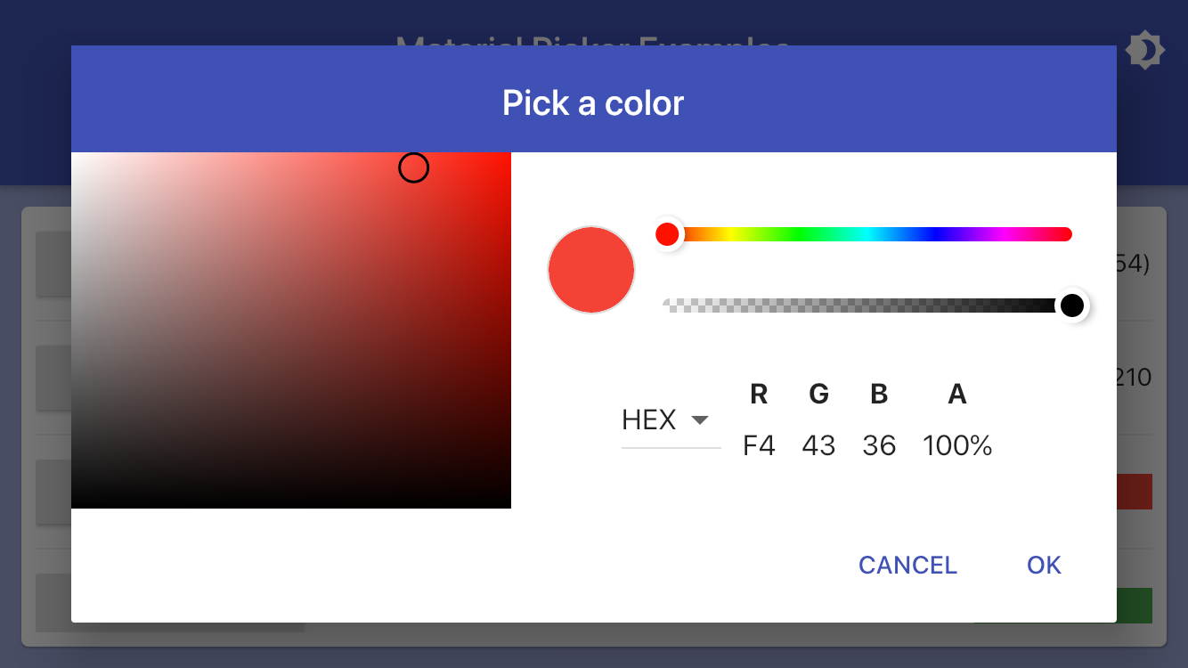
Color color = Colors.red;

showMaterialColorPicker(
  context: context,
  selectedColor: color,
  onChanged: (value) => setState(() => color = value),
);
Palette Picker Example
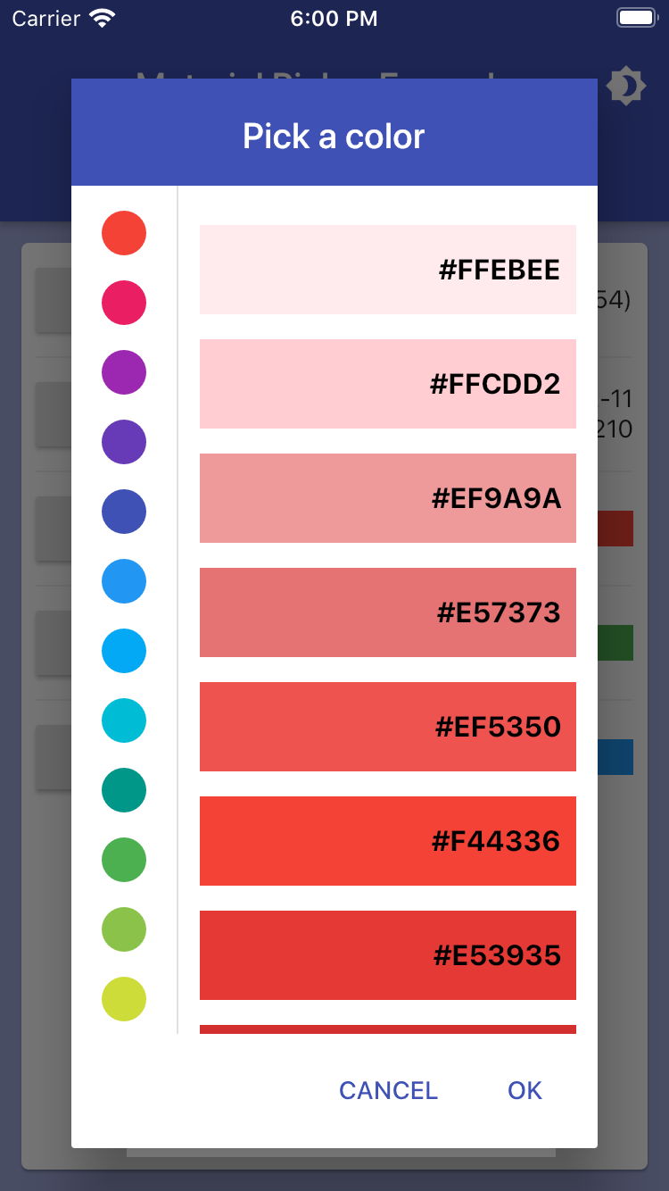
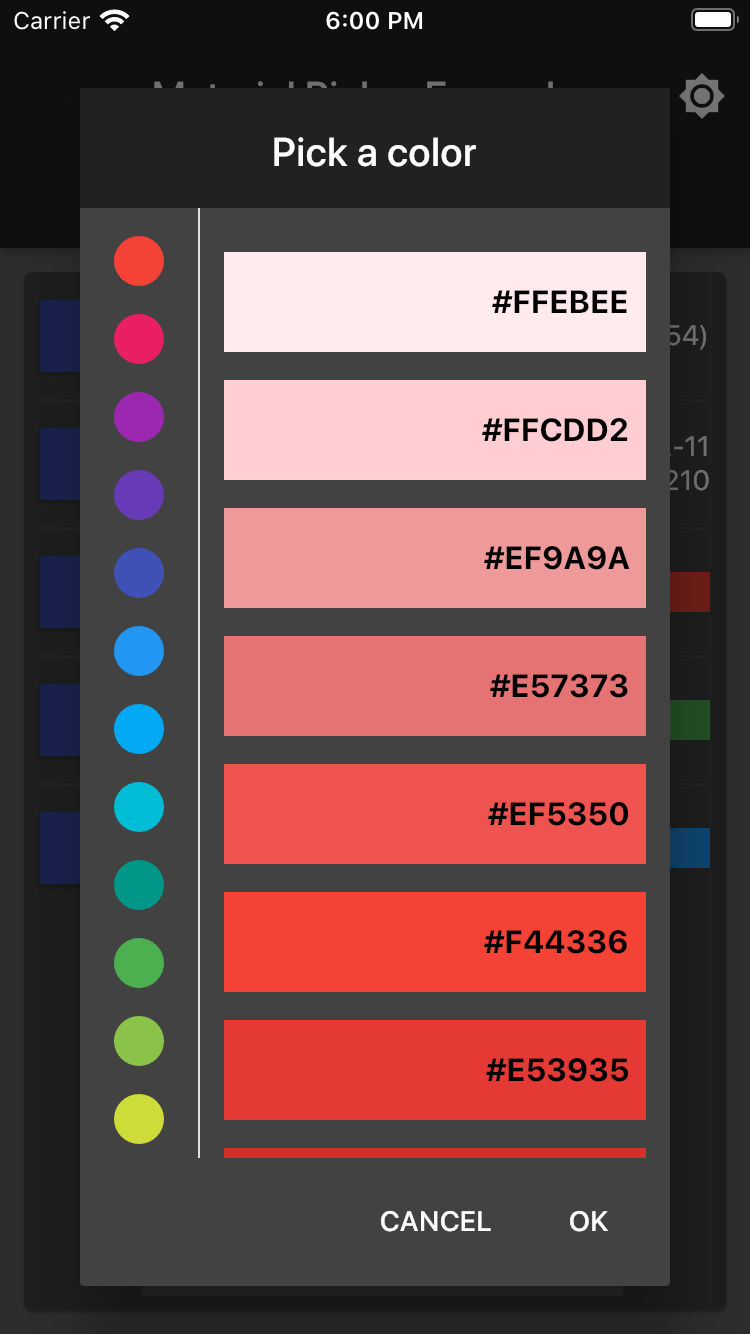
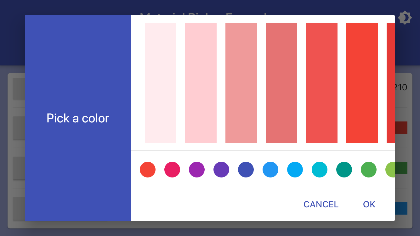
Color palette = Colors.green;

showMaterialPalettePicker(
  context: context,
  selectedColor: palette,
  onChanged: (value) => setState(() => palette = value),
);
Swatch Picker Example
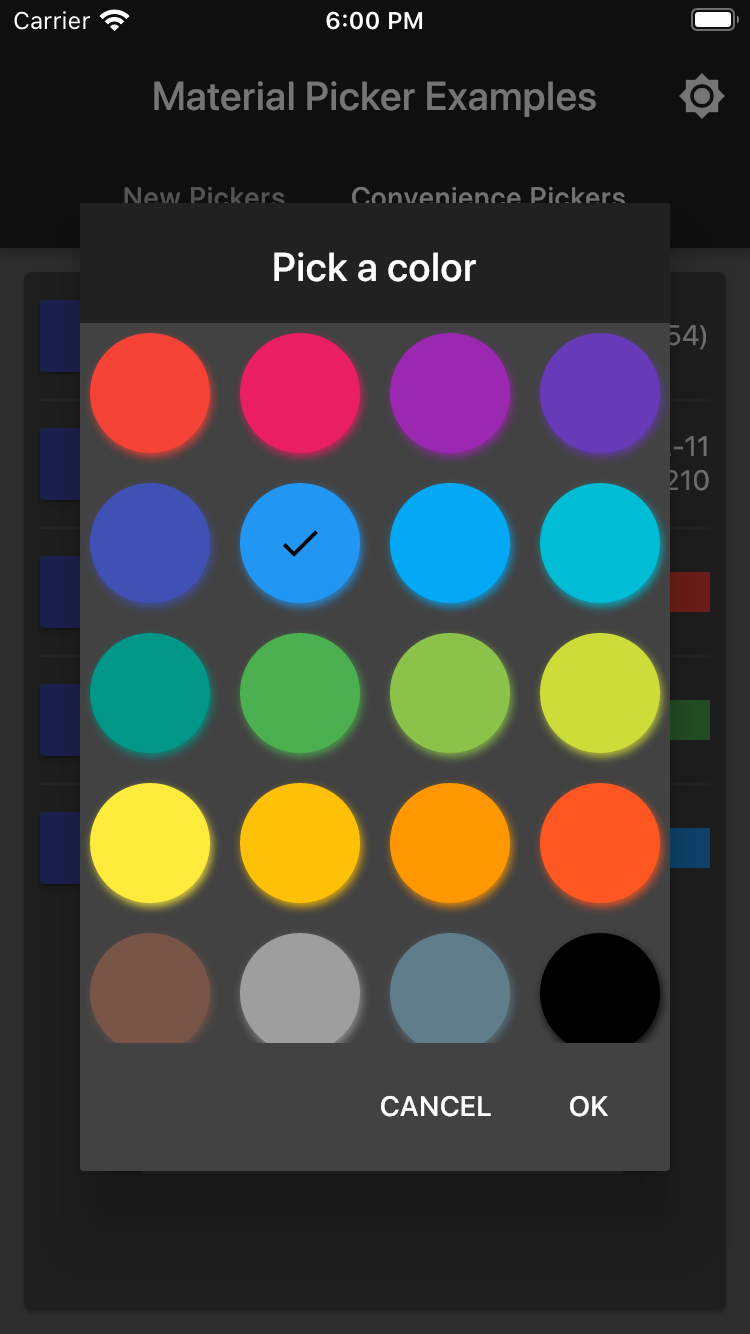
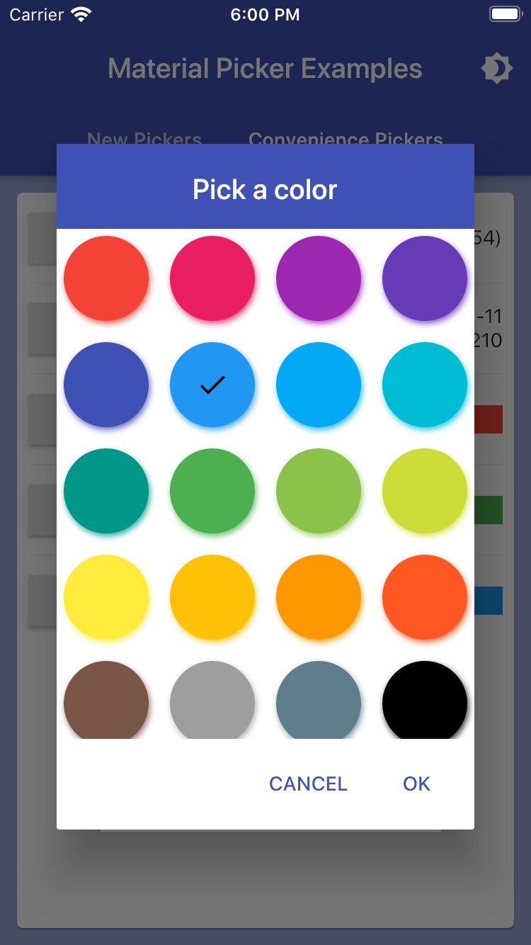
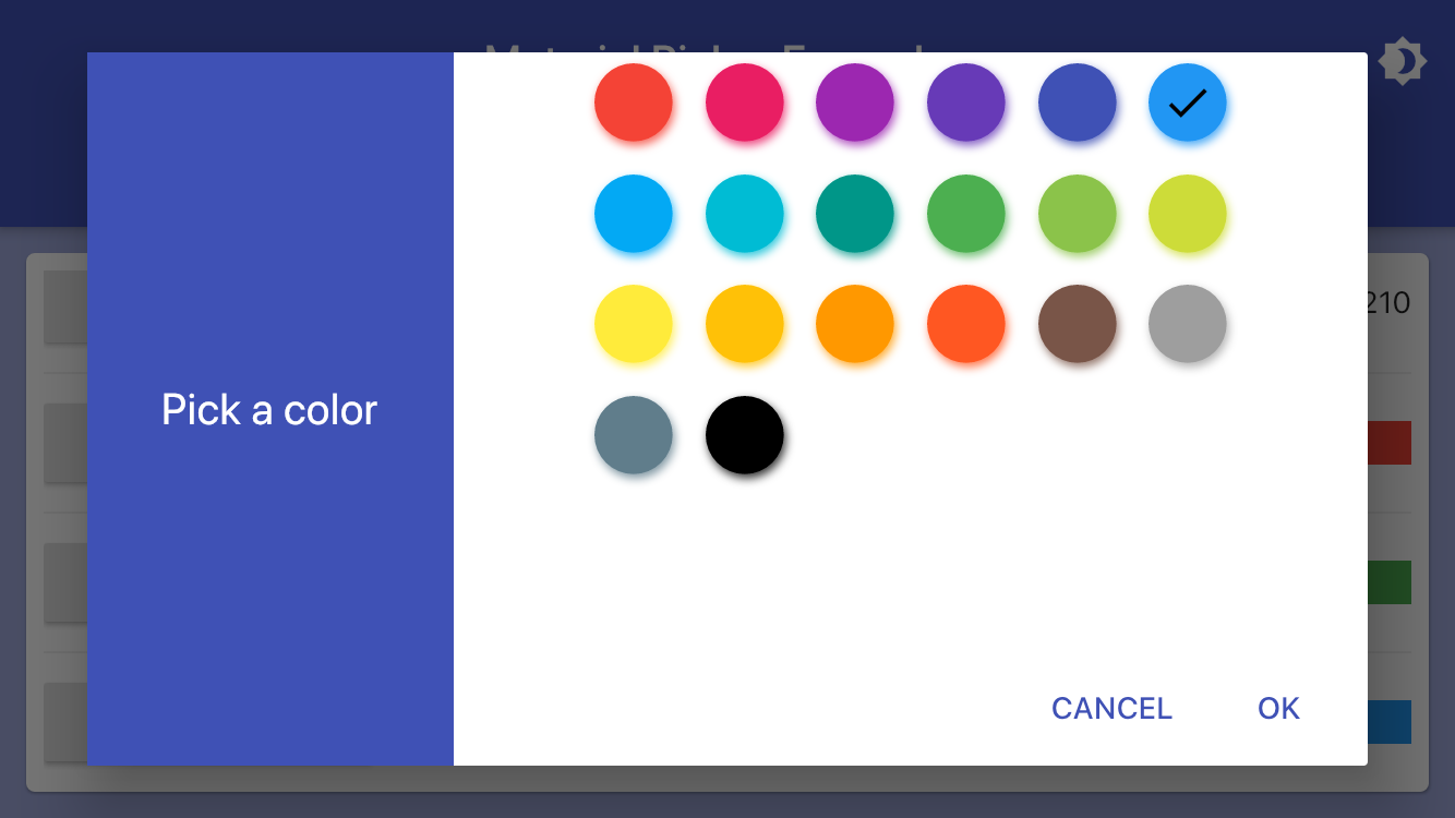
Color swatch = Colors.blue;

showMaterialSwatchPicker(
  context: context,
  selectedColor: swatch,
  onChanged: (value) => setState(() => swatch = value),
);
Picker Model
If you don't already have or want to build a custom object to hold selction items, this library includes a general purpose one called PickerModel that you would use like this:
  static const List<PickerModel> items = <PickerModel>[
    PickerModel('First', code: 1, icon: Icon(Icons.sort)),
    PickerModel('Second', code: 2, icon: Icon(Icons.clear_all)),
    PickerModel('Third', code: 3, icon: Icon(Icons.swap_calls)),
    PickerModel('Fourth', code: 4, icon: Icon(Icons.select_all)),
  ];
The code and icon fields are optional.
Theming
It is highly recommended you use Flutter's built in theme styling with primarySwatch to automatically style all controls across your entire application.
ThemeData(
  primarySwatch: Colors.indigo,
)
If you desire to override the color for a given control, here is how to customize the theme:
var theme = ThemeData();
theme = theme.copyWith(
primaryColor: Colors.green,
accentColor: Colors.black,
dialogBackgroundColor: Colors.green[300],
primaryTextTheme: theme.primaryTextTheme.copyWith(
title: theme.primaryTextTheme.title.copyWith(
color: Colors.lightGreen[50],
),
),
textTheme: theme.textTheme.copyWith(
body1: theme.textTheme.body1.copyWith(
color: Colors.green[900],
),
button: theme.textTheme.button.copyWith(
color: Colors.lightGreen[50],
),
),
);
The example app demonstrates switching between light and dark themes globally.
However, if for some reason you want to change colors in an individual dialog, several parameters are exposed to allow this:
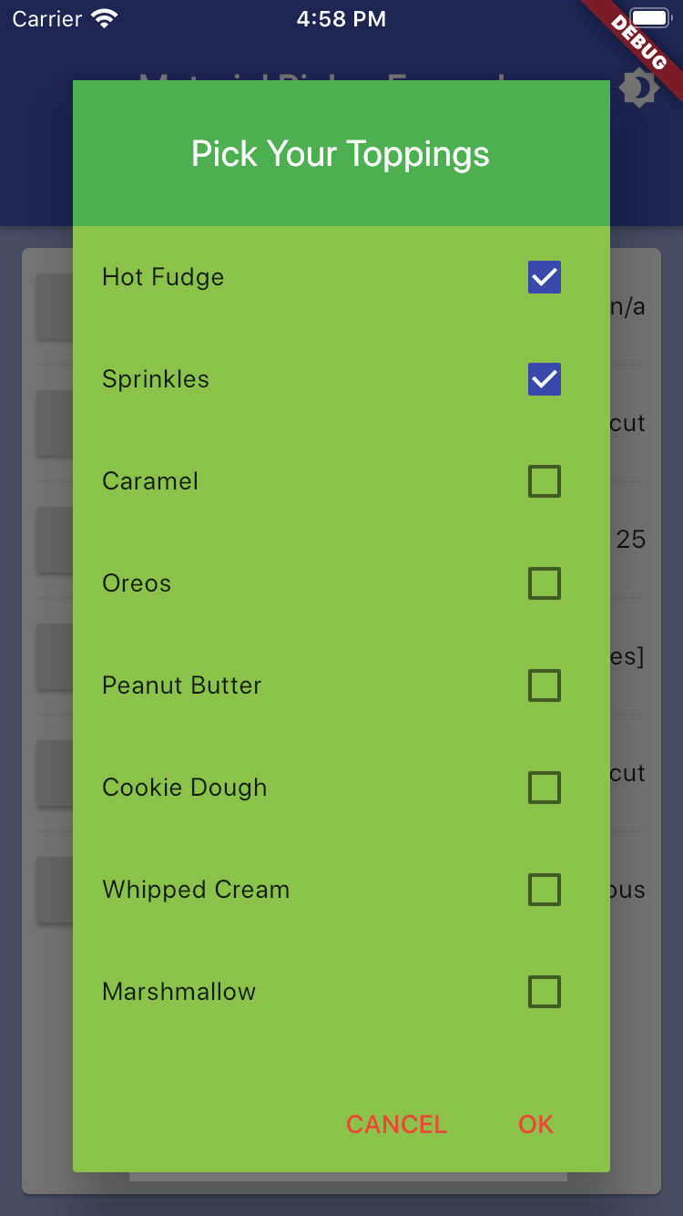
showMaterialResponsiveDialog(
context: context,
headerColor: Colors.green,
headerTextColor: Colors.white,
backgroundColor: Colors.lightGreen,
buttonTextColor: Colors.red,
child: Text('Custom dialog colors'),
);
Customization
You can customize the text that appears in various areas of the screen. The button labels automatically localize to the native language versions of "Ok" and "Cancel", unless replacement text is provided.
showMaterialNumberPicker(
  title: 'Pick Your Age',
  confirmText: 'Count me in',
  cancelText: 'Negatory',
);
Sizing
To prevent dialogs from growing to full screen on larger devices (or web) two properties control the maxmium size that it will grow:
  maxLongSide: 600,
  maxShortSide: 400,
The sides relate to if the dialog is showing in landscape or portrait mode. If you wish larger (or smaller) dialogs you can overide these values.
Supported Platforms
- [x] Android
- [x] iOS
- [x] Web
Dependencies
This widget set relies on these external third-party components:
Changelog
Please see the Changelog page to know what's recently changed.
Contributions
If you find a bug or want a feature, but don't know how to fix/implement it, please fill an issue.
If you fixed a bug or implemented a new feature, please send a pull request. Please include a note about your change in CHANGELOG.md with your pull request.