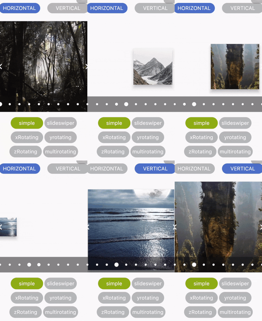
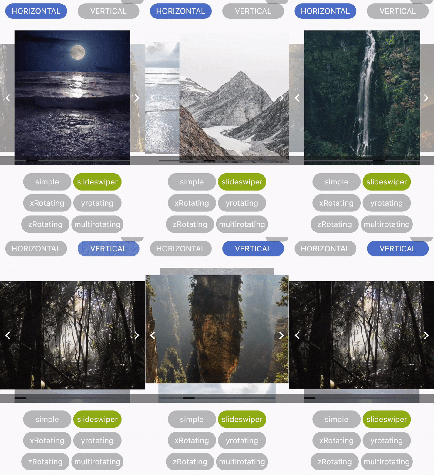
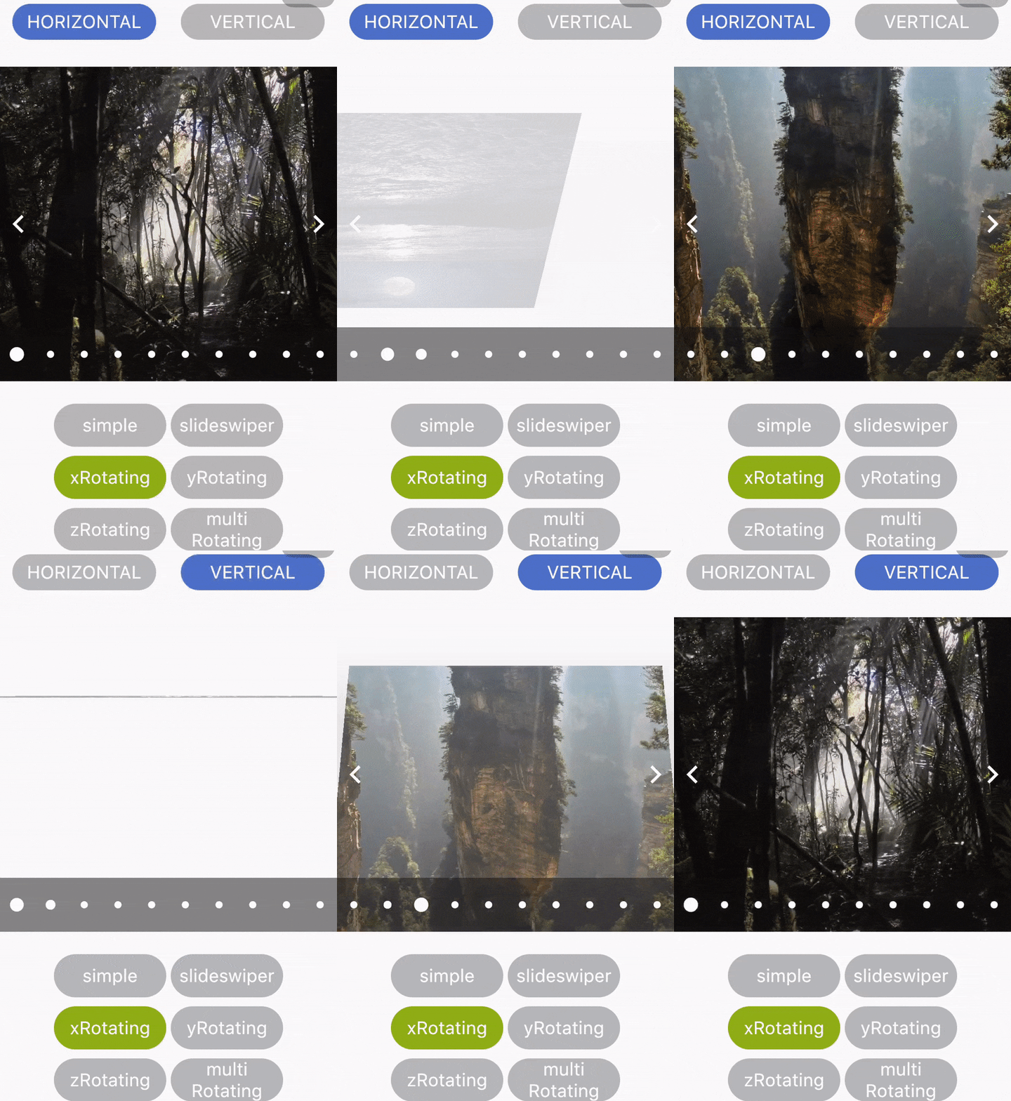
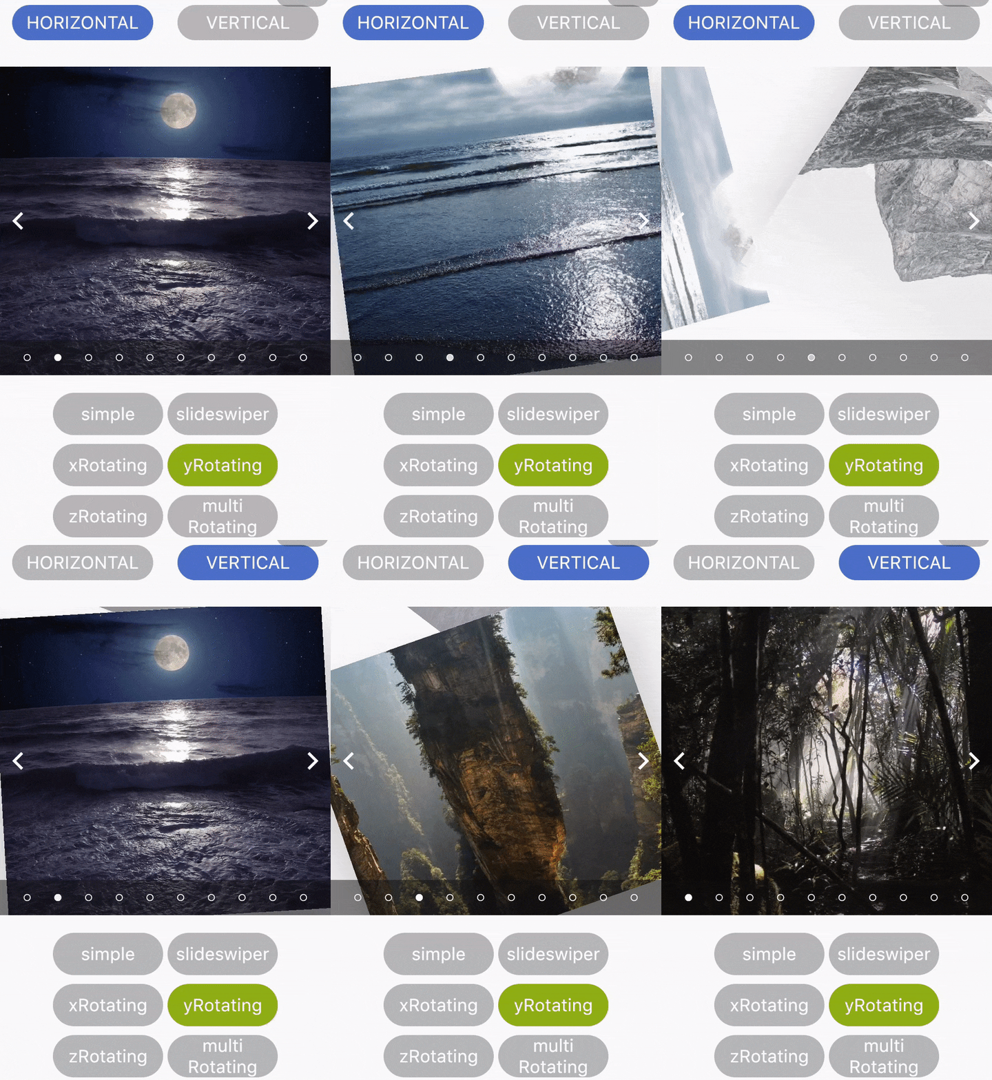
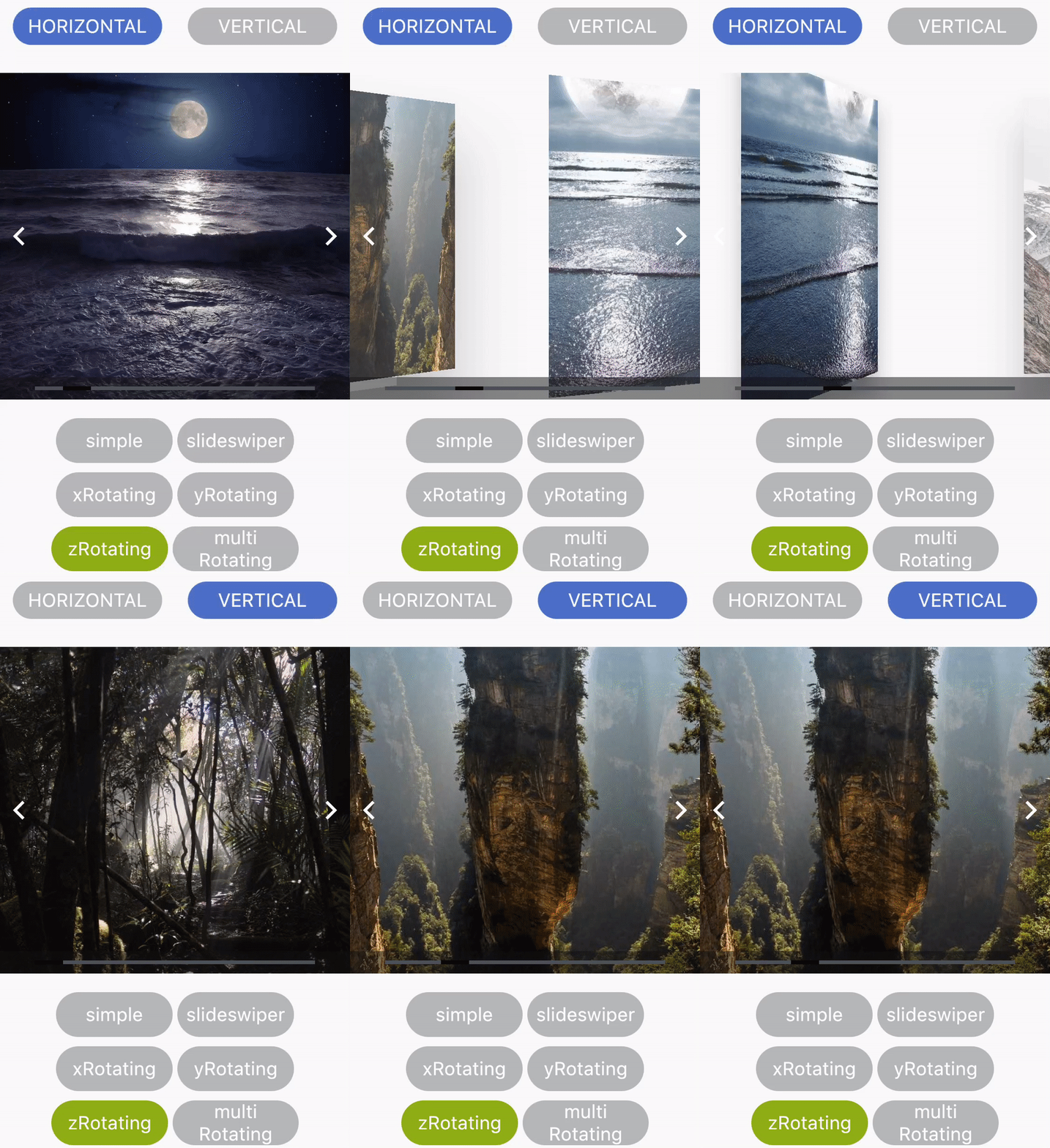
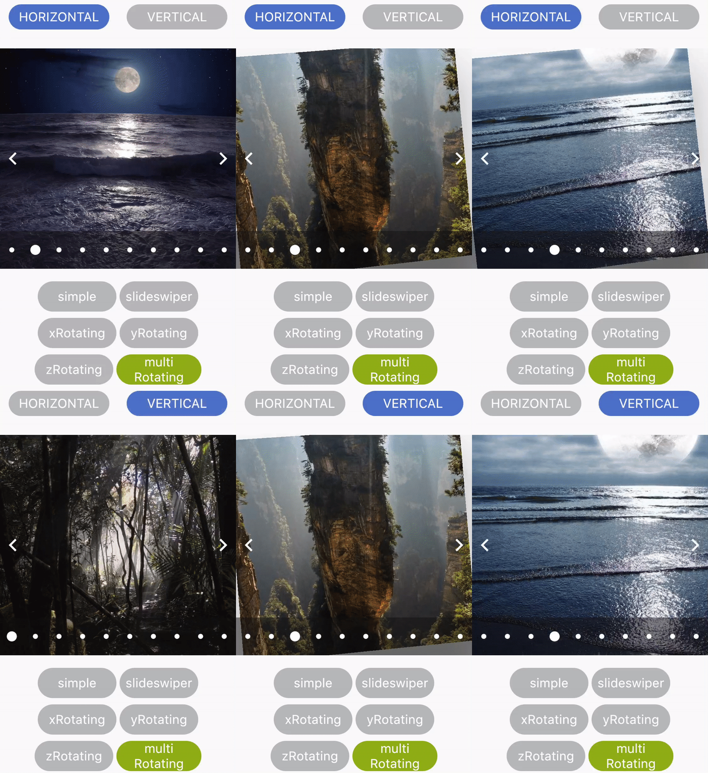
Flutter_Carosel
A simple Carousel Widget with multiple configuration option.
...
dependencies:
 ...
 flutter_multi_carousel: ^1.0.0
...
And install it using flutter packages get on your project folder. After that, just import the module and use it:
import 'package:flutter/material.dart';
import 'package:flutter_multi_carousel/carousel.dart';
void main() => runApp(MyApp());
class MyApp extends StatelessWidget {
@override
Widget build(BuildContext context) {
return MaterialApp(
title: 'Carousel Demo',
home: CarouselExample(),
);
}
}
class CarouselExample extends StatelessWidget {
@override
Widget build(BuildContext context) {
return Scaffold(
body: Center(
child: Carousel(
height: 350.0,
width: 350,
initialPage: 3,
allowWrap: false,
type: Types.slideSwiper,
onCarouselTap: (i) {
print("onTap $i");
},
indicatorType: IndicatorTypes.bar,
arrowColor: Colors.black,
axis: Axis.horizontal,
showArrow: true,
children: List.generate(
7,
(i) => Center(
child:
Container(color: Colors.red.withOpacity((i + 1) / 7)),
))),
),
);
}
}
For detailed demonstration refer this GitHub link
https://github.com/jaiswalshubham84/Flutter-Carousel
Getting Startedslide
| Properties |
Type |
Default Value |
Description |
| height |
Double |
null |
Defines height of carousel.This field is required |
| width |
Double |
null |
Defines width of carousel. This field is required |
| axis |
Axis |
Axis.horizontal |
Defines axis of carousel. |
| type |
Types |
"simple" |
Defines type of carousel.
for ex: Types.simple, Types.slideSwiper, Types.xRotating, Types.yRotating, Types.zRotating, Types.multiRotating
|
| onCarouselTap |
Function |
null |
A callback function |
| arrowColor |
Color |
Colors.white |
Define the color of arrow |
| arrowColor |
Color |
Colors.white |
Define the color of arrow |
| showIndicator |
Bool |
true |
Choice to show indicator in carousel |
| indicatorType |
IndicatorTypes |
bar |
Defines the type of indicator.
For ex: IndicatorTypes.bar, IndicatorTypes.dot, IndicatorTypes.bubble
|
| initialPage |
int |
0 |
Start your carousel with custom initial page number |
| activeIndicatorColor |
Color |
Colors.white |
Defines the color of active indicator |
| unActiveIndicatorColor |
Color |
Colors.black |
Defines the color of unactive indicator |
| indicatorBackgroundColor |
Color |
Color(0xff121212) |
Defines the background color of indicator |
| indicatorBackgroundOpacity |
Double |
0.5 |
Defines the opacity of indicator background |
| allowWrap |
bool |
true |
Defines if the carousel should wrap once you reach the end or if your at the begining and go left if it should take you to the end |
Credits
Developed by Shubham Jaiswal <jaiswal.shubham84@gmail.com>
Contributing
Feel free to Contribute!
For help getting started with Flutter, view our online
documentation.