Flutter Multiple Loaders
https://pub.dev/packages/flutter_multiple_loaders
A Flutter package providing a collection of customizable loading animations for your Flutter applications.
Define. Get. Set. Done.


🌐 Live Demo
Experience all the loaders in action: Flutter Multiple Loaders Demo
Requirements
- Flutter SDK >= 1.17.0
- Dart SDK >= 3.7.2
Features
This package includes multiple loading animation styles with customizable properties:
Standard Loaders
- Spinner Loader: A classic spinning circular loader
- Pulse Loader: A circle that pulses in and out
- Bounce Loader: Multiple dots that bounce up and down
- Wave Loader: Multiple bars that animate in a wave-like pattern
- Circle Loader: A circular progress indicator with customizable properties
- Dots Loader: Multiple dots that fade in and out in sequence
- Rotating Square Loader: A square that rotates on its center axis
- Flipping Card Loader: A card that flips in 3D
- Glowing Loader: A circle with pulsing glow effects and gradient colors
- Typing Loader: A typing indicator with animated dots, commonly used in chat applications
- Blinking Loader: A shape (circle, square, triangle, or star) that fades in and out
- Ripple Loader: Concentric circles that expand outward like ripples on water
- Heartbeat Loader: A realistic anatomical heart animation with authentic cardiac rhythm patterns
- Hourglass Loader (new in 1.1.0): A smooth hourglass with Bézier curves and animated sand flow
- Clock Loader (new in 1.1.0): An analog clock face with rotating hour and minute hands
Innovative Loaders
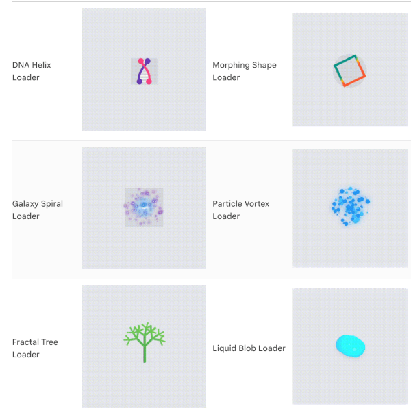
- DNA Helix Loader: An animated double helix that rotates in 3D space with connecting "rungs" between the strands
- Morphing Shape Loader: A shape that smoothly transitions between different geometric forms
- Galaxy Spiral Loader: A spiral galaxy with stars rotating around a glowing core
- Particle Vortex Loader: Mesmerizing particles flowing in a vortex pattern with customizable flow speed and colors
- Fractal Tree Loader: A beautiful animated fractal tree that grows and branches organically
- Liquid Blob Loader: A morphing liquid-like blob with fluid motion and realistic highlights
- Page Turning Loader: A book with smoothly turning pages that simulates a realistic reading animation
- Heartbeat Loader: A realistic anatomical heart animation with authentic cardiac rhythm patterns
- Neon Pulse Loader: Futuristic cyberpunk-style concentric neon rings with glow effects
🛠️ Developer Utilities (new in 1.1.0)
MultipleLoaders.showOverlay — One-line modal loading barrier that blocks user interaction during async tasksLoaderFutureBuilder<T> — Drop-in FutureBuilder wrapper that auto-shows a loader while waiting
All loaders feature:
- Customizable sizes (extra small to extra large)
- Custom colors (primary, secondary, tertiary, and quaternary)
- Adjustable animation speed
- Optional background colors
- Animation control (start, stop, reset)
Screenshots
Standard Loaders
| Loader |
Preview |
Loader |
Preview |
| Spinner Loader |
 |
Pulse Loader |
 |
| Bounce Loader |
 |
Wave Loader |
 |
| Circle Loader |
 |
Dots Loader |
 |
| Rotating Square Loader |
 |
Glowing Loader |
 |
| Typing Loader |
 |
Ripple Loader |
 |
| HeartBeat Loader |
 |
Hourglass Loader |
(screenshot coming soon) |
| Clock Loader |
(screenshot coming soon) |
|
|
Innovative Loaders Gallery
| Loader |
Preview |
Loader |
Preview |
| DNA Helix Loader |
 |
Morphing Shape Loader |
 |
| Galaxy Spiral Loader |
 |
Particle Vortex Loader |
 |
| Fractal Tree Loader |
 |
Liquid Blob Loader |
 |
| Flipping Card Loader |
 |
|
|
Getting started
Add the dependency to your pubspec.yaml:
dependencies:
  flutter_multiple_loaders: ^1.1.0
Then run:
flutter pub get
Usage
Import the package:
import 'package:flutter_multiple_loaders/flutter_multiple_loaders.dart';
Basic Usage
Use any of the loaders with default options:
SpinnerLoader();
PulseLoader();
BounceLoader();
WaveLoader();
CircleLoader();
BlinkingLoader();
PageTurningLoader(
pageCount: 20,
options: LoaderOptions(
color: Colors.indigo,
secondaryColor: Colors.indigoAccent,
tertiaryColor: Colors.white,
durationMs: 3500,
),
);
HeartbeatLoader(
pulseIntensity: 0.4,
options: LoaderOptions(
color: Colors.red,
size: LoaderSize.large,
durationMs: 2000,
),
);
HourglassLoader(
options: LoaderOptions(
color: Colors.amber,
secondaryColor: Colors.amber.withOpacity(0.35),
size: LoaderSize.large,
strokeWidth: 3.0,
durationMs: 2400,
),
);
ClockLoader(
options: LoaderOptions(
color: Colors.deepPurple,
secondaryColor: Colors.deepPurpleAccent,
size: LoaderSize.large,
strokeWidth: 3.0,
durationMs: 3000,
),
);
🛠️ Developer Utilities (new in 1.1.0)
Loading Overlay Dialog
Display a full-screen loading barrier that blocks user interaction during async tasks:
MultipleLoaders.showOverlay(
context,
loader: const SpinnerLoader(
options: LoaderOptions(
color: Colors.white,
size: LoaderSize.large,
),
),
);
await myLongRunningTask();
MultipleLoaders.hideOverlay(context);
LoaderFutureBuilder
A drop-in replacement for FutureBuilder that automatically shows a loader while the future is pending:
LoaderFutureBuilder<String>(
future: myNetworkRequest(),
loader: const CircleLoader(
options: LoaderOptions(
color: Colors.teal,
size: LoaderSize.large,
strokeWidth: 4.0,
),
),
builder: (context, data) {
return Text('Loaded: $data');
},
)
Customizing Loaders
All loaders accept custom options through the LoaderOptions class:
SpinnerLoader(
options: LoaderOptions(
color: Colors.purple,
size: LoaderSize.large,
durationMs: 1000,
loop: true,
),
);
WaveLoader(
barCount: 5,
options: LoaderOptions(
color: Colors.blue,
secondaryColor: Colors.green,
tertiaryColor: Colors.orange,
size: LoaderSize.medium,
),
);
Controlling Animation Programmatically
Use the LoaderController to control the animation:
class _MyWidgetState extends State<MyWidget> {
  final LoaderController _controller = LoaderController();

  @override
  Widget build(BuildContext context) {
    return Column(
      children: [
        SpinnerLoader(controller: _controller),

        ElevatedButton(
          onPressed: () => _controller.start(),
          child: Text('Start'),
        ),

        ElevatedButton(
          onPressed: () => _controller.stop(),
          child: Text('Stop'),
        ),

        ElevatedButton(
          onPressed: () => _controller.reset(),
          child: Text('Reset'),
        ),
      ],
    );
  }
}
Interactive Example
The package includes a complete example app that demonstrates all loaders with interactive controls for customization. The example app allows you to:
- Switch between different loader types via category tabs (Standard / Innovative)
- Change sizes, colors, and stroke widths via the control panel
- Control animation duration
- Start, stop, and reset animations
- Try interactive Developer Utilities demos (Overlay & FutureBuilder)
- Copy ready-to-use code snippets for every loader
Check the example folder for more detailed usage examples.
Additional information
Contributing
Contributions are welcome! Feel free to open an issue or submit a pull request.
License
This package is licensed under the MIT License - see the LICENSE file for details.