flutter_otp_text_field


flutter_otp_text_field
The flutter_otp_text_field package for flutter is a TextField widget that allows you to display different style pin. It supports all the platforms flutter supports.
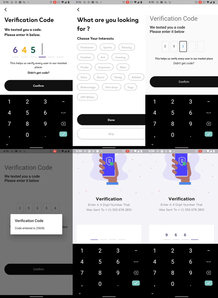
Features 👇👇
- allows you to customize the shape of textField in any way you want
- built-in 2 commonly used pin styles of shape
- obscure support
- input decoration support
- support all the textField properties support
- Flutter web support
Installing 🔧
Install the latest version from pub.
Installing
Use this package as a library
1. Depend on it
Add this to your package's pubspec.yaml file:
dependencies:
  flutter_otp_text_field: ^1.1.0+2
2. Install it
You can install packages from the command line:
with Flutter:
$ flutter packages get
Alternatively, your editor might support flutter packages get. Check the docs for your editor to learn more.
3. Import it
Now in your Dart code, you can use:
import 'package:flutter_otp_text_field/flutter_otp_text_field.dart';
Example Usage 1
if you want an otp_text_field with same style or with field shaped as a box
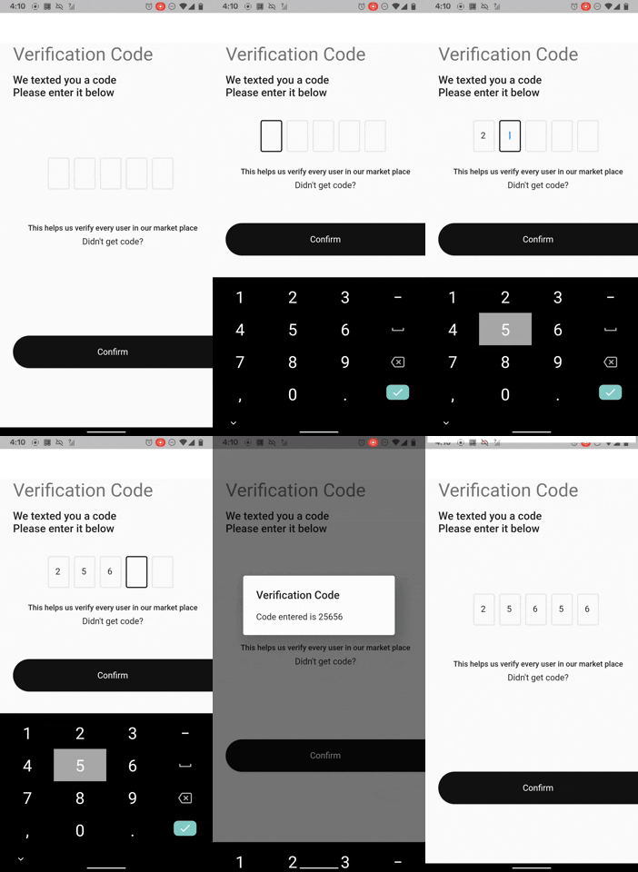
OtpTextField(
numberOfFields: 5,
borderColor: Color(0xFF512DA8),
showFieldAsBox: true,
onCodeChanged: (String code) {
},
onSubmit: (String verificationCode){
showDialog(
context: context,
builder: (context){
return AlertDialog(
title: Text("Verification Code"),
content: Text('Code entered is $verificationCode'),
);
}
);
},
),
Example Usage 2
if you want an otp_text_field with different styles for each field
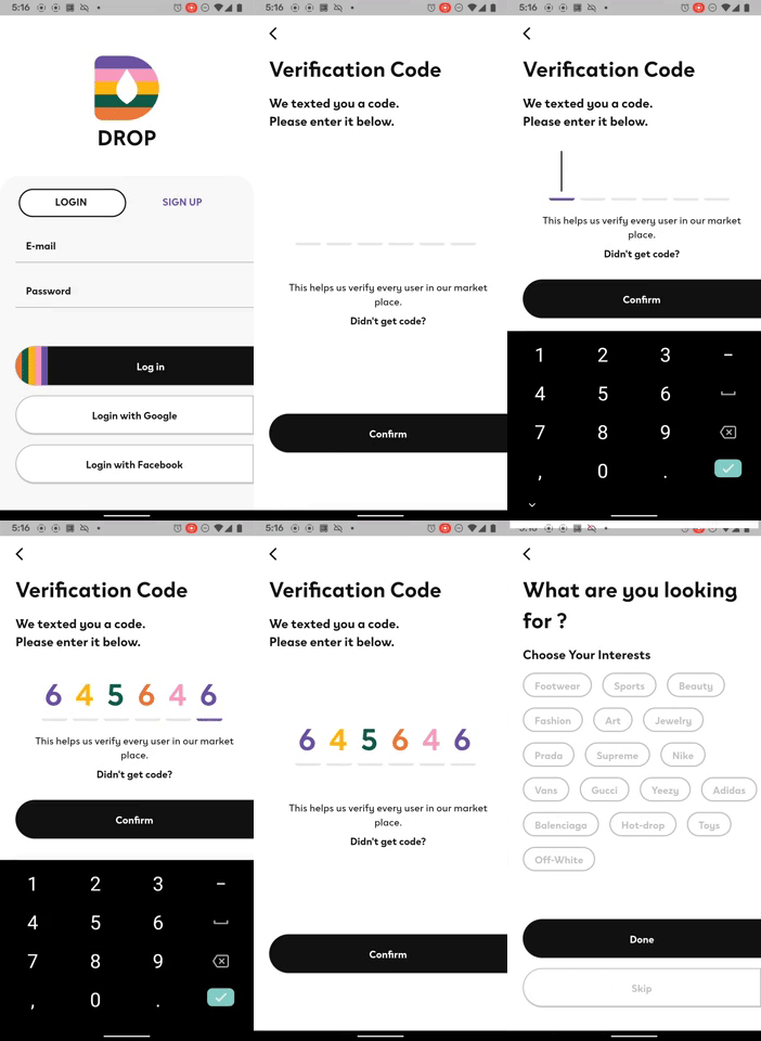
Color accentPurpleColor = Color(0xFF6A53A1);
Color primaryColor = Color(0xFF121212);
Color accentPinkColor = Color(0xFFF99BBD);
Color accentDarkGreenColor = Color(0xFF115C49);
Color accentYellowColor = Color(0xFFFFB612);
Color accentOrangeColor = Color(0xFFEA7A3B);
otpTextStyles = [
createStyle(accentPurpleColor),
createStyle(accentYellowColor),
createStyle(accentDarkGreenColor),
createStyle(accentOrangeColor),
createStyle(accentPinkColor),
createStyle(accentPurpleColor),
];
TextStyle? createStyle(Color color) {
ThemeData theme = Theme.of(context);
return theme.textTheme.headline3?.copyWith(color: color);
}
OtpTextField(
numberOfFields: 6,
borderColor: accentPurpleColor,
focusedBorderColor: accentPurpleColor,
styles: otpTextStyles,
showFieldAsBox: false,
borderWidth: 4.0,
onCodeChanged: (String code) {
},
onSubmit: (String verificationCode) {
},
),
Properties
Customizable Properties for OtpTextField
| Attribute Name |
Example Value |
Description |
| numberOfFields |
4 |
The default is 4 |
| fieldWidth |
40 |
allows to change the width of the textField |
| showFieldAsBox |
true |
changes the default decoration of the textFields to a box with borderRadius of 4.0 |
| hasCustomInputDecoration |
true |
set this to true if you want to pass your own decoration |
| decoration |
InputDecoration |
set hasCustomInputDecoration to true and pass your own input decoration the way you see fit |
| filled |
false |
set to true if you want to pass a fillColor |
| fillColor |
Color(0xFFFFFFFF) |
pass fillColor and set filled to true |
| enabledBorderColor |
Color(0xFF4F44FF) |
Pass Color value to show when textfield is enabled |
| focusedBorderColor |
Color(0xFF4F44FF) |
Pass Color value to show when textfield is in focus |
| borderColor |
Color(0xFFE7E7E7) |
Pass Color value to set border color |
| disabledBorderColor |
Color(0xFFE7E7E7) |
Pass Color value to show when textfield is disabled |
| styles |
List |
Pass a list of textStyles to customize the styles of each field. TextStyle in each index matches each field. Note that length of the styles array should be equal to the numberOfFields |
| borderRadius |
BorderRadius.all(Radius.circular(4.0)) |
pass BorderRadius to customise textField when showFieldAsBox is set to true |
| margin |
EdgeInsets.only(right: 8.0) |
customize the margin between each textField |
| textStyle |
TextStyle(fontSize: 20, color: Colors.green); |
Add custom textStyle |
| borderWidth |
2.0 |
Default value is 2.0, allows you to customize the width of the border |
| cursorColor |
Colors.blue |
Change color of textFields cursor. Defaults to [ThemeData.cursorColor]
or [CupertinoTheme.primaryColor] depending on [ThemeData.platform].
|
| mainAxisAlignment |
MainAxisAlignment.center |
Defaults to MainAxisAlignment.center |
| crossAxisAlignment |
CrossAxisAlignment.center |
Defaults to CrossAxisAlignment.center |
| onSubmit |
(String pin){} |
The callback will execute when user is done inputting the verification code. |
| keyboardType |
TextInputType.number |
Just like TextField's keyboardType, the default is TextInputType.number |
| clearText |
Bool |
When set to true, it clears all the text in the fields |
| autoFocus |
false |
Same as TextField's autoFocus, the default is false |
| enabled |
true |
Same as TextField's enabled, the default is true |
| obscureText |
false |
Defaults to false |
| onCodeChanged |
(String code){} |
Executes every time a value is entered into the textField. Same as TextField's onChanged |
| handleControllers |
(List controllers){} |
exposes the list of textEditingControllers to control the textFields. This can be set to a local variable for manipulation |

