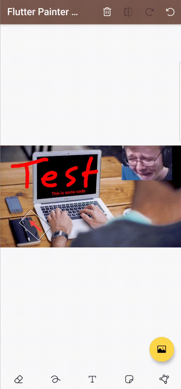
Flutter Painter 是一個專為互動式繪圖設計的 Flutter 小部件,允許使用者在可自訂的背景上進行草圖繪製、文字書寫、新增形狀與插入圖片。它支援即時渲染,非常適合需要創意輸入的應用程式,例如數位簽名、白板或藝術工具。此套件可無縫整合至 Flutter 應用程式中,並提供簡單的 API 來管理筆劃、顏色與圖層。在教育、設計與協作應用中,當使用者產生內容至關重要時,它尤其實用。
適用情境
數位簽名捕獲
互動式白板
藝術素描
教育註釋
協作繪圖
圖像標記
主要特色
即時繪圖
文字和形状疊加
圖像插入
可自定背景
圖層管理
筆畫自定義
適合對象
應用開發者建構創意工具
具有註釋功能的教育軟體
表單中的簽名收集
設計和原型應用
協作平台
使用建議
有限的平台特定優化
無內建匯出功能
需要手動處理狀態持久化
未針對高性能量化動畫進行優化
可能影響低階裝置的效能
原始 README
以下為關聯原始碼儲存庫的 README 原文快照,最新內容請造訪原始碼儲存庫。
Flutter Painter 🎨🖌️
A pure-Flutter package for painting.
Requires Flutter 3.32 or later and Dart 3.8 or later.
Active maintenance resumed in 2026, with support for Flutter 3.44.8.
Summary
Flutter Painter provides you with a widget that can be used to draw on it. Right now, it supports:
Free-style drawing with custom brushes, lifecycle callbacks, erasing, and
paint-bucket flood fill.
Objects that you can move, scale and rotate in an easy and familiar way, such as:
Text with configurable TextStyle and alignment.
Shapes such as angles, labeled measurements, lines, arrows, ovals,
rectangles, and triangles with any Paint.
Images with flipping, cropping, opacity, blur, tagging, and captured
widget/SVG support.
Groups of transformable objects.
Undo and redo, drawable color editing, JSON save/restore, and image export.
Color or image backgrounds with fitting, alignment, and quarter-turn rotation.
These are called drawables.
You can use a color or an image for the background of your drawing, and export your painting as an image.
Example
You can check out the example tab for an example on how to use the package.
The example is hosted here if you want to try it out yourself!
A video recording showing the example running:
Usage
First, you'll need a PainterController object. The PainterController controls the different drawables, the background you're drawing on and provides the FlutterPainter widget with the settings it needs. Then, in your UI, use the FlutterPainter widget with the controller assigned to it.
You can also use the FlutterPainter.builder constructor, which uses a builder method that automatically updates whenever a change happens in the controller, without using setState, callbacks, or listeners. However, this will perform worse than a StatefulWidget since it will rebuild more often, so it is recommended to use if the widget tree that depends on PainterController is simple.
NOTE:FlutterPainter does not define its own constraints on its size, so it is advised to use a widget that can provide its child with size constraints, such as SizedBox or AspectRatio (more on constraints here).
NOTE: If multiple parts of your UI depend on the PainterController, you can use a ValueListenableBuilder with the valueListenable being your controller, which will re-build automatically whenever the controller updates. This is the approach used in the example project.
Callbacks
FlutterPainter has some helpful callbacks that are called when internal changes happen in the widget itself.
onDrawableCreated: Called when a drawable is created from FlutterPainter. Passes the drawable as an argument.
onDrawableDeleted: Called when a drawable is deleted from FlutterPainter. Passes the drawable as an argument.
onSelectedObjectDrawableChanged: Called when the selected object drawable changes. This can be useful if you want to display some UI to edit the object's properties. Passes the selected object drawable as an argument.
If the drawable is updated (moved, for example), the passed drawable will become invalid. Make sure to use PainterController.selectedObjectDrawable to get the up-to-date value of the selected drawable.
onPainterSettingsChanged: Called when the settings of PainterController are changed from FlutterPainter itself. Passes the new settings as an argument.
onIsDrawingStateChanged: Called with true when a free-style gesture starts and false when it ends or is canceled.
onFreeStyleDrawingStarted, onFreeStyleDrawingUpdated, onFreeStyleDrawingEnded, and onFreeStyleDrawingCanceled: Report the complete free-style gesture lifecycle and pass its current PathDrawable.
PainterController
The PainterController is the heart of the operation of Flutter Painter. It controls the settings for FlutterPainter, its background, and all of its drawables, and the selected object drawable.
All setters on PainterController directly notify your FlutterPainter to respond and repaint. If you're using FlutterPainter.builder, the builder is automatically called to build the widget tree. If not, make sure to use setState and listen to the callbacks
NOTE: If you are using multiple painters, make sure that each FlutterPainter widget has its own PainterController, do not use the same controller for multiple painters.
Settings
There are currently five types of settings:
freeStyleSettings: They control the parameters used in drawing scribbles, such as the width and color. It also has a field to enable/disable scribbles, to prevent the user from drawing on the FlutterPainter.
textSettings: They control the TextStyle and TextAlign of text being drawn. They also include a focus node (more on focus nodes here) so you can detect when the user starts and stops editing text.
objectSettings: These settings control objects that can be moved, scaled and rotated. Texts, shapes and images are all considered objects. It controls layout assist, which allows to center objects and rotate them at a right angle, and settings regarding the object controls for scaling, rotating and resizing.
shapeSettings: These control the paint and shape factory used (Shape Factory is used to create shapes), and whether the shape is drawn once or continuously.
scaleSettings: These settings control the scaling on the painter (zooming in/out). By default, scaling is disabled.
When scaling and free-style drawing are both enabled, one pointer draws and a
two-pointer pinch zooms the canvas. Starting a pinch cancels the pending
free-style stroke so it does not leave an accidental line.
Use the built-in ScaleSettings to zoom and pan the painter. Drawing positions
remain in the painter's local coordinate system after transformation, so the
background and drawables stay aligned. Avoid transforming the background or
FlutterPainter separately with an external widget.
The first finite layout establishes the drawable coordinate space for a
controller. If the parent later resizes, the background is fitted to the new
viewport while drawables and gestures scale from that original coordinate
space. This keeps their relative positions and sizes stable across orientation
and window-size changes, and renderImage uses the same coordinates.
You can provide initial settings for the things you want to draw through the settings parameter in the constructor of the PainterController.
Each setting and sub-setting has extension setters and getters which you can use to read and modify the value of that setting.*
For example, this is how you would modify the stroke width of free-style drawings:
NOTE: If you're not using the extensions library, note that all of the settings objects are immutable and cannot be modified, so in order to change some settings, you'll have to create a copy of your current settings and apply the changes you need (this is similar to how you would copy ThemeData).
Custom free-style brushes
Set FreeStyleSettings.factory (or controller.freeStyleFactory) to create a
custom PathDrawable for each drawing gesture. Override draw for textured,
stamped, or image-based brushes, and make sure copyWith returns the same
custom drawable type as points are appended:
Set controller.freeStyleFactory = null to restore the built-in brush. Custom
factories do not affect erase or fill modes.
Paint-bucket flood fill
Enable paint-bucket mode to fill the four-connected region under the next tap.
The current background and drawables are sampled together, while the result is
stored as a compact, undoable FloodFillDrawable:
controller.freeStyleColor = Colors.amber;
controller.fillTolerance = 8; // Per-channel percentage from 0 to 100.
controller.freeStyleMode = FreeStyleMode.fill;
For programmatic fills, use painter coordinates:
final fill = await controller.addFloodFill(constOffset(120, 80));
If the controller has not been laid out, pass its intended coordinate size
with size: const Size(width, height). The pixel scan runs through Flutter's
background-compute helper and rejects rasters above the configurable
maxPixels safety limit. Existing black outlines or other contrasting pixels
act as boundaries; increase tolerance only when nearby shades should be part of
the same region.
Angles
Use AngleFactory to draw two-ray angles. The gesture starts at the vertex;
the first ray points horizontally and the drag direction defines a clockwise
sweep from 0 to 360 degrees, including reflex angles:
controller.shapeFactory = constAngleFactory();
Angle objects can be moved, scaled, and rotated like other object drawables.
Change the selected angle later in degrees while preserving undo and redo:
final selected = controller.selectedObjectDrawable;
if (selected isAngleDrawable) {
controller.setAngleDegrees(selected, 235);
}
For programmatic construction, AngleDrawable.sweepAngle uses radians and
sweepAngleDegrees exposes its normalized degree value.
Labeled shapes
Wrap any built-in one- or two-dimensional shape factory with
LabeledShapeFactory to keep text attached while the shape is drawn, moved,
resized, scaled, or rotated:
The label is centered by default. Configure its padding, background, rounded
corners, direction, alignment, or local offset through ShapeLabel. Updating
a label through the controller preserves selection and participates in undo and
redo:
final selected = controller.selectedObjectDrawable;
if (selected isLabeledShapeDrawable) {
controller.setShapeLabel(
selected,
selected.label.withText('240 mm'),
);
}
Custom factories can also be wrapped when their drawable extends
Sized1DDrawable or Sized2DDrawable.
Background
You can also provide a background for the FlutterPainter widget from the controller. You can use a color, an image, or an image fitted over a color.
In order to use a color, you can simply call the backgroundDrawable extension getter on any color.*
voidsetBackground(){
// Sets the background to the color black
controller.background = Colors.black.backgroundDrawable;
}
In order to use an image, you will need an Image object from the dart library dart:ui. Since Flutter has an Image widget from the Material package, we'll refer to the image type we need as ui.Image.
import'dart:ui'as ui;
ui.Image? myImage;
In order to get the ui.Image object from usual image sources (file, asset, network), you can use an ImageProvider with the image extension getter (Examples of ImageProvider: FileImage, MemoryImage, NetworkImage). This getter returns Future<ui.Image>.*
Then, you can use the backgroundDrawable extension getter on the ui.Image.*
voidsetBackground() async {
// Obtains an image from network and creates a [ui.Image] objectfinal ui.Image myImage = awaitNetworkImage('https://picsum.photos/960/720').image;
// Sets the background to the image
controller.background = myImage.backgroundDrawable;
}
The image getter removes its image-stream listener after the first frame and
returns an owned ui.Image. Dispose that image when the controller no longer
uses it.
Multiple image pages
Keep one controller and one resolved image for each page so every page retains
its own drawings:
final images = awaitFuture.wait(imageProviders.map((provider) => provider.image));
final controllers = images
.map((image) => PainterController(background: image.backgroundDrawable))
.toList();
PageView.builder(
itemCount: controllers.length,
itemBuilder: (context, index) =>
FlutterPainter(controller: controllers[index]),
);
@overridevoiddispose() {
for (final controller in controllers) {
controller.dispose();
}
for (final image in images) {
image.dispose();
}
super.dispose();
}
PainterController.dispose() does not dispose application-owned images because
the same ui.Image may be shared by multiple controllers or drawables.
Keep a page's controller alive while that page must retain its drawing; dispose
the controller and its owned image only when the page is permanently removed.
To preserve the image aspect ratio and show a color around it, configure an
ImageBackgroundDrawable directly. BoxFit.fill remains the default for
backward compatibility.
quarterTurns rotates only the background image clockwise, so drawable
coordinates remain unchanged. Avoid wrapping FlutterPainter in RotatedBox,
which rotates the entire painter coordinate space. To rotate an image object
instead, replace its ImageDrawable with
copyWith(rotation: angleInRadians).
The background can also be assigned from the constructor of PainterController directly.
Adding rendered widgets and SVGs
Flutter Painter renders canvas drawables, so arbitrary live widgets cannot be
stored directly. An already-painted widget—including an SvgPicture from
flutter_svg—can instead be captured as a movable, scalable, rotatable, and
undoable image:
final svgKey = GlobalKey();
RepaintBoundary(
key: svgKey,
child: SvgPicture.asset(
'assets/logo.svg',
width: 120,
height: 80,
),
);
// Call after the RepaintBoundary has completed its first paint.final svgDrawable = await controller.addWidgetSnapshot(
svgKey,
pixelRatio: 3,
tag: 'logo',
);
The snapshot keeps the widget's logical size; pixelRatio controls raster
detail when the object is enlarged. Omitting it uses the device pixel ratio.
The returned ImageDrawable supports normal object interactions and JSON
persistence. It is a static raster snapshot rather than a live widget, so
capture it again after the source widget changes. Dispose
svgDrawable.image only after the drawable and its undo history no longer use
it.
Blurring sensitive image regions
Blur real source-image pixels and clip the result as a rectangle or oval. The
result remains movable, scalable, rotatable, undoable, and JSON-persisted:
For a redaction overlay, map the source crop to the matching position and size
used by the painter background. The caller retains ownership of sourceImage
and must keep it alive while the drawable uses it.
Blur is visual obfuscation, not destructive source removal. Share the result of
renderImage when you need a flattened image; DrawableJsonCodec embeds the
original source pixels and must not be treated as a sanitized redacted file.
Drawables
All the drawables drawn on FlutterPainter are stored and controller by the PainterController. On most use cases, you won't need to interact with the drawables directly. However, you may add, insert, replace or remove drawables from the code (without the user actually drawing them).
You can assign an initial list of drawables from the PainterController constructor to initialize the controller with them. You can also modify them from the controller, but be careful, use the methods from the PainterController itself and don't modify the drawables list directly.
DrawableJsonCodec converts all built-in drawable types to versioned JSON,
including nested erase groups, text styles, shape labels, transformations, and
tagged images. Image pixels are embedded as PNG data, so encoding and decoding
are asynchronous:
final codec = DrawableJsonCodec();
// Save this string with a file, database, preferences, or cloud API.final savedJson = await codec.encodeJson(controller.drawables);
// Restore into a new controller on the next app session.final restored = await codec.decodeJson(savedJson);
final restoredController = PainterController(drawables: restored);
To replace the contents of an existing controller as one undoable operation:
The codec stores drawables only; persist the painter background separately when
needed. Custom drawable classes require a DrawableJsonAdapter. Paint shaders
and filters are rejected unless a custom adapter handles that drawable, so
unsupported visual state is never silently discarded. Applications own decoded
image resources and should dispose them when the restored drawing is no longer
used.
Selected Object Drawable
PainterController also provides the currently-selected ObjectDrawable from the getter field PainterController.selectedObjectDrawable. This value stays up-to-date for any changes from the UI (the user selecting a new object drawable, for example). You can also programatically select and de-select an object drawable, granted it is in the list of drawables of the controller.
The selected object drawable will also be automatically update if it is replaced or removed from the controller.
Grouping objects
Two or more top-level object drawables can be combined into one selectable
ObjectGroupDrawable. Shapes, text, images, stickers, and nested object groups
can then be moved, scaled, or rotated together:
final group = controller.groupObjectDrawables([
firstShape,
sticker,
]);
if (group != null) {
// Restore the transformed children as individual top-level objects.final children = controller.ungroupObjectDrawable(group);
}
The application chooses which objects to group, so this works with custom
multi-selection interfaces. Group and ungroup operations participate in undo
and redo, preserve child paint order, and are supported by
DrawableJsonCodec.
To remove one known drawable, pass it to removeDrawable. For an object the
user selected, call removeSelectedObjectDrawable directly. Both operations
participate in undo and redo.
controller.removeDrawable(drawable);
// Returns false without changing history when no object is selected.final removed = controller.removeSelectedObjectDrawable();
To select an existing TextDrawable and open it for editing, use
editTextDrawable. The drawable must already belong to the controller.
final textDrawable = controller.drawables.whereType<TextDrawable>().first;
controller.editTextDrawable(textDrawable);
Image drawables support opacity values from 0 (transparent) to 1 (opaque).
Replace the selected image through the controller so selection and undo history
stay synchronized.
final imageDrawable = controller.selectedObjectDrawable;
if (imageDrawable isImageDrawable) {
controller.replaceDrawable(
imageDrawable,
imageDrawable.copyWith(opacity: 0.5),
);
}
To count each sticker type, add images with an application-defined tag. Tags
remain attached while a sticker is moved, transformed, cropped, or otherwise
replaced:
controller.addTaggedImage(
stickerImage,
tag: 'star',
size: constSize(100, 100),
);
final counts = controller.imageDrawableCountsByTag;
final starCount = counts['star'] ?? 0;
The count map omits untagged images and is read-only. Use any stable string,
such as an asset name, database ID, or sticker URL, as the tag.
Updating Drawable Colors
Use setDrawableColor to update an existing free-style, shape, or text
drawable. The controller replaces the stored drawable, preserves object
selection, and records the change for undo and redo.
final selectedDrawable = controller.selectedObjectDrawable;
if (selectedDrawable isShapeDrawable) {
controller.setDrawableColor(selectedDrawable, Colors.blue);
}
final stroke = controller.drawables.whereType<FreeStyleDrawable>().first;
controller.setDrawableColor(stroke, Colors.red);
Cropping images
ImageDrawable.sourceRect selects the source-image pixels that are rendered.
The cropped bounds are used consistently for painting, object controls, hit
testing, transforms, and exported images:
Crop rectangles use source-image pixel coordinates and must remain inside the
image. Applications can provide any crop-selection UI without adding a cropper
dependency to Flutter Painter.
Rendering Image
From the PainterController, you can render the contents of FlutterPainter as a PNG-encoded ui.Image object. In order to do that, you need to provide the size of the output image. All the drawings will be scaled according to that size.
From the ui.Image object, you can convert it into a raw bytes list (Uint8List) in order to display it with Image.memory or save it as a file.
Flutter Painter supports free-style erasing of drawables. However, whenever you use the erase mode, all object drawables will be locked in place and cannot be modified. This is done because erasing is just another layer, and if objects stayed movable, you'd be able to move from under and around erased areas of the painting, which doesn't make sense. If you un-do the action of using the erase mode, the objects will be unlocked again and you'll be able to move them.
Images can opt out of this behavior. A non-erasable image stays above erased
content and remains selectable, movable, scalable, and rotatable while erase
mode is active:
flutter_painter_pure, which contains all the APIs of Flutter Painter except for extensions on Flutter and Flutter Painter itself.
flutter_painter_extensions, which contains all the extensions defined and used by Flutter Painter.
flutter_painter which includes both previously mentioned libraries.
This is done so that people who don't want to use the extensions (conflicts, too many getters/setters, etc...) can use the pure library, and for people who only need the extensions to be able to import them alone.
If you're trying to use the extensions and they're showing as undefined, make sure you're importing the correct library.
Flutter Web
The html renderer for Flutter Web is not supported, and using it will cause unexpected behavior and errors (also includes the auto renderer which chooses the renderer depending on the device). If you're using it for Flutter Web, make sure to use --web-renderer canvaskit as an argument for your run/build commands. If you need to use auto or html for any reason (such as better performance), consider using another package.
If anybody is willing to help out the Flutter Web issue or with testing it would be highly appreciated (either contact me through my GitHub or contribute and post a pull request).
Support Me
If you like my work and would like to support me, feel free to do so :D