搜尋套件、儲存庫與 APP 分類

flutter_pannable_rating_bar 封面
套件詳情v2.7.2+1

flutter_pannable_rating_bar

一個多功能且可自定義的 Flutter 評分條。此評分條因其能夠選擇任意小數值而脫穎而出。支援拖曳、點擊和懸停事件。

AndroidiOSWebmacOSWindowsLinux
近 30 天下載
50
喜歡數
35
Pub 分數
150

安裝套件

flutter pub add flutter_pannable_rating_bar

套件介紹

根據套件公開資料產生的選型評估,僅供參考。

一個高度可自訂的 Flutter 評分條,支援選擇任何小數分數的評分值。與傳統的評分條不同,它透過拖曳、點擊和懸停事件實現流暢的互動,為各種裝置提供反應迅速且直覺的使用者體驗。非常適合需要精確反饋輸入的應用程式,例如評論或調查。此套件與所有主要平台相容,包括 Android、iOS、Web、macOS、Windows 和 Linux。

適用情境

  • 用戶評分與細粒度評分
  • 互動式調查介面
  • 應用中的反饋收集
  • 即時評分調整
  • 觸控友善的使用者介面元件

主要特色

  • 支援小數評分
  • 拖曳、點擊和懸停互動
  • 高度可定制的設計
  • 跨平台相容性
  • 流暢的動畫過渡
  • 可設定的步長

適合對象

  • 開發互動式反饋系統的開發者
  • 需要精確評分輸入的應用程式
  • 希望觸控優化的使用者介面的設計人員
  • 針對多個平台的專案
  • 需要動態評分控制項的原型

使用建議

  • 可能需要為複雜主題添加額外的樣式
  • 大型評分條列表上的效能影響
  • 需要仔細處理手勢衝突
  • 除了基本用法外,文件有限
  • 未針對極高頻率的更新進行優化

原始 README

以下為關聯原始碼儲存庫的 README 原文快照,最新內容請造訪原始碼儲存庫。

pub package

PannableRatingBar

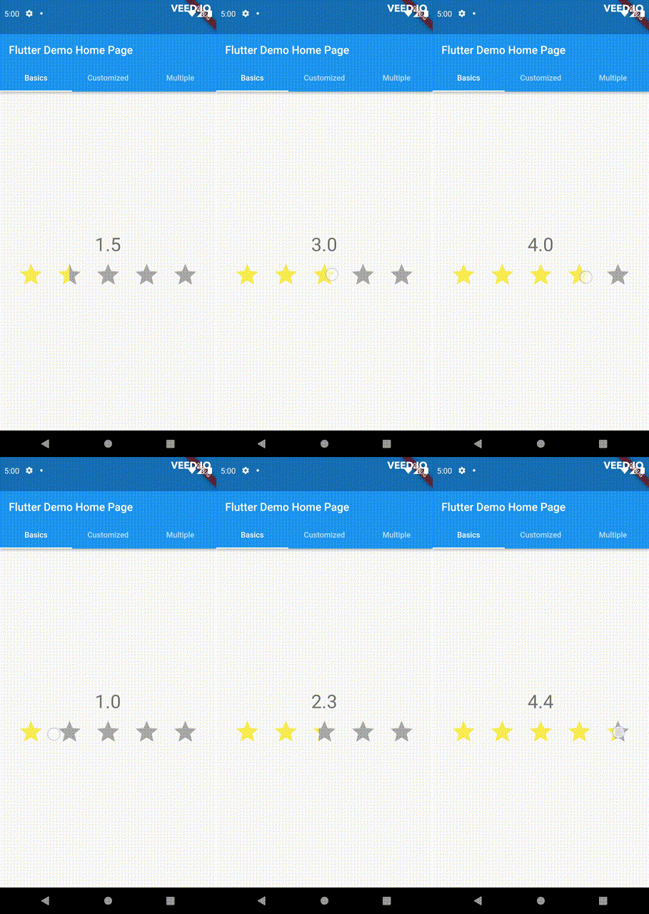
Introducing a new and improved rating bar for Flutter, offering versatility and full customization. Unlike other rating bars, this one allows for any value to be selected, not just full or half ratings when interacted. Tap, drag and hover gestures are seamlessly supported, providing a smooth user experience.

Features

  • Offers fractional values for rating
  • High degree of customization for the rating widgets, which can be of different sizes, shapes, and colors.
  • Precise hit testing, as the child widget's render object is utilized to determine the results.
  • Allows for filtering gestures with either tapOnly, dragOnly or tapAndDrag options.
  • Rating reports on cursor hovering supported.
  • Built on Flutter's Wrap widget, offering a variety of supported layouts, including consideration of Wrap properties such as textDirection and verticalDirection when painting the indicators.

Getting started

First import the widget

import 'package:flutter_pannable_rating_bar/flutter_pannable_rating_bar.dart';

Usage

This widget is stateless and highly flexible, allowing you to easily manipulate values and customize the display of the PannableRatingBar. Simply rebuild the widget with the value provided in the onChanged callback or onHover callback and the widget will automatically adjust the rating distribution across each rating widget.

double rating = 0.0;

PannableRatingBar(
  rate: rating,
  items: List.generate(5, (index) =>
    const RatingWidget(
      selectedColor: Colors.yellow,
      unSelectedColor: Colors.grey,
      child: Icon(
        Icons.star,
        size: 48,
      ),
    )),
  onChanged: (value) { // the rating value is updated on tap or drag.
    setState(() {
      rating = value;
    });
  },
)

The widget also supports getting the rate value by hovering with the onHover callback. It works best on devices that support a mouse cursor, including desktop web browsers.

double rating = 0.0;

PannableRatingBar(
  rate: rating,
  items: List.generate(5, (index) =>
    const RatingWidget(
      selectedColor: Colors.yellow,
      unSelectedColor: Colors.grey,
      child: Icon(
        Icons.star,
        size: 48,
      ),
    )),
  onHover: (value) { // the rating value is updated every time the cursor moves over a new item.
    setState(() {
      rating = value;
    });
  },
)

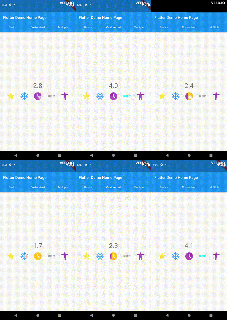
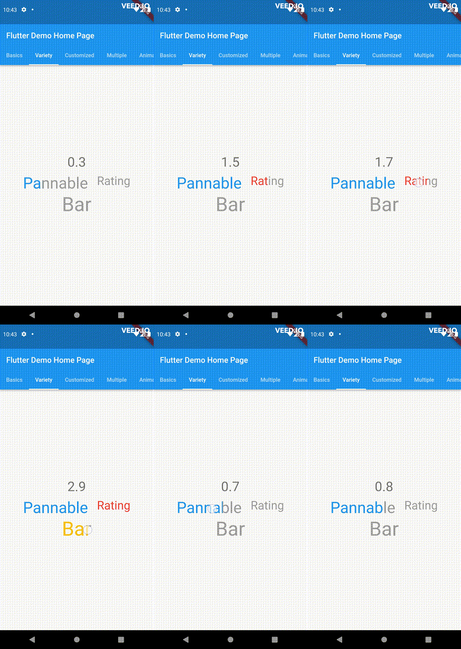
Utilize your own custom widgets as the rating indicators. With complete customization freedom, they don't have to be uniform in size, color, or any other aspect.

double rating = 0.0;

PannableRatingBar(
  rate: rating,
  onChanged: (value) {
    setState(() {
      rating = value;
    });
  },
  items: const [
    RatingWidget(
      selectedColor: Colors.yellow,
      unSelectedColor: Colors.grey,
      child: Icon(
        Icons.star,
        size: 48,
      ),
    ),
    RatingWidget(
      selectedColor: Colors.blue,
      unSelectedColor: Colors.red,
      child: Icon(
        Icons.ac_unit,
        size: 48,
      ),
    ),
    RatingWidget(
      selectedColor: Colors.purple,
      unSelectedColor: Colors.amber,
      child: Icon(
        Icons.access_time_filled,
        size: 48,
      ),
    ),
    RatingWidget(
      selectedColor: Colors.cyanAccent,
      unSelectedColor: Colors.grey,
      child: Icon(
        Icons.abc,
        size: 48,
      ),
    ),
    RatingWidget(
      selectedColor: Colors.tealAccent,
      unSelectedColor: Colors.purple,
      child: Icon(
        Icons.accessibility_new_sharp,
        size: 48,
      ),
    ),
  ],
)
double rating = 0;
PannableRatingBar(
  rate: rating,
  onChanged: (value){
    setState((){
      rating = value;
    });
  },
  spacing: 20,
  items: const [
    RatingWidget(
      selectedColor: Colors.blue,
      child: Text(
        "Pannable",
        style: TextStyle(color: Colors.grey, fontSize: 40),
      ),
    ),
    RatingWidget(
      selectedColor: Colors.red,
      child: Text(
        "Rating",
        style: TextStyle(color: Colors.grey, fontSize: 30),
      ),
    ),
    RatingWidget(
      selectedColor: Colors.amber,
      child: Text(
        "Bar",
        style: TextStyle(color: Colors.grey, fontSize: 50),
      ),
    ),
  ],
),

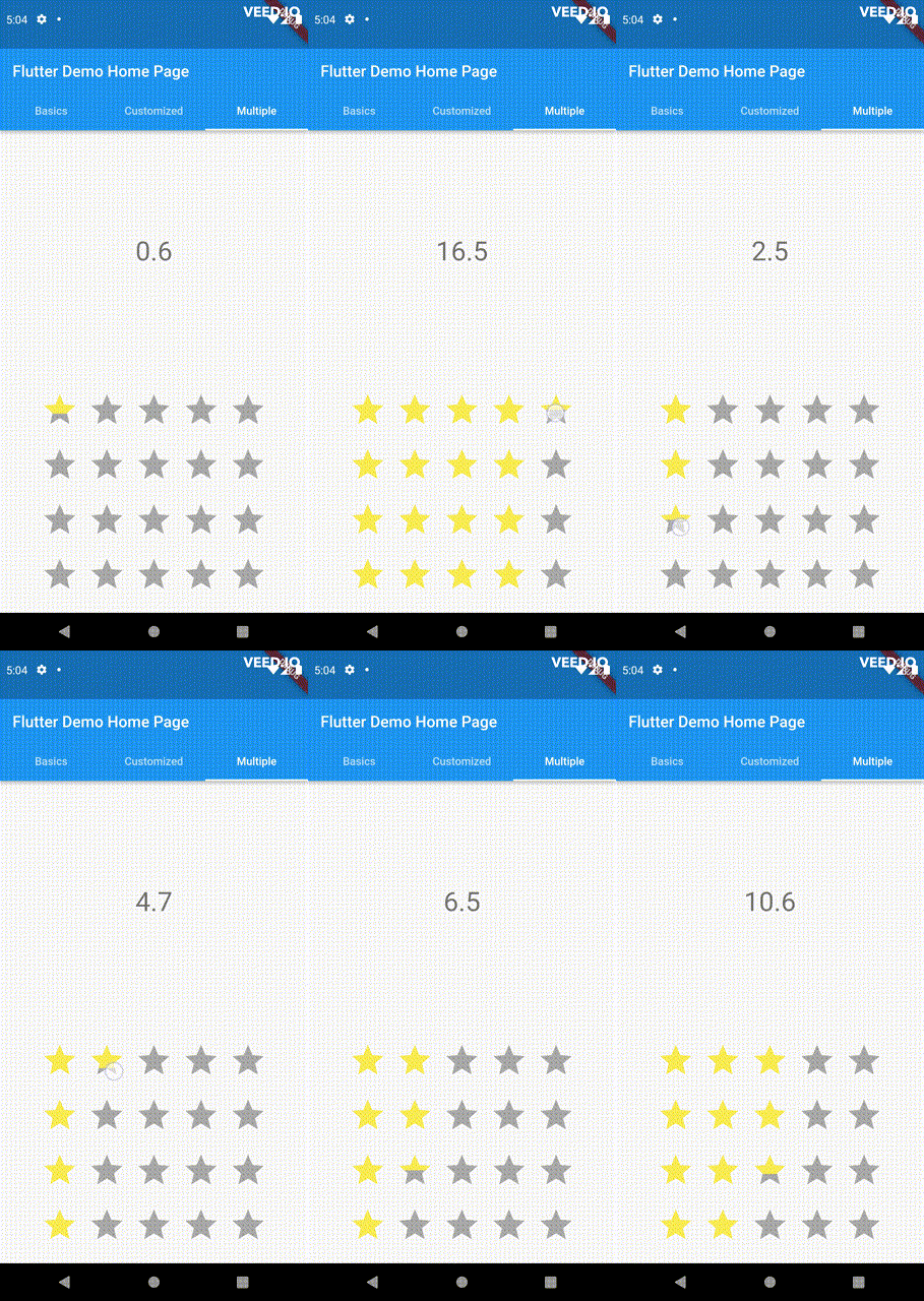
This widget utilizes the layout capabilities of Flutter's built-in Wrap widget, allowing for a wide range of possible layouts to be achieved. The properties of the Wrap widget, such as textDirection and verticalDirection, are also considered when painting the indicators, giving you even greater control over the final look and feel of the rating bar.

double rating = 0.0;

PannableRatingBar.builder(
  rate: rating,
  alignment: WrapAlignment.center,
  spacing: 20,
  runSpacing: 10,
  itemCount: 20,
  direction: Axis.vertical,
  itemBuilder: (context, index) {
    return const RatingWidget(
      selectedColor: Colors.yellow,
      unSelectedColor: Colors.grey,
      child: Icon(
        Icons.star,
        size: 48,
      ),
    );
  },
  onChanged: (value) {
    setState(() {
      rating = value;
    });
  },
)

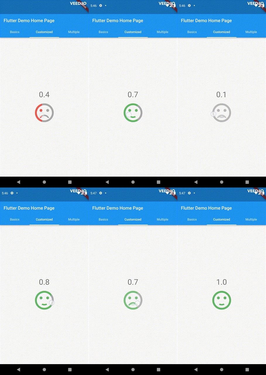
Customize the appearance of the rating indicators based on their values.

double rating = 0;

PannableRatingBar(
    rate: rating,
    spacing: 20,
    onChanged: (value){
      setState((){
        rating = value;
      });
    },
    items: [
      RatingWidget(
        selectedColor: rating <= 0.5 ? Colors.red : Colors.green,
        unSelectedColor: Colors.grey,
        child: AnimatedSwitcher(
          duration: const Duration(milliseconds: 300),
          child: rating <= 0.5
              ? const Icon(
                  Icons.sentiment_very_dissatisfied,
                  key: ValueKey("sad"),
                  size: 100,
                )
              : const Icon(
                  Icons.sentiment_satisfied,
                  key: ValueKey("happy"),
                  size: 100,
                ),
        ),
      ),
    ],
),

For ease of transforming / mutating rating values, the library support using functions to do as such, used as a parameter in PannableRatingBar.

Return null from this will cause the current rating value skipped in all callbacks.

typedef RatingValueTransformer = double? Function(double value);

Some of the pre-built RatingValueTransformers available are:

// Rounding to nearest single fractional digit. This is also the default one that 
// `PannableRatingBar` used.
double singleFractionalValueTransformer(double value);
// Rounding to nearest .5.
double halfFractionalValueTransformer(double value);
// Leave the rating as is.
double rawValueTransformer(double value);

Additional information

For more, checkout and play with the example file. If you have any suggestions for improvement, simply create an issue in the repository!

所屬分類

原始碼儲存庫

使用此套件的專案

暫無相關資料。