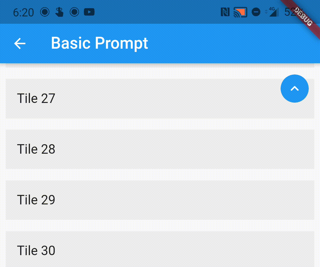
If the child ScrollView has different properties for scrollController, scrollDirection,
primary or reverse parameters than the default values, you need to pass them to the ScrollWrapper
widget as it requires the same parameters. It provides a ScrollViewProperties object in the builder
callback that you can use to access the properties in the ScrollView widget.
You can pass the following parameters to customise the prompt accordingly
enabledAtOffset - At what scroll offset to enable the prompt on.
alwaysVisibleAtOffset - If the prompt is to be always visible at the provided offset. Setting this to false only shows the prompt when the user starts scrolling upwards. Default value is false.
scrollOffsetUntilVisible - Offset should the user scroll in the opposite direction before the prompt becomes visible.
scrollOffsetUntilHide - Offset should the user scroll before the prompt hides itself, if visible.
promptAlignment - Where on the widget to align the prompt.
promptDuration - Duration it takes for the prompt to come into view/vanish.
promptAnimationCurve - Animation Curve that the prompt will follow when coming into view.
promptAnimationType - PromptAnimation that the prompt follows when animating. Has three options, fade, scale and size.
scrollToTopDuration - Duration it takes for the page to scroll to the top on prompt button press.
scrollToTopCurve - Animation Curve for scrolling to the top.
promptTheme - You can pass PromptButtonTheme to modify the prompt button further. It has the following parameters:
padding - Padding around the prompt button.
iconPadding - Padding around the icon inside the button.