搜尋套件、儲存庫與 APP 分類

套件詳情v1.0.5

flutter_sizer

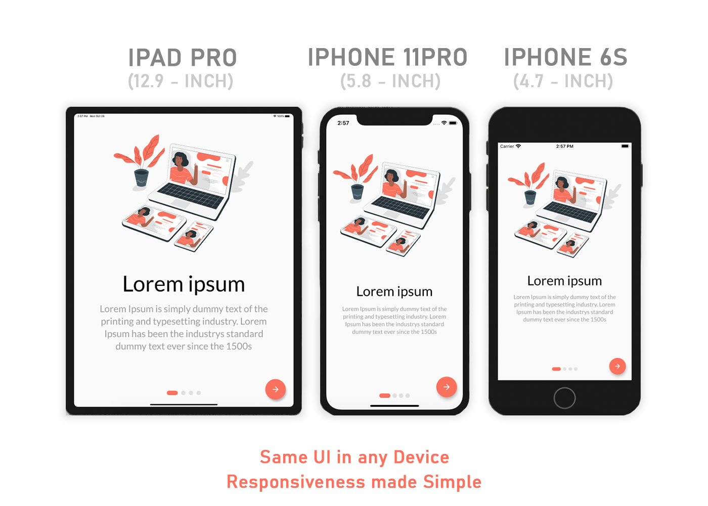
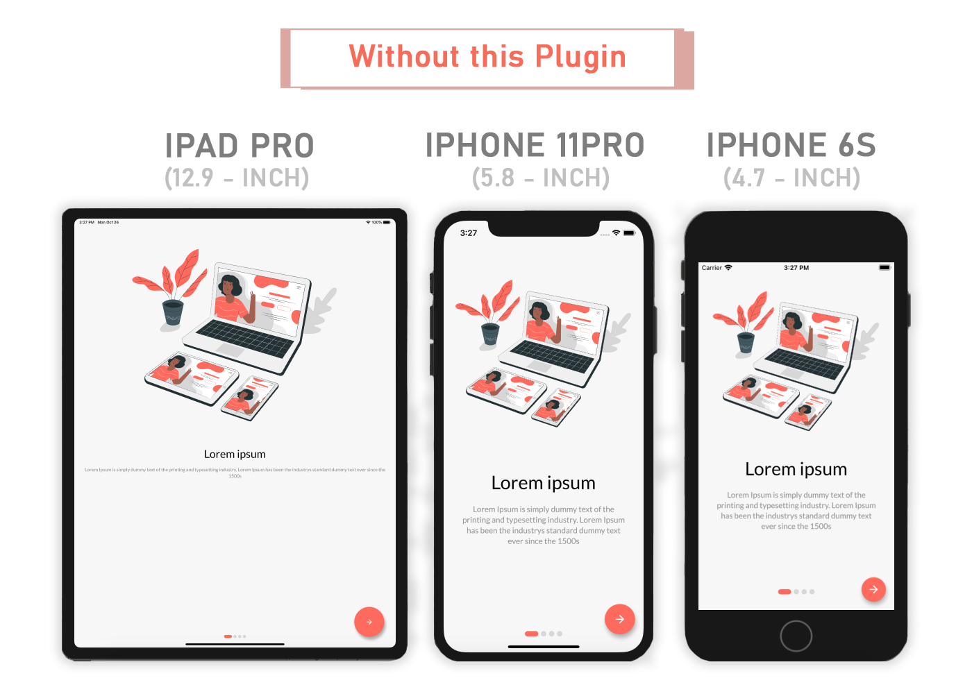
Flutter Sizer 透過提供輔助組件和擴展來幫助實現響應式佈局。

AndroidiOSWebmacOSWindowsLinux
近 30 天下載
942
喜歡數
24
Pub 分數
150

安裝套件

flutter pub add flutter_sizer

套件介紹

根據套件公開資料產生的選型評估,僅供參考。

Flutter Sizer 是一個響應式 UI 套件,可於不同螢幕尺寸與方向上實現自適應版面。它提供輔助元件與擴充功能,可輕鬆根據裝置螢幕尺寸縮放字型、大小與邊距。透過利用螢幕的寬度與高度,確保在各種裝置上呈現一致的設計外觀,無需手動計算。非常適合希望建立流暢、可擴展介面且程式碼量最少的開發者。

適用情境

  • 為多種螢幕尺寸建立響應式版面
  • 在設備間按比例縮放UI元素
  • 簡化移動和網路應用中的響應式設計
  • 保持一致的間距和排版
  • 使用統一外觀構建跨平台應用
  • 減少UI程式碼中的手動尺寸計算

主要特色

  • 根據螢幕尺寸自動調整小工具的大小
  • 用於輕鬆單位轉換的輔助擴展
  • 支援直式與橫式模式
  • 僅需幾行代碼的最小設置
  • 跨平台相容性
  • 對 Android、iOS、Web、macOS、Windows 和 Linux 的內建支援

適合對象

  • 開發響應式 Flutter 應用程式的開發者
  • 優先考慮跨裝置的一致性使用者介面
  • 需要快速實現響應式佈局的專案
  • 針對具有不同螢幕尺寸的多個平台的應用程式
  • 設計師與開發人員緊密合作,實現像素級精確的佈局
  • 初學者學習響應式 Flutter 模式

使用建議

  • 使用自定樣式配置時可能需要調整
  • 不適合高度複雜或非均勻佈局
  • 過度嵌套小部件可能會影響效能
  • 需要在多種螢幕尺寸上進行仔細測試
  • 最佳搭配一致的設計系統使用
  • 進階縮放邏輯的自訂功能有限

原始 README

以下為關聯原始碼儲存庫的 README 原文快照,最新內容請造訪原始碼儲存庫。

Flutter Sizer

Flutter Sizer helps implement a responsive layout by providing helper widgets and extensions

Responsive Image

Responsive Image

Content

Installation

Add flutter_sizer to pubspec.yaml

dependencies:
  flutter_sizer: ^1.0.4

Parameters

  • Adaptive.h() - Returns a calculated height based on the device
  • Adaptive.w() - Returns a calculated width based on the device
  • Adaptive.sp() - Returns a calculated sp based on the device (deprecated)
  • Adaptive.dp() - Returns a calculated dp based on the device
  • .h - Returns a calculated height based on the device
  • .w - Returns a calculated width based on the device
  • .sp - Returns a calculated sp based on the device (deprecated)
  • .dp - Returns a calculated dp based on the device
  • Device.boxConstraints - Returns the Device's BoxConstraints
  • Device.orientation - Returns the Screen Orientation (portrait or landscape)
  • Device.screenType - Returns the Screen Type (mobile or tablet)
  • Device.devicePixelRatio - Returns the devicePixel Ratio or (1.0)

Usage

Import the Package

import 'package:flutter_sizer/flutter_sizer.dart';

Wrap MaterialApp with FlutterSizer widget

 FlutterSizer(
      builder: (context, orientation, screenType) {
        return MaterialApp();
      }
 )

Widget Size

Container(
  width: Adaptive.w(20),    // This will take 20% of the screen's width
  height: 30.5.h     // This will take 30.5% of the screen's height
)

Font size

Text(
  'Flutter Sizer', 
  style: TextStyle(fontSize: 15.dp),
)

Orientation

If you want to support both portrait and landscape orientations

Device.orientation == Orientation.portrait
  ? Container(   // Widget for Portrait
      width: 100.w,
      height: 20.5.h,
   )
  : Container(   // Widget for Landscape
      width: 100.w,
      height: 12.5.h,
   )

DeviceType

If you want the same layout to look different in tablet and mobile, use the Device.screenType method:

Device.screenType == ScreenType.tablet
  ? Container(   // Widget for Tablet
      width: 100.w,
      height: 20.5.h,
   )
  : Container(   // Widget for Mobile
      width: 100.w,
      height: 12.5.h,
   )

Take Note

You need to import flutter_sizer package in order to access number.h, number.w, and number.dp

Auto import in VSCode and Android Studio doesn't work for dart extension methods. Typing 10.h would not bring up auto import suggestion for this package

One workaround is to type Device so that the auto import suggestion would show up:

import 'package:flutter_sizer/flutter_sizer.dart';

Community Support

If you have any suggestions or issues, feel free to open an issue

If you would like to contribute, feel free to create a PR

所屬分類

原始碼儲存庫

使用此套件的專案

暫無相關資料。