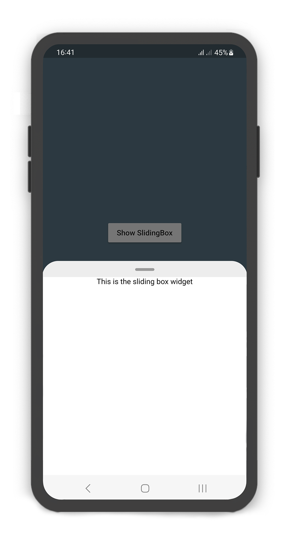
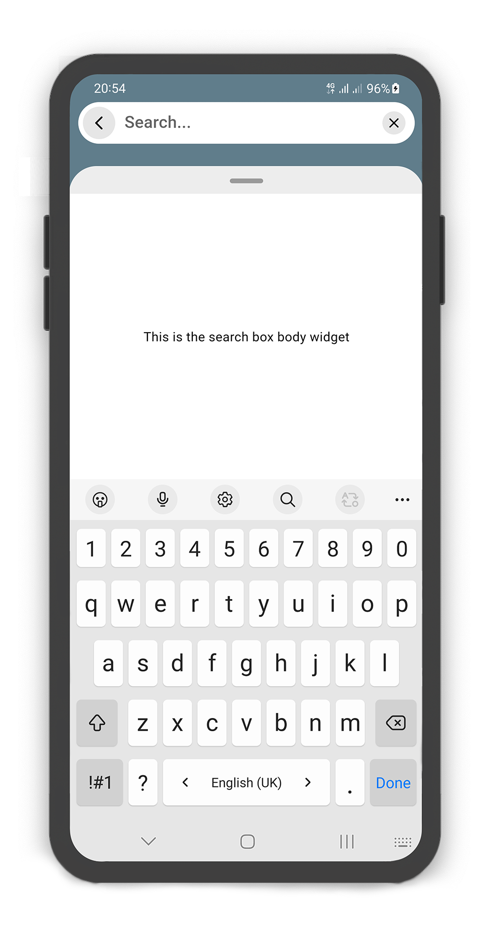
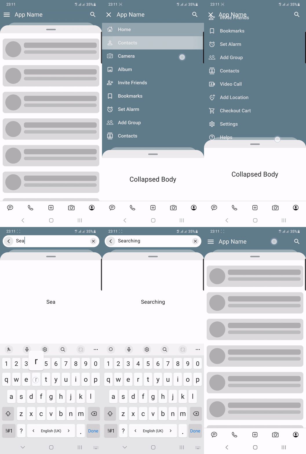
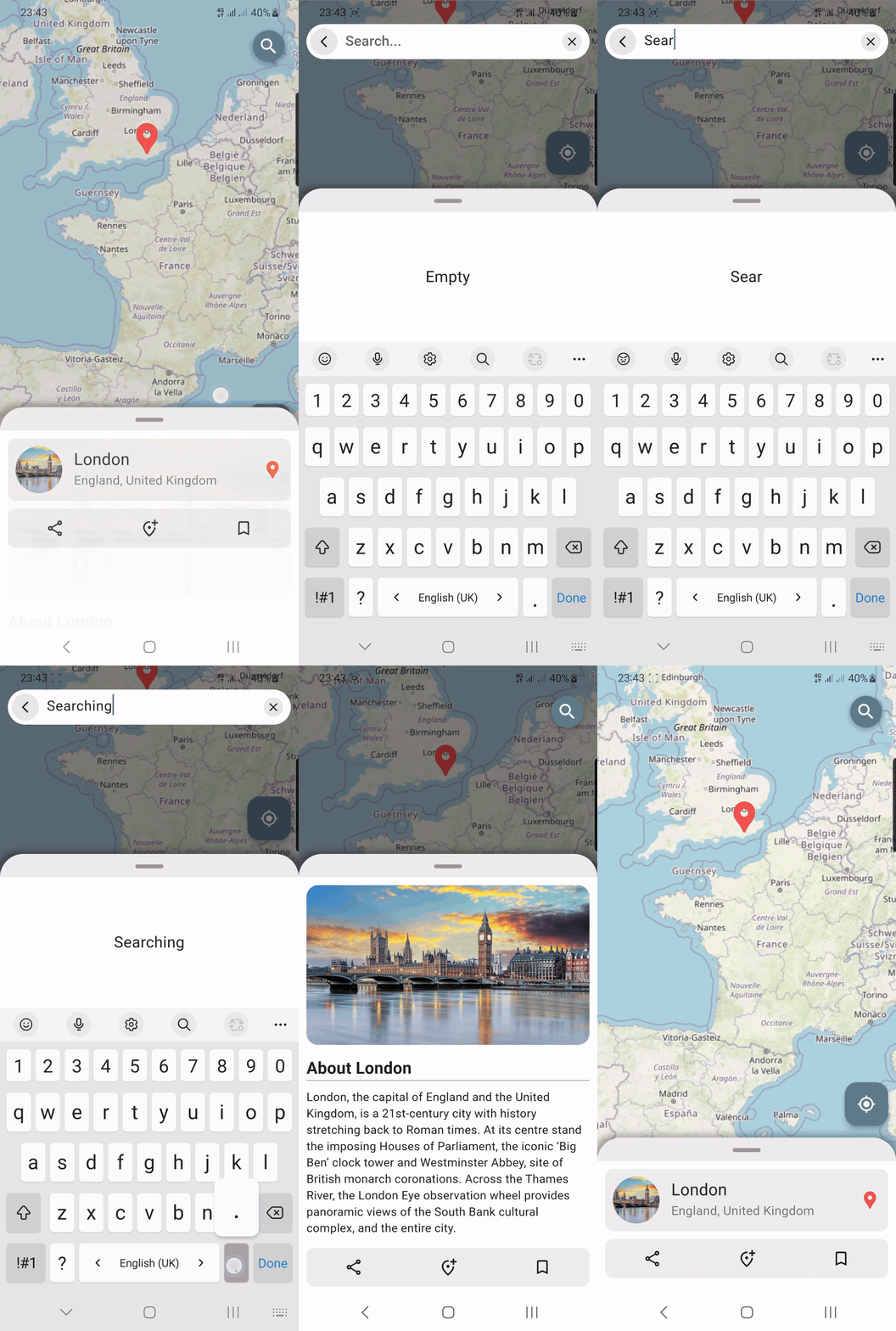
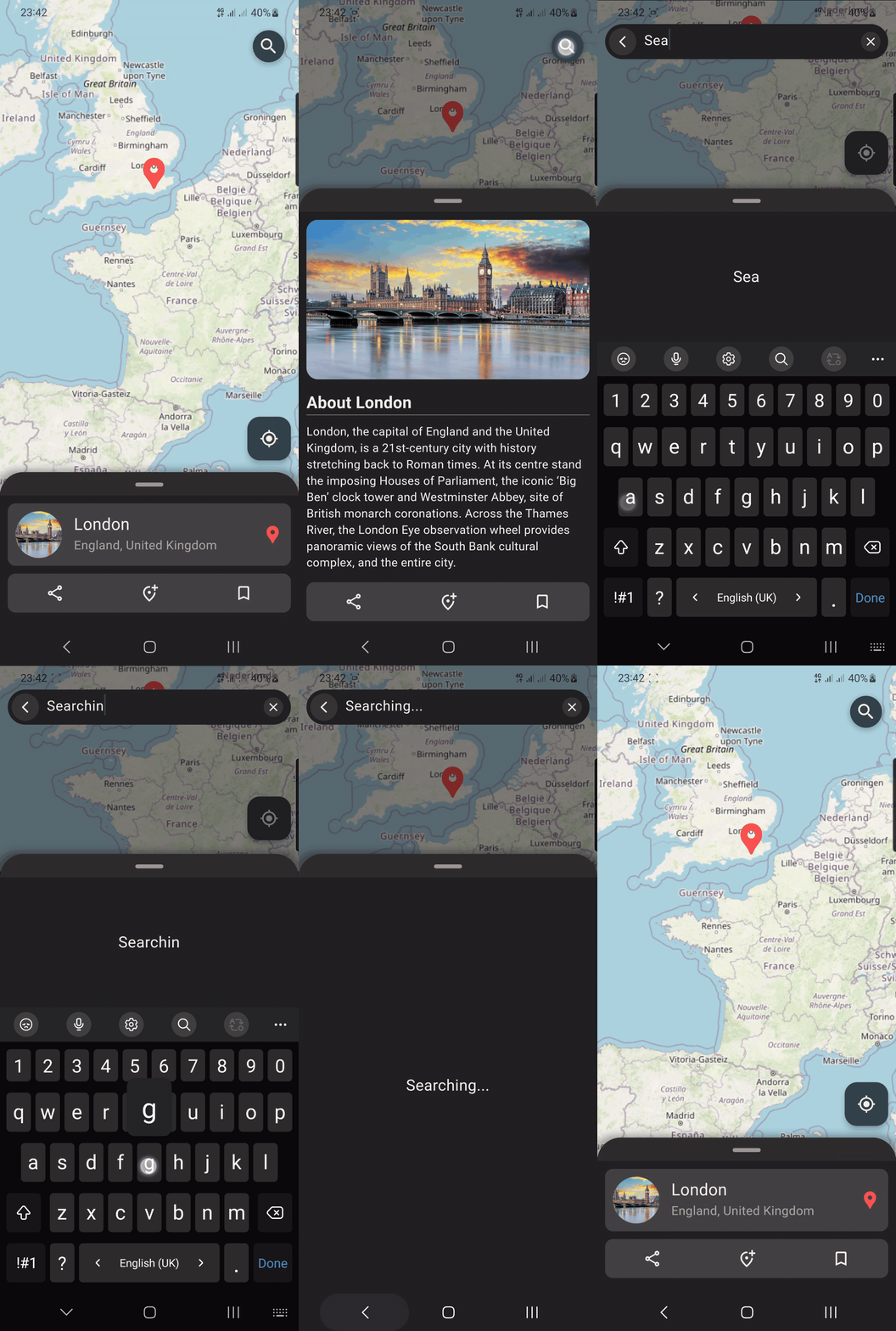
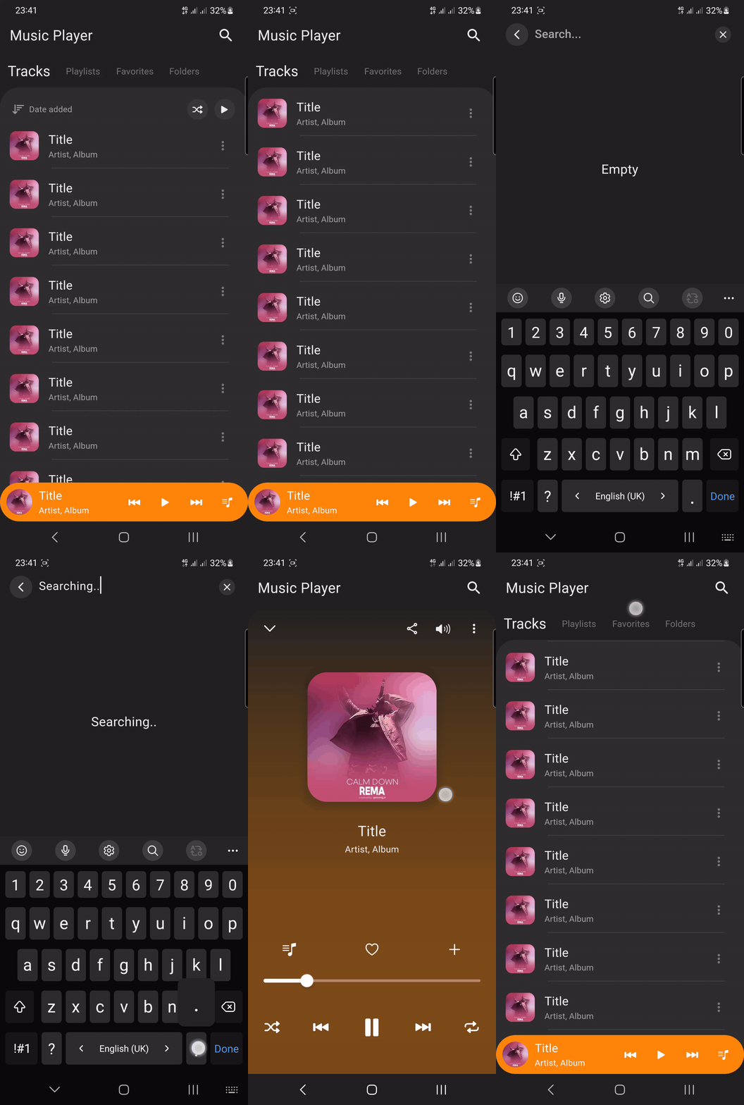
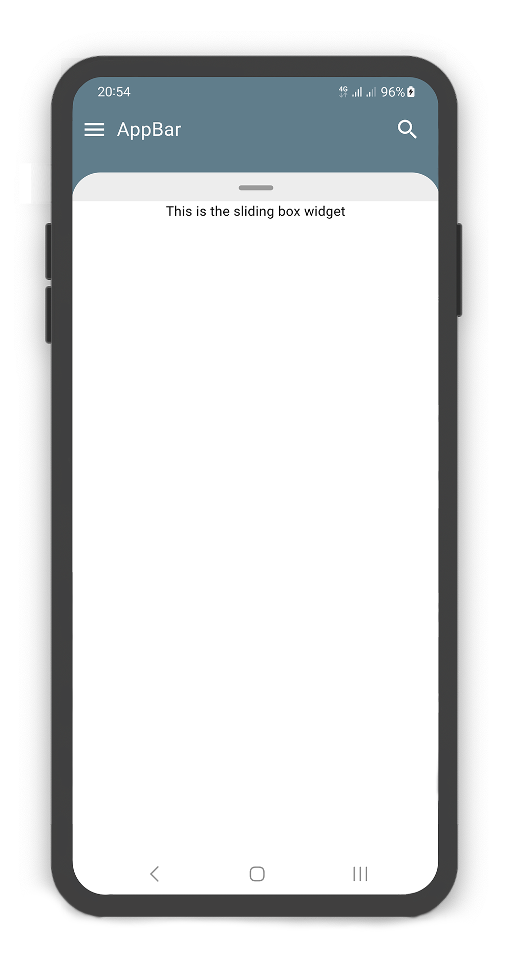
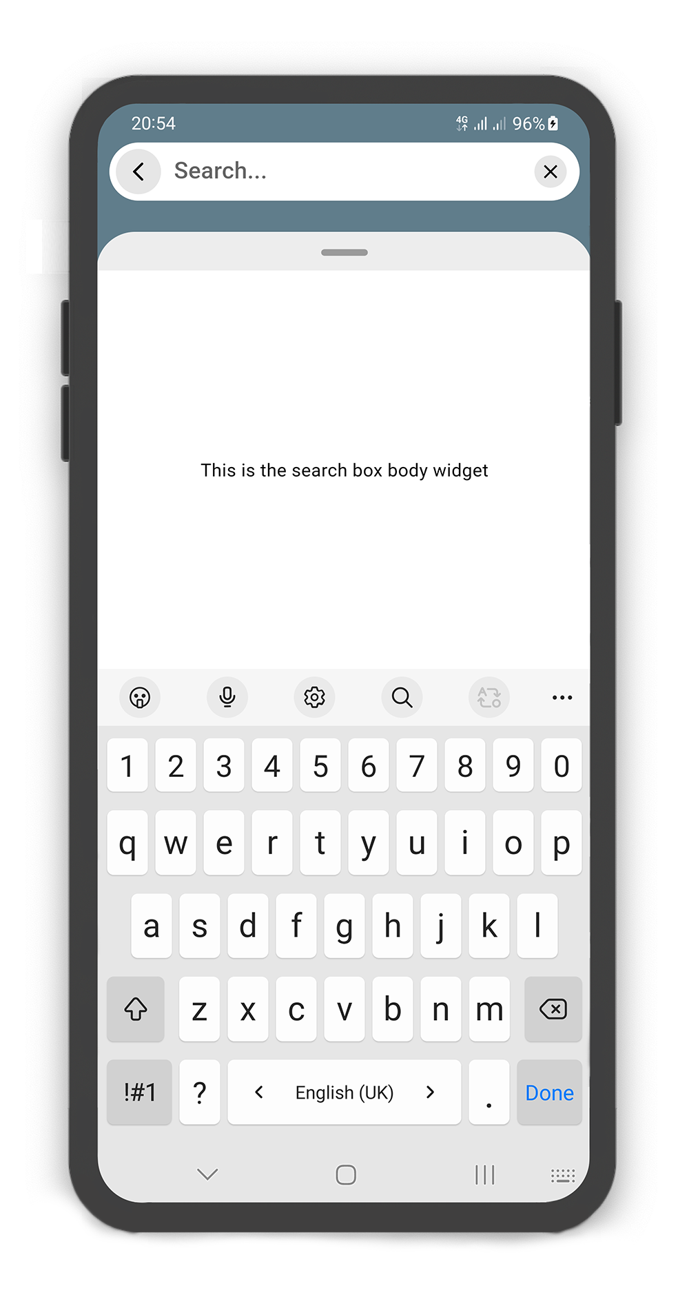
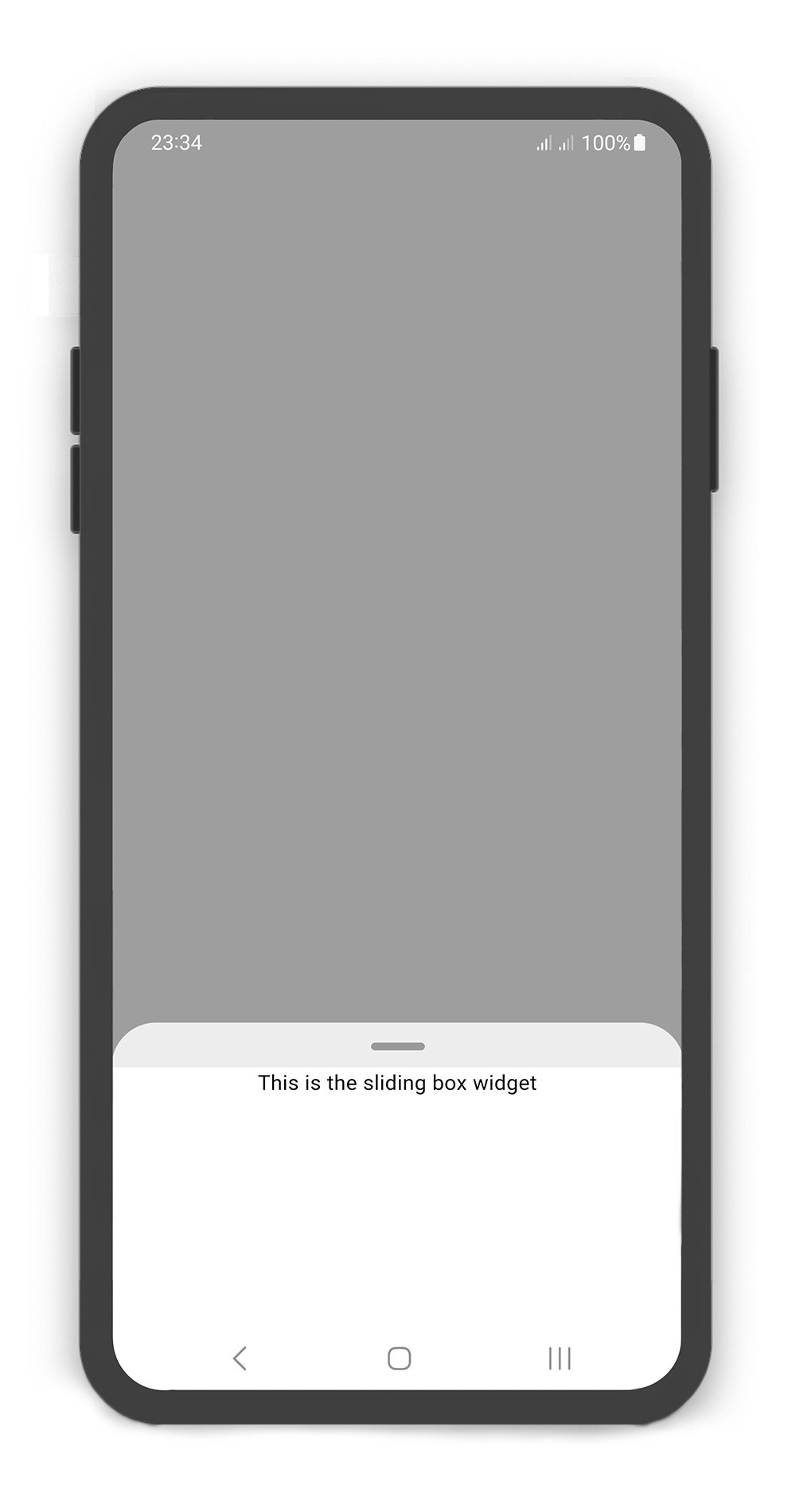
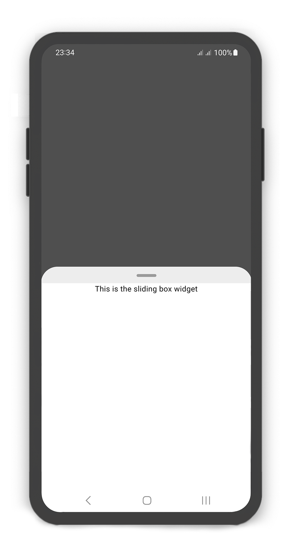
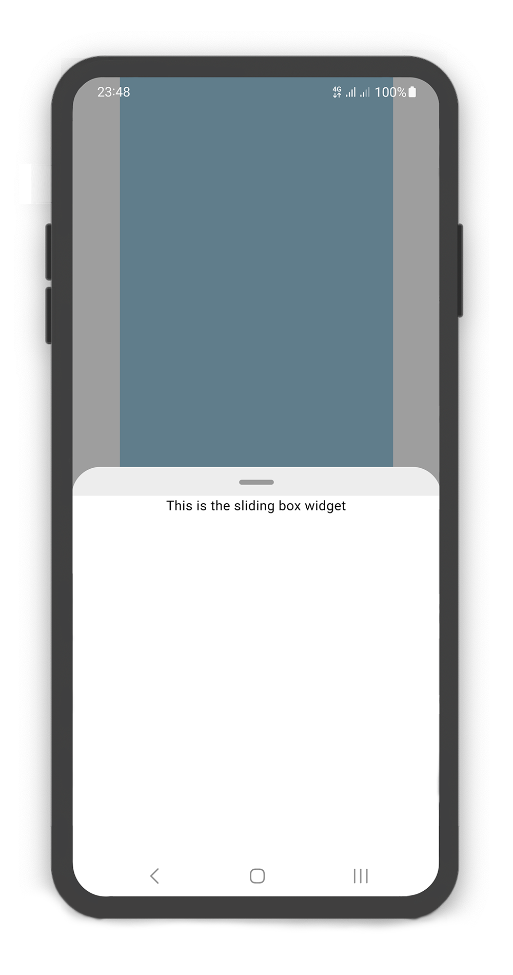
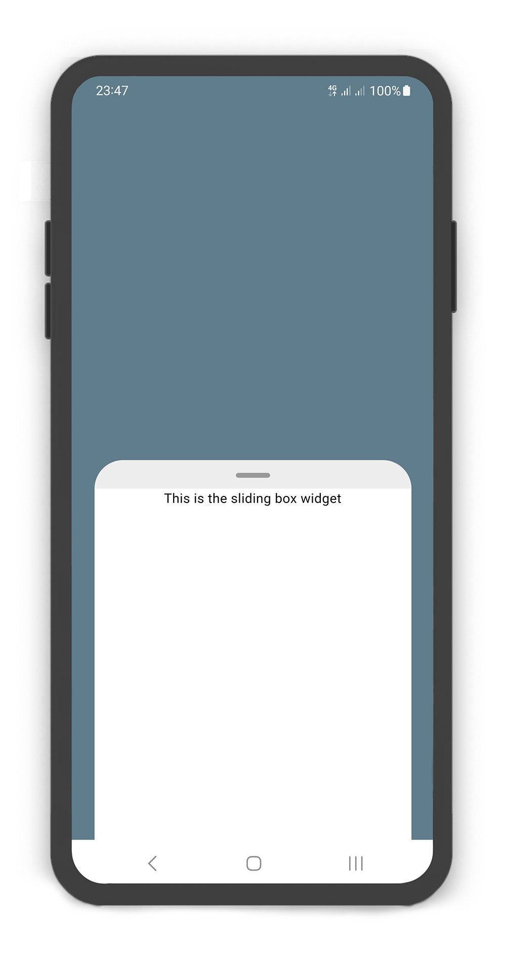
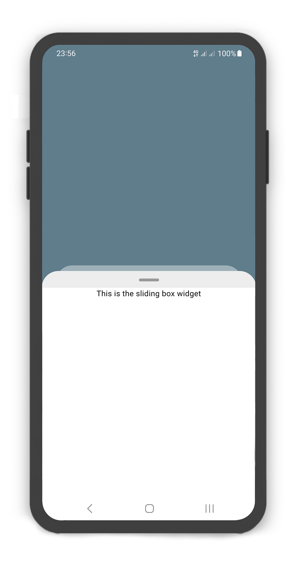
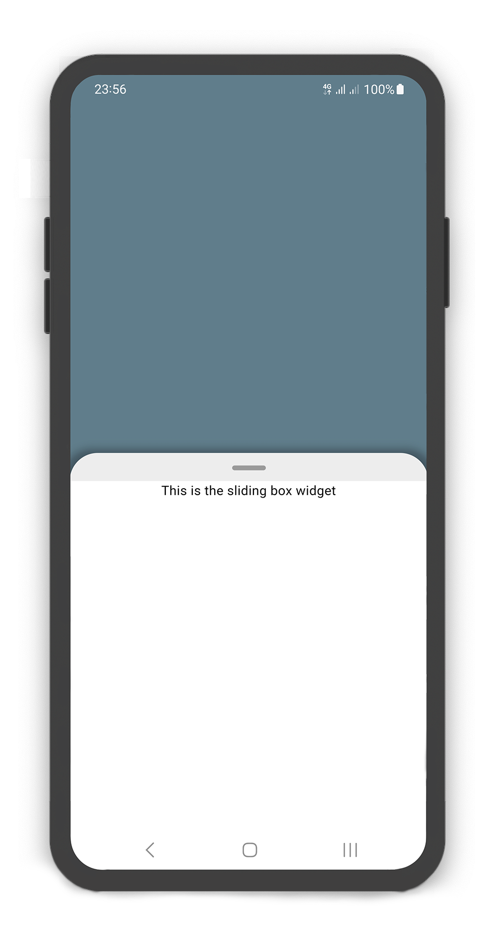
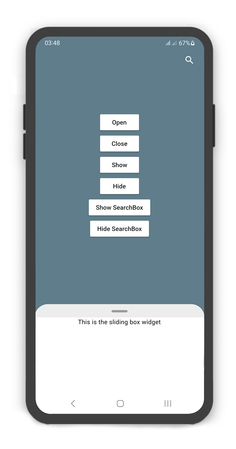
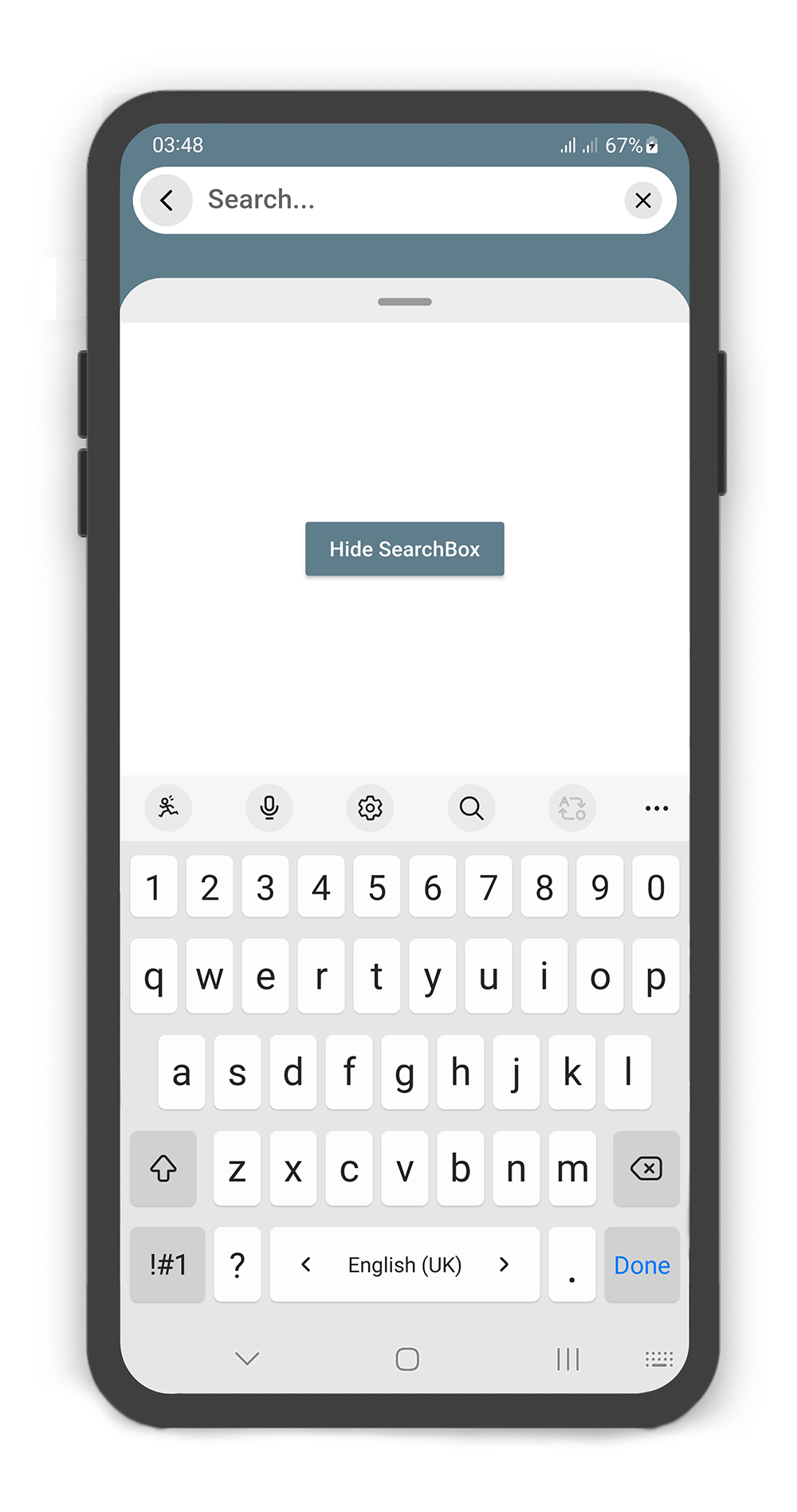
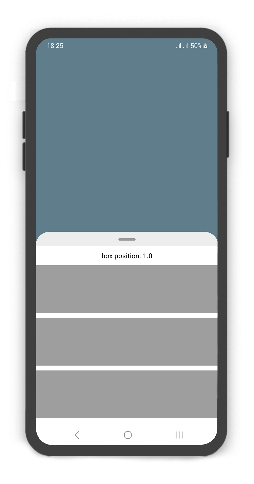
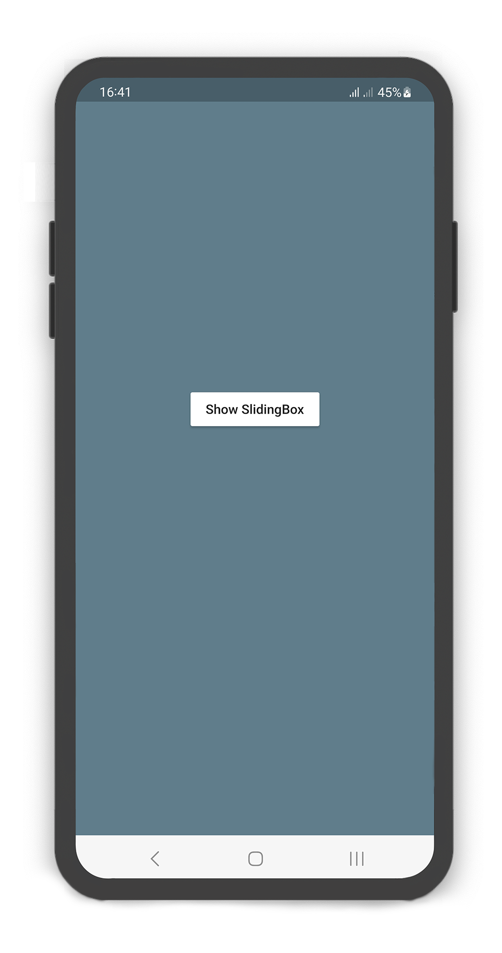
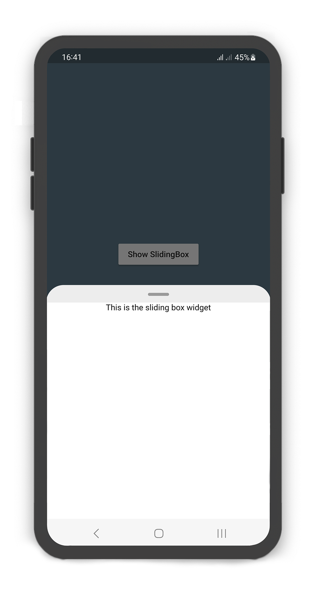
Flutter 滑動框是一個可拖曳組件,旨在簡化在所有平台實現滑動面板的流程,類似於底部彈出選單。它為 Android、iOS、Web、macOS、Windows 和 Linux 提供一致且響應迅速的介面。該套件透過支援流暢的垂直或水平滑動手勢來增強使用者互動,非常適合用於可摺疊的內容區域,如選單、表單或詳細檢視。基於 Flutter 的彈性建構,確保原生般的操作體驗,無需撰寫平台特定程式碼。其輕量級設計支援輕鬆整合至現有專案中。
適用情境
實現可摺疊的底部抽屜
建立互動式表單抽屜
構建動態內容面板
設計以行動裝置為首的導航抽屜
啟用手勢驅動的使用者介面元件
主要特色
跨平台相容性
可拖曳的滑動行為
可自訂的動畫曲線
支援多種方向
內建手勢辨識
輕量且易於整合
適合對象
開發多平台應用的開發者
需要互動式面板的UI設計師
需要基於手勢導航的應用
具有可摺疊內容區域的專案
尋求一致底部表單體驗的團隊
使用建議
可能需要額外的樣式來適應複雜佈局
效能取決於面板內容的複雜度
對進階動畫的自訂功能有限
最適合簡單到中等複雜度的滑動介面
不建議用於高度動態或嵌套的滑動結構
原始 README
以下為關聯原始碼儲存庫的 README 原文快照,最新內容請造訪原始碼儲存庫。
SlidingBox for Flutter
A draggable flutter widget (like bottom sheet panel) that makes it easier to use a SlidingBox for all platform.
Boxes can be customized with your content and placed in your app.
To see example of the following SlidingBox on a device or simulator:
There are several options that allow for more control:
Properties
Data Type
Description
body
Widget
A widget that slides from minHeight to maxHeight and is placed on the backdrop.
bodyBuilder
Widget
Provides a ScrollController to attach to a scrollable widget in the box and current box position. If body and bodyBuilder are both non-null, body will be used.
controller
BoxController
It can be used to control the state of sliding box and search box.
collapsed
bool
If set to true, the state of the box is collapsed.
collapsedBody
Widget
The Widget displayed overtop the box when collapsed. This fades out as the sliding box is opened.
width
double
width of the sliding box.
minHeight
double
The height of the sliding box when fully collapsed.
maxHeight
double
The height of the sliding box when fully opened.
color
Color
color to fill the background of the sliding box.
borderRadius
BorderRadius
The corners of the sliding box are rounded by this.
style
BoxStyle
The styles of the sliding box that includes shadow and sheet and none.
physics
ScrollPhysics
Gets a ScrollPhysic, the physics determines how the scroll view continues to animate after the user stops dragging the scroll view.
draggable
bool
Allows toggling of draggability of the sliding box. If set to false, the sliding box cannot be dragged up or down.
draggableIcon
IconData
A Icon Widget that is placed in top of the box. Gets a IconData.
draggableIconColor
Color
The color of the draggableIcon.
draggableIconVisible
bool
If set to false, the draggableIcon hides. Use controller to open and close sliding box by taps.
draggableIconBackColor
Color
The color to fill the background of the draggableIcon icon. The position of the icon is top of the box.
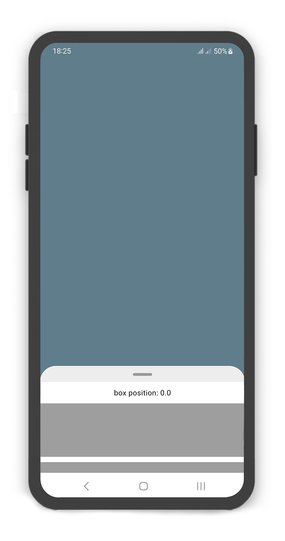
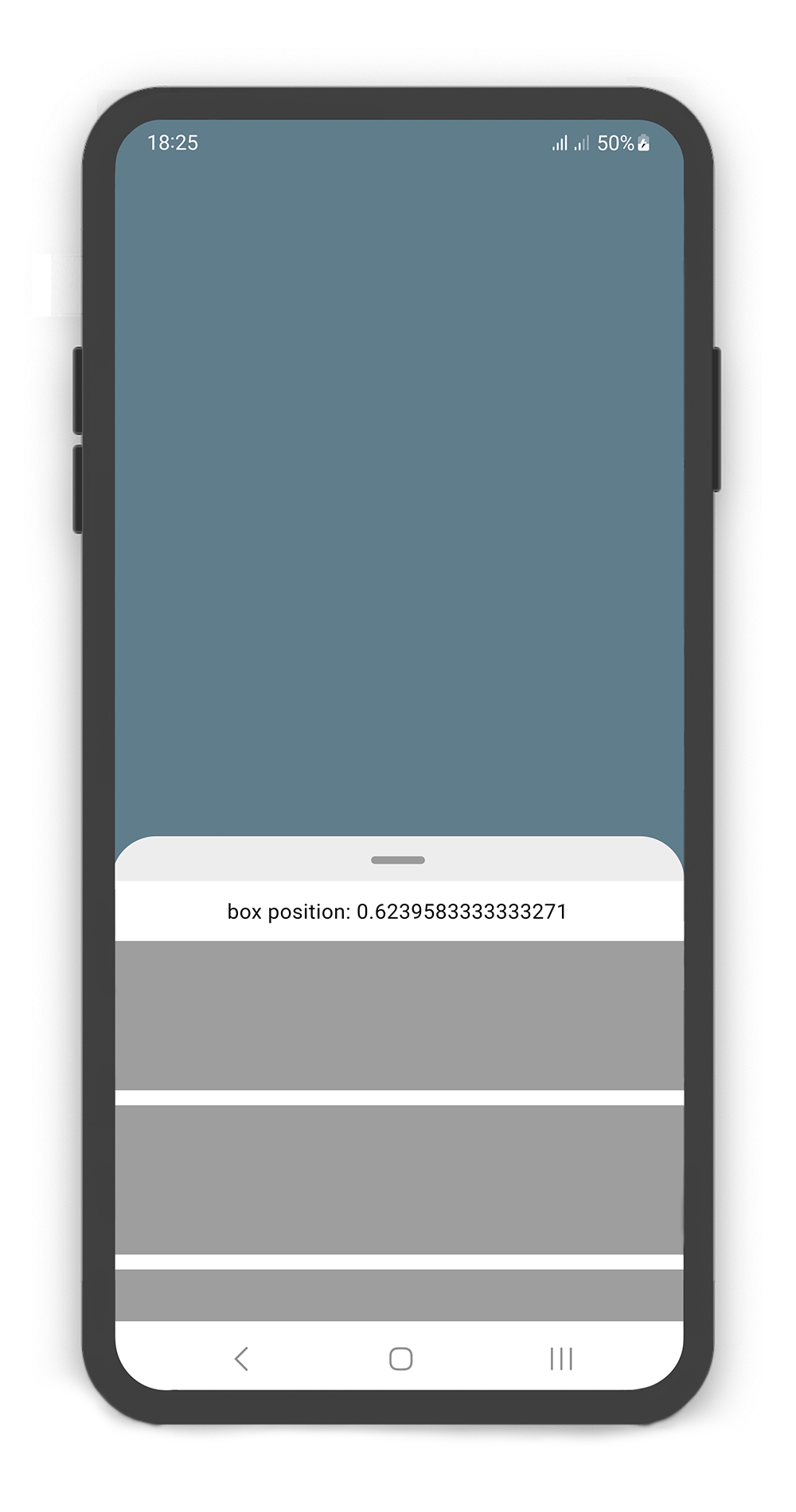
onBoxSlide
ValueChanged<double>
This callback is called when the sliding box slides around with position of the box. The position is a double value between 0.0 and 1.0, where 0.0 is fully collapsed and 1.0 is fully opened.
onBoxOpen
VoidCallback
This callback is called when the sliding box is fully opened.
onBoxClose
VoidCallback
This callback is called when the sliding box is fully closed.
onBoxShow
VoidCallback
This callback is called when the sliding box is visible.
onBoxHide
VoidCallback
This callback is called when the sliding box is invisible.
onSearchBoxShow
VoidCallback
This callback is called when the search box is visible.
onSearchBoxHide
VoidCallback
This callback is called when the search box is invisible.
animationCurve
Curve
animationCurve defines the easier behavior of the box animation.
animationDuration
Duration
animationDuration defines the time for the box animation to complete.
backdrop
Backdrop
A Widget that is placed behind of the box, filled with the Backdrop.
Backdrop Usage
Using the Backdrop
Manually change the Backdrop properties.
Properties
Data Type
Description
color
Color
color to fill the background of the backdrop.
width
double
width of the backdrop body.
fading
bool
If set to true, the backdrop body fades out when the sliding box opened.
moving
bool
If set to true, the backdrop body moving up when the sliding box opened.
overlay
bool
If set to true, a dark layer displayed above of the backdrop and behind of the sliding box when is opened.
overlayOpacity
double
Amount of dark overlay layer. a double value between 0.0 and 1.0.
backgroundGradient
Gradient
The gradient color to fill the background of the backdrop. if color and backgroundGradient are both non-null, color will be used.
body
Widget
A Widget that is placed in the backdrop and behind of the sliding box.
It can be used to control the state of search box text field. Gets a TextEditingController.
leading
Icon
A Icon Widget that is placed in left of the search box text field.
color
Color
color to fill the background of the SearchBox.
inputDecoration
InputDecoration
decoration to show around the search box text field.
borderRadius
BorderRadius
The corners of the search box are rounded by this.
style
TextStyle
style for text of the SearchBox.
body
Widget
A Widget that is placed in the sliding box (in search mode displays the search result).
draggableBody
bool
In search mode, allows toggling of draggability of the sliding box. If set to false, the sliding box cannot be dragged up or down when search box visible. If set to true, search box invisible when dragging.
SlidingBox backdrop includes overlay: true
Customize overlayOpacity (a value between 0.0 and 1.0), default value is 0.5
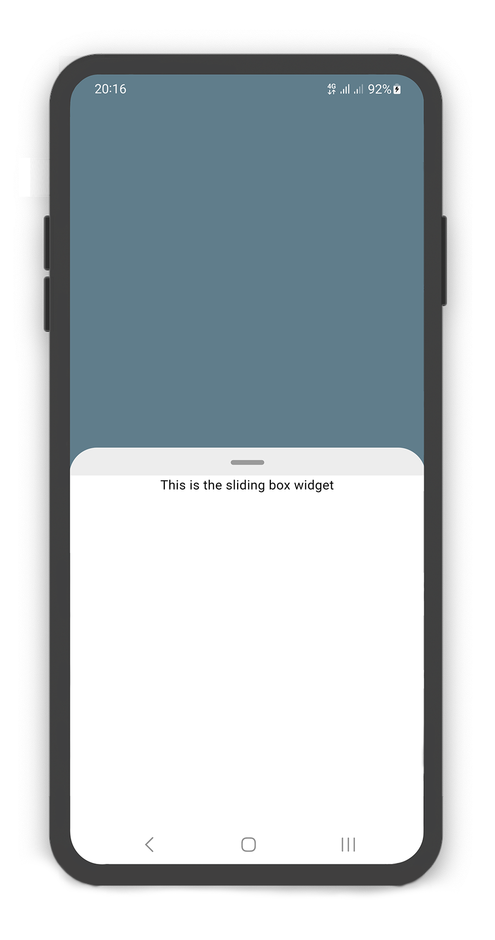
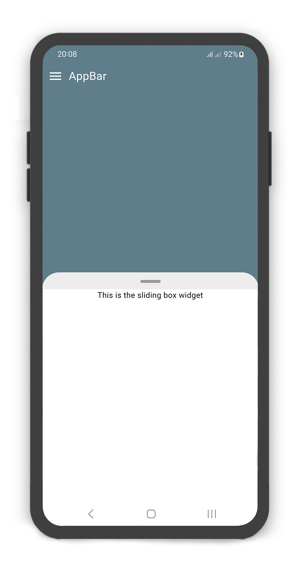
@overrideWidgetbuild(BuildContext context) {
returnScaffold(
body: SlidingBox(
minHeight: 200,
maxHeight: 400,
style: BoxStyle.sheet, /// or BoxStyle.shadow (default is 'none')
body: Center(
child: Text("This is the sliding box widget",
style: TextStyle(color: Colors.black),),
),
backdrop: Backdrop(
color: Colors.blueGrey,
),
),
);
}
Box Controller
Using the BoxController
Manually change the SearchBox state. For better performance, use a BoxController as controller (recommended).
Properties
Data Type
Description
isAttached
bool
Determine if the boxController is attached to an instance of the SlidingBox (this property must be true before any other BoxController functions can be used).
isBoxOpen
bool
Returns whether or not the box is open.
isBoxClosed
bool
Returns whether or not the box is close.
isBoxVisible
bool
Returns whether or not the box is visible.
isSearchBoxVisible
bool
Returns whether or not the search box is visible.
getPosition
bool
Returns box position (a value between 0.0 and 1.0).
minHeight
double
Returns box minHeight.
maxHeight
double
Returns box maxHeight.
boxWidth
double
Returns box width.
backdropWidth
double
Returns backdrop width.
Methods
Return Type
Description
openBox()
Future<void>
Opens the sliding box with animation (i.e. to the maxHeight).
closeBox()
Future<void>
Closes the sliding box with animation (i.e. to the minHeight).
showBox()
Future<void>
Shows the sliding box (i.e. is visible).
hideBox()
Future<void>
Hides the sliding box (i.e. is invisible).
showSearchBox()
Future<void>
Shows the search box (i.e. is visible).
hideSearchBox()
Future<void>
Hides the search box (i.e. is invisible).
setPosition()
Future<void>
Sets the sliding box position with animation (a value between 0.0 and 1.0).