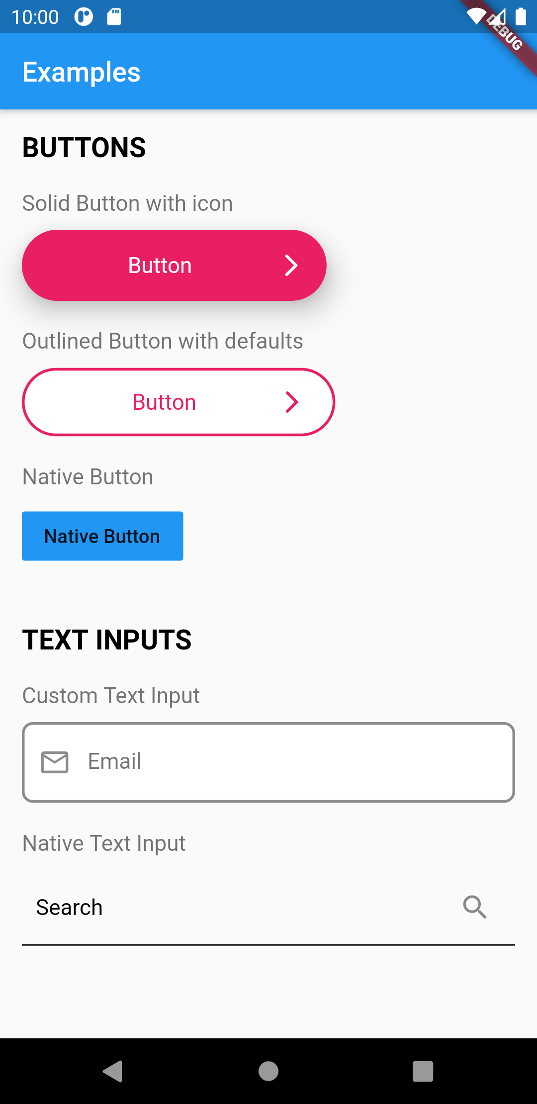
Flutter UI 工具包是一個全面的預建可重複使用的組件庫,旨在加速應用開發。它受到 HTML 和 CSS 類的簡潔性啟發,使開發者能夠快速使用現成的組件組裝介面。該工具包強調一致性、可自訂性和易用性,減少樣板程式碼。它支援 Android、iOS、macOS、Windows 和 Linux 等多個平台,非常適合需要快速進行 UI 迭代的跨平台專案。
適用情境
快速原型設計
跨平台應用程式開發
一致的使用者介面設計
減少重複的組件代碼
簡化UI組件重用
主要特色
預建構、可自訂的小工具
用於樣式的類似 CSS 的類系統
多平台支援
最小的樣板程式碼
透過 pub 輕鬆整合
適合對象
前端開發人員
以使用者介面為重點的團隊
快速發展的初創企業
設計系統實施
初學者到中級 Flutter 使用者
使用建議
可能限制對小部件行為的細粒度控制
依賴外部維護
不適用於需要擴展的高度自定義UI
如果包含未使用的組件,可能會導致膨脹
基於類別的樣式方法的學習曲線
原始 README
以下為關聯原始碼儲存庫的 README 原文快照,最新內容請造訪原始碼儲存庫。
Flutter UI Toolkit
The development of this  package is still in progress. More widgets are to come.
However because the widgets are purely Flutter widgets, you can use it with no fear :)
Flutter UI Toolkit is a pre-built collection of the most used widgets to create apps,
the basic ones like: Buttons, Inputs, Headings, Dialogs, Action Sheets, etc..
The idea is that you can use these widgets the way you use classes in HTML and CSS and be a simple helper.
The widgets can receive an argument called as that will carry the widget's styles.
The advantage of this approach is that we don't need to repeat styling every time we create a new widget.
In addition to custom styles, this package also provides native look and feel to the widgets.
This is useful when you want to have one widget that displays the right look and feel based on the Platform.
We can also add custom styles to UIHeading as well
/// Use Google Fonts to set font family and extend stylyes

final articleTitleLato = UIHeadingDefaults(
    color: Colors.pink,
    style: GoogleFonts.lato(
      fontSize: 40.0,
    ),
);
Then use the headings anywhere in your application.
import'styles/headings.dart'// Use articleTitleUIHeading(
as: articleTitle,
text: 'Article Title',
),
// Use articleTitleLatoUIHeading(
as: articleTitleLato,
text: 'Big title using font Lato',
),
UIBottomSheet
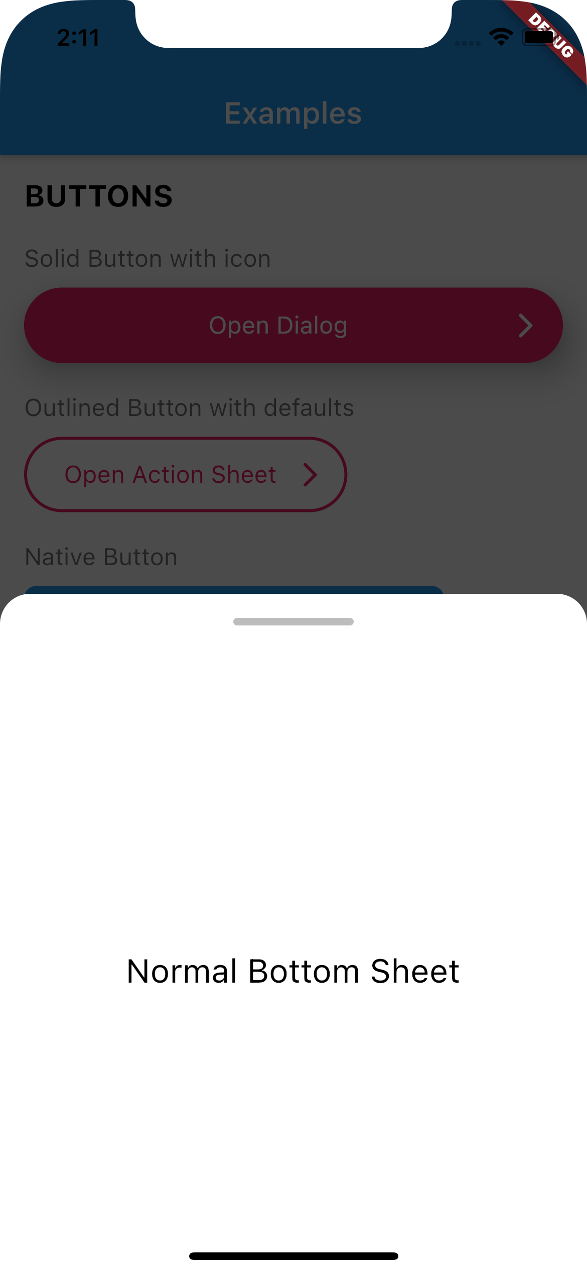
Use UIBottomSheet when you want to display a bottomsheet.
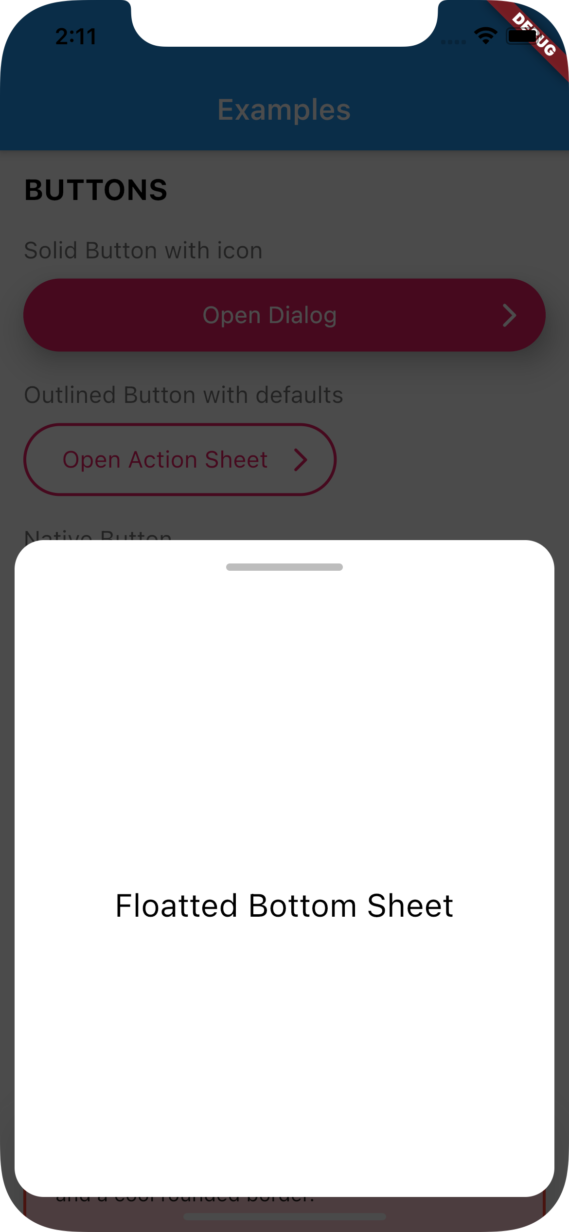
Set floatted: true if you want the bottom sheet to be floatted (have margin all around it, like some iOS bottom sheets)
You can also have a trailing Widget that can be useful for a close button when you have enableDrag set to false.
Full Width
Floatted
How to use:
Create a function that calls UIBottomSheet.show().
Call the function when you need it (eg.: on tap on a button)
// Set up the bottom sheetFuture<void> _openBottomSheet(BuildContext context) async {
awaitUIBottomSheet.show(
context: context,
floatted: true,
hideHead: false,
content: Container(
alignment: Alignment.center,
height: 400,
child: UIHeading(
heading: 3,
text: 'Some cool content',
),
),
);
}
// Open the bottom sheet UIButton.native(
label: 'Open Bottom Sheet',
onPressed: () async {
// OPEN BOTTOM SHEET// and wait until it's closedawait_openBottomSheet(context);
// proceedprint('Bottom sheet closed');
},
),
UITextField
This widget renders a input text field.
There are two kind of text fields you can choose from:
UITextField(),
UITextField.native(),
To create default styles for the text field you need to create a class of type UITextFieldDefaults.
You can have a separated directory where you add all your default styles.
import'styles/containers.dart';
// Show container with error stylingUIContainer(
as: errorContainer,
child: Text('This is a box with a nice shadow\nand a cool rounded border.'),
),
UIActionSheet
This widget creates a Native Action Sheet.
Compared with the other classes in this package,UIActionSheet is a bit more verbose.
However you write once for all platforms.
How to use:
Create a function that calls UIActionSheet.show().
The actions need to be of type UIAction.
Call the function when you need it (eg.: on tap on a button)
See example below:
// Creates a Native Action Sheet Factoryvoid_openActionSheet(BuildContext context) {
UIActionSheet.show(
context,
/// TITLE
title: UIHeading(
text: 'Select you favorite color',
color: Colors.blue,
textAlign: TextAlign.center,
heading: 5,
),
/// CONTENT
content: Text('We will use the color on your profile.'),
/// ACTIONS
actions: [
UIAction(
child: Text('Red'),
onPressed: () => Navigator.of(context).pop(),
),
UIAction(
child: Text('Green'),
onPressed: () => Navigator.of(context).pop(),
),
UIAction(
child: Text('Bue'),
onPressed: () => Navigator.of(context).pop(),
),
UIAction(
child: Text('Pink'),
onPressed: () => Navigator.of(context).pop(),
),
],
/// CANCEL BUTTON
cancel: UIAction(
child: UIHeading(
text: 'Cancel',
color: Colors.red,
heading: 4,
),
onPressed: () => print('Cancel'),
),
);
}
// Will open action sheet based on the current OSUIButton.solid(
as: solidButtonStyles,
label: "Open Action SHeet",
onPressed: () => _openActionSheet(context),
),
UIDialog
This widget creates a Native Dialog.
Compared with the other classes in this package, UIDialog is a bit more verbose.
However you write once for all platforms.
How to use:
Create a function that calls UIDialog.show().
The actions need to be of type UIAction.
Call the function when you need it (eg.: on tap on a button)
See example below:
// Creates a Native Dialog Factoryvoid_openDialog(BuildContext context) {
UIDialog.show(
context,
/// TITLE
title: Text('Are you sure?'),
/// CONTENT
content: Text('You cannot reverse this action.'),
/// ACTIONS
actions: [
UIAction(
child: Text('YES'),
onPressed: () => print('YES'),
),
UIAction(
child: Text('NO'),
onPressed: () => Navigator.of(context).pop(),
),
],
);
}
// Will open a dialog based on the current OSUIButton.solid(
as: solidButtonStyles,
label: "Open Dialog",
onPressed: () => _openDialog(context),
),
If you find any bug or want to request a feature, feel free to open an issue on Github.